Split buttons
Split buttons combine a primary action with a secondary action in a single component.
Overview · Specs · Guidelines · Accessibility
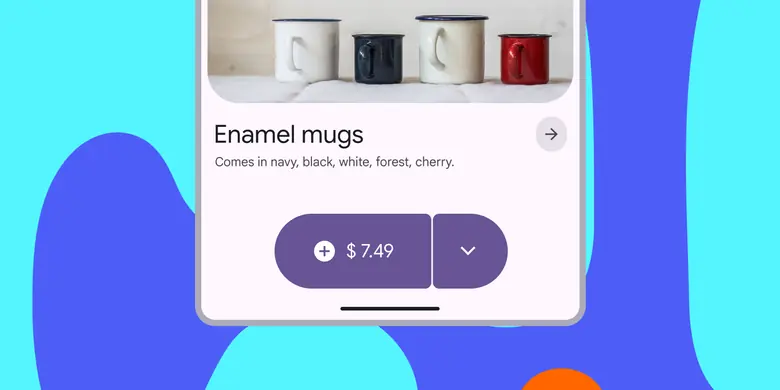
- Use to show an action with a menu of related actions
- Same size range as buttons and icon buttons: XS, S, M, L, XL
Split buttons are made of a common button and a menu icon button
Availability & resources
| Type | Resource | Status |
|---|---|---|
| Design | Design Kit (Figma) | Available |
| Implementation | Jetpack Compose: Expressive | Available |
| Implementation | Android Views (MDC-Android): Expressive | Available |
| Implementation | Web: Expressive | Unavailable |
M3 Expressive update
May 2025
The split button has a separate menu button that spins and changes shape when activated. It can be used alongside other buttons of the same size. More on M3 Expressive
New component added to catalog.
Sizes:
- Extra small
- Small
- Medium
- Large
- Extra large
Color styles:
- Elevated
- Filled
- Tonal
- Outlined
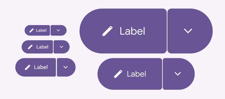
Split buttons have the same five recommended sizes as label and icon buttons