Icon buttons
Icon buttons help people take supplementary actions with a single tap.
Overview · Specs · Guidelines · Accessibility
Icon buttons can be a wide variety of sizes, shapes, and colors. When placed in a button group, adjacent icon buttons respond to one another when pressed.
Usage
Use icon buttons to display common actions. There are two variants: default and toggle.
- Default icon buttons can open other elements, such as a menu or search.
- Toggle icon buttons can represent binary actions that can be toggled on and off, such as favorite or bookmark.
Icon buttons can be placed directly on the background or in most container components, such as cards, app bars, and toolbars.
Multiple icon buttons can be placed in a standard button group to add interaction and motion between the buttons when pressed. More about standard button groups
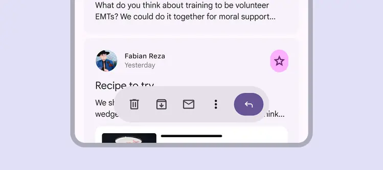
Icon buttons can be used within other components, such as in a toolbar or card
Color
There are four icon button color styles, in order of emphasis:
- Filled
- Tonal
- Outlined
- Standard
For the highest emphasis, use the filled style. For the lowest emphasis, use standard.
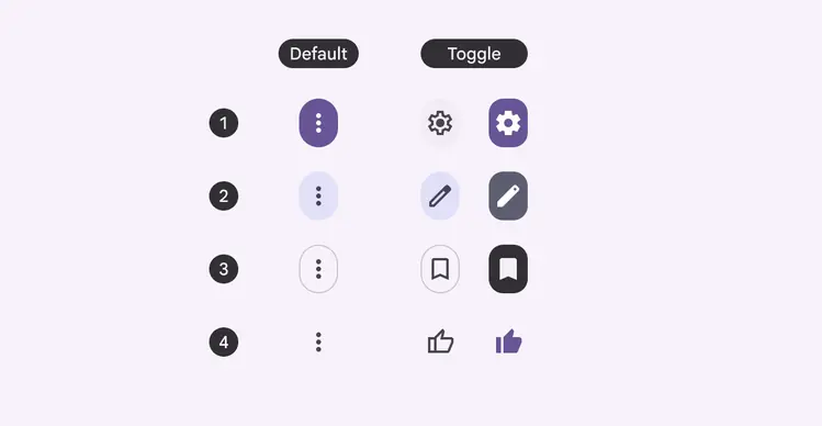
The default (left) and toggle (right) icon buttons are available in all four color styles
Use a filled, tonal, or outlined icon button when the button needs more visual separation from the background.
Choose the right style and emphasis for the situation.
Do
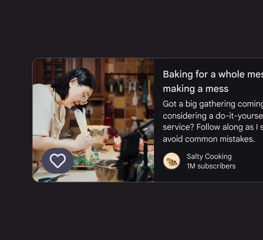
Use icons with a background to make them easy to see on any surface
Do
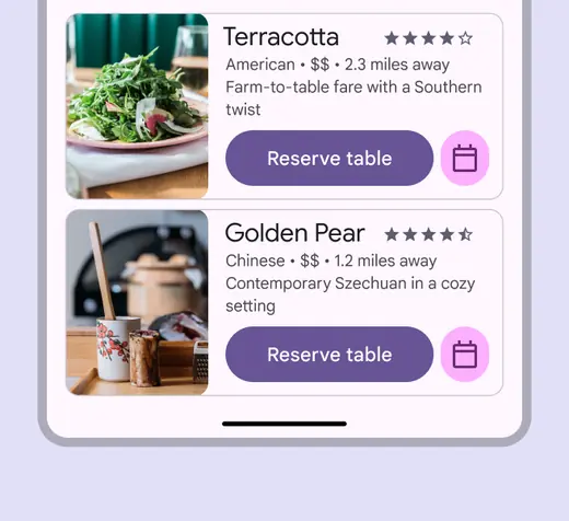
When mixing button variants, use color styles to make the primary action clear
Use the filled style for visual impact and key actions that require high emphasis.
Avoid overusing the filled style on a screen. Use them sparingly.
Use filled icon buttons for high emphasis actions, such as downloading or deleting
Use the tonal style as a middle ground between filled and outlined icon buttons. It’s useful for secondary actions paired with a high emphasis action.
For example, use the tonal style for actions like Raise hand in a video meeting. When selected, its visual emphasis is greater than the outlined menu button, but less than the filled End call button.

Leverage the different color styles to establish emphasis and direct people to important actions
Use the outlined style for medium-emphasis buttons. It’s useful when the button isn’t the main focus of the interaction, such as browsing through sets of cards.
Use the standard style for low-emphasis buttons, or when placing buttons on a colorful surface.
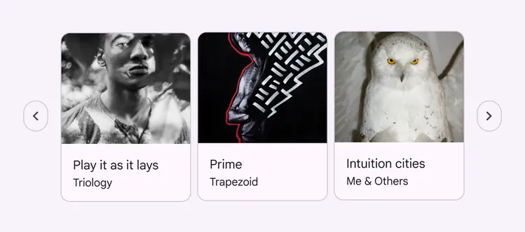
Outlined buttons indicate that more content is available without grabbing attention
Size & width
Icon buttons are available in five different sizes:
- Extra small - 32dp
- Small - 40dp (default)
- Medium - 56dp
- Large - 96dp
- Extra large - 136dp
And three widths:
- Default
- Narrow
- Wide
Use size and width to provide emphasis and visual hierarchy in a page with multiple buttons. The main action should be the most visually prominent, whether through color or size, like starting and stopping a timer or playing and pausing a song.
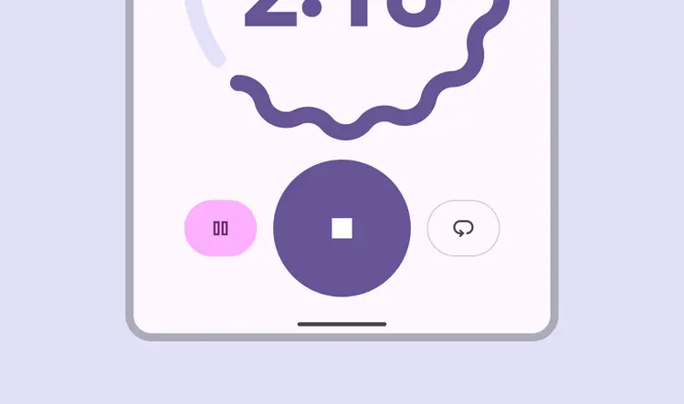
Use different button colors and sizes to provide visual hierarchy and emphasize primary actions
Not all icon buttons will need to emphasize a primary and secondary action.
When buttons have a similar importance, they should be the same size.
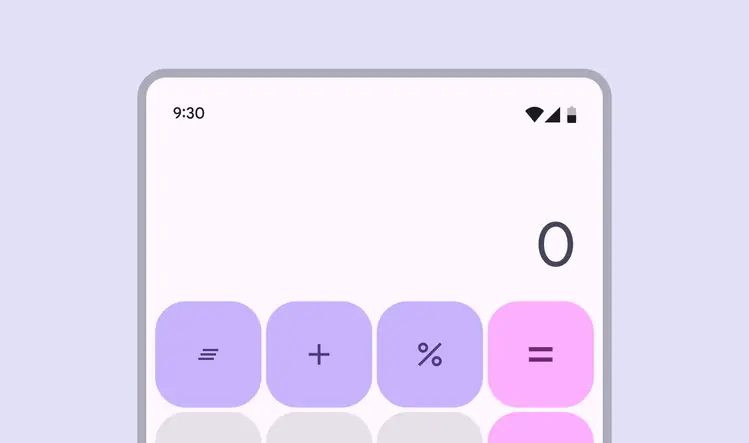
When everything should have the same emphasis, use icon buttons that are the same size
Anatomy
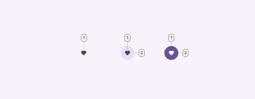
- Icon
- Container
Icon
Icons visually communicate the button’s action. Their meaning should be clear and unambiguous. Browse popular icons
Default icon buttons should use filled icons.
Toggle buttons should use an outlined icon when unselected, and a filled version of the icon when selected.
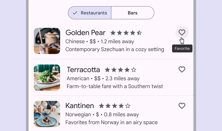
Ensure the meaning of the icon is clear, such as a heart indicating Favorite
Icon accessibility requirements
For selected toggle buttons, if a filled version of an icon doesn’t exist, increase the icon weight to semibold. If semibold doesn’t provide enough visual change, use bold.
This is to ensure that selection is communicated through at least two properties, rather than just color. This requirement doesn't apply to default non-toggle buttons.
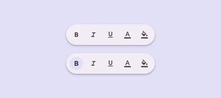
Icons without a fill should be semibolded when selected
Container
The container provides increased contrast and hierarchy in places that need more visual separation from the background or other elements.
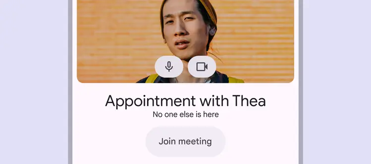
The container provides visual separation from the background image
Placement
Icon buttons are commonly used in other components, such as app bars and cards.
These buttons should be used for common, easily understandable actions.
Only use a few icon buttons at once.
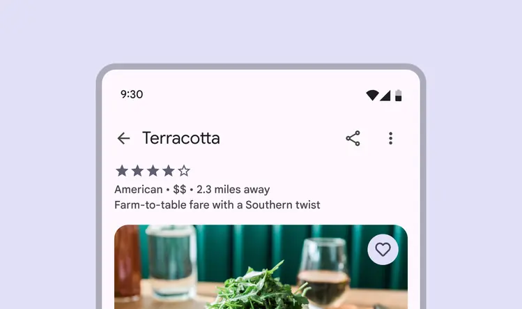
App bars often contain icon buttons
In dense layouts, group popular actions by placing many icon buttons next to each other in components like a toolbar or button group.
These components draw attention or add interaction between buttons.
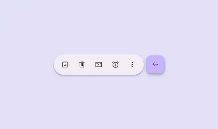
A toolbar is a collection of icon buttons and other components
Behavior
Hover
On hover, the icon button displays a tooltip describing its action, rather than the name of the icon itself.
The tooltip label text should be clear and concise
Selection
Toggle icon buttons allow a single choice to be selected or deselected, such as adding or removing something from favorites.
When placed in a button group, icon buttons change shape to help the selected button stand out.
More on button groups
Do
Use toggle icon buttons when the icon can be selected
Don't
Don’t use toggle icon buttons for actions that don’t have a selected state, such as an icon button for an overflow menu
The icon should become filled to represent selection.
If a filled version of the icon doesn't exist, use semibold weight instead.
When making a selection, such as bookmarking or saving a video, the icon transitions from outlined (unselected) to filled (selected)