Dialogs
Dialogs provide important prompts in a user flow. Use dialogs to make sure users act on information
Overview · Specs · Guidelines · Accessibility

A basic dialog
Usage
A dialog is a modal window that appears in front of app content to provide critical information or ask for a decision. Dialogs disable all app functionality when they appear, and remain on screen until confirmed, dismissed, or a required action has been taken.
Dialogs are purposefully interruptive, so they should be used sparingly. A less disruptive alternative is to use a dropdown menu, which provides options without interrupting a user’s experience.
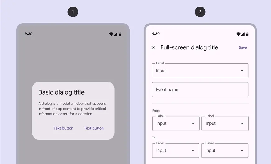
There are two variants of dialogs:
- Basic dialog
- Full-screen dialog
Do
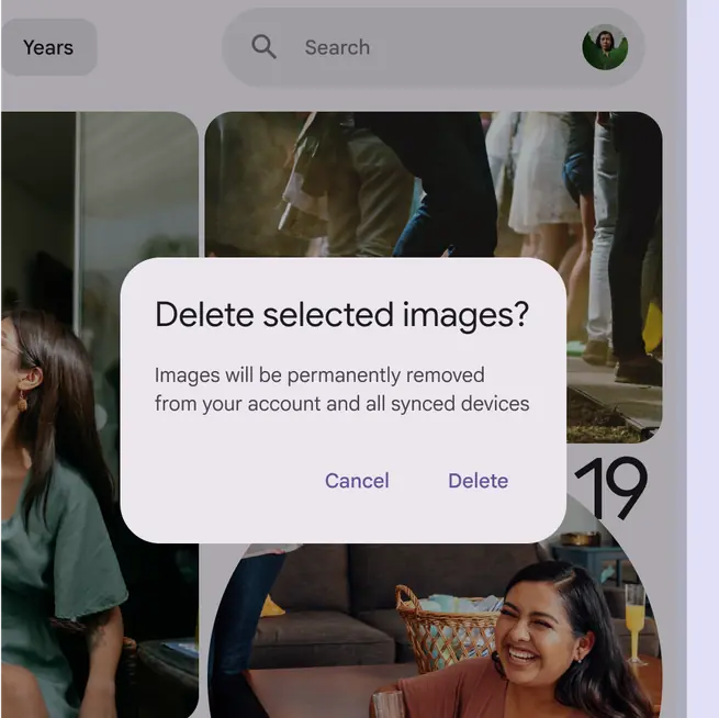
Use dialogs for prompts that block an app’s normal operation, and for critical information that requires a specific user task, decision, or acknowledgement
Don't
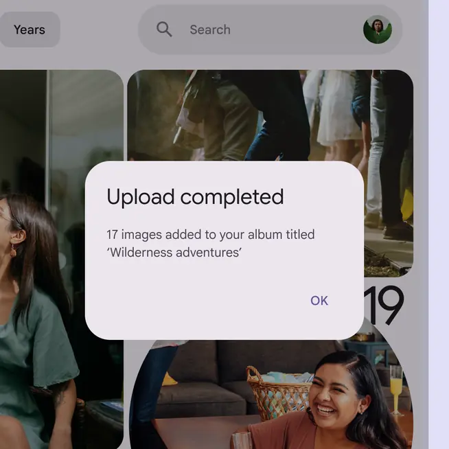
Don’t use dialogs for low- or medium-priority information. Instead use a snackbar, which can be dismissed or disappear automatically.
Similar components
Snackbars are also designed to show important messages.
Choose the right component based on the importance of the message. This component messaging strategy helps avoid overusing dialogs.
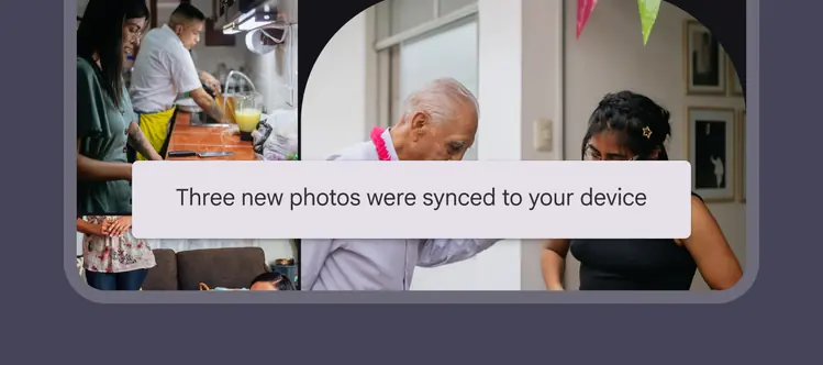
Snackbars can disappear automatically
| Component | Importance | Action needed |
|---|---|---|
| Snackbar | Low importance | Optional: Snackbars may not have a button, and can disappear automatically |
| Dialog | High importance | Required: Dialogs block the main content until an action is confirmed |
Anatomy
Basic dialog
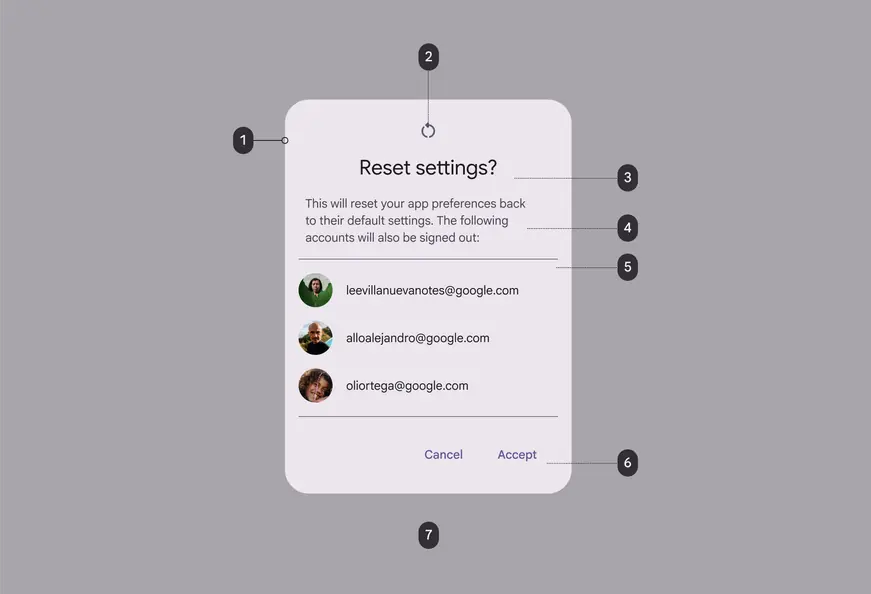
- Container
- Icon (optional)
- Headline (optional)
- Supporting text
- Divider (optional)
- Buttons label text
- Scrim
Full-screen dialog
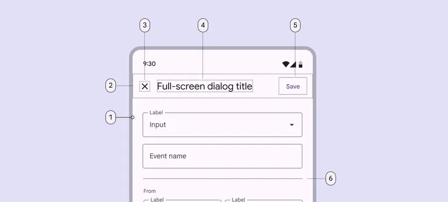
- Container
- Header region
- Icon (close affordance)
- Headline (optional)
- Button label text
- Divider (optional)
Container and scrim
Dialog containers appear above other screen elements and hold the dialog’s headline, text, buttons, and list items.
To focus attention on the dialog, surfaces behind the container are scrimmed with a temporary overlay to make them less prominent.
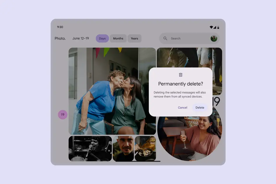
Basic dialogs appear over a background scrim
Headline (optional)
A dialog’s purpose should be communicated by its headline and buttons or actionable items.
Headlines should:
- Contain a brief, clear statement or question
- Avoid apologies (“Sorry for the interruption”), alarm (“Warning!”), or ambiguity (“Are you sure?”)
Do
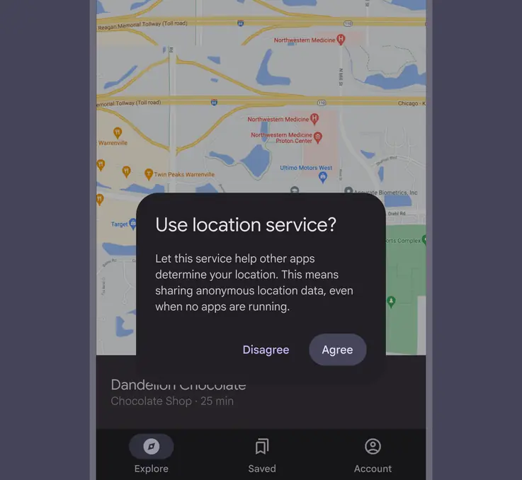
This dialog title poses a specific question, concisely explains what’s involved in the request, and provides clear actions
Don't
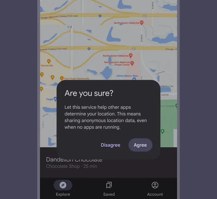
Don’t use dialog titles that pose an ambiguous question
Headlines should always be succinct. They can wrap to a second line if necessary, and be truncated.
In full-screen dialogs, long headlines or headlines of variable lengths (such as translations), can be placed in the content area instead of the app bar.
Caution
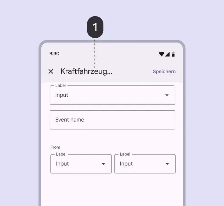
Avoid placing long headlines in a full-screen dialog’s app bar (1), as the truncated text may lead to misunderstanding
Do
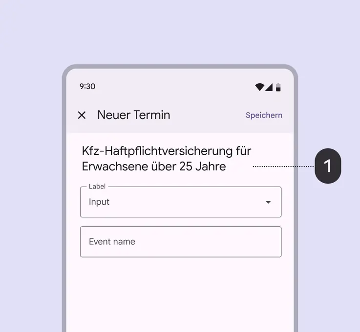
Find ways to shorten app bar text, and place longer headlines into the content area (1) of a full-screen dialog
Buttons
Dialog actions are most often represented as buttons and allow users to confirm, dismiss, or acknowledge something.
Buttons are aligned to the trailing edge of the dialog for easier interaction. The confirmation button is always closest to the edge.
Button alignment responds automatically for right-to-left languages, where the confirmation button is aligned to the left edge.
Do
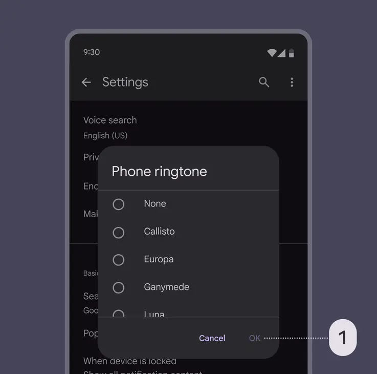
Disable confirming actions (1) until a choice is made. Dismissive actions are never disabled.
Don't
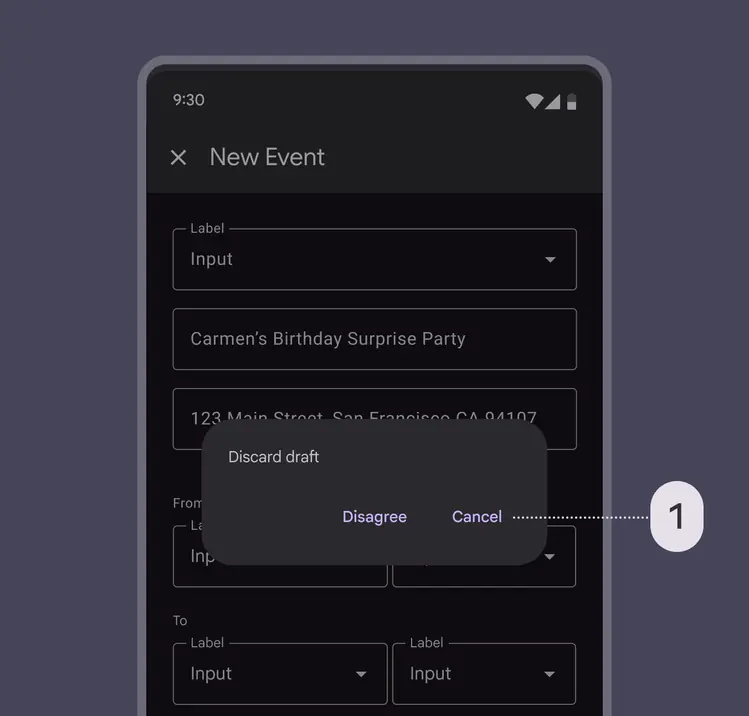
Don’t place dismissive actions (1) to the right of confirming actions. Instead, place them to the left of confirming actions.
Do
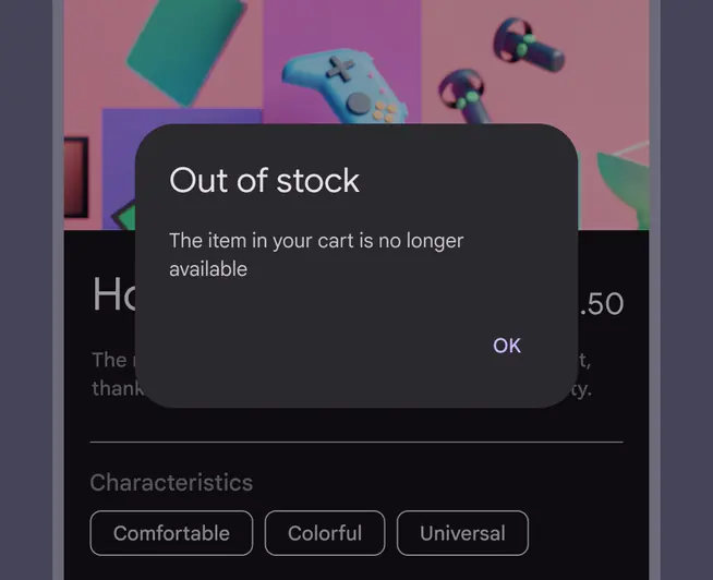
A single action may be provided only if it’s an acknowledgement
Don't
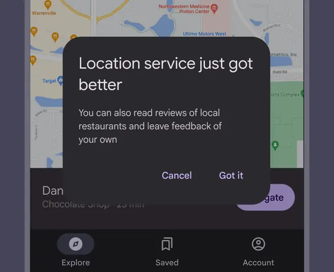
Avoid presenting people with unclear choices. Cancel doesn't make sense here because no clear action is proposed.
Dialogs should contain a maximum of two actions.
- If a single action is provided, it must be an acknowledgement action
- If two actions are provided, one must be a confirming action, and the other a dismissing action
Do
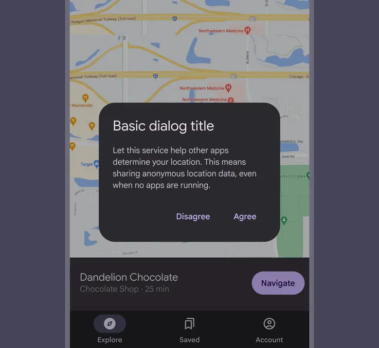
Display two text buttons next to one another
Caution
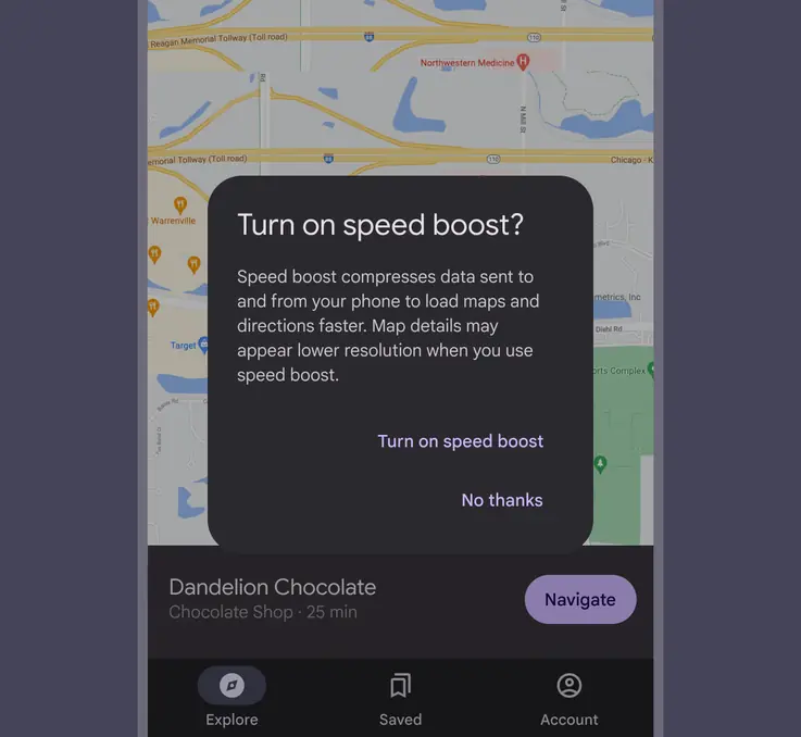
Stacked buttons accommodate longer button text, but take up more room. Confirming actions appear above dismissive actions.
Providing a third action, such as Learn more, is not recommended as it navigates the user away from the dialog, leaving the dialog task unfinished.
Rather than adding a third action, an inline expansion can display more information. If more extensive information is needed, provide it prior to entering the dialog.
Caution
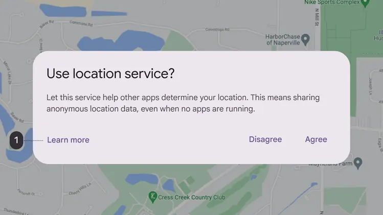
The Learn more action (1) navigates away from this dialog, potentially leaving it in an indeterminate state
Basic dialog
Basic dialogs interrupt users with urgent information, details, or actions. Common use cases for basic dialogs include alerts, quick selection, and confirmation.
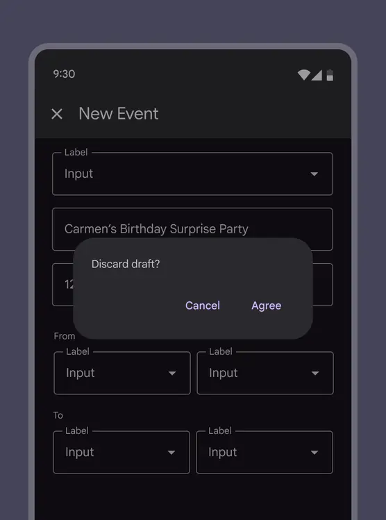
Basic dialogs require a person to take action before it will close
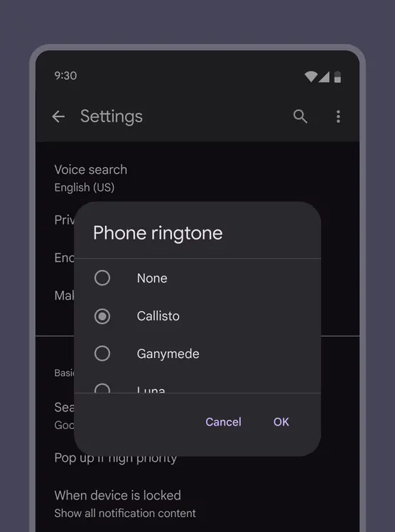
Basic dialogs can give people the ability to provide confirmation of a choice before committing to it
Basic dialogs most often appear as alerts or lists, but can have a variety of layouts and component combinations, including lists, date pickers, and time pickers.
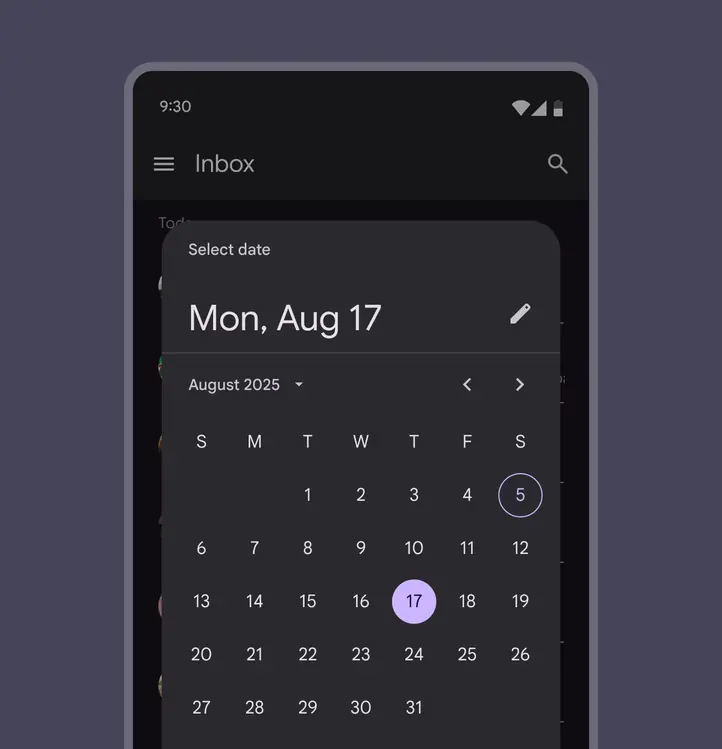
Date picker dialogs allow people to tap a date, then confirm it by tapping OK
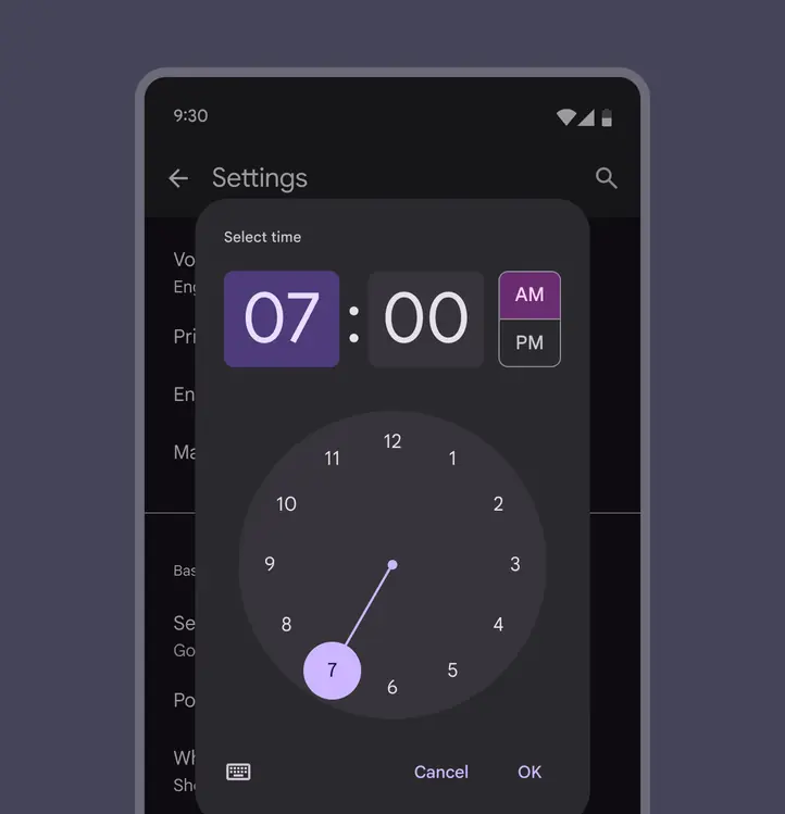
Time picker dialogs allow people to move the clock hand and then confirm by tapping OK
Full-screen dialog
Full-screen dialogs fill the entire screen, containing actions that require a series of tasks to complete. One example is creating a calendar entry with the event title, date, location, and time.
Because they take up the entire screen, full-screen dialogs are the only dialogs over which other dialogs can appear.
Use a container transform pattern to transition a FAB into a full-screen dialog.
Full-screen dialogs contain actions that require a series of tasks to complete
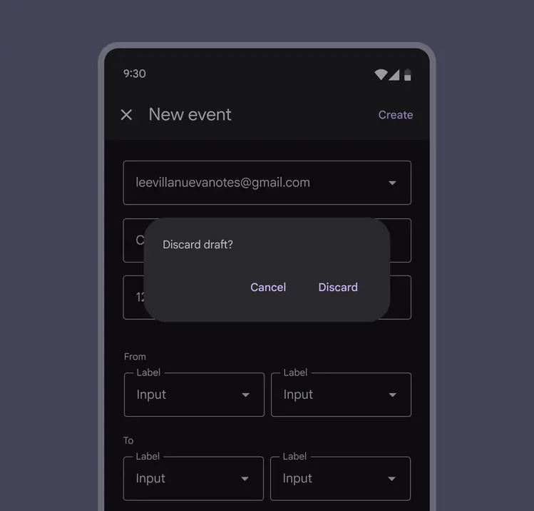
When a full-screen dialog is closed without being saved, a basic dialog appears in front of it to confirm selections should be discarded without saving changes.
A basic modal dialog appears when a full-screen dialog is closed without being saved
Full-screen dialogs may be used for content or tasks that meet any of these criteria:
- Dialogs that include components which require keyboard input, such as form fields
- When changes aren’t saved instantly
- When components within the dialog open additional dialogs
Full-screen dialogs are for compact breakpoints only, like mobile devices. For medium and expanded breakpoints, use a basic dialog.
Saving selections
To save a selection in a full-screen dialog, use Save. The close icon or dismissive action, such as Cancel or Back, should close the dialog.
Confirmation
The confirmation action should be clear about what happens next, like Send or Create. Avoid using vague terms like Done, OK, or Close. Only trigger an additional basic dialog if the action fails. Don’t disable the confirmation button.
Do
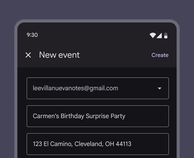
A Create button is clear that the event will be created
Don't
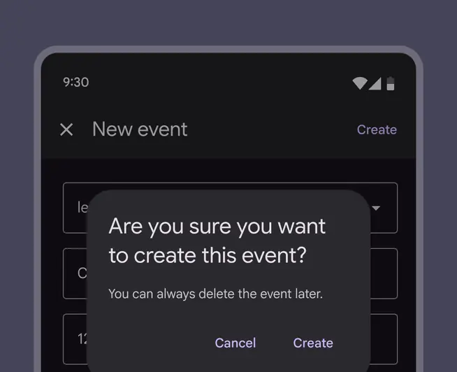
Don’t trigger a basic dialog when the confirming action is selected
Dismissing
When someone dismisses a full-screen dialog, a basic dialog should appear to confirm that they want to discard the unsaved changes.
Do
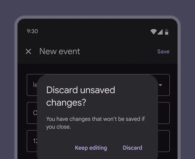
Use a basic dialog to confirm that the user wants to discard unsaved changes
Don't
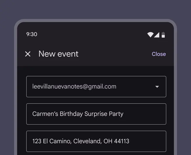
Don’t use the confirming action to dismiss the full-screen dialog
Error messages
Errors about the dialog fields should always appear inline where they occur. Some components like text fields have built-in error messaging, while others like checkboxes and radio buttons need error messages to be added next to the fields.
General errors such as network issues preventing saving or submitting should appear in a basic dialog when the confirming action fails.
Error messages should clearly but briefly explain the source of the error and how to fix it. Show all errors on the page at once so people can fix everything before trying again.
Do
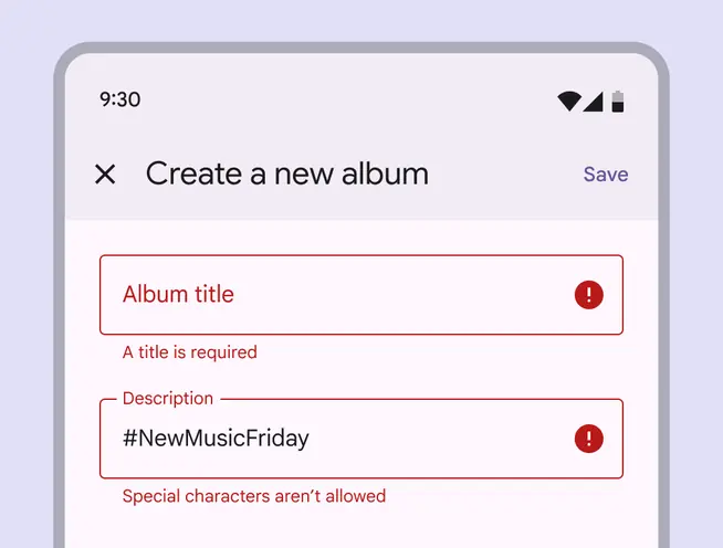
Error messages related to the fields should be displayed inline
Caution
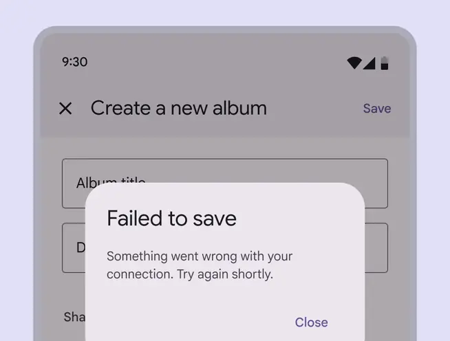
Errors unrelated to the fields can be displayed in a basic dialog
Dialog windows
Launching a full-screen dialog temporarily resets the app’s perceived elevation, allowing simple menus or dialogs to appear above the full-screen dialog. They cover the screen and don’t appear as a floating modal window.
Navigation
Because full-screen dialogs can only be completed, dismissed, or closed, the close “X” icon button should be the only navigation option in the app bar.
Adaptive design
Dialogs can swap variants as the breakpoint changes. For example, a full-screen dialog can change into a basic dialog at larger breakpoints.
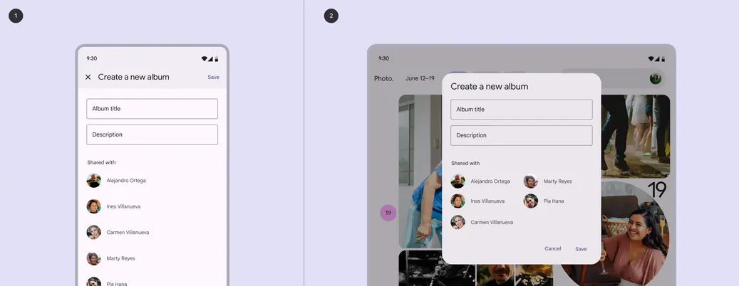
- Full-screen dialog on mobile
- Dialog on a tablet
Medium breakpoint
Basic dialogs appear in a center position by default.
Their position can be overridden to provide a more ergonomic experience.
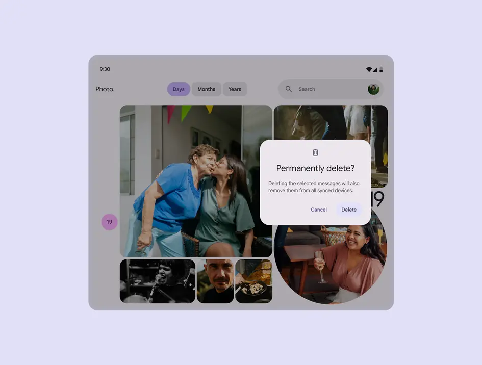
Dialog custom positioned on the right side of the screen
Expanded breakpoint
Dialogs on expanded breakpoints, like desktop, are modal windows above a scrim. This puts the dialog at the forefront of a person's view, calling attention to the action prompted in the dialog.
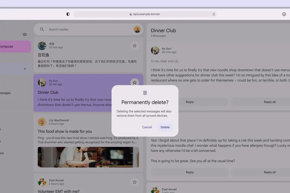
Desktop dialogs call attention to the required action
Basic dialogs can be custom-positioned anywhere on larger screens, respecting margins to prevent edge collision.
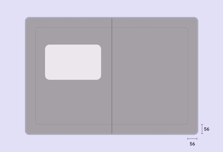
Custom placement area for basic dialogs that respects a 56dp margin from the edges of the screen
Behavior
Appearing
Dialogs appear without warning, requiring users to stop their current task. They should be used sparingly, as not every choice or setting warrants interruption.
Dialogs use an enter and exit transition pattern to appear on screen.
A dialog appears with an enter and exit transition
Position
Dialogs retain focus until dismissed or an action has been taken, such as choosing a setting. They shouldn’t be obscured by other elements or appear partially on screen, with the exception of full-screen dialogs.
Dialogs shouldn’t be obscured by other elements except for full-screen dialogs
Scrolling
Most dialog content should avoid scrolling. Even when scrolling is required, the dialog title is pinned at the top, with buttons pinned at the bottom. This ensures selected content remains visible alongside the title and buttons, even upon scroll.
Dialogs don’t scroll with elements outside of the dialog, such as the background.
When viewing a scrollable list of options, the dialog title and buttons remain fixed