Navigation rail
Navigation rails let people switch between UI views on mid-sized devices. They can contain 3-7 destinations plus an optional FAB.
Overview · Specs · Guidelines · Accessibility

- Use navigation rails in medium, expanded, large, or extra-large window sizes
- Can contain 3-7 destinations plus an optional FAB
- Always put the rail in the same place, even on different screens of an app
Collapsed and expanded navigation rails can transition between each other on any device, including:
1. Large or medium window size classes like tablets
2. Compact window size classes like phones in portrait orientation
Availability & resources
| Type | Resource | Status |
|---|---|---|
| Design | Design Kit (Figma) | Available |
| Implementation | Flutter | Available |
| Implementation | Jetpack Compose | Available |
| Implementation | Jetpack Compose: Expressive | Available |
| Implementation | Android Views (MDC-Android) | Available |
| Implementation | Android Views (MDC-Android): Expressive | Available |
| Implementation | Web | Unavailable |
| Implementation | Web: Expressive | Unavailable |
M3 Expressive update
May 2025
A collapsed and expanded navigation rail have been introduced to replace the baseline nav rail. The expanded nav rail is meant to replace the navigation drawer. More on M3 Expressive
Variants and naming:
The baseline navigation rail is no longer recommended
Added two wider navigation rails:
- Collapsed: replaces baseline nav rail
- Expanded: replaces navigation drawer
Configurations:
Expanded rail modality:
- Non-modal
- Modal
Expanded behavior:
- Transition to collapsed navigation rail
- Hide when collapsed
Color:
- Active label on vertical items changed from on surface variant to secondary
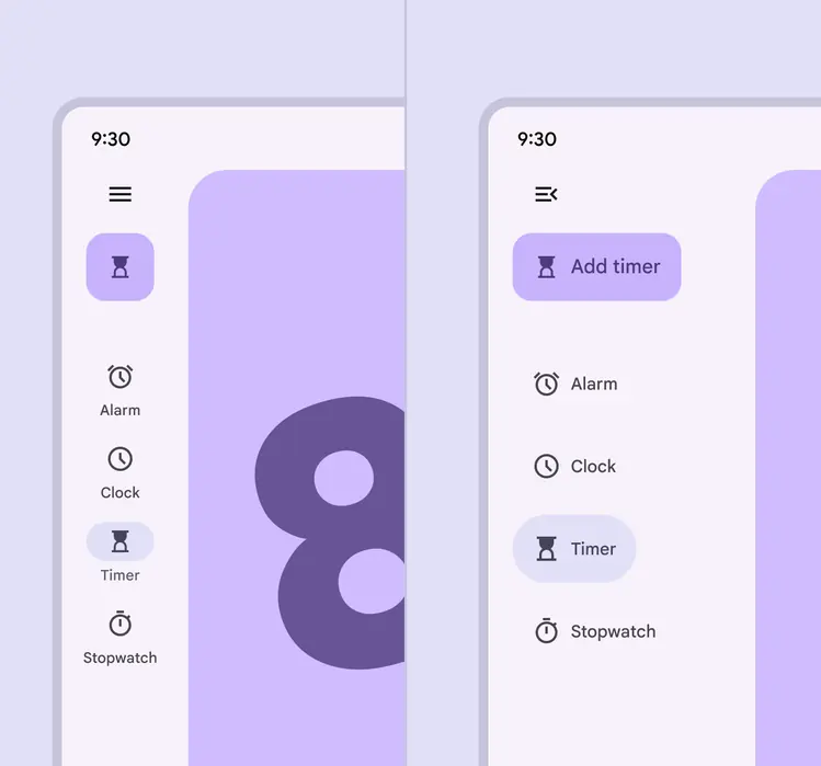
The collapsed and expanded navigation rails match visually and can transition into each other
Differences from M2
- Behavior: Predictive back interaction
- Color: New color mappings and compatibility with dynamic color
- States: The active destination can be indicated with a pill shape in a contrasting color
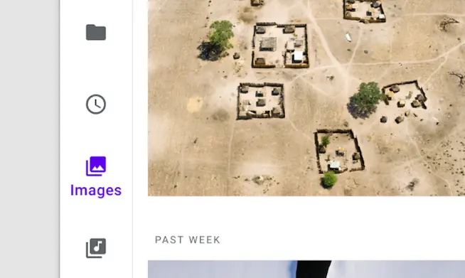
M2: The navigation rail uses icon color, weight, and fill to communicate which destination is active

M3: The navigation rail uses a pill-shaped active indicator to communicate which destination is active