Loading indicator
Loading indicators show the progress of a process for a short wait time
Overview · Specs · Guidelines · Accessibility
Use cases
People should be able to do the following with assistive technology:
- Navigate to the loading indicator
- Understand what progress the indicator is communicating
- Initiate a content refresh without relying on a gesture
Interaction & style
The active indicator, which displays progress, provides visual contrast of at least 3:1 against most container and surface colors.
The indicator itself must have 3:1 contrast with the background, but the container does not.
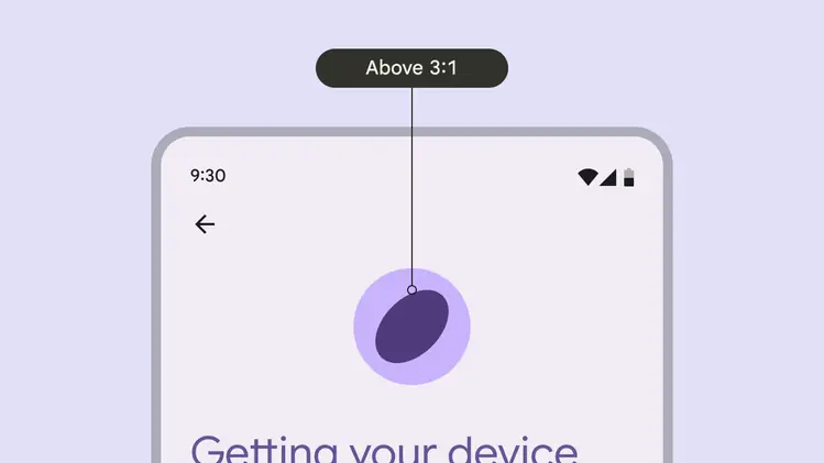
The loading indicator provides visual contrast of at least 3:1 against most background colors
When integrated into another component, such as a button, make sure that the active indicator provides a visual contrast of at least 3:1 against the other component.
Do
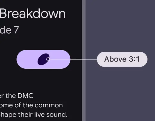
Ensure at least 3:1 contrast between the indicator and the surface it's on
Don't
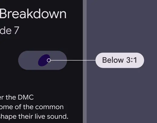
Avoid using when the contrast is under 3:1
Pull-to-refresh interactions can’t be accessible by just swiping. Provide an alternate way to refresh the content with a single pointer, such as placing a refresh button in a menu or directly alongside the content.
The refresh action can be in an app bar
Labeling elements
Since the loading indicator is a visual cue, it needs an accessibility label to assist people who can't rely on visuals.
It should use the progress bar accessibility role. Write a label describing the purpose of the loading indicator, such as loading news article or refreshing page.
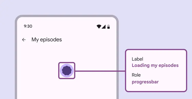
Loading indicator labels should explain which items are loading