Breakpoints
Breakpoints ensure layouts work across a wide range of devices
Overview · Compact · Medium · Expanded · Large & extra-large
Layouts for compact breakpoints are for screen widths smaller than 600dp.

A compact breakpoint focuses on a single view
Navigation
Use a navigation bar or modal expanded navigation rail.
Place navigation components close to the edge of the screen where they’re easier to reach.
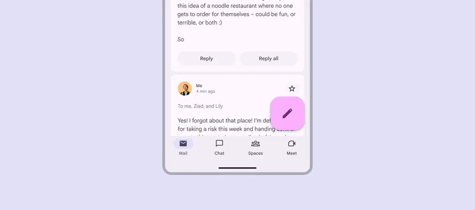
Place navigation elements near the bottom of a compact window so they’re easy to reach
Panes
Use a single pane in compact layouts.
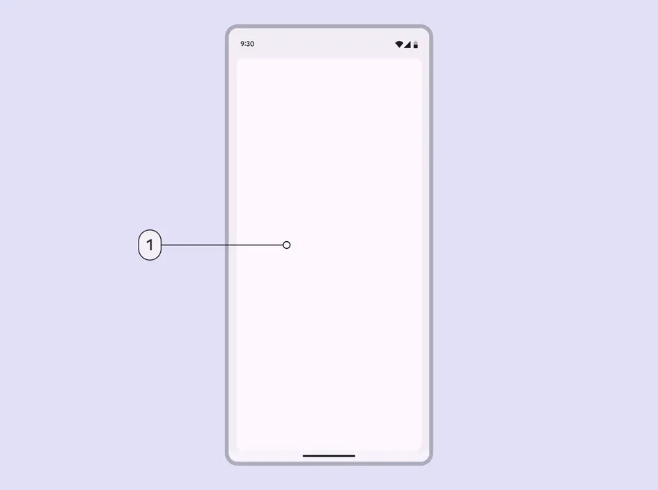
- Single-pane layouts work best for compact breakpoints
Spacing
Margins are 16dp from the leading and trailing edge of the window.
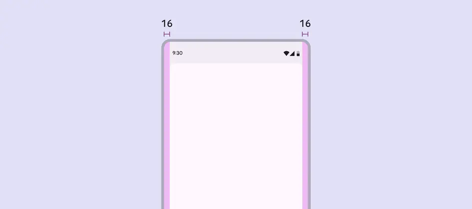
In compact layouts, use 16dp margins
Special considerations
A compact layout will need to transition dynamically to a medium or expanded layout when:
- A foldable device is unfolded
- A mobile device is rotated from portrait to landscape
- A tablet exits split-screen mode
- A product is resized to be larger in multi-window mode
- A free-form window is resized
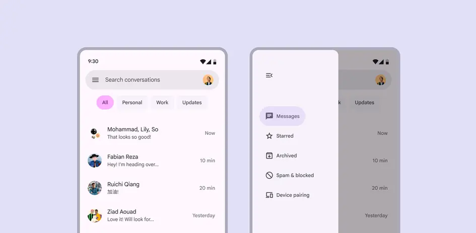
Compact layouts should dynamically transition to larger layouts when a device is unfolded or rotated