Segmented buttons
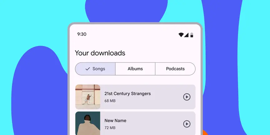
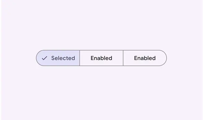
Segmented buttons help people select options, switch views, or sort elements.
Overview · Specs · Guidelines · Accessibility
Note
Segmented buttons are no longer recommended in the Material 3 expressive update. For those who have updated, use the connected button group instead, which has mostly the same functionality but with an updated visual design.
- Segmented buttons can contain icons, label text, or both
- Two variants: single-select and multi-select
- Use for simple choices between two to five items (for more items or complex choices, use chips)
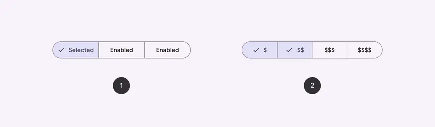
- Single-select segmented button
- Multi-select segmented button
Availability & resources
| Type | Resource | Status |
|---|---|---|
| Design | Design Kit (Figma) | Available |
| Implementation | Flutter | Available |
| Implementation | Jetpack Compose | Available |
| Implementation | Android Views (MDC-Android) | Available |
| Implementation | Web | Unavailable |
M3 Expressive update
May 2025
The segmented button is no longer recommended. Use the connected button group instead. More on M3 Expressive
Differences from M2
- Color: New color mappings and compatibility with dynamic color
- Icons: Optional check icon to indicate selected state
- Layout: Taller container height of 40dp
- Name and variants: Segmented buttons were previously known as toggle buttons. They now have two official variants: single-select and multi-select.
- Shape: Fully rounded corners
- Typography: Labels use sentence case instead of all caps
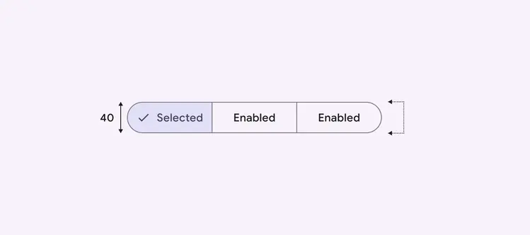
Segmented buttons now have a container height of 40dp
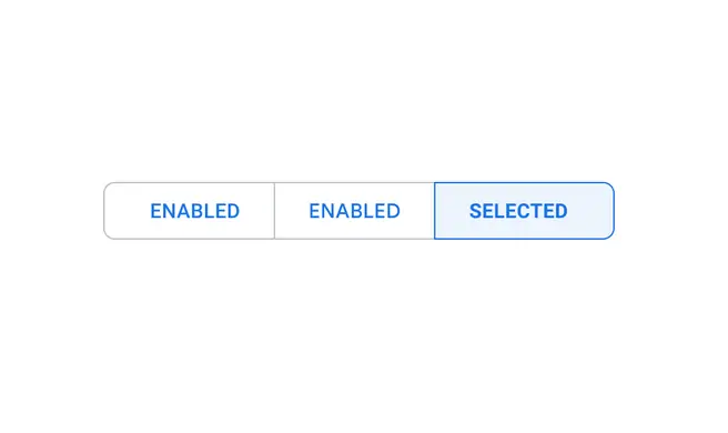
M2: Segmented buttons had a small corner radius and label text in all caps
M3: Segmented buttons have fully rounded corners, sentence-case text, different height, and new color mappings