Side sheets
Side sheets are surfaces containing supplementary content or actions to support tasks as part of a flow.
Overview · Specs · Guidelines · Accessibility
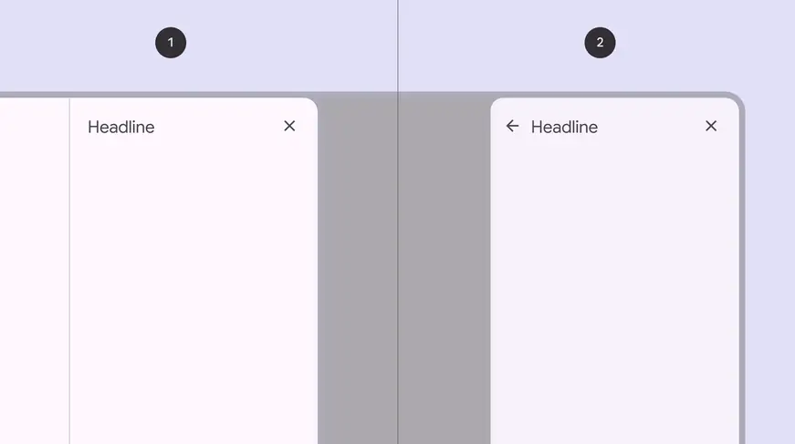
- Standard side sheet
- Modal side sheet
Usage
Standard side sheets are supplementary surfaces used mostly in medium to expanded breakpoints, like tablet and desktop. They provide a consistent and predictable surface for contextual actions and information.
Standard side sheets display content that complements the screen’s primary content. They remain visible while people interact with primary content.
Common uses include:
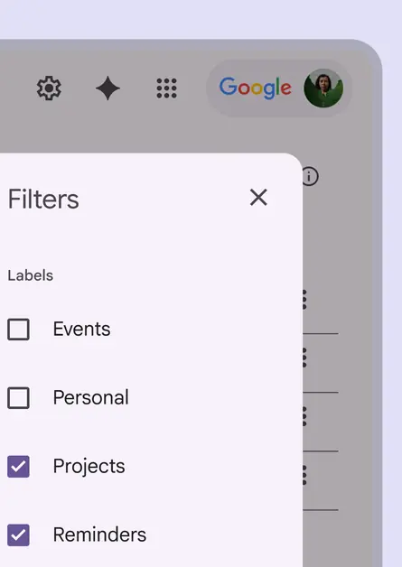
- Displaying a list of actions that affect the screen’s primary content, such as filters
- Displaying supplemental content and features
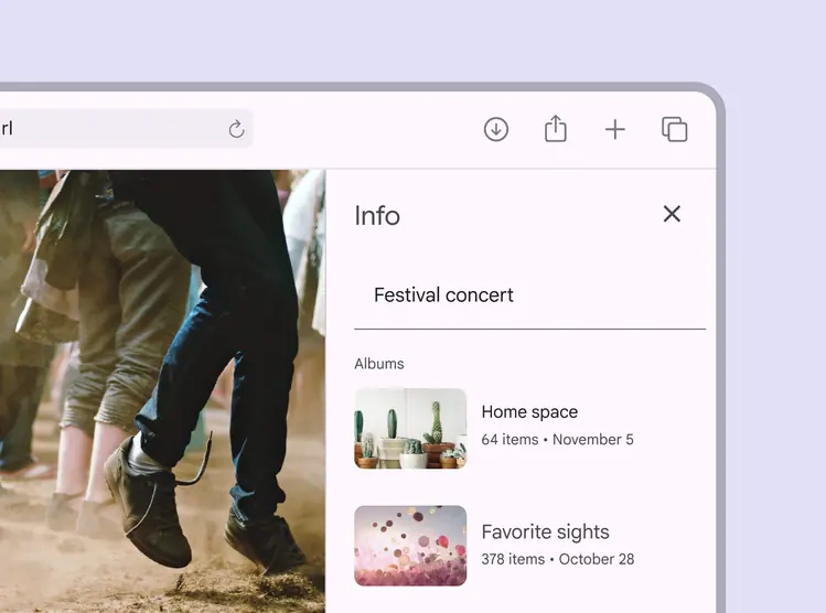
Information about a photo in a standard side sheet
Modal side sheets are preferred in compact breakpoints, like mobile, due to limited screen size.
They can display the same kinds of content as standard side sheets, but must be dismissed in order to interact with the underlying content.
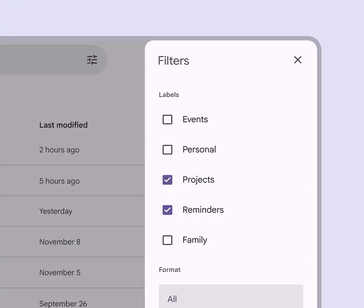
Modal side sheet with filter controls
Side sheets have a fixed width and typically span the height of the screen.
Their dimensions depend on how the app’s layout is subdivided into UI regions.
Do
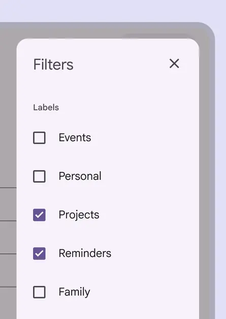
Place side sheets along the edge of the screen, usually on the right side to avoid interference with any navigational components on the left edge. They can be slightly inset by 16dp.
Don't
Don’t inset a side sheet from the screen edges far beyond the recommended margin. This makes the sheet’s position and scroll behavior unclear, while obscuring primary content.
Anatomy
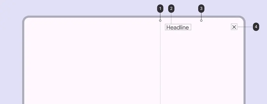
- Divider (optional)
- Headline
- Container
- Close icon button
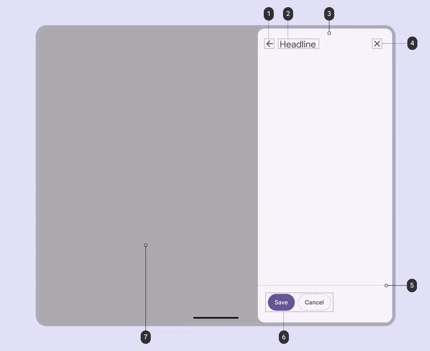
- Back icon button (optional)
- Headline
- Container
- Close icon button
- Divider (optional)
- Action buttons (optional)
- Scrim
Container
Side sheet containers hold all side sheet elements. Their size is determined by the space those elements occupy.
The container is the only required element of a side sheet.
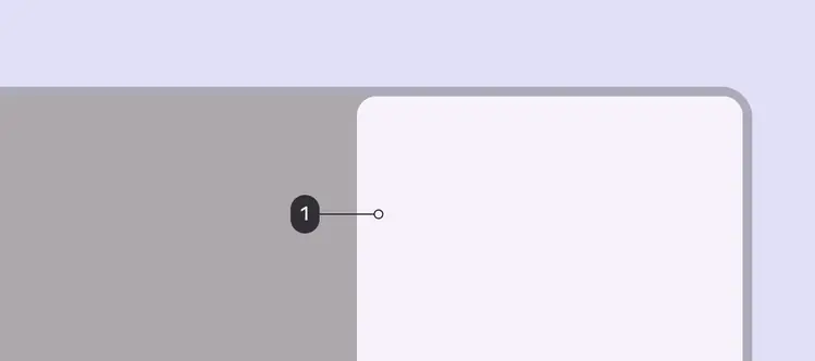
- Container
Back icon button (optional)
Icon buttons can provide ways to exit a side sheet or move to a different experience.
Because the primary content behind or beside a side sheet is always visible, it’s important to provide affordances for leaving a side sheet and returning to the primary content.

- Back icon button
Close icon button (optional)
A close affordance provides a consistent method for dismissing a side sheet.
A close icon button is highly recommended, increases accessibility, and makes focused side sheets easier to close.
- Close icon button
Action buttons (optional)
Buttons represent actions available from a side sheet. Examples: Save, Edit, Download
Use elevation, fill, and tone to call attention to specific actions.
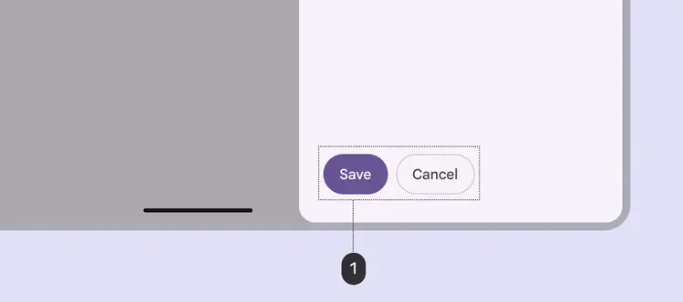
- Action buttons
Divider (optional)
Dividers can separate different kinds of content and create distinct regions in a side sheet.
Use a divider to separate:
- Action buttons from content
- User-generated content from system-generated content
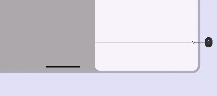
- Divider
Content (optional)
Side sheets can display a wide variety of content and layouts, ranging from a list of actions to supplemental content in a tabular layout.
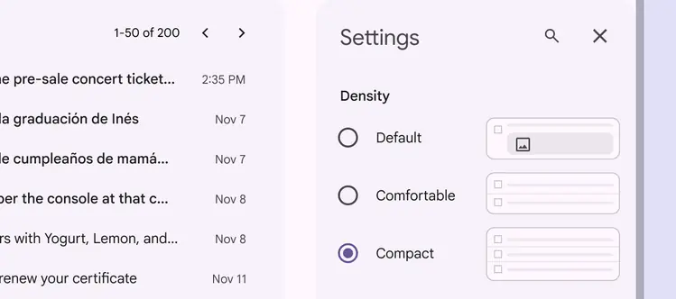
Form controls shown in a side sheet for app settings
Modal side sheets on smaller screens can transition to standard side sheets at larger screen sizes
Adaptive design
Side sheets have a default width, but can be resized depending on the needs of the layout.
When a standard side sheet opens, the body area shrinks to accommodate the sheet’s width while maintaining a margin on the body’s trailing edge.
Entrance of standard side sheets will cause the body area to adjust and accommodate the new content
RTL language support
In right-to-left (RTL) languages, side sheets should appear on the left edge of the window with all elements reversed.
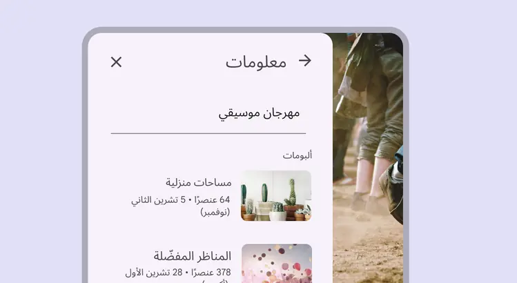
Side sheet elements are reversed in RTL languages
Behavior
Side sheets can vertically scroll independent of the rest of the UI.
This allows their scroll position and content to persist while the page is scrolled, and vice versa.
Side sheets cannot scroll horizontally.
Do
Side sheets can vertically scroll internally when their content exceeds the screen height
Don't
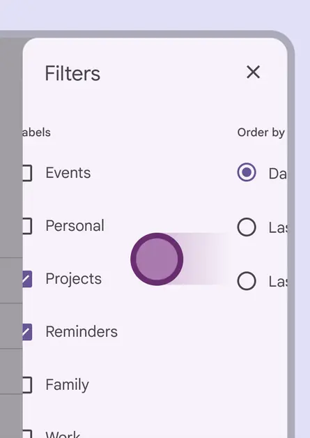
Don’t allow horizontal scrolling or lay out the side sheet in a way that suggests horizontal scrolling. A side sheet’s narrow width leaves limited space to fully view items.
Predictive back
On Android, a gesture called predictive back allows a person to swipe left or right on the side sheet.
When predictive back is used:
- The side sheet detaches from the top and bottom edges of the screen to signal it will close
- The previous screen is revealed in a preview
- The side sheet and its content always scales in the direction of the gesture
Find a list of compatible components
Preview of the result of the gestures: release to commit, fling to commit, and cancel