Toolbars
Toolbars display frequently used actions relevant to the current page.
Overview · Specs · Guidelines · Accessibility
Variants
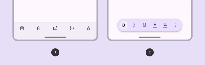
- Docked toolbar
- Floating toolbar
Baseline variant
The baseline bottom app bar is no longer recommended. It should be replaced with the docked toolbar, which is very similar and more flexible.

- Bottom app bar (not recommended)
| Variant | M3 | M3 Expressive |
|---|---|---|
| Docked toolbar | -- | Available |
| Floating toolbar | -- | Available |
| Bottom app bar | Available | Not recommended. Use docked toolbar. |
Note
Implementation differs per platform. On Jetpack Compose, the floating toolbar is a separate component from the docked toolbar and bottom app bar.
Configurations
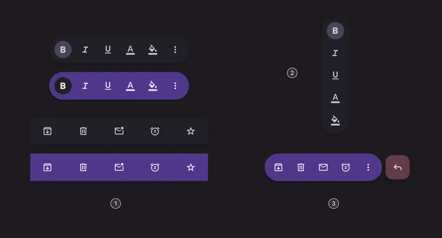
- Standard and vibrant toolbars
- Vertical floating toolbar
- Floating toolbar with FAB
| Category | Configuration | M3 | M3 Expressive |
|---|---|---|---|
| Color | Standard (default) | Available as bottom app bar | Available |
| Color | Vibrant | -- | Available |
| Floating toolbar layout | Horizontal (default) | -- | Available |
| Floating toolbar layout | Vertical | -- | Available |
| Other elements | With FAB | Available as bottom app bar | Available* |
Note
*Implementation differs per platform. On Jetpack Compose, floating toolbar with FAB is fully supported. On other platforms, each component needs to be added separately.
Tokens & specs
Browse the component elements, attributes, tokens, and their values. Jump to baseline bottom app bar specs
Design tokens
Token table
Machine-readable relationship table
Toolbars tokens · 5 token sets · 106 tokens · live token table · DSDB TOKEN_TABLE.2956a7939bf0879c
- Default context: Theme: Light · Platform: Android · Audience: 3P · Contrast: Default · iOS dark theme elevation: None · iOS weight setting: Default
- Not configurable here (group default used): Motion scheme: Standard · Font: Static · Language height: Small
- Other contexts: Theme: Dark · Contrast: Medium contrast, High contrast. "Other contexts" lists values that differ from the default when only that one context changes.
- Reference chain: aliases from the token to its source value (
token → alias → … → value). "—" means the token holds a literal value.
Toolbar - Color - Standard · md.comp.toolbar.standard · 33 tokens
For standard docked and floating toolbars.
| Group | Token | Type | Reference chain | Resolved value | Other contexts |
|---|---|---|---|---|---|
| Enabled | md.comp.toolbar.standard.button.container.color | Color | md.sys.color.surface-container → md.ref.palette.neutral94 | #F3EDF7 | Dark: #211F26 via md.ref.palette.neutral12 |
| Enabled | md.comp.toolbar.standard.selected.button.container.color | Color | md.sys.color.secondary-container → md.ref.palette.secondary90 | #E8DEF8 | Dark: #4A4458 via md.ref.palette.secondary30Medium contrast: #625B71 via md.ref.palette.secondary40High contrast: #4A4458 via md.ref.palette.secondary30 |
| Enabled | md.comp.toolbar.standard.icon.color | Color | md.sys.color.on-surface-variant → md.ref.palette.neutral-variant30 | #49454F | Dark: #CAC4D0 via md.ref.palette.neutral-variant80Medium contrast: #322F37 via md.ref.palette.neutral-variant20High contrast: #000000 via md.ref.palette.neutral-variant0 |
| Enabled | md.comp.toolbar.standard.selected.icon.color | Color | md.sys.color.on-secondary-container → md.ref.palette.secondary30 | #4A4458 | Dark: #E8DEF8 via md.ref.palette.secondary90Medium contrast: #FFFFFF via md.ref.palette.secondary100High contrast: #FFFFFF via md.ref.palette.secondary100 |
| Enabled | md.comp.toolbar.standard.label-text.color | Color | md.sys.color.on-surface-variant → md.ref.palette.neutral-variant30 | #49454F | Dark: #CAC4D0 via md.ref.palette.neutral-variant80Medium contrast: #322F37 via md.ref.palette.neutral-variant20High contrast: #000000 via md.ref.palette.neutral-variant0 |
| Enabled | md.comp.toolbar.standard.selected.label-text.color | Color | md.sys.color.on-secondary-container → md.ref.palette.secondary30 | #4A4458 | Dark: #E8DEF8 via md.ref.palette.secondary90Medium contrast: #FFFFFF via md.ref.palette.secondary100High contrast: #FFFFFF via md.ref.palette.secondary100 |
| Enabled | md.comp.toolbar.standard.container.shape | Shape | md.sys.shape.corner.full | Circular (fully rounded) | — |
| Enabled | md.comp.toolbar.standard.container.color | Color | md.sys.color.surface-container → md.ref.palette.neutral94 | #F3EDF7 | Dark: #211F26 via md.ref.palette.neutral12 |
| Disabled | md.comp.toolbar.standard.disabled.icon.opacity | Opacity | — | 0.38 | — |
| Disabled | md.comp.toolbar.standard.disabled.label-text.color | Color | md.sys.color.on-surface → md.ref.palette.neutral10 | #1D1B20 | Dark: #E6E0E9 via md.ref.palette.neutral90Medium contrast: #000000 via md.ref.palette.neutral0High contrast: #000000 via md.ref.palette.neutral0 |
| Disabled | md.comp.toolbar.standard.disabled.label-text.opacity | Opacity | — | 0.38 | — |
| Disabled | md.comp.toolbar.standard.disabled.icon.color | Color | md.sys.color.on-surface → md.ref.palette.neutral10 | #1D1B20 | Dark: #E6E0E9 via md.ref.palette.neutral90Medium contrast: #000000 via md.ref.palette.neutral0High contrast: #000000 via md.ref.palette.neutral0 |
| Hovered | md.comp.toolbar.standard.selected.hovered.state-layer.color | Color | md.sys.color.on-secondary-container → md.ref.palette.secondary30 | #4A4458 | Dark: #E8DEF8 via md.ref.palette.secondary90Medium contrast: #FFFFFF via md.ref.palette.secondary100High contrast: #FFFFFF via md.ref.palette.secondary100 |
| Hovered | md.comp.toolbar.standard.hovered.state-layer.opacity | Opacity | md.sys.state.hover.state-layer-opacity | 0.08 | — |
| Hovered | md.comp.toolbar.standard.hovered.icon.color | Color | md.sys.color.on-surface-variant → md.ref.palette.neutral-variant30 | #49454F | Dark: #CAC4D0 via md.ref.palette.neutral-variant80Medium contrast: #322F37 via md.ref.palette.neutral-variant20High contrast: #000000 via md.ref.palette.neutral-variant0 |
| Hovered | md.comp.toolbar.standard.selected.hovered.icon.color | Color | md.sys.color.on-secondary-container → md.ref.palette.secondary30 | #4A4458 | Dark: #E8DEF8 via md.ref.palette.secondary90Medium contrast: #FFFFFF via md.ref.palette.secondary100High contrast: #FFFFFF via md.ref.palette.secondary100 |
| Hovered | md.comp.toolbar.standard.hovered.label-text.color | Color | md.sys.color.on-surface-variant → md.ref.palette.neutral-variant30 | #49454F | Dark: #CAC4D0 via md.ref.palette.neutral-variant80Medium contrast: #322F37 via md.ref.palette.neutral-variant20High contrast: #000000 via md.ref.palette.neutral-variant0 |
| Hovered | md.comp.toolbar.standard.selected.hovered.label-text.color | Color | md.sys.color.on-secondary-container → md.ref.palette.secondary30 | #4A4458 | Dark: #E8DEF8 via md.ref.palette.secondary90Medium contrast: #FFFFFF via md.ref.palette.secondary100High contrast: #FFFFFF via md.ref.palette.secondary100 |
| Hovered | md.comp.toolbar.standard.hovered.state-layer.color | Color | md.sys.color.on-surface-variant → md.ref.palette.neutral-variant30 | #49454F | Dark: #CAC4D0 via md.ref.palette.neutral-variant80Medium contrast: #322F37 via md.ref.palette.neutral-variant20High contrast: #000000 via md.ref.palette.neutral-variant0 |
| Focused | md.comp.toolbar.standard.selected.focused.state-layer.color | Color | md.sys.color.on-secondary-container → md.ref.palette.secondary30 | #4A4458 | Dark: #E8DEF8 via md.ref.palette.secondary90Medium contrast: #FFFFFF via md.ref.palette.secondary100High contrast: #FFFFFF via md.ref.palette.secondary100 |
| Focused | md.comp.toolbar.standard.focused.state-layer.opacity | Opacity | md.sys.state.focus.state-layer-opacity | 0.1 | — |
| Focused | md.comp.toolbar.standard.focused.icon.color | Color | md.sys.color.on-surface-variant → md.ref.palette.neutral-variant30 | #49454F | Dark: #CAC4D0 via md.ref.palette.neutral-variant80Medium contrast: #322F37 via md.ref.palette.neutral-variant20High contrast: #000000 via md.ref.palette.neutral-variant0 |
| Focused | md.comp.toolbar.standard.selected.focused.icon.color | Color | md.sys.color.on-secondary-container → md.ref.palette.secondary30 | #4A4458 | Dark: #E8DEF8 via md.ref.palette.secondary90Medium contrast: #FFFFFF via md.ref.palette.secondary100High contrast: #FFFFFF via md.ref.palette.secondary100 |
| Focused | md.comp.toolbar.standard.focused.label-text.color | Color | md.sys.color.on-surface-variant → md.ref.palette.neutral-variant30 | #49454F | Dark: #CAC4D0 via md.ref.palette.neutral-variant80Medium contrast: #322F37 via md.ref.palette.neutral-variant20High contrast: #000000 via md.ref.palette.neutral-variant0 |
| Focused | md.comp.toolbar.standard.selected.focused.label-text.color | Color | md.sys.color.on-secondary-container → md.ref.palette.secondary30 | #4A4458 | Dark: #E8DEF8 via md.ref.palette.secondary90Medium contrast: #FFFFFF via md.ref.palette.secondary100High contrast: #FFFFFF via md.ref.palette.secondary100 |
| Focused | md.comp.toolbar.standard.focused.state-layer.color | Color | md.sys.color.on-surface-variant → md.ref.palette.neutral-variant30 | #49454F | Dark: #CAC4D0 via md.ref.palette.neutral-variant80Medium contrast: #322F37 via md.ref.palette.neutral-variant20High contrast: #000000 via md.ref.palette.neutral-variant0 |
| Pressed | md.comp.toolbar.standard.selected.pressed.state-layer.color | Color | md.sys.color.on-secondary-container → md.ref.palette.secondary30 | #4A4458 | Dark: #E8DEF8 via md.ref.palette.secondary90Medium contrast: #FFFFFF via md.ref.palette.secondary100High contrast: #FFFFFF via md.ref.palette.secondary100 |
| Pressed | md.comp.toolbar.standard.pressed.state-layer.opacity | Opacity | md.sys.state.pressed.state-layer-opacity | 0.1 | — |
| Pressed | md.comp.toolbar.standard.pressed.icon.color | Color | md.sys.color.on-surface-variant → md.ref.palette.neutral-variant30 | #49454F | Dark: #CAC4D0 via md.ref.palette.neutral-variant80Medium contrast: #322F37 via md.ref.palette.neutral-variant20High contrast: #000000 via md.ref.palette.neutral-variant0 |
| Pressed | md.comp.toolbar.standard.selected.pressed.icon.color | Color | md.sys.color.on-secondary-container → md.ref.palette.secondary30 | #4A4458 | Dark: #E8DEF8 via md.ref.palette.secondary90Medium contrast: #FFFFFF via md.ref.palette.secondary100High contrast: #FFFFFF via md.ref.palette.secondary100 |
| Pressed | md.comp.toolbar.standard.pressed.label-text.color | Color | md.sys.color.on-surface-variant → md.ref.palette.neutral-variant30 | #49454F | Dark: #CAC4D0 via md.ref.palette.neutral-variant80Medium contrast: #322F37 via md.ref.palette.neutral-variant20High contrast: #000000 via md.ref.palette.neutral-variant0 |
| Pressed | md.comp.toolbar.standard.selected.pressed.label-text.color | Color | md.sys.color.on-secondary-container → md.ref.palette.secondary30 | #4A4458 | Dark: #E8DEF8 via md.ref.palette.secondary90Medium contrast: #FFFFFF via md.ref.palette.secondary100High contrast: #FFFFFF via md.ref.palette.secondary100 |
| Pressed | md.comp.toolbar.standard.pressed.state-layer.color | Color | md.sys.color.on-surface-variant → md.ref.palette.neutral-variant30 | #49454F | Dark: #CAC4D0 via md.ref.palette.neutral-variant80Medium contrast: #322F37 via md.ref.palette.neutral-variant20High contrast: #000000 via md.ref.palette.neutral-variant0 |
Toolbar - Color - Vibrant · md.comp.toolbar.vibrant · 33 tokens
For vibrant docked and floating toolbars.
| Group | Token | Type | Reference chain | Resolved value | Other contexts |
|---|---|---|---|---|---|
| Enabled | md.comp.toolbar.vibrant.button.container.color | Color | md.sys.color.primary-container → md.ref.palette.primary90 | #EADDFF | Dark: #4F378B via md.ref.palette.primary30Medium contrast: #6750A4 via md.ref.palette.primary40High contrast: #4F378B via md.ref.palette.primary30 |
| Enabled | md.comp.toolbar.vibrant.selected.button.container.color | Color | md.sys.color.surface-container → md.ref.palette.neutral94 | #F3EDF7 | Dark: #211F26 via md.ref.palette.neutral12 |
| Enabled | md.comp.toolbar.vibrant.icon.color | Color | md.sys.color.on-primary-container → md.ref.palette.primary30 | #4F378B | Dark: #EADDFF via md.ref.palette.primary90Medium contrast: #FFFFFF via md.ref.palette.primary100High contrast: #FFFFFF via md.ref.palette.primary100 |
| Enabled | md.comp.toolbar.vibrant.selected.icon.color | Color | md.sys.color.on-surface → md.ref.palette.neutral10 | #1D1B20 | Dark: #E6E0E9 via md.ref.palette.neutral90Medium contrast: #000000 via md.ref.palette.neutral0High contrast: #000000 via md.ref.palette.neutral0 |
| Enabled | md.comp.toolbar.vibrant.label-text.color | Color | md.sys.color.on-primary-container → md.ref.palette.primary30 | #4F378B | Dark: #EADDFF via md.ref.palette.primary90Medium contrast: #FFFFFF via md.ref.palette.primary100High contrast: #FFFFFF via md.ref.palette.primary100 |
| Enabled | md.comp.toolbar.vibrant.selected.label-text.color | Color | md.sys.color.on-surface → md.ref.palette.neutral10 | #1D1B20 | Dark: #E6E0E9 via md.ref.palette.neutral90Medium contrast: #000000 via md.ref.palette.neutral0High contrast: #000000 via md.ref.palette.neutral0 |
| Enabled | md.comp.toolbar.vibrant.container.shape | Shape | md.sys.shape.corner.full | Circular (fully rounded) | — |
| Enabled | md.comp.toolbar.vibrant.container.color | Color | md.sys.color.primary-container → md.ref.palette.primary90 | #EADDFF | Dark: #4F378B via md.ref.palette.primary30Medium contrast: #6750A4 via md.ref.palette.primary40High contrast: #4F378B via md.ref.palette.primary30 |
| Disabled | md.comp.toolbar.vibrant.disabled.icon.opacity | Opacity | — | 0.38 | — |
| Disabled | md.comp.toolbar.vibrant.disabled.label-text.color | Color | md.sys.color.on-surface → md.ref.palette.neutral10 | #1D1B20 | Dark: #E6E0E9 via md.ref.palette.neutral90Medium contrast: #000000 via md.ref.palette.neutral0High contrast: #000000 via md.ref.palette.neutral0 |
| Disabled | md.comp.toolbar.vibrant.disabled.label-text.opacity | Opacity | — | 0.38 | — |
| Disabled | md.comp.toolbar.vibrant.disabled.icon.color | Color | md.sys.color.on-surface → md.ref.palette.neutral10 | #1D1B20 | Dark: #E6E0E9 via md.ref.palette.neutral90Medium contrast: #000000 via md.ref.palette.neutral0High contrast: #000000 via md.ref.palette.neutral0 |
| Hovered | md.comp.toolbar.vibrant.selected.hovered.state-layer.color | Color | md.sys.color.on-surface → md.ref.palette.neutral10 | #1D1B20 | Dark: #E6E0E9 via md.ref.palette.neutral90Medium contrast: #000000 via md.ref.palette.neutral0High contrast: #000000 via md.ref.palette.neutral0 |
| Hovered | md.comp.toolbar.vibrant.hovered.state-layer.opacity | Opacity | md.sys.state.hover.state-layer-opacity | 0.08 | — |
| Hovered | md.comp.toolbar.vibrant.hovered.icon.color | Color | md.sys.color.on-primary-container → md.ref.palette.primary30 | #4F378B | Dark: #EADDFF via md.ref.palette.primary90Medium contrast: #FFFFFF via md.ref.palette.primary100High contrast: #FFFFFF via md.ref.palette.primary100 |
| Hovered | md.comp.toolbar.vibrant.selected.hovered.icon.color | Color | md.sys.color.on-surface → md.ref.palette.neutral10 | #1D1B20 | Dark: #E6E0E9 via md.ref.palette.neutral90Medium contrast: #000000 via md.ref.palette.neutral0High contrast: #000000 via md.ref.palette.neutral0 |
| Hovered | md.comp.toolbar.vibrant.hovered.label-text.color | Color | md.sys.color.on-primary-container → md.ref.palette.primary30 | #4F378B | Dark: #EADDFF via md.ref.palette.primary90Medium contrast: #FFFFFF via md.ref.palette.primary100High contrast: #FFFFFF via md.ref.palette.primary100 |
| Hovered | md.comp.toolbar.vibrant.selected.hovered.label-text.color | Color | md.sys.color.on-surface → md.ref.palette.neutral10 | #1D1B20 | Dark: #E6E0E9 via md.ref.palette.neutral90Medium contrast: #000000 via md.ref.palette.neutral0High contrast: #000000 via md.ref.palette.neutral0 |
| Hovered | md.comp.toolbar.vibrant.hovered.state-layer.color | Color | md.sys.color.on-primary-container → md.ref.palette.primary30 | #4F378B | Dark: #EADDFF via md.ref.palette.primary90Medium contrast: #FFFFFF via md.ref.palette.primary100High contrast: #FFFFFF via md.ref.palette.primary100 |
| Focused | md.comp.toolbar.vibrant.selected.focused.state-layer.color | Color | md.sys.color.on-surface → md.ref.palette.neutral10 | #1D1B20 | Dark: #E6E0E9 via md.ref.palette.neutral90Medium contrast: #000000 via md.ref.palette.neutral0High contrast: #000000 via md.ref.palette.neutral0 |
| Focused | md.comp.toolbar.vibrant.focused.state-layer.opacity | Opacity | md.sys.state.focus.state-layer-opacity | 0.1 | — |
| Focused | md.comp.toolbar.vibrant.focused.icon.color | Color | md.sys.color.on-primary-container → md.ref.palette.primary30 | #4F378B | Dark: #EADDFF via md.ref.palette.primary90Medium contrast: #FFFFFF via md.ref.palette.primary100High contrast: #FFFFFF via md.ref.palette.primary100 |
| Focused | md.comp.toolbar.vibrant.selected.focused.icon.color | Color | md.sys.color.on-surface → md.ref.palette.neutral10 | #1D1B20 | Dark: #E6E0E9 via md.ref.palette.neutral90Medium contrast: #000000 via md.ref.palette.neutral0High contrast: #000000 via md.ref.palette.neutral0 |
| Focused | md.comp.toolbar.vibrant.focused.label-text.color | Color | md.sys.color.on-primary-container → md.ref.palette.primary30 | #4F378B | Dark: #EADDFF via md.ref.palette.primary90Medium contrast: #FFFFFF via md.ref.palette.primary100High contrast: #FFFFFF via md.ref.palette.primary100 |
| Focused | md.comp.toolbar.vibrant.selected.focused.label-text.color | Color | md.sys.color.on-surface → md.ref.palette.neutral10 | #1D1B20 | Dark: #E6E0E9 via md.ref.palette.neutral90Medium contrast: #000000 via md.ref.palette.neutral0High contrast: #000000 via md.ref.palette.neutral0 |
| Focused | md.comp.toolbar.vibrant.focused.state-layer.color | Color | md.sys.color.on-primary-container → md.ref.palette.primary30 | #4F378B | Dark: #EADDFF via md.ref.palette.primary90Medium contrast: #FFFFFF via md.ref.palette.primary100High contrast: #FFFFFF via md.ref.palette.primary100 |
| Pressed | md.comp.toolbar.vibrant.selected.pressed.state-layer.color | Color | md.sys.color.on-surface → md.ref.palette.neutral10 | #1D1B20 | Dark: #E6E0E9 via md.ref.palette.neutral90Medium contrast: #000000 via md.ref.palette.neutral0High contrast: #000000 via md.ref.palette.neutral0 |
| Pressed | md.comp.toolbar.vibrant.pressed.state-layer.opacity | Opacity | md.sys.state.pressed.state-layer-opacity | 0.1 | — |
| Pressed | md.comp.toolbar.vibrant.pressed.icon.color | Color | md.sys.color.on-primary-container → md.ref.palette.primary30 | #4F378B | Dark: #EADDFF via md.ref.palette.primary90Medium contrast: #FFFFFF via md.ref.palette.primary100High contrast: #FFFFFF via md.ref.palette.primary100 |
| Pressed | md.comp.toolbar.vibrant.selected.pressed.icon.color | Color | md.sys.color.on-surface → md.ref.palette.neutral10 | #1D1B20 | Dark: #E6E0E9 via md.ref.palette.neutral90Medium contrast: #000000 via md.ref.palette.neutral0High contrast: #000000 via md.ref.palette.neutral0 |
| Pressed | md.comp.toolbar.vibrant.pressed.label-text.color | Color | md.sys.color.on-primary-container → md.ref.palette.primary30 | #4F378B | Dark: #EADDFF via md.ref.palette.primary90Medium contrast: #FFFFFF via md.ref.palette.primary100High contrast: #FFFFFF via md.ref.palette.primary100 |
| Pressed | md.comp.toolbar.vibrant.selected.pressed.label-text.color | Color | md.sys.color.on-surface → md.ref.palette.neutral10 | #1D1B20 | Dark: #E6E0E9 via md.ref.palette.neutral90Medium contrast: #000000 via md.ref.palette.neutral0High contrast: #000000 via md.ref.palette.neutral0 |
| Pressed | md.comp.toolbar.vibrant.pressed.state-layer.color | Color | md.sys.color.on-primary-container → md.ref.palette.primary30 | #4F378B | Dark: #EADDFF via md.ref.palette.primary90Medium contrast: #FFFFFF via md.ref.palette.primary100High contrast: #FFFFFF via md.ref.palette.primary100 |
Toolbar - Docked · md.comp.toolbar.docked · 7 tokens
For docked toolbars.
| Group | Token | Type | Reference chain | Resolved value | Other contexts |
|---|---|---|---|---|---|
| Color | md.comp.toolbar.docked.container.color (deprecated) | Color | md.sys.color.surface-container → md.ref.palette.neutral94 | #F3EDF7 | Dark: #211F26 via md.ref.palette.neutral12 |
| Size | md.comp.toolbar.docked.container.leading-space | Length | md.sys.measurement.space200 | 16dp | — |
| Size | md.comp.toolbar.docked.container.trailing-space | Length | md.sys.measurement.space200 | 16dp | — |
| Size | md.comp.toolbar.docked.container.max-spacing | Length | — | 32dp | — |
| Size | md.comp.toolbar.docked.container.min-spacing | Length | — | 4dp | — |
| Size | md.comp.toolbar.docked.container.height | Length | — | 64dp | — |
| Shape | md.comp.toolbar.docked.container.shape | Shape | md.sys.shape.corner.none | Rounded corners 0dp | — |
Toolbar - Floating · md.comp.toolbar.floating · 18 tokens
For floating toolbars.
| Group | Token | Type | Reference chain | Resolved value | Other contexts |
|---|---|---|---|---|---|
| Color | md.comp.toolbar.floating.vibrant.container.color (deprecated) | Color | md.sys.color.primary-container → md.ref.palette.primary90 | #EADDFF | Dark: #4F378B via md.ref.palette.primary30Medium contrast: #6750A4 via md.ref.palette.primary40High contrast: #4F378B via md.ref.palette.primary30 |
| Color | md.comp.toolbar.floating.vibrant.button.unselected.icon.color (deprecated) | Color | md.sys.color.on-primary-container → md.ref.palette.primary30 | #4F378B | Dark: #EADDFF via md.ref.palette.primary90Medium contrast: #FFFFFF via md.ref.palette.primary100High contrast: #FFFFFF via md.ref.palette.primary100 |
| Color | md.comp.toolbar.floating.vibrant.button.unselected.text.color (deprecated) | Color | md.sys.color.on-primary-container → md.ref.palette.primary30 | #4F378B | Dark: #EADDFF via md.ref.palette.primary90Medium contrast: #FFFFFF via md.ref.palette.primary100High contrast: #FFFFFF via md.ref.palette.primary100 |
| Color | md.comp.toolbar.floating.vibrant.button.selected.icon.color (deprecated) | Color | md.sys.color.on-surface → md.ref.palette.neutral10 | #1D1B20 | Dark: #E6E0E9 via md.ref.palette.neutral90Medium contrast: #000000 via md.ref.palette.neutral0High contrast: #000000 via md.ref.palette.neutral0 |
| Color | md.comp.toolbar.floating.vibrant.button.selected.text.color (deprecated) | Color | md.sys.color.on-surface → md.ref.palette.neutral10 | #1D1B20 | Dark: #E6E0E9 via md.ref.palette.neutral90Medium contrast: #000000 via md.ref.palette.neutral0High contrast: #000000 via md.ref.palette.neutral0 |
| Color | md.comp.toolbar.floating.vibrant.button.selected.container.color (deprecated) | Color | md.sys.color.surface-container → md.ref.palette.neutral94 | #F3EDF7 | Dark: #211F26 via md.ref.palette.neutral12 |
| Color | md.comp.toolbar.floating.standard.container.color (deprecated) | Color | md.sys.color.surface-container → md.ref.palette.neutral94 | #F3EDF7 | Dark: #211F26 via md.ref.palette.neutral12 |
| Size | md.comp.toolbar.floating.horizontal.container.height | Length | — | 64dp | — |
| Size | md.comp.toolbar.floating.vertical.container.width | Length | — | 64dp | — |
| Size | md.comp.toolbar.floating.container.leading-space | Length | md.sys.measurement.space100 | 8dp | — |
| Size | md.comp.toolbar.floating.container.trailing-space | Length | md.sys.measurement.space100 | 8dp | — |
| Size | md.comp.toolbar.floating.container.external-padding (deprecated) | Length | — | 16dp | — |
| Size | md.comp.toolbar.floating.horizontal.container.external-space | Length | md.sys.measurement.space200 | 16dp | — |
| Size | md.comp.toolbar.floating.vertical.container.external-space | Length | md.sys.measurement.space300 | 24dp | — |
| Size | md.comp.toolbar.floating.container.between-space | Length | md.sys.measurement.space50 | 4dp | — |
| Size | md.comp.toolbar.floating.container.height (deprecated) | Length | — | 64dp | — |
| Shape | md.comp.toolbar.floating.container.shape | Shape | md.sys.shape.corner.full | Circular (fully rounded) | — |
| Elevation | md.comp.toolbar.floating.container.elevation | Elevation | md.sys.elevation.level3 | 6dp | — |
Toolbar - Floating - FAB · md.comp.toolbar.floating.fab · 15 tokens
For floating toolbars with a FAB in them.
| Group | Token | Type | Reference chain | Resolved value | Other contexts |
|---|---|---|---|---|---|
| Expanded | md.comp.toolbar.floating.fab.container.width | Length | — | 56dp | — |
| Expanded | md.comp.toolbar.floating.fab.icon.size | Length | — | 24dp | — |
| Expanded | md.comp.toolbar.floating.fab.container.shape | Shape | md.sys.shape.corner.large | Rounded corners 16dp | — |
| Expanded | md.comp.toolbar.floating.fab.container.elevation | Elevation | md.sys.elevation.level1 | 1dp | — |
| Expanded | md.comp.toolbar.floating.fab.container.height | Length | — | 56dp | — |
| Collapsed | md.comp.toolbar.floating.fab.medium.container.width | Length | — | 80dp | — |
| Collapsed | md.comp.toolbar.floating.fab.medium.icon.size | Length | — | 28dp | — |
| Collapsed | md.comp.toolbar.floating.fab.medium.container.shape | Shape | md.sys.shape.corner.large-increased | Rounded corners 20dp | — |
| Collapsed | md.comp.toolbar.floating.fab.medium.container.elevation | Elevation | md.sys.elevation.level2 | 3dp | — |
| Collapsed | md.comp.toolbar.floating.fab.medium.container.height | Length | — | 80dp | — |
| Other | md.comp.toolbar.floating.fab.between-space | Length | md.sys.measurement.space100 | 8dp | — |
| Other | md.comp.toolbar.floating.fab.standard.container.color | Color | md.sys.color.secondary-container → md.ref.palette.secondary90 | #E8DEF8 | Dark: #4A4458 via md.ref.palette.secondary30Medium contrast: #625B71 via md.ref.palette.secondary40High contrast: #4A4458 via md.ref.palette.secondary30 |
| Other | md.comp.toolbar.floating.fab.standard.icon.color | Color | md.sys.color.on-secondary-container → md.ref.palette.secondary30 | #4A4458 | Dark: #E8DEF8 via md.ref.palette.secondary90Medium contrast: #FFFFFF via md.ref.palette.secondary100High contrast: #FFFFFF via md.ref.palette.secondary100 |
| Other | md.comp.toolbar.floating.fab.vibrant.container.color | Color | md.sys.color.tertiary-container → md.ref.palette.tertiary90 | #FFD8E4 | Dark: #633B48 via md.ref.palette.tertiary30Medium contrast: #7D5260 via md.ref.palette.tertiary40High contrast: #633B48 via md.ref.palette.tertiary30 |
| Other | md.comp.toolbar.floating.fab.vibrant.icon.color | Color | md.sys.color.on-tertiary-container → md.ref.palette.tertiary30 | #633B48 | Dark: #FFD8E4 via md.ref.palette.tertiary90Medium contrast: #FFFFFF via md.ref.palette.tertiary100High contrast: #FFFFFF via md.ref.palette.tertiary100 |
Anatomy
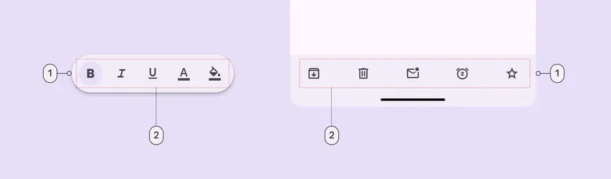
- Container
- Placed components
Flexibility & slots
When configuring a toolbar, think of it as a container with several slots.
Each slot can be a different element. The most common elements are icon buttons, buttons, and text fields.
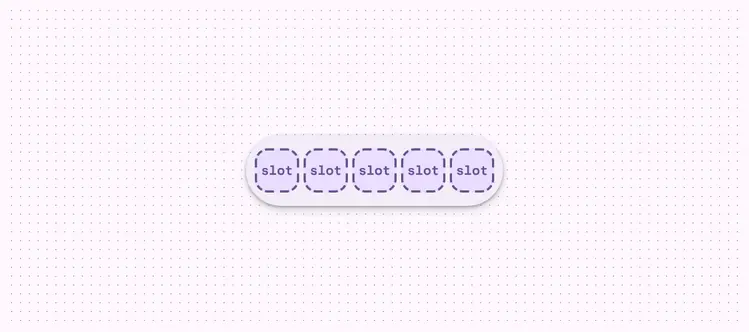
A toolbar is essentially a container with configurable slots
Color
Color values are implemented through design tokens. For design, this means working with color values that correspond with tokens. For implementation, a color value will be a token that references a value. Learn more about design tokens
Standard
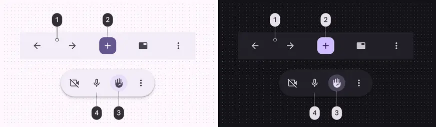
Standard color schemes and icon button types:
- Surface container
- Filled button (Primary, On primary)
- Toggle tonal button (Secondary container, On secondary container)
- Standard button (Primary)
Vibrant
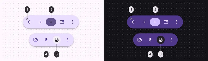
Vibrant color scheme and icon button types:
- Primary container
- Filled button (Primary, On primary)
- Toggle tonal button: (Surface container, On surface)
- Standard button (On primary container)
Measurements
By default all toolbars are 64dp high, center-aligned, have equal padding between items, and have a minimum outside padding of 16dp.
Docked toolbar
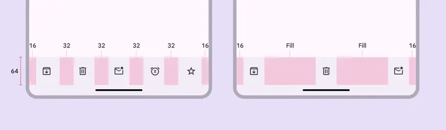
- Default margins and padding
- Margins and padding with leading, middle, and trailing content
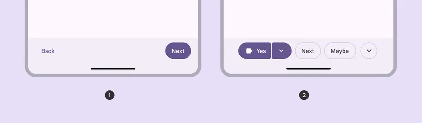
Alignment and padding can be configured to create unique layouts:
- Left and right alignment
- Center-aligned, 8dp padding between items
Floating toolbar

Default padding of floating toolbar
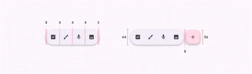
Floating toolbar size and padding measurements
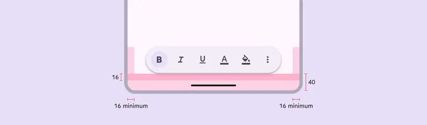
Floating toolbar margins
Bottom app bar (baseline)

- Container
Tokens & specs
Bottom app bar tokens are in one token set.
Design tokens
Token table
Machine-readable relationship table
Toolbars tokens · 6 token sets · 112 tokens · live token table · DSDB TOKEN_TABLE.2956a7939bf0879c
- Default context: none
- Not configurable here (group default used): Theme: Light · Platform: Android · Audience: 1P Baseline · Motion scheme: Standard · Font: Static · Contrast: Default · iOS dark theme elevation: None · iOS weight setting: Default · Language height: Small
- Reference chain: aliases from the token to its source value (
token → alias → … → value). "—" means the token holds a literal value.
Bottom app bar (baseline) · md.comp.bottom-app-bar · 6 tokens
Baseline bottom app bar container tokens. For expressive, use `md.comp.toolbar.docked` and `md.comp.toolbar.standard` instead.
| Group | Token | Type | Reference chain | Resolved value |
|---|---|---|---|---|
| Enabled › Container | md.comp.bottom-app-bar.container.color | Color | md.sys.color.surface-container | #F0F4F9 |
| Enabled › Container | md.comp.bottom-app-bar.container.shape | Shape | md.sys.shape.corner.none | Rounded corners 0dp |
| Enabled › Container | md.comp.bottom-app-bar.container.elevation | Elevation | md.sys.elevation.level2 | 3dp |
| Enabled › Container | md.comp.bottom-app-bar.container.surface-tint-layer.color (deprecated) | Color | md.sys.color.surface-tint | #6991D6 |
| Enabled › Container | md.comp.bottom-app-bar.container.height | Length | — | 80dp |
| Enabled › Container | md.comp.bottom-app-bar.with-fab.container.height (deprecated) | Length | — | 72dp |
Toolbar - Docked · md.comp.toolbar.docked · 7 tokens
For docked toolbars.
| Group | Token | Type | Reference chain | Resolved value |
|---|---|---|---|---|
| Color | md.comp.toolbar.docked.container.color (deprecated) | Color | md.sys.color.surface-container | #F0F4F9 |
| Size | md.comp.toolbar.docked.container.leading-space | Length | md.sys.measurement.space200 | 16dp |
| Size | md.comp.toolbar.docked.container.trailing-space | Length | md.sys.measurement.space200 | 16dp |
| Size | md.comp.toolbar.docked.container.max-spacing | Length | — | 32dp |
| Size | md.comp.toolbar.docked.container.min-spacing | Length | — | 4dp |
| Size | md.comp.toolbar.docked.container.height | Length | — | 64dp |
| Shape | md.comp.toolbar.docked.container.shape | Shape | md.sys.shape.corner.none | Rounded corners 0dp |
Toolbar - Floating · md.comp.toolbar.floating · 18 tokens
For floating toolbars.
| Group | Token | Type | Reference chain | Resolved value |
|---|---|---|---|---|
| Color | md.comp.toolbar.floating.vibrant.container.color (deprecated) | Color | md.sys.color.primary-container → md.ref.palette.primary90 | #D3E3FD |
| Color | md.comp.toolbar.floating.vibrant.button.unselected.icon.color (deprecated) | Color | md.sys.color.on-primary-container → md.ref.palette.primary30 | #0842A0 |
| Color | md.comp.toolbar.floating.vibrant.button.unselected.text.color (deprecated) | Color | md.sys.color.on-primary-container → md.ref.palette.primary30 | #0842A0 |
| Color | md.comp.toolbar.floating.vibrant.button.selected.icon.color (deprecated) | Color | md.sys.color.on-surface → md.ref.palette.neutral10 | #1F1F1F |
| Color | md.comp.toolbar.floating.vibrant.button.selected.text.color (deprecated) | Color | md.sys.color.on-surface → md.ref.palette.neutral10 | #1F1F1F |
| Color | md.comp.toolbar.floating.vibrant.button.selected.container.color (deprecated) | Color | md.sys.color.surface-container | #F0F4F9 |
| Color | md.comp.toolbar.floating.standard.container.color (deprecated) | Color | md.sys.color.surface-container | #F0F4F9 |
| Size | md.comp.toolbar.floating.horizontal.container.height | Length | — | 64dp |
| Size | md.comp.toolbar.floating.vertical.container.width | Length | — | 64dp |
| Size | md.comp.toolbar.floating.container.leading-space | Length | md.sys.measurement.space100 | 8dp |
| Size | md.comp.toolbar.floating.container.trailing-space | Length | md.sys.measurement.space100 | 8dp |
| Size | md.comp.toolbar.floating.container.external-padding (deprecated) | Length | — | 16dp |
| Size | md.comp.toolbar.floating.horizontal.container.external-space | Length | md.sys.measurement.space200 | 16dp |
| Size | md.comp.toolbar.floating.vertical.container.external-space | Length | md.sys.measurement.space300 | 24dp |
| Size | md.comp.toolbar.floating.container.between-space | Length | md.sys.measurement.space50 | 4dp |
| Size | md.comp.toolbar.floating.container.height (deprecated) | Length | — | 64dp |
| Shape | md.comp.toolbar.floating.container.shape | Shape | md.sys.shape.corner.full | Circular (fully rounded) |
| Elevation | md.comp.toolbar.floating.container.elevation | Elevation | md.sys.elevation.level3 | 6dp |
Toolbar - Color - Standard · md.comp.toolbar.standard · 33 tokens
For standard docked and floating toolbars.
| Group | Token | Type | Reference chain | Resolved value |
|---|---|---|---|---|
| Enabled | md.comp.toolbar.standard.button.container.color | Color | md.sys.color.surface-container | #F0F4F9 |
| Enabled | md.comp.toolbar.standard.selected.button.container.color | Color | md.sys.color.secondary-container → md.ref.palette.secondary90 | #C2E7FF |
| Enabled | md.comp.toolbar.standard.icon.color | Color | md.sys.color.on-surface-variant → md.ref.palette.neutral-variant30 | #444746 |
| Enabled | md.comp.toolbar.standard.selected.icon.color | Color | md.sys.color.on-secondary-container → md.ref.palette.secondary30 | #004A77 |
| Enabled | md.comp.toolbar.standard.label-text.color | Color | md.sys.color.on-surface-variant → md.ref.palette.neutral-variant30 | #444746 |
| Enabled | md.comp.toolbar.standard.selected.label-text.color | Color | md.sys.color.on-secondary-container → md.ref.palette.secondary30 | #004A77 |
| Enabled | md.comp.toolbar.standard.container.shape | Shape | md.sys.shape.corner.full | Circular (fully rounded) |
| Enabled | md.comp.toolbar.standard.container.color | Color | md.sys.color.surface-container | #F0F4F9 |
| Disabled | md.comp.toolbar.standard.disabled.icon.opacity | Opacity | — | 0.38 |
| Disabled | md.comp.toolbar.standard.disabled.label-text.color | Color | md.sys.color.on-surface → md.ref.palette.neutral10 | #1F1F1F |
| Disabled | md.comp.toolbar.standard.disabled.label-text.opacity | Opacity | — | 0.38 |
| Disabled | md.comp.toolbar.standard.disabled.icon.color | Color | md.sys.color.on-surface → md.ref.palette.neutral10 | #1F1F1F |
| Hovered | md.comp.toolbar.standard.selected.hovered.state-layer.color | Color | md.sys.color.on-secondary-container → md.ref.palette.secondary30 | #004A77 |
| Hovered | md.comp.toolbar.standard.hovered.state-layer.opacity | Opacity | md.sys.state.hover.state-layer-opacity | 0.08 |
| Hovered | md.comp.toolbar.standard.hovered.icon.color | Color | md.sys.color.on-surface-variant → md.ref.palette.neutral-variant30 | #444746 |
| Hovered | md.comp.toolbar.standard.selected.hovered.icon.color | Color | md.sys.color.on-secondary-container → md.ref.palette.secondary30 | #004A77 |
| Hovered | md.comp.toolbar.standard.hovered.label-text.color | Color | md.sys.color.on-surface-variant → md.ref.palette.neutral-variant30 | #444746 |
| Hovered | md.comp.toolbar.standard.selected.hovered.label-text.color | Color | md.sys.color.on-secondary-container → md.ref.palette.secondary30 | #004A77 |
| Hovered | md.comp.toolbar.standard.hovered.state-layer.color | Color | md.sys.color.on-surface-variant → md.ref.palette.neutral-variant30 | #444746 |
| Focused | md.comp.toolbar.standard.selected.focused.state-layer.color | Color | md.sys.color.on-secondary-container → md.ref.palette.secondary30 | #004A77 |
| Focused | md.comp.toolbar.standard.focused.state-layer.opacity | Opacity | md.sys.state.focus.state-layer-opacity | 0.1 |
| Focused | md.comp.toolbar.standard.focused.icon.color | Color | md.sys.color.on-surface-variant → md.ref.palette.neutral-variant30 | #444746 |
| Focused | md.comp.toolbar.standard.selected.focused.icon.color | Color | md.sys.color.on-secondary-container → md.ref.palette.secondary30 | #004A77 |
| Focused | md.comp.toolbar.standard.focused.label-text.color | Color | md.sys.color.on-surface-variant → md.ref.palette.neutral-variant30 | #444746 |
| Focused | md.comp.toolbar.standard.selected.focused.label-text.color | Color | md.sys.color.on-secondary-container → md.ref.palette.secondary30 | #004A77 |
| Focused | md.comp.toolbar.standard.focused.state-layer.color | Color | md.sys.color.on-surface-variant → md.ref.palette.neutral-variant30 | #444746 |
| Pressed | md.comp.toolbar.standard.selected.pressed.state-layer.color | Color | md.sys.color.on-secondary-container → md.ref.palette.secondary30 | #004A77 |
| Pressed | md.comp.toolbar.standard.pressed.state-layer.opacity | Opacity | md.sys.state.pressed.state-layer-opacity | 0.1 |
| Pressed | md.comp.toolbar.standard.pressed.icon.color | Color | md.sys.color.on-surface-variant → md.ref.palette.neutral-variant30 | #444746 |
| Pressed | md.comp.toolbar.standard.selected.pressed.icon.color | Color | md.sys.color.on-secondary-container → md.ref.palette.secondary30 | #004A77 |
| Pressed | md.comp.toolbar.standard.pressed.label-text.color | Color | md.sys.color.on-surface-variant → md.ref.palette.neutral-variant30 | #444746 |
| Pressed | md.comp.toolbar.standard.selected.pressed.label-text.color | Color | md.sys.color.on-secondary-container → md.ref.palette.secondary30 | #004A77 |
| Pressed | md.comp.toolbar.standard.pressed.state-layer.color | Color | md.sys.color.on-surface-variant → md.ref.palette.neutral-variant30 | #444746 |
Toolbar - Color - Vibrant · md.comp.toolbar.vibrant · 33 tokens
For vibrant docked and floating toolbars.
| Group | Token | Type | Reference chain | Resolved value |
|---|---|---|---|---|
| Enabled | md.comp.toolbar.vibrant.button.container.color | Color | md.sys.color.primary-container → md.ref.palette.primary90 | #D3E3FD |
| Enabled | md.comp.toolbar.vibrant.selected.button.container.color | Color | md.sys.color.surface-container | #F0F4F9 |
| Enabled | md.comp.toolbar.vibrant.icon.color | Color | md.sys.color.on-primary-container → md.ref.palette.primary30 | #0842A0 |
| Enabled | md.comp.toolbar.vibrant.selected.icon.color | Color | md.sys.color.on-surface → md.ref.palette.neutral10 | #1F1F1F |
| Enabled | md.comp.toolbar.vibrant.label-text.color | Color | md.sys.color.on-primary-container → md.ref.palette.primary30 | #0842A0 |
| Enabled | md.comp.toolbar.vibrant.selected.label-text.color | Color | md.sys.color.on-surface → md.ref.palette.neutral10 | #1F1F1F |
| Enabled | md.comp.toolbar.vibrant.container.shape | Shape | md.sys.shape.corner.full | Circular (fully rounded) |
| Enabled | md.comp.toolbar.vibrant.container.color | Color | md.sys.color.primary-container → md.ref.palette.primary90 | #D3E3FD |
| Disabled | md.comp.toolbar.vibrant.disabled.icon.opacity | Opacity | — | 0.38 |
| Disabled | md.comp.toolbar.vibrant.disabled.label-text.color | Color | md.sys.color.on-surface → md.ref.palette.neutral10 | #1F1F1F |
| Disabled | md.comp.toolbar.vibrant.disabled.label-text.opacity | Opacity | — | 0.38 |
| Disabled | md.comp.toolbar.vibrant.disabled.icon.color | Color | md.sys.color.on-surface → md.ref.palette.neutral10 | #1F1F1F |
| Hovered | md.comp.toolbar.vibrant.selected.hovered.state-layer.color | Color | md.sys.color.on-surface → md.ref.palette.neutral10 | #1F1F1F |
| Hovered | md.comp.toolbar.vibrant.hovered.state-layer.opacity | Opacity | md.sys.state.hover.state-layer-opacity | 0.08 |
| Hovered | md.comp.toolbar.vibrant.hovered.icon.color | Color | md.sys.color.on-primary-container → md.ref.palette.primary30 | #0842A0 |
| Hovered | md.comp.toolbar.vibrant.selected.hovered.icon.color | Color | md.sys.color.on-surface → md.ref.palette.neutral10 | #1F1F1F |
| Hovered | md.comp.toolbar.vibrant.hovered.label-text.color | Color | md.sys.color.on-primary-container → md.ref.palette.primary30 | #0842A0 |
| Hovered | md.comp.toolbar.vibrant.selected.hovered.label-text.color | Color | md.sys.color.on-surface → md.ref.palette.neutral10 | #1F1F1F |
| Hovered | md.comp.toolbar.vibrant.hovered.state-layer.color | Color | md.sys.color.on-primary-container → md.ref.palette.primary30 | #0842A0 |
| Focused | md.comp.toolbar.vibrant.selected.focused.state-layer.color | Color | md.sys.color.on-surface → md.ref.palette.neutral10 | #1F1F1F |
| Focused | md.comp.toolbar.vibrant.focused.state-layer.opacity | Opacity | md.sys.state.focus.state-layer-opacity | 0.1 |
| Focused | md.comp.toolbar.vibrant.focused.icon.color | Color | md.sys.color.on-primary-container → md.ref.palette.primary30 | #0842A0 |
| Focused | md.comp.toolbar.vibrant.selected.focused.icon.color | Color | md.sys.color.on-surface → md.ref.palette.neutral10 | #1F1F1F |
| Focused | md.comp.toolbar.vibrant.focused.label-text.color | Color | md.sys.color.on-primary-container → md.ref.palette.primary30 | #0842A0 |
| Focused | md.comp.toolbar.vibrant.selected.focused.label-text.color | Color | md.sys.color.on-surface → md.ref.palette.neutral10 | #1F1F1F |
| Focused | md.comp.toolbar.vibrant.focused.state-layer.color | Color | md.sys.color.on-primary-container → md.ref.palette.primary30 | #0842A0 |
| Pressed | md.comp.toolbar.vibrant.selected.pressed.state-layer.color | Color | md.sys.color.on-surface → md.ref.palette.neutral10 | #1F1F1F |
| Pressed | md.comp.toolbar.vibrant.pressed.state-layer.opacity | Opacity | md.sys.state.pressed.state-layer-opacity | 0.1 |
| Pressed | md.comp.toolbar.vibrant.pressed.icon.color | Color | md.sys.color.on-primary-container → md.ref.palette.primary30 | #0842A0 |
| Pressed | md.comp.toolbar.vibrant.selected.pressed.icon.color | Color | md.sys.color.on-surface → md.ref.palette.neutral10 | #1F1F1F |
| Pressed | md.comp.toolbar.vibrant.pressed.label-text.color | Color | md.sys.color.on-primary-container → md.ref.palette.primary30 | #0842A0 |
| Pressed | md.comp.toolbar.vibrant.selected.pressed.label-text.color | Color | md.sys.color.on-surface → md.ref.palette.neutral10 | #1F1F1F |
| Pressed | md.comp.toolbar.vibrant.pressed.state-layer.color | Color | md.sys.color.on-primary-container → md.ref.palette.primary30 | #0842A0 |
Toolbar - Floating - FAB · md.comp.toolbar.floating.fab · 15 tokens
For floating toolbars with a FAB in them.
| Group | Token | Type | Reference chain | Resolved value |
|---|---|---|---|---|
| Expanded | md.comp.toolbar.floating.fab.container.width | Length | — | 56dp |
| Expanded | md.comp.toolbar.floating.fab.icon.size | Length | — | 24dp |
| Expanded | md.comp.toolbar.floating.fab.container.shape | Shape | md.sys.shape.corner.large | Rounded corners 16dp |
| Expanded | md.comp.toolbar.floating.fab.container.elevation | Elevation | md.sys.elevation.level1 | 1dp |
| Expanded | md.comp.toolbar.floating.fab.container.height | Length | — | 56dp |
| Collapsed | md.comp.toolbar.floating.fab.medium.container.width | Length | — | 80dp |
| Collapsed | md.comp.toolbar.floating.fab.medium.icon.size | Length | — | 28dp |
| Collapsed | md.comp.toolbar.floating.fab.medium.container.shape | Shape | md.sys.shape.corner.large-increased | Rounded corners 20dp |
| Collapsed | md.comp.toolbar.floating.fab.medium.container.elevation | Elevation | md.sys.elevation.level2 | 3dp |
| Collapsed | md.comp.toolbar.floating.fab.medium.container.height | Length | — | 80dp |
| Other | md.comp.toolbar.floating.fab.between-space | Length | md.sys.measurement.space100 | 8dp |
| Other | md.comp.toolbar.floating.fab.standard.container.color | Color | md.sys.color.secondary-container → md.ref.palette.secondary90 | #C2E7FF |
| Other | md.comp.toolbar.floating.fab.standard.icon.color | Color | md.sys.color.on-secondary-container → md.ref.palette.secondary30 | #004A77 |
| Other | md.comp.toolbar.floating.fab.vibrant.container.color | Color | md.sys.color.tertiary-container → md.ref.palette.tertiary90 | #C4EED0 |
| Other | md.comp.toolbar.floating.fab.vibrant.icon.color | Color | md.sys.color.on-tertiary-container → md.ref.palette.tertiary30 | #0F5223 |
Color
Color values are implemented through design tokens. For designers, this means working with color values that correspond with tokens. In implementation, a color value will be a token that references a value. Learn more about design tokens
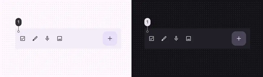
Bottom app bar color role used for light and dark themes:
- Surface container
Measurements
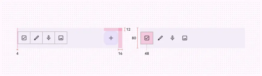
Bottom app bar padding and size measurements
Common layouts
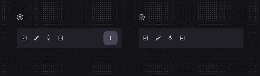
- Icon buttons and FAB
- Icon buttons and no FAB