Radio button
Radio buttons allow users to select one option from a set.
Overview · Specs · Guidelines · Accessibility
Use cases
People should be able to do the following with assistive technology:
- Navigate to a radio button
- Select a radio button
- Get appropriate feedback based on input type
Interaction & style
A radio button can be either selected or unselected. Selecting one radio button deselects any others. A radio group can start with one radio button selected, or none selected.
Once a radio button is selected, the group can’t be deselected. To let people opt out of their selection, either provide a Not applicable or No option radio button, or provide a separate way to deselect all radio buttons, like Clear selection.
People should be able to select either the text label or the radio button to select an option.
Only one radio button is selected at a time
Avoid applying density by default
Don't apply density to radio buttons by default. This lowers their targets below Material's recommendation of 48x48 CSS pixels. Instead, give people a way to choose a higher density, like selecting a denser layout or changing the theme.
To ensure this density setting can be easily reverted when it's active, keep all targets to change it at a minimum of 48x48 CSS pixels each.
Initial focus
When outside the radio group, Tab moves focus directly to the selected radio button, or the first one if none are selected.
Shift+Tab instead focuses on the last radio if none are selected.
Use the arrows to navigate between options.
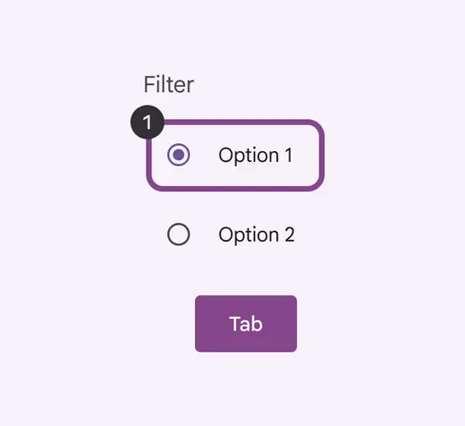
Tab brings the focus to the initially selected item or the initial radio option
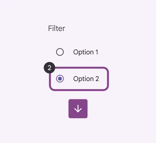
Arrows move to next element in a list
Keyboard navigation
| Keys | Actions |
|---|---|
| Tab | Moves focus into the group to the selected radio button, or the first if none are selected |
| Shift + Tab | Moves focus into the group to the selected radio button, or the last if none are selected |
| Arrows | Moves focus and selects the previous or next radio button. Wraps focus and selection between the first and last radio buttons. |
| Space | Selects a focused radio button. If already selected, does nothing. |
Labeling elements
If the UI text is correctly linked to the radio button, assistive tech such as a screenreader will read the UI text, followed by the component’s role.
The accessibility label for a group of radio buttons is typically the same as its title. The role is Radio group.
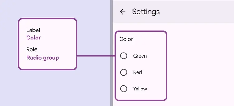
Label the radio group based on the category title
The accessibility label for an individual radio button is typically the same as its adjacent text label.
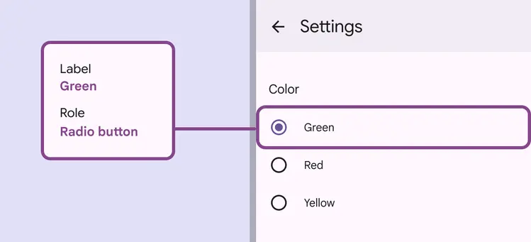
Label the radio button based on its label text