Badges
Badges are used as indicators to convey dynamic information, such as counts or status. A badge can include labels or numbers.
Overview · Specs · Guidelines · Accessibility
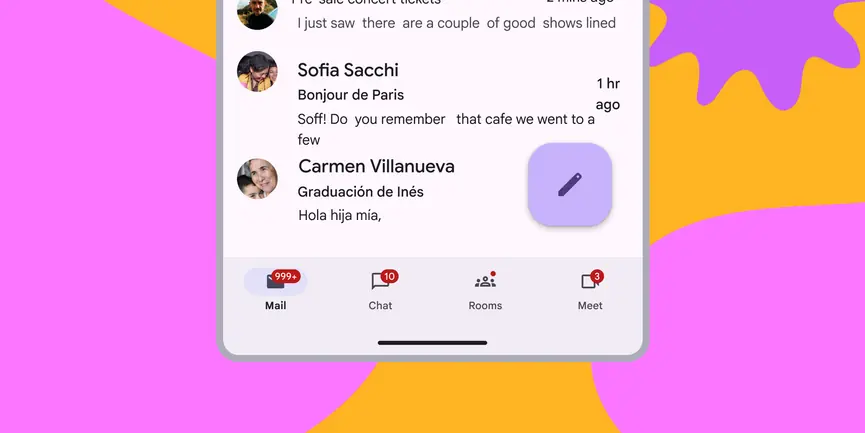
- Can contain labels or numbers
- Two variants: small and large
- Anchor badges inside the icon bounding box, at the upper trailing edge of the icon
- Limit content to four characters, including a +
- Keep the default color mapping

- Small badge on a navigation item
- Large badge on a navigation item
- Large badge with max characters on a navigation item
Availability & resources
| Type | Resource | Status |
|---|---|---|
| Design | Design Kit (Figma) | Available |
| Implementation | Flutter | Available |
| Implementation | Jetpack Compose | Available |
| Implementation | Android Views (MDC-Android) | Available |
| Implementation | Web | Unavailable |
Differences from M2
- Color: New color mappings and compatibility with dynamic color
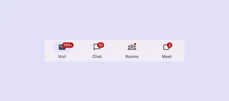
Badges have new color mappings