Spacing
Spacing is the distance around and between component and layout elements
Overview · Applying spacing · Tokens
Material’s spacing system is intentionally designed to be a simple linear scale. Unlike the color system, which adjusts light and dark theme logic across all components at once, tailored spacing logic is built within each component.
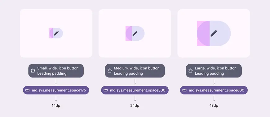
Components have padding tokens that map to system tokens, which resolve to final values
What to use
Pre-tokenized components
Some Material components map to spacing system tokens out of the box. This mapping can be customized by products to adapt to form factor or density.
Note: Work is ongoing to hook up all Material components to spacing tokens.
System tokens
Spacing system tokens define the recommended values. Apply these to your product’s custom components and layouts, replacing any hardcoded values.
If the right system token doesn’t exist, customize the system and add your own.
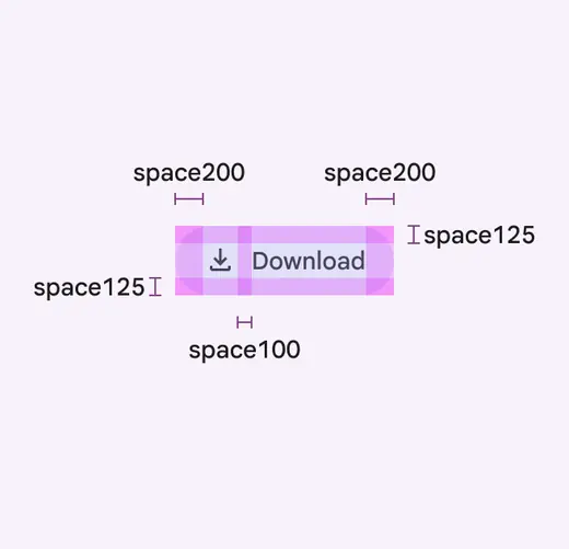
Many Material components map to spacing system tokens
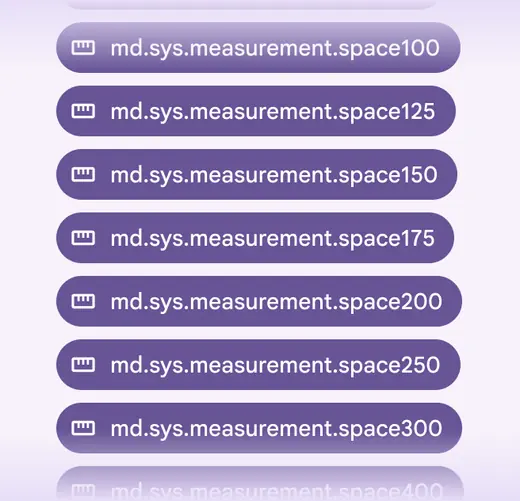
System tokens define all spacing values recommended by Material
Spacing complements text scaling
When text is scaled up to 200%, the same spacing should be preserved by default.
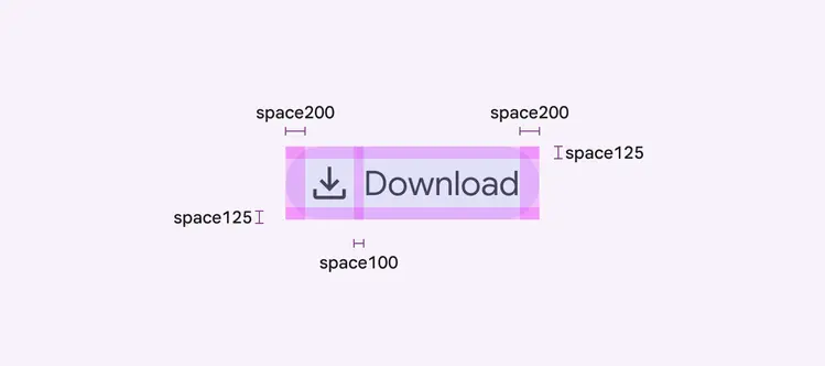
Keep the same spacing when text scales
Customizing the system
The spacing system is meant to capture Material’s design intent, but customization is expected and often necessary. How you customize the system depends on your needs:
Customize Material’s existing component spacing
Use this approach to customize how the base component appears across the entire product.
- For example, change the “button top padding” mapping from space125 to space200 for a taller default button.
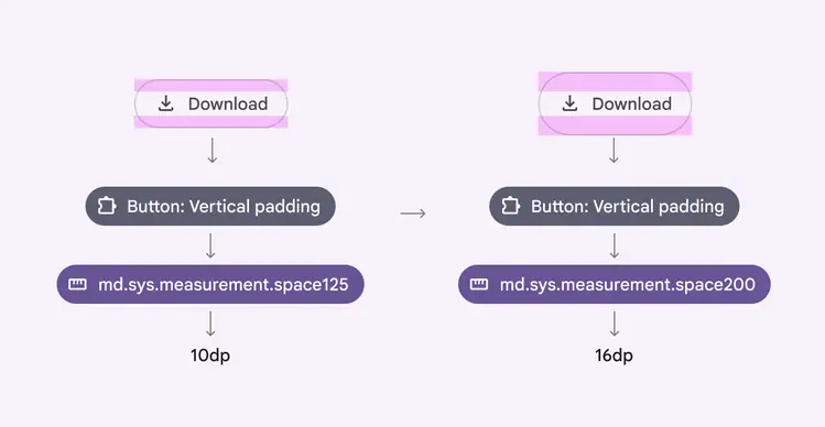
Customize component spacing to change it across the entire product
Add custom system spacing & patterns
Use this approach when you need spacing units beyond what Material provides, or have common adaptive spacing patterns in your product.
- Follow the multiplier pattern for new space tokens, so space225 = 18dp (8dp x 2.25).
- Spacing patterns unique to your product can be tokenized.
- For example, if cards and sheets adapt horizontal content padding the same way, you could create a surface content horizontal padding token for that pattern.
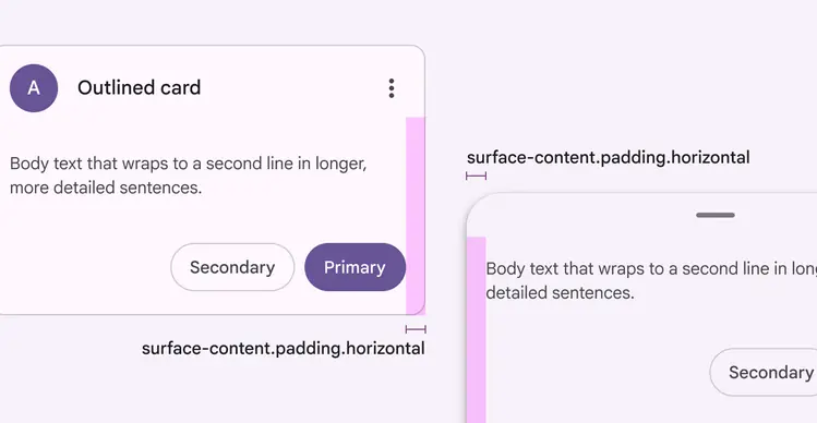
For products that adapt spacing the exact same way, consider creating a token for that pattern
Add adaptive layout & density
Use this approach when you want the same core component, but want it to appear differently in specific situations, like screen sizes and density settings.
- Adaptive layout: Map the spacing to different system tokens for each device type, such as mobile or desktop
- Density: Adapt vertical padding to different spacing values for each setting
Components can be customized to adapt spacing to each form factor
Components can be customized to adapt spacing to density settings