Tabs
Tabs organize content across different screens, data sets, and other interactions.
Overview · Specs · Guidelines · Accessibility
Tokens and specs
Select a component variant below to see its elements, attributes, tokens, and their values.
Design tokens
Token table
Machine-readable relationship table
Tabs tokens · 2 token sets · 83 tokens · live token table · DSDB TOKEN_TABLE.6039f0080a95df1e
- Default context: Theme: Light · Platform: Android · Audience: 3P · Font: Static · Contrast: Default · iOS dark theme elevation: None · iOS weight setting: Default
- Not configurable here (group default used): Motion scheme: Standard · Language height: Small
- Other contexts: Theme: Dark · Contrast: Medium contrast, High contrast. "Other contexts" lists values that differ from the default when only that one context changes.
- Reference chain: aliases from the token to its source value (
token → alias → … → value). "—" means the token holds a literal value.
Tabs - Primary navigation · md.comp.primary-navigation-tab · 48 tokens
For primary tabs.
| Group | Token | Type | Reference chain | Resolved value | Other contexts |
|---|---|---|---|---|---|
| Enabled › Container | md.comp.primary-navigation-tab.container.color | Color | md.sys.color.surface → md.ref.palette.neutral98 | #FEF7FF | Dark: #141218 via md.ref.palette.neutral6 |
| Enabled › Container | md.comp.primary-navigation-tab.container.shape | Shape | md.sys.shape.corner.none | Rounded corners 0dp | — |
| Enabled › Container | md.comp.primary-navigation-tab.container.height | Length | — | 48dp | — |
| Enabled › Container | md.comp.primary-navigation-tab.with-icon-and-label-text.container.height | Length | — | 64dp | — |
| Enabled › Container | md.comp.primary-navigation-tab.container.elevation | Elevation | md.sys.elevation.level0 | 0dp | — |
| Enabled › Label text | md.comp.primary-navigation-tab.with-label-text.label-text.font | Font names | md.sys.typescale.title-small.font → md.ref.typeface.plain | Roboto | — |
| Enabled › Label text | md.comp.primary-navigation-tab.with-label-text.label-text.line-height | Line height | md.sys.typescale.title-small.line-height | 20pt | — |
| Enabled › Label text | md.comp.primary-navigation-tab.with-label-text.label-text.size | Font size | md.sys.typescale.title-small.size | 14pt | — |
| Enabled › Label text | md.comp.primary-navigation-tab.with-label-text.label-text.weight | Font weight | md.sys.typescale.title-small.weight → md.ref.typeface.weight-medium | 500 | — |
| Enabled › Label text | md.comp.primary-navigation-tab.with-label-text.label-text.tracking | Font tracking | md.sys.typescale.title-small.tracking | 0.1pt | — |
| Enabled › Label text | md.comp.primary-navigation-tab.with-label-text.label-text.type | Typography | composite font names: md.comp.primary-navigation-tab.with-label-text.label-text.font → md.sys.typescale.title-small.font → md.ref.typeface.plainfont weight: md.comp.primary-navigation-tab.with-label-text.label-text.weight → md.sys.typescale.title-small.weight → md.ref.typeface.weight-mediumfont size: md.comp.primary-navigation-tab.with-label-text.label-text.size → md.sys.typescale.title-small.sizeline height: md.comp.primary-navigation-tab.with-label-text.label-text.line-height → md.sys.typescale.title-small.line-heightfont tracking: md.comp.primary-navigation-tab.with-label-text.label-text.tracking → md.sys.typescale.title-small.tracking | Roboto · weight 500 · size 14pt · line height 20pt · tracking 0.1pt | — |
| Enabled › Label text | md.comp.primary-navigation-tab.with-label-text.active.label-text.color | Color | md.sys.color.primary → md.ref.palette.primary40 | #6750A4 | Dark: #D0BCFF via md.ref.palette.primary80Medium contrast: #4F378B via md.ref.palette.primary30High contrast: #381E72 via md.ref.palette.primary20 |
| Enabled › Label text | md.comp.primary-navigation-tab.with-label-text.inactive.label-text.color | Color | md.sys.color.on-surface-variant → md.ref.palette.neutral-variant30 | #49454F | Dark: #CAC4D0 via md.ref.palette.neutral-variant80Medium contrast: #322F37 via md.ref.palette.neutral-variant20High contrast: #000000 via md.ref.palette.neutral-variant0 |
| Enabled › Icon | md.comp.primary-navigation-tab.with-icon.icon.size | Length | — | 24dp | — |
| Enabled › Icon | md.comp.primary-navigation-tab.with-icon.active.icon.color | Color | md.sys.color.primary → md.ref.palette.primary40 | #6750A4 | Dark: #D0BCFF via md.ref.palette.primary80Medium contrast: #4F378B via md.ref.palette.primary30High contrast: #381E72 via md.ref.palette.primary20 |
| Enabled › Icon | md.comp.primary-navigation-tab.with-icon.inactive.icon.color | Color | md.sys.color.on-surface-variant → md.ref.palette.neutral-variant30 | #49454F | Dark: #CAC4D0 via md.ref.palette.neutral-variant80Medium contrast: #322F37 via md.ref.palette.neutral-variant20High contrast: #000000 via md.ref.palette.neutral-variant0 |
| Enabled › Divider | md.comp.primary-navigation-tab.divider.color (deprecated) | Color | md.sys.color.surface-variant → md.ref.palette.neutral-variant90 | #E7E0EC | Dark: #49454F via md.ref.palette.neutral-variant30 |
| Enabled › Divider | md.comp.primary-navigation-tab.divider.height (deprecated) | Length | — | 1dp | — |
| Enabled › Active indicator | md.comp.primary-navigation-tab.active-indicator.color | Color | md.sys.color.primary → md.ref.palette.primary40 | #6750A4 | Dark: #D0BCFF via md.ref.palette.primary80Medium contrast: #4F378B via md.ref.palette.primary30High contrast: #381E72 via md.ref.palette.primary20 |
| Enabled › Active indicator | md.comp.primary-navigation-tab.active-indicator.height | Length | — | 3dp | — |
| Enabled › Active indicator | md.comp.primary-navigation-tab.active-indicator.shape | Shape | — | Rounded corners: top-left 3dp, top-right 3dp, bottom-right 0dp, bottom-left 0dp | — |
| Hovered › Label text | md.comp.primary-navigation-tab.with-label-text.active.hover.label-text.color | Color | md.sys.color.primary → md.ref.palette.primary40 | #6750A4 | Dark: #D0BCFF via md.ref.palette.primary80Medium contrast: #4F378B via md.ref.palette.primary30High contrast: #381E72 via md.ref.palette.primary20 |
| Hovered › Label text | md.comp.primary-navigation-tab.with-label-text.inactive.hover.label-text.color | Color | md.sys.color.on-surface → md.ref.palette.neutral10 | #1D1B20 | Dark: #E6E0E9 via md.ref.palette.neutral90Medium contrast: #000000 via md.ref.palette.neutral0High contrast: #000000 via md.ref.palette.neutral0 |
| Hovered › State layer | md.comp.primary-navigation-tab.active.hover.state-layer.color | Color | md.sys.color.primary → md.ref.palette.primary40 | #6750A4 | Dark: #D0BCFF via md.ref.palette.primary80Medium contrast: #4F378B via md.ref.palette.primary30High contrast: #381E72 via md.ref.palette.primary20 |
| Hovered › State layer | md.comp.primary-navigation-tab.active.hover.state-layer.opacity | Opacity | md.sys.state.hover.state-layer-opacity | 0.08 | — |
| Hovered › State layer | md.comp.primary-navigation-tab.inactive.hover.state-layer.color | Color | md.sys.color.on-surface → md.ref.palette.neutral10 | #1D1B20 | Dark: #E6E0E9 via md.ref.palette.neutral90Medium contrast: #000000 via md.ref.palette.neutral0High contrast: #000000 via md.ref.palette.neutral0 |
| Hovered › State layer | md.comp.primary-navigation-tab.inactive.hover.state-layer.opacity | Opacity | md.sys.state.hover.state-layer-opacity | 0.08 | — |
| Hovered › Icon | md.comp.primary-navigation-tab.with-icon.active.hover.icon.color | Color | md.sys.color.primary → md.ref.palette.primary40 | #6750A4 | Dark: #D0BCFF via md.ref.palette.primary80Medium contrast: #4F378B via md.ref.palette.primary30High contrast: #381E72 via md.ref.palette.primary20 |
| Hovered › Icon | md.comp.primary-navigation-tab.with-icon.inactive.hover.icon.color | Color | md.sys.color.on-surface → md.ref.palette.neutral10 | #1D1B20 | Dark: #E6E0E9 via md.ref.palette.neutral90Medium contrast: #000000 via md.ref.palette.neutral0High contrast: #000000 via md.ref.palette.neutral0 |
| Focused › Label text | md.comp.primary-navigation-tab.with-label-text.active.focus.label-text.color | Color | md.sys.color.primary → md.ref.palette.primary40 | #6750A4 | Dark: #D0BCFF via md.ref.palette.primary80Medium contrast: #4F378B via md.ref.palette.primary30High contrast: #381E72 via md.ref.palette.primary20 |
| Focused › Label text | md.comp.primary-navigation-tab.with-label-text.inactive.focus.label-text.color | Color | md.sys.color.on-surface → md.ref.palette.neutral10 | #1D1B20 | Dark: #E6E0E9 via md.ref.palette.neutral90Medium contrast: #000000 via md.ref.palette.neutral0High contrast: #000000 via md.ref.palette.neutral0 |
| Focused › State layer | md.comp.primary-navigation-tab.active.focus.state-layer.color | Color | md.sys.color.primary → md.ref.palette.primary40 | #6750A4 | Dark: #D0BCFF via md.ref.palette.primary80Medium contrast: #4F378B via md.ref.palette.primary30High contrast: #381E72 via md.ref.palette.primary20 |
| Focused › State layer | md.comp.primary-navigation-tab.active.focus.state-layer.opacity | Opacity | md.sys.state.focus.state-layer-opacity | 0.1 | — |
| Focused › State layer | md.comp.primary-navigation-tab.inactive.focus.state-layer.color | Color | md.sys.color.on-surface → md.ref.palette.neutral10 | #1D1B20 | Dark: #E6E0E9 via md.ref.palette.neutral90Medium contrast: #000000 via md.ref.palette.neutral0High contrast: #000000 via md.ref.palette.neutral0 |
| Focused › State layer | md.comp.primary-navigation-tab.inactive.focus.state-layer.opacity | Opacity | md.sys.state.focus.state-layer-opacity | 0.1 | — |
| Focused › Icon | md.comp.primary-navigation-tab.with-icon.active.focus.icon.color | Color | md.sys.color.primary → md.ref.palette.primary40 | #6750A4 | Dark: #D0BCFF via md.ref.palette.primary80Medium contrast: #4F378B via md.ref.palette.primary30High contrast: #381E72 via md.ref.palette.primary20 |
| Focused › Icon | md.comp.primary-navigation-tab.with-icon.inactive.focus.icon.color | Color | md.sys.color.on-surface → md.ref.palette.neutral10 | #1D1B20 | Dark: #E6E0E9 via md.ref.palette.neutral90Medium contrast: #000000 via md.ref.palette.neutral0High contrast: #000000 via md.ref.palette.neutral0 |
| Focused › Focus indicator | md.comp.primary-navigation-tab.focus.indicator.color | Color | md.sys.color.secondary → md.ref.palette.secondary40 | #625B71 | Dark: #CCC2DC via md.ref.palette.secondary80Medium contrast: #4A4458 via md.ref.palette.secondary30High contrast: #332D41 via md.ref.palette.secondary20 |
| Focused › Focus indicator | md.comp.primary-navigation-tab.focus.indicator.thickness | Length | md.sys.state.focus-indicator.thickness | 3dp | — |
| Focused › Focus indicator | md.comp.primary-navigation-tab.focus.indicator.outline.offset | Length | md.sys.state.focus-indicator.inner-offset | -3dp | — |
| Pressed (ripple) › Label text | md.comp.primary-navigation-tab.with-label-text.active.pressed.label-text.color | Color | md.sys.color.primary → md.ref.palette.primary40 | #6750A4 | Dark: #D0BCFF via md.ref.palette.primary80Medium contrast: #4F378B via md.ref.palette.primary30High contrast: #381E72 via md.ref.palette.primary20 |
| Pressed (ripple) › Label text | md.comp.primary-navigation-tab.with-label-text.inactive.pressed.label-text.color | Color | md.sys.color.on-surface → md.ref.palette.neutral10 | #1D1B20 | Dark: #E6E0E9 via md.ref.palette.neutral90Medium contrast: #000000 via md.ref.palette.neutral0High contrast: #000000 via md.ref.palette.neutral0 |
| Pressed (ripple) › State layer | md.comp.primary-navigation-tab.active.pressed.state-layer.color | Color | md.sys.color.primary → md.ref.palette.primary40 | #6750A4 | Dark: #D0BCFF via md.ref.palette.primary80Medium contrast: #4F378B via md.ref.palette.primary30High contrast: #381E72 via md.ref.palette.primary20 |
| Pressed (ripple) › State layer | md.comp.primary-navigation-tab.active.pressed.state-layer.opacity | Opacity | md.sys.state.pressed.state-layer-opacity | 0.1 | — |
| Pressed (ripple) › State layer | md.comp.primary-navigation-tab.inactive.pressed.state-layer.color | Color | md.sys.color.primary → md.ref.palette.primary40 | #6750A4 | Dark: #D0BCFF via md.ref.palette.primary80Medium contrast: #4F378B via md.ref.palette.primary30High contrast: #381E72 via md.ref.palette.primary20 |
| Pressed (ripple) › State layer | md.comp.primary-navigation-tab.inactive.pressed.state-layer.opacity | Opacity | md.sys.state.pressed.state-layer-opacity | 0.1 | — |
| Pressed (ripple) › Icon | md.comp.primary-navigation-tab.with-icon.active.pressed.icon.color | Color | md.sys.color.primary → md.ref.palette.primary40 | #6750A4 | Dark: #D0BCFF via md.ref.palette.primary80Medium contrast: #4F378B via md.ref.palette.primary30High contrast: #381E72 via md.ref.palette.primary20 |
| Pressed (ripple) › Icon | md.comp.primary-navigation-tab.with-icon.inactive.pressed.icon.color | Color | md.sys.color.on-surface → md.ref.palette.neutral10 | #1D1B20 | Dark: #E6E0E9 via md.ref.palette.neutral90Medium contrast: #000000 via md.ref.palette.neutral0High contrast: #000000 via md.ref.palette.neutral0 |
Tabs - Secondary navigation · md.comp.secondary-navigation-tab · 35 tokens
For secondary tabs.
| Group | Token | Type | Reference chain | Resolved value | Other contexts |
|---|---|---|---|---|---|
| Enabled › Container | md.comp.secondary-navigation-tab.container.color | Color | md.sys.color.surface → md.ref.palette.neutral98 | #FEF7FF | Dark: #141218 via md.ref.palette.neutral6 |
| Enabled › Container | md.comp.secondary-navigation-tab.container.shape | Shape | md.sys.shape.corner.none | Rounded corners 0dp | — |
| Enabled › Container | md.comp.secondary-navigation-tab.container.height | Length | — | 48dp | — |
| Enabled › Container | md.comp.secondary-navigation-tab.container.elevation | Elevation | md.sys.elevation.level0 | 0dp | — |
| Enabled › Container | md.comp.secondary-navigation-tab.container.shadow-color | Color | md.sys.color.shadow → md.ref.palette.neutral0 | #000000 | — |
| Enabled › Label text | md.comp.secondary-navigation-tab.label-text.font | Font names | md.sys.typescale.title-small.font → md.ref.typeface.plain | Roboto | — |
| Enabled › Label text | md.comp.secondary-navigation-tab.label-text.line-height | Line height | md.sys.typescale.title-small.line-height | 20pt | — |
| Enabled › Label text | md.comp.secondary-navigation-tab.label-text.size | Font size | md.sys.typescale.title-small.size | 14pt | — |
| Enabled › Label text | md.comp.secondary-navigation-tab.label-text.weight | Font weight | md.sys.typescale.title-small.weight → md.ref.typeface.weight-medium | 500 | — |
| Enabled › Label text | md.comp.secondary-navigation-tab.label-text.tracking | Font tracking | md.sys.typescale.title-small.tracking | 0.1pt | — |
| Enabled › Label text | md.comp.secondary-navigation-tab.label-text.type | Typography | composite font names: md.comp.secondary-navigation-tab.label-text.font → md.sys.typescale.title-small.font → md.ref.typeface.plainfont weight: md.comp.secondary-navigation-tab.label-text.weight → md.sys.typescale.title-small.weight → md.ref.typeface.weight-mediumfont size: md.comp.secondary-navigation-tab.label-text.size → md.sys.typescale.title-small.sizeline height: md.comp.secondary-navigation-tab.label-text.line-height → md.sys.typescale.title-small.line-heightfont tracking: md.comp.secondary-navigation-tab.label-text.tracking → md.sys.typescale.title-small.tracking | Roboto · weight 500 · size 14pt · line height 20pt · tracking 0.1pt | — |
| Enabled › Label text | md.comp.secondary-navigation-tab.active.label-text.color | Color | md.sys.color.on-surface → md.ref.palette.neutral10 | #1D1B20 | Dark: #E6E0E9 via md.ref.palette.neutral90Medium contrast: #000000 via md.ref.palette.neutral0High contrast: #000000 via md.ref.palette.neutral0 |
| Enabled › Label text | md.comp.secondary-navigation-tab.inactive.label-text.color | Color | md.sys.color.on-surface-variant → md.ref.palette.neutral-variant30 | #49454F | Dark: #CAC4D0 via md.ref.palette.neutral-variant80Medium contrast: #322F37 via md.ref.palette.neutral-variant20High contrast: #000000 via md.ref.palette.neutral-variant0 |
| Enabled › Icon | md.comp.secondary-navigation-tab.with-icon.icon.size | Length | — | 24dp | — |
| Enabled › Icon | md.comp.secondary-navigation-tab.with-icon.active.icon.color | Color | md.sys.color.on-surface → md.ref.palette.neutral10 | #1D1B20 | Dark: #E6E0E9 via md.ref.palette.neutral90Medium contrast: #000000 via md.ref.palette.neutral0High contrast: #000000 via md.ref.palette.neutral0 |
| Enabled › Icon | md.comp.secondary-navigation-tab.with-icon.inactive.icon.color | Color | md.sys.color.on-surface-variant → md.ref.palette.neutral-variant30 | #49454F | Dark: #CAC4D0 via md.ref.palette.neutral-variant80Medium contrast: #322F37 via md.ref.palette.neutral-variant20High contrast: #000000 via md.ref.palette.neutral-variant0 |
| Enabled › Divider | md.comp.secondary-navigation-tab.divider.color (deprecated) | Color | md.sys.color.surface-variant → md.ref.palette.neutral-variant90 | #E7E0EC | Dark: #49454F via md.ref.palette.neutral-variant30 |
| Enabled › Divider | md.comp.secondary-navigation-tab.divider.height (deprecated) | Length | — | 1dp | — |
| Enabled › Active indicator | md.comp.secondary-navigation-tab.active-indicator.color | Color | md.sys.color.primary → md.ref.palette.primary40 | #6750A4 | Dark: #D0BCFF via md.ref.palette.primary80Medium contrast: #4F378B via md.ref.palette.primary30High contrast: #381E72 via md.ref.palette.primary20 |
| Enabled › Active indicator | md.comp.secondary-navigation-tab.active-indicator.height | Length | — | 2dp | — |
| Hovered › Label text | md.comp.secondary-navigation-tab.hover.label-text.color | Color | md.sys.color.on-surface → md.ref.palette.neutral10 | #1D1B20 | Dark: #E6E0E9 via md.ref.palette.neutral90Medium contrast: #000000 via md.ref.palette.neutral0High contrast: #000000 via md.ref.palette.neutral0 |
| Hovered › State layer | md.comp.secondary-navigation-tab.hover.state-layer.color | Color | md.sys.color.on-surface → md.ref.palette.neutral10 | #1D1B20 | Dark: #E6E0E9 via md.ref.palette.neutral90Medium contrast: #000000 via md.ref.palette.neutral0High contrast: #000000 via md.ref.palette.neutral0 |
| Hovered › State layer | md.comp.secondary-navigation-tab.hover.state-layer.opacity | Opacity | md.sys.state.hover.state-layer-opacity | 0.08 | — |
| Hovered › Icon | md.comp.secondary-navigation-tab.with-icon.hover.icon.color | Color | md.sys.color.on-surface → md.ref.palette.neutral10 | #1D1B20 | Dark: #E6E0E9 via md.ref.palette.neutral90Medium contrast: #000000 via md.ref.palette.neutral0High contrast: #000000 via md.ref.palette.neutral0 |
| Focused › Label text | md.comp.secondary-navigation-tab.focus.label-text.color | Color | md.sys.color.on-surface → md.ref.palette.neutral10 | #1D1B20 | Dark: #E6E0E9 via md.ref.palette.neutral90Medium contrast: #000000 via md.ref.palette.neutral0High contrast: #000000 via md.ref.palette.neutral0 |
| Focused › State layer | md.comp.secondary-navigation-tab.focus.state-layer.color | Color | md.sys.color.on-surface → md.ref.palette.neutral10 | #1D1B20 | Dark: #E6E0E9 via md.ref.palette.neutral90Medium contrast: #000000 via md.ref.palette.neutral0High contrast: #000000 via md.ref.palette.neutral0 |
| Focused › State layer | md.comp.secondary-navigation-tab.focus.state-layer.opacity | Opacity | md.sys.state.focus.state-layer-opacity | 0.1 | — |
| Focused › Icon | md.comp.secondary-navigation-tab.with-icon.focus.icon.color | Color | md.sys.color.on-surface → md.ref.palette.neutral10 | #1D1B20 | Dark: #E6E0E9 via md.ref.palette.neutral90Medium contrast: #000000 via md.ref.palette.neutral0High contrast: #000000 via md.ref.palette.neutral0 |
| Focused › Focus indicator | md.comp.secondary-navigation-tab.focus.indicator.color | Color | md.sys.color.secondary → md.ref.palette.secondary40 | #625B71 | Dark: #CCC2DC via md.ref.palette.secondary80Medium contrast: #4A4458 via md.ref.palette.secondary30High contrast: #332D41 via md.ref.palette.secondary20 |
| Focused › Focus indicator | md.comp.secondary-navigation-tab.focus.indicator.thickness | Length | md.sys.state.focus-indicator.thickness | 3dp | — |
| Focused › Focus indicator | md.comp.secondary-navigation-tab.focus.indicator.outline.offset | Length | md.sys.state.focus-indicator.inner-offset | -3dp | — |
| Pressed (ripple) › Label text | md.comp.secondary-navigation-tab.pressed.label-text.color | Color | md.sys.color.on-surface → md.ref.palette.neutral10 | #1D1B20 | Dark: #E6E0E9 via md.ref.palette.neutral90Medium contrast: #000000 via md.ref.palette.neutral0High contrast: #000000 via md.ref.palette.neutral0 |
| Pressed (ripple) › State layer | md.comp.secondary-navigation-tab.pressed.state-layer.color | Color | md.sys.color.on-surface → md.ref.palette.neutral10 | #1D1B20 | Dark: #E6E0E9 via md.ref.palette.neutral90Medium contrast: #000000 via md.ref.palette.neutral0High contrast: #000000 via md.ref.palette.neutral0 |
| Pressed (ripple) › State layer | md.comp.secondary-navigation-tab.pressed.state-layer.opacity | Opacity | md.sys.state.pressed.state-layer-opacity | 0.1 | — |
| Pressed (ripple) › Icon | md.comp.secondary-navigation-tab.with-icon.pressed.icon.color | Color | md.sys.color.on-surface → md.ref.palette.neutral10 | #1D1B20 | Dark: #E6E0E9 via md.ref.palette.neutral90Medium contrast: #000000 via md.ref.palette.neutral0High contrast: #000000 via md.ref.palette.neutral0 |
Primary tabs
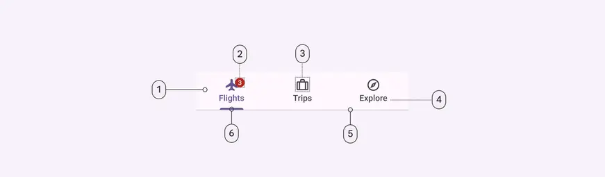
- Container
- Badge (optional)
- Icon (optional)
- Label
- Divider
- Active indicator
Primary tabs color
Color values are implemented through design tokens. For design, this means working with color values that correspond with tokens. For implementation, a color value will be a token that references a value. Learn more about design tokens
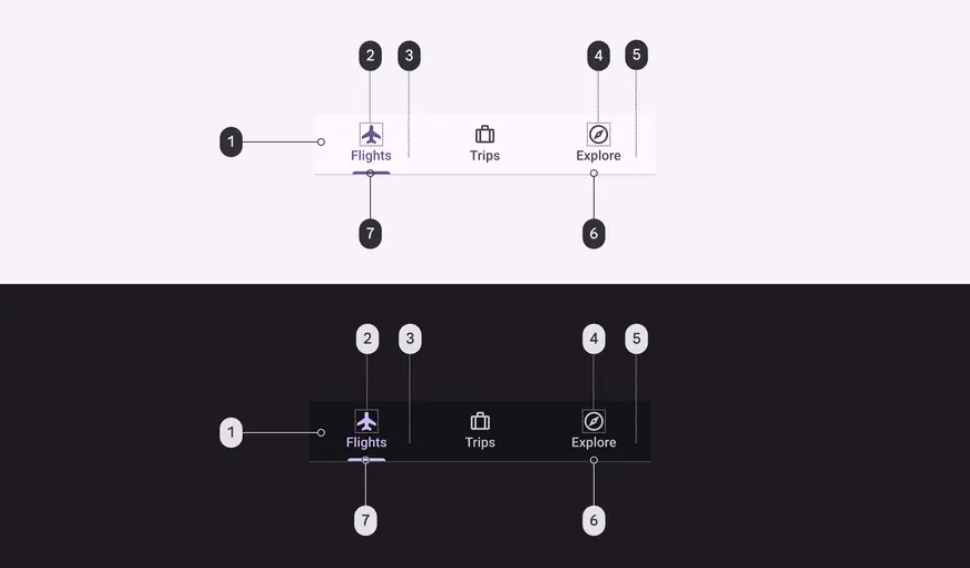
Primary tab color roles used for light and dark schemes:
- Surface
- Primary
- Primary
- On surface variant
- On surface variant
- Outline variant
- Primary
Primary tabs states
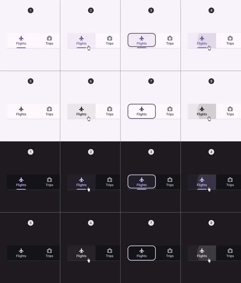
- Enabled (active destination)
- Hover (active destination)
- Focused (active destination)
- Pressed (active destination)
- Enabled (inactive destination)
- Hover (inactive destination)
- Focused (inactive destination)
- Pressed (inactive destination)
Secondary tabs
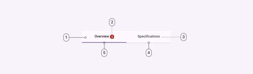
- Container
- Badge (optional)
- Label
- Divider
- Active indicator
Secondary tabs color
Color values are implemented through design tokens. For design, this means working with color values that correspond with tokens. For implementation, a color value will be a token that references a value. Learn more about design tokens
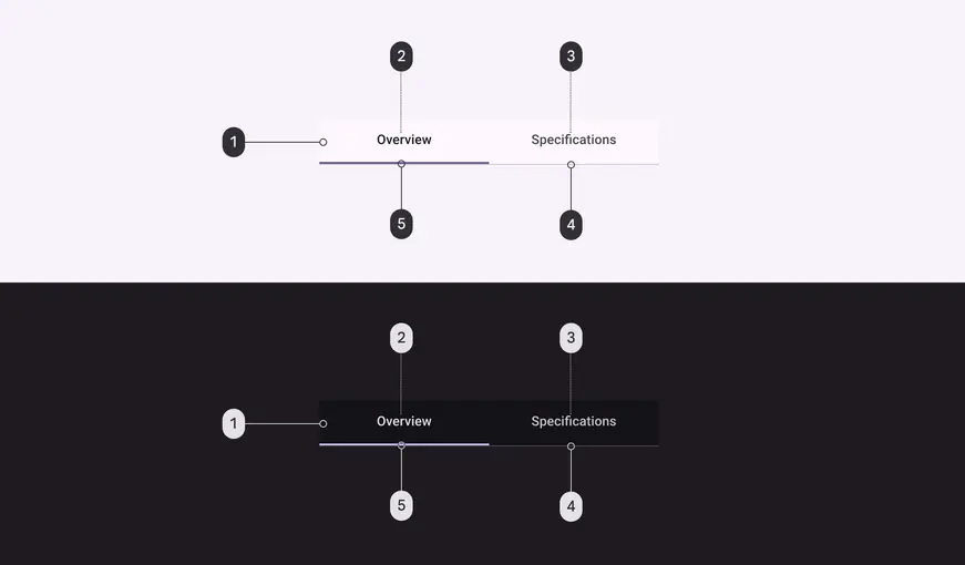
Secondary tab color roles used for light and dark schemes:
- Surface
- On surface
- On surface variant
- Outline variant
- Primary
Secondary tabs states
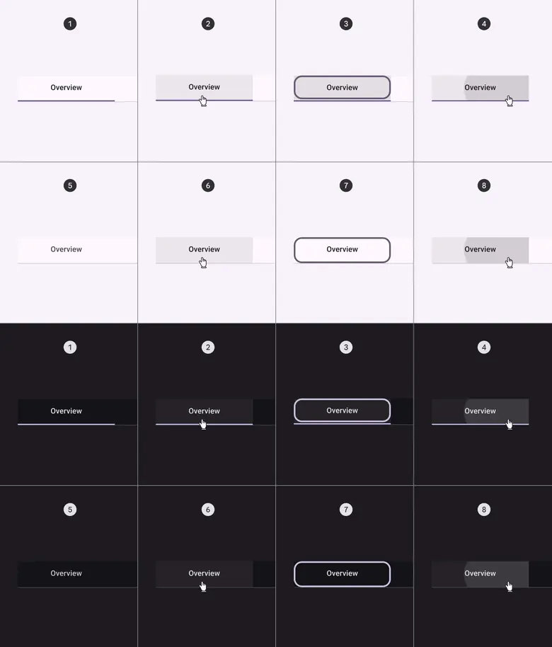
- Enabled (active destination)
- Hover (active destination)
- Focused (active destination)
- Pressed (active destination)
- Enabled (inactive destination)
- Hover (inactive destination)
- Focused (inactive destination)
- Pressed (inactive destination)
Measurements
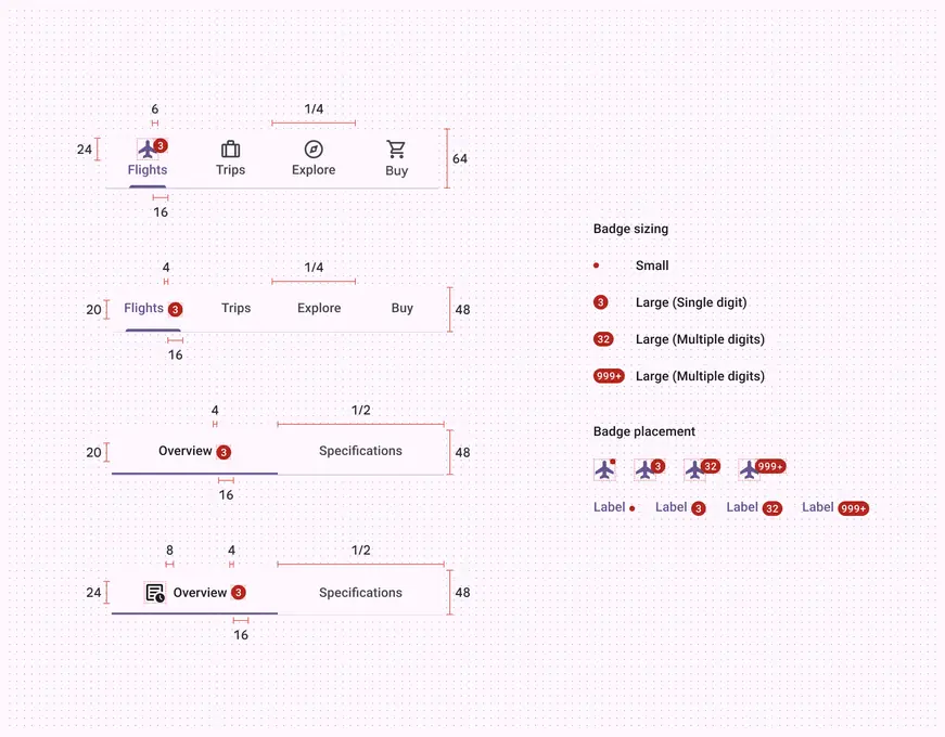
Tabs are divided into equal sections, with labels and icons positioned vertically centered. The divider is included in the height, placed inside the container.
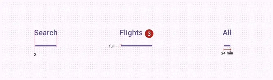
Primary tab active indicators are inset 2dp on each side, have a fully rounded corner radius, and a minimum length of 24dp.
| Attribute | Value |
|---|---|
| Container height (label text only) | 48dp |
| Container height (icon and label text) | 64dp |
| Icon size | 24dp |
| Divider height | 1dp |
| Primary active indicator height | 3dp |
| Secondary active indicator height | 2dp |
| Active indicator shape | 3, 3, 0, 0 |
| Active indicator minimum length | 24dp |
| Padding between inline icon and text | 8dp |
| Padding between inline text and badge | 4dp |
| Overlap of badge on stacked icon | 6dp |