Tooltips
Tooltips display brief labels or messages. Tooltips are informative, specific, and action-oriented text labels that provide contextual support
Overview · Specs · Guidelines · Accessibility
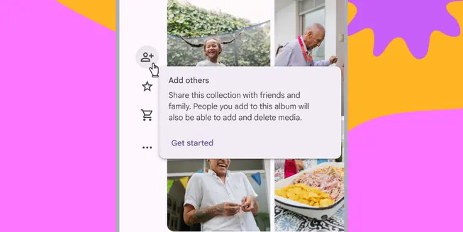
- Use tooltips to add additional context to a button or other UI element
- Two variants: plain and rich
- Use plain tooltips to describe elements or actions of icon buttons
- Use rich tooltips to provide more details, like describing the value of a feature
- Rich tooltips can include an optional title, link, and buttons
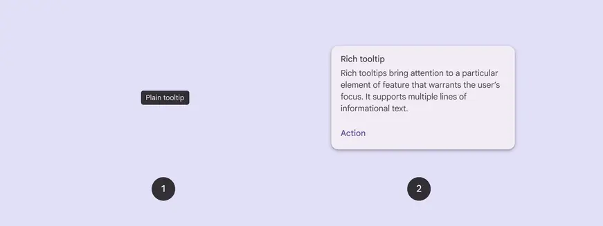
- Plain tooltip
- Rich tooltip
Availability & resources
| Type | Resource | Status |
|---|---|---|
| Design | Design Kit (Figma) | Available |
| Implementation | Flutter | Unavailable |
| Implementation | Jetpack Compose | Available |
| Implementation | Android Views (MDC-Android) | Unavailable |
| Implementation | Web | Unavailable |
Differences from M2
- Color: New color mappings and compatibility with dynamic color
- Shape: Rich tooltips have more rounded corners
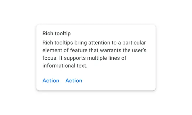
M2: Rich tooltips have slightly rounded corners
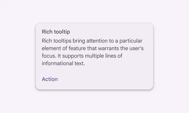
M3: Rich tooltips have more rounded corners and support dynamic color