Usability
Usability focuses on making products intuitive and easy to understand for everyone
Overview · Applying M3 Expressive
Aura: An example app showcasing usability with M3 Expressive
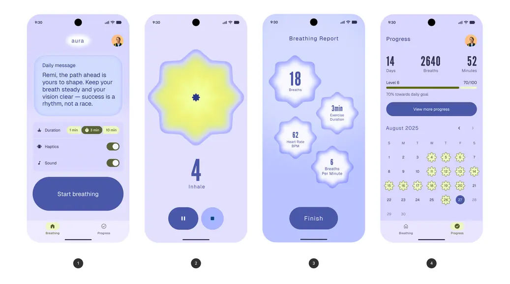
The four goals in the Aura breathing app:
- Start a breathing session
- Experience and complete a breathing session
- View the breathing session results
- Check progress towards personal goals
Aura is a conceptual breathing app that illustrates how Material 3 (M3) Expressive design tactics can make an app more usable and draw the user’s attention to the most important actions. It’s used with a smart watch to measure heart rate. It was created based on the eye tracking and focus group research that played a key role in the creation of M3 Expressive. Research showed that participants were able to spot key UI elements up to four times faster in the M3 Expressive designs compared to other designs.
Examples include:
- Using scale, color, and containment to guide people to start a breathing session
- Using shape, color, and empty space to guide people to breathe slowly and with intention
- Minimizing cognitive load by using empty space and fewer actions, so people can stay focused on their breath
- Balancing primary tasks with supportive data to show progress and impact of a session
Example 1: Start a breathing session
Starting the session is the primary goal when opening the app. Size, placement, color, and contrast guide the user to the Start breathing button. The button’s large size and low placement makes it easy to reach when holding a phone.
The settings use a secondary color to draw attention, but they’re not as emphasized as the button.
The daily message is the least emphasized, but uses large containment and type to draw attention.
Expressive components used:
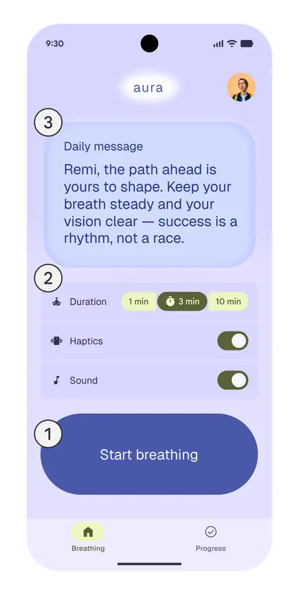
App elements in order of emphasis:
- The Start breathing button is the primary goal of the app
- Breathing session settings
- Daily welcome message
Usability design tactics
| Color & contrast | The prominent dark purple Start breathing button (1) on a soft light purple background uses Material primary color roles to create high contrast, making the button easy to find and remember. |
|---|---|
| Hierarchy | The main goal is to tap the large Start breathing button (1). The daily message (3) and settings (2) are in lighter colors and in subtle containers because they are supportive actions, but not required. |
| Placement | The button (1) is close to the bottom so it’s easy to reach. It’s the final, most prominent element in the vertical flow, naturally guiding the eye down the screen without competing with other content. |
| Shape | The rounded button form reinforces it as a distinct, touchable control. |
| Size | The button (1) is extra large to make it the most emphasized element on the screen. |
| Spacing | Generous spacing separates the button (1) from the message (3) and settings (2). |
| Typography | The button (1) has larger text to emphasize the primary action. |
| Visual harmony & hierarchy | The daily message is placed at the top in a soft blue container with medium sized text, setting a reflective tone without drawing too much focus. The hierarchy guides the user from the daily message (3) to settings (2) and finally to the Start breathing button (1). |
Example 2: Breathing session (inhale & exhale)
The guided breathing exercise is the hero moment. A large central flower expands and contracts, serving as the visual guide for each breath, while a countdown shows remaining seconds for inhaling, exhaling, and holding the breath.
The pause and stop buttons are less prominent than the flower to encourage people to focus on the session. The buttons are placed at the bottom so they’re easy to reach.
Expressive components and styles used:
- Large buttons in a button group
- Material shape library (“flower” and “sunny”)
- Emphasized typography
The flower’s shape, size, and movement guide the user to inhale, exhale, and hold the breath.
Usability design tactics
| Color & contrast | The vibrant yellow appears when inhaling to contrast the soft purple background and be obvious. |
|---|---|
| Motion | The flower expands and contracts to guide the pace of the breath. The motion uses Material Spring Motion Tokens. |
| Placement | The pause and stop buttons are at the bottom, spaced away from the flower, but easy to reach. The navigation bar hides during the breathing journey. |
| Shape | The flower uses the “flower” and “sunny” Material shapes to draw attention and clearly stand apart from the simple pause and stop buttons. |
| Size | The size of the animating, breathing flower dominates the screen to draw attention. |
| Typography | The countdown numbers are very large in comparison to the inhale, hold, and exhale text to focus attention on the exercise. This provides strong visual contrast, while still keeping the instructions associated with the countdown. |
Example 3: Breathing report
The breathing report comes after the breathing exercise. It’s the secondary goal in the app, not the primary hero moment, so it uses fewer design tactics to reduce cognitive load.
It draws attention to each data point on the page using shapes and decreasing size. The button is less emphasized than the Start breathing button on the landing page.
Expressive components and elements used:
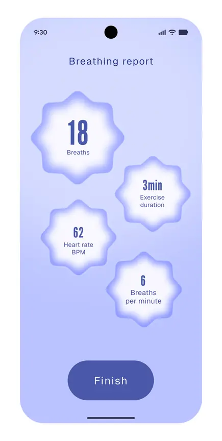
Shapes and smaller sizes emphasize key information and draw attention down the screen to the Finish button
Usability design tactics
| Color & contrast | Dark text on the light flower shapes creates a strong contrast, making each metric easy to read at a glance. The solid, dark purple Finish button stands out clearly against the light purple background, guiding users to the next step. |
|---|---|
| Placement | The metrics are spread out across the screen in a loose cluster, guiding the user from one to the next. The Finish button is centered at the bottom so it’s easy to reach. |
| Shape | The metrics are inside Material flower shapes, making achievements stand out. The use of flower shapes make the design look consistent. |
| Size & typography | Key numbers like 18 and 3min are larger and use emphasized styles, making it easy to scan the most important data. |
| Spacing & grouping | Ample spacing around each metric avoids clutter, while making the layout tide any scannable. Playful Material shapes serve as clear containers, making the grouping feel lively. |
Example 4: Check progress
The progress report is a tertiary goal in the app to track statistics and see progress over a monthly view. Since it’s not a primary goal or hero moment, it uses more subtle design tactics to make the app usable and draw more attention.
The key data is dark on a light background to draw attention, while the yellow shapes on the calendar highlight completed sessions.
Expressive components and elements used:
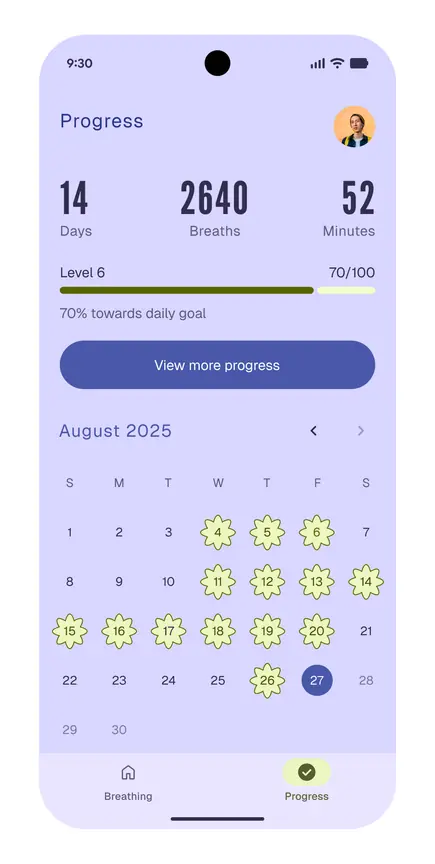
Large text and colorful completed sessions draw attention to the key progress information
Usability design tactics
| Color & contrast | The data uses the primary role to be darker than all other elements and draw attention. The yellow accents on the daily goal bar and calendar use the secondary roles to highlight progress. |
|---|---|
| Grouping & spacing | The metrics (days, breaths, and minutes) are grouped together. The equal vertical spacing between elements makes it easy to scan data. |
| Shape | The rounded Material flower shape on the highlighted days in the calendar makes data more expressive. The flower shapes remind the user of the breathing exercise visualization. |
| Size | Custom-scaled numbers for key statistics such as days, breaths, and minutes are large enough to scan, but they don’t dominate the screen. |
Testing & iteration improves the experience
By testing the experience with users, it’s easy to identify usability issues and address them. From version 1 to 2, the design shifts from cluttered to calm and simplified.
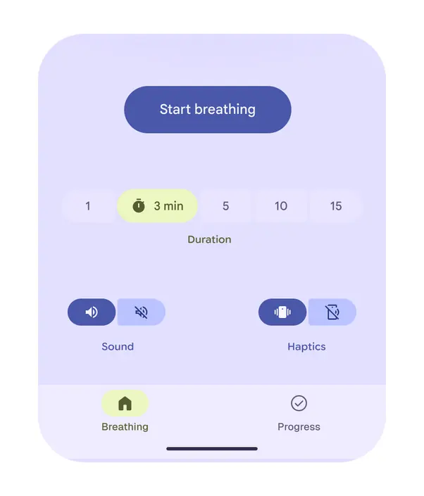
Version 1: No containment, similar sizes, and inconsistent colors
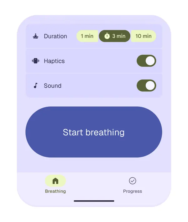
Version 2: Neatly grouped settings, an extra large button, and consistent secondary color usage
Version 1 loaded the screen with settings for duration, sound, and haptics all fighting for attention, creating unnecessary complexity. In Version 2, these options are neatly grouped as list items above the main action. The focus stays on starting the breathing session.
By carefully using hierarchy, containment, shape, and color, the final design is easier to follow and more intuitive. Exploring different design refinements can result in an experience that feels intuitive and easy for the user to follow.
Best practices for applying usability design tactics
Use clear scale and placement
Avoid crowding the screen with too many large or equally prominent elements. Scale and placement create a clear focal point.
Caution
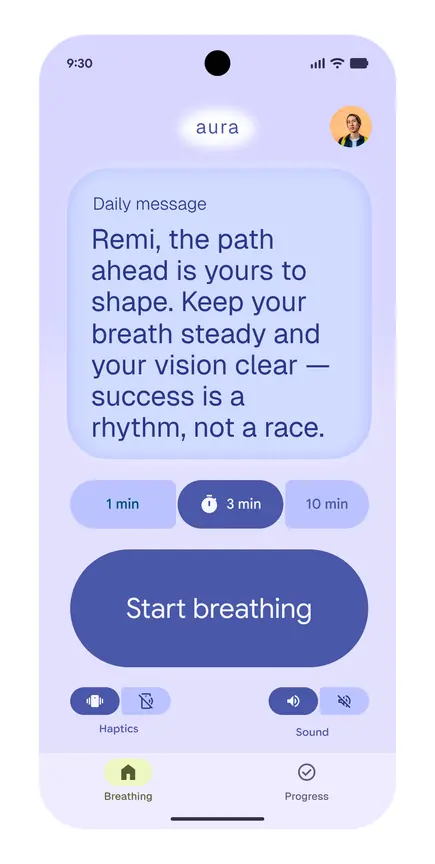
- All the elements were large and competed for attention
- The visual hierarchy was unclear
- The settings weren’t grouped together
Do
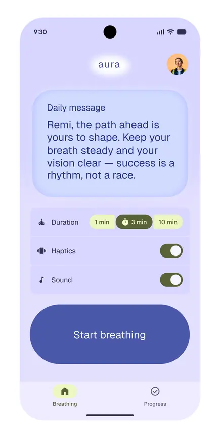
- The large Start breathing button is a strong visual focal point
- The supporting controls are clear, but less prominent than the Start breathing button
Reinforce with consistent color roles
Use different color roles for actions and data to create a visual hierarchy that makes it simple for users to identify what they can do.
Caution
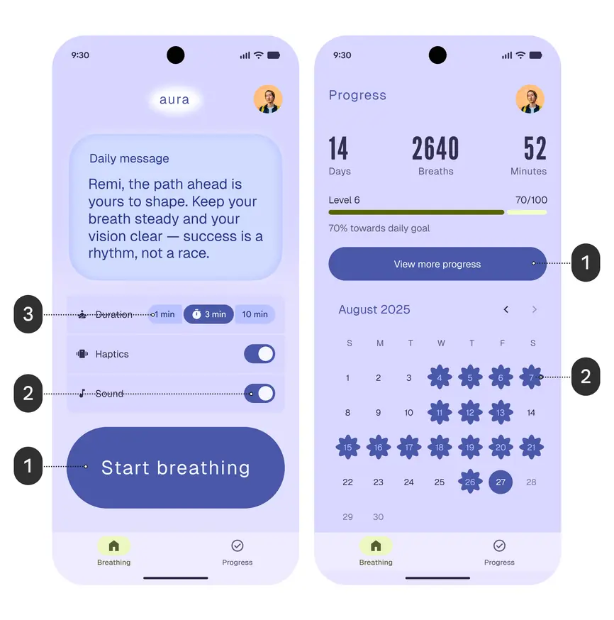
- The same color roles, primary (1, 2) and primary container (3), are used for all actions and data
Do
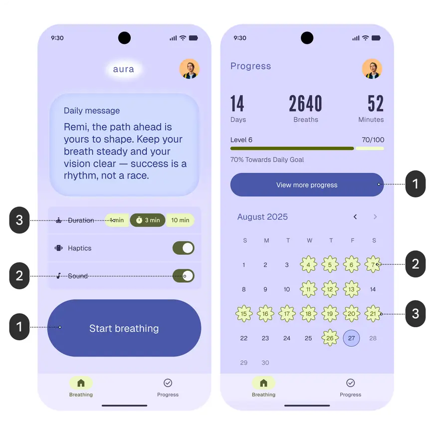
- The primary color role (1) makes the button clear and prominent
- The secondary color on selected settings (2) and secondary container color on the dates (3) contrast with the background and primary colors
Create calm, balanced layouts
Use uniform shapes and sizes. Add space between shapes and data to make it simple to compare data. Create gentle visual rhythm by aligning elements in a consistent flow to support a serene, focused experience.
Caution
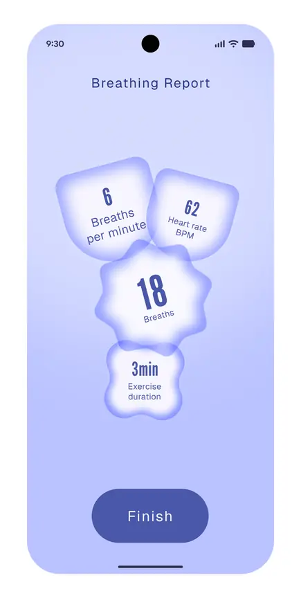
- The shapes have different forms and sizes
- The shapes overlap
Do
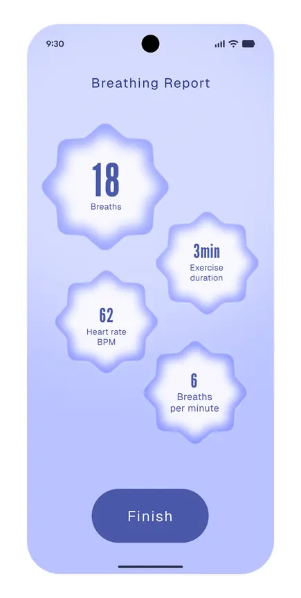
- There’s more even spacing between shapes
- The shapes are uniform
Caution
- The text shifts from very condensed (inhale) and expanded (exhale) while the large arrows animate at the same time as the moving flower
Do
- The text spacing is consistent so the user can focus on the flower’s pulsating and morphing shape guiding the pace of breathing