Search
Search lets people enter a keyword or phrase to get relevant information. Search bars can display suggested keywords or phrases as the user types.
Overview · Specs · Guidelines · Accessibility

- Use search for navigating a product with queries
- A search bar can include a leading search icon, hinted search text, and optional trailing icons
- Search can display suggested keywords or phrases as a person types
- A search bar displays search suggestions or results in a list
- Use a search app bar to provide an emphasized, global entry-point
When inputting text, search suggestions or results appear below the search bar
Availability & resources
| Type | Resource | Status |
|---|---|---|
| Design | Design Kit (Figma) | Available |
| Implementation | Android Views (MDC-Android) | Available |
| Implementation | Android Views (MDC-Android): Expressive | Unavailable |
| Implementation | Flutter | Available |
| Implementation | Jetpack Compose | Available |
| Implementation | Jetpack Compose: Expressive | Available |
| Implementation | Web | Unavailable |
| Implementation | Web: Expressive | Unavailable |
M3 Expressive update
Search has a new visual style, motion, and more flexibility for trailing icons. More on M3 Expressive
February 2025
Naming
- Search bar and search view are now collectively named search
Configurations
- Styles: Search can be contained (recommended) or divided
- Gaps can separate results into groups
Motion
- The search bar grows wider when focused
Supported platforms:
The contained search style features a persistent, filled search container
Differences from M2 to M3 baseline
- Color: New color mappings and compatibility with dynamic color
- Elevation: Lower elevation and no shadow by default
- Name: Search was formerly known as open search bar
- Variants: Two official variants of search components: search bar and search view
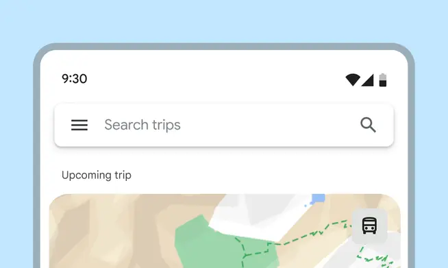
M2 open search bars were square and elevated
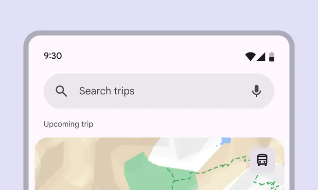
M3 search bars are rounded, use tonal surface, and support dynamic color