Designing
Implement intuitive, accessible layouts, considering structure, color, and flow
Overview · Color contrast · Structure · Flow · Elements
Labeling elements
Elements can be defined and labeled to enhance understanding of their function and reduce confusion for those navigating with assistive technology. Add accessibility labels to define roles and indicate decorative elements.
Visual elements that need labels
- Interactive icons or buttons with no visible text or not enough context in the text (for example, an edit button with a pencil icon)
- Interactive images
- Visual cues (including progress bars and error handling)
- Meaningful icons (such as status icons)
- Meaningful images (for example, diagrams, substantive photos, and illustrations)
Text elements need labels to add additional context
- Generic links (for example, "Learn more")
- Buttons with generic text (for example, "Save" when there are multiple such buttons on a page)
Elements that do not need labels
- Non-interactive UI text, as this will be automatically read by the screen reader
- Buttons with sufficient text (for example, "Download image")
Do not include the element name in labels
Do not use an element role (for example, button or menu) in your label. This identifier is automatically added when the element is assigned its proper role, typically by a developer.
Label language style
This article uses the general term accessibility label to refer to several different types, including ARIA labels and alt tags. When accessibility labels are implemented in code, they'll be translated to the appropriate type for the intended platform. Additionally, the term role is used to cover both general component control types and ARIA roles for web apps. Learn more about writing alt text
How to add labels
1. Label elements
Accessibility labels assist users who cannot rely on a product's visual interface. Thoughtful labels help make the text-based experience as usable as the visual experience. Labels should concisely describe an element's content, purpose and behavior.
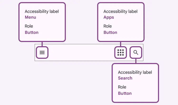
Example: The accessibility labels for these icons describe their purpose—NOT what the icon looks like (for example, "magnifying glass")
2. Add labels for meaningful images and interactive elements
Add labels to visuals that convey meaning or enhance content.
Labels should be concise, descriptive, and convey the content and context of the image.
This applies to infographics and other instructive images found in support docs.
Do
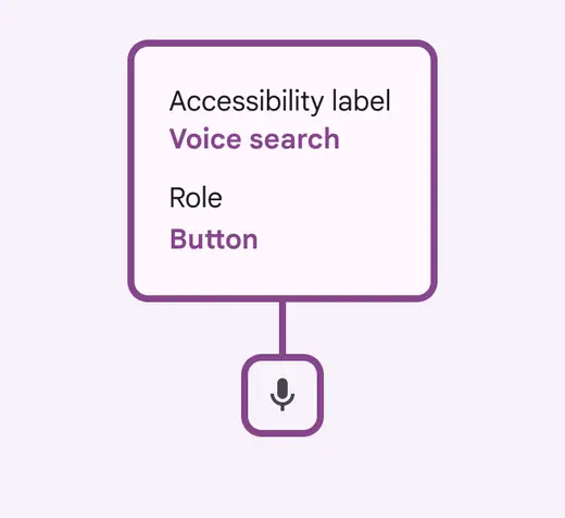
The label “voice search” describes the user task (search) paired with the input method (voice)
Don't
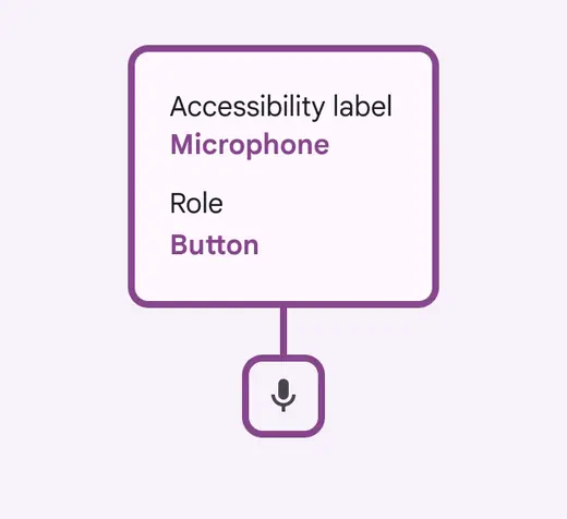
Don't include the element type (button, menu, etc.) in your label. This will automatically be added by assigning the element the proper role.
Hiding images
Decorative icons and images that don't enhance the experience for a visually-impaired user should be annotated as decorative in order to hide them in code.
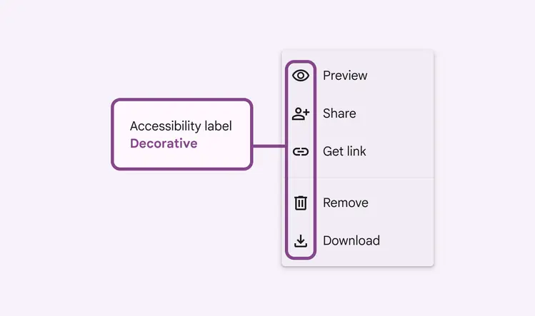
Mark decorative visual elements to "hide"
3. Assign a role to interactive elements
ARIA roles apply to web apps and specify how to increase the accessibility of web pages on top of HTML.
- For web, assign ARIA roles for all interactive elements
- For non-web, assign roles based on your design system components (button, slider, menu, etc.)
Assign ARIA roles (web) or component type (mobile) to communicate desired interaction patterns into engineering action. Note that some visual elements may look the same, but are intended to behave differently.
Defining an interactive element's category by assigning it a role helps users of assistive technology establish expectations for how to interact with that element and anticipate what is likely to happen upon interaction.
Don't
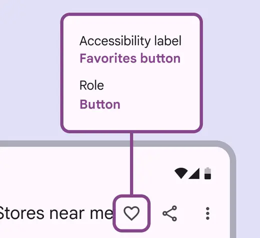
Don't include the control type in the label. Screen readers automatically add the control, so you’d be having it repeat (for example, “Got it button button”).