Inputs
Inputs are devices that provide interactive control of an app. Common inputs include a mouse, keyboard, or touchpad.

- Design for touch, keyboard, and mouse interactions
- Embrace multiple input methods and gestures within your app
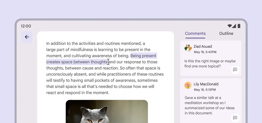
Designing for inputs allows people to use the inputs they prefer, like a mouse to highlight text on a tablet
External inputs for devices
People can use external inputs like a mouse, keyboard, or stylus with their phone, tablet, foldable, TV, laptop, or desktop computer. When someone connects an external input to their device, they expect it to behave in familiar and useful ways. Designing for different input methods can make a product more usable and accessible on all screen sizes.
Common features of external inputs
Mouse
- Left and right click
- Mouse wheel
- Extra buttons
Trackpad
- Left and right click
- Gestures
- Haptics
Physical keyboard
- Replaces virtual keyboard
- Media keys
- Modifier keys
Input device behaviors
Depending on the input device, designers and developers can implement behaviors that meet standard conventions and user expectations.
| Input device action | Anticipated behavior |
|---|---|
| Mouse and trackpad movement | Show a mouse cursor on the screen |
| Primary click | Treat mouse clicks differently than touch events |
| Secondary click | Activate context menus |
| Hover | Change component states |
| Highlight | Allow text to be selected by the mouse cursor |
| Mouse wheel and trackpad two finger drag | Scroll list vertically and horizontally |
| Trackpad pinch | Zoom an element or page |
| Physical keyboard | Hide and show on screen keyboard |
Mouse and cursor interactions
When an external mouse input device is used, a mouse cursor should be shown, regardless of the device type.
A mouse may be connected to tablets, laptops, phones, foldables, and more. On some devices, it's possible to use an external input device simultaneously with touch input.
On devices that don't specifically recognize mouse or stylus input, the mouse is treated as touch input.
Primary click
A mouse click or stylus tap should demonstrate the same feedback as touch input. One example of this is showing the ripple for a pressed state.
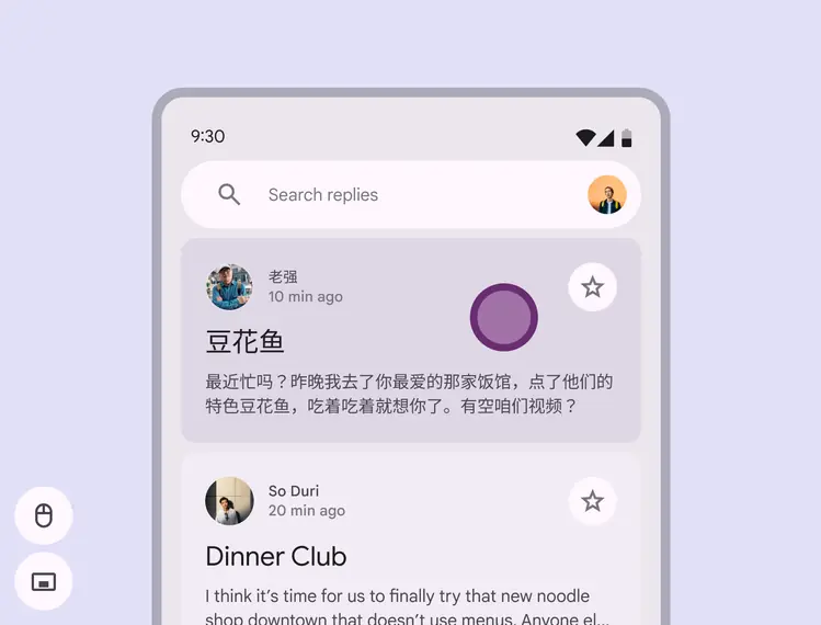
A visible mouse cursor is seen when the external input is connected
Secondary click
Context menus
A secondary click (whether using a single button or two fingers on a trackpad) should activate a context menu. The context menu shows additional options for the object that's clicked. See menus for more usage and guidelines.
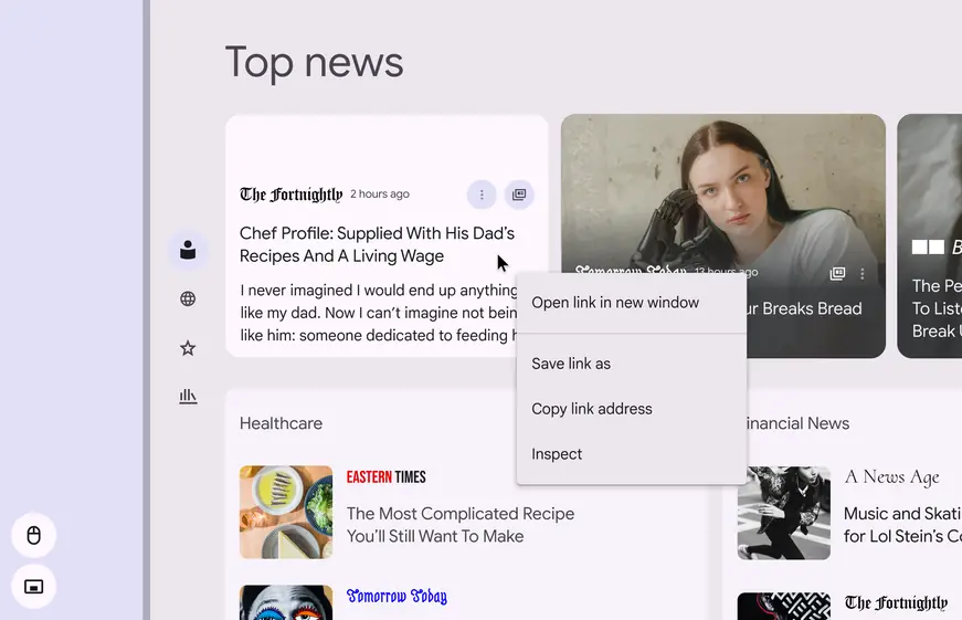
The context menu should appear when right clicking with a mouse or trackpad
Hover
When using a mouse cursor, help users discover interactive objects by enabling visual changes. When the mouse rests on an interactive element, the hover state is a valuable cue for interaction. See states for styles and guidelines.
Hovering with a cursor (or stylus) should also invoke tooltips when applicable. See tooltips for guidance.
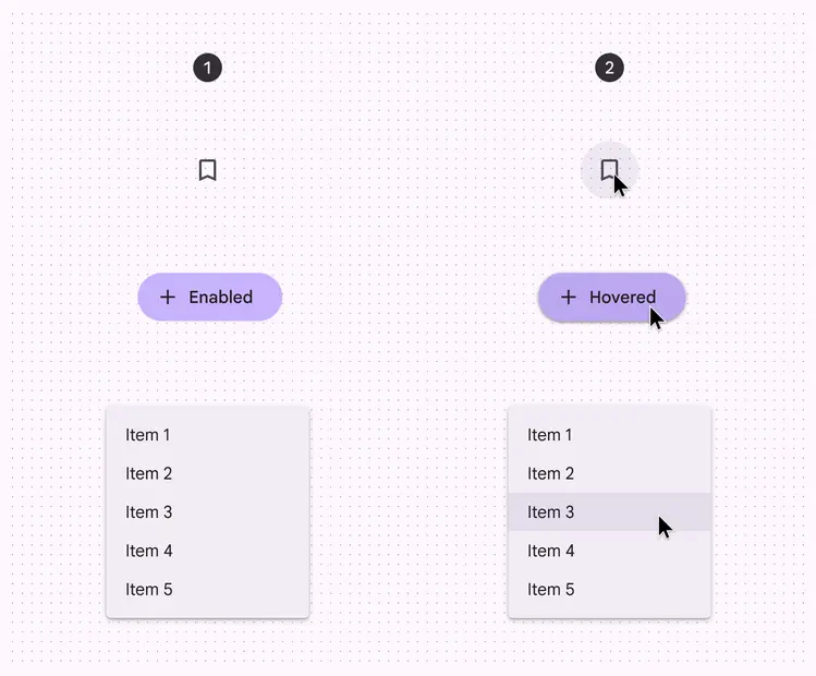
- Components without a hover state
- Components with a hover state change applied
Cursors
Cursors appear when using external input devices like a mouse or trackpad. The cursor can change to communicate more information about interactive elements.
Pointer
By default, external input control should be rendered as a pointer.
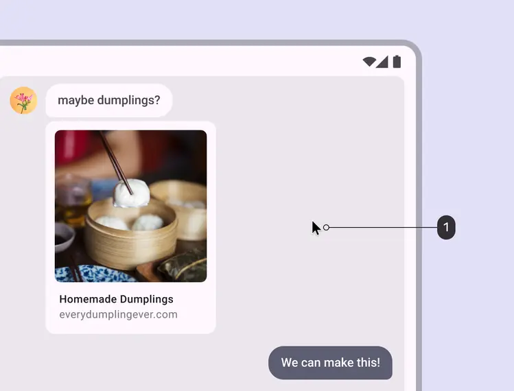
- A pointer provides a visible indicator for input controls
Hand
The cursor should appear as a hand to indicate links or linked images.
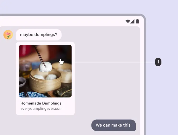
- The hand cursor is used for links and clickable images
Resize arrows
The cursor should change to resize arrows on the boundaries of resizable elements.
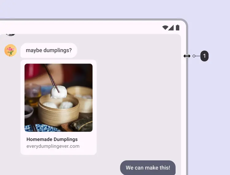
- Resize arrows indicate an element can be resized
I-beam
The cursor should appear as an I-beam when hovering on text. When manipulating editable text, the following interactions apply:
- Single click places the cursor
- Double click selects a word
- Triple click selects a paragraph
- Single click deselects text and repositions the cursor
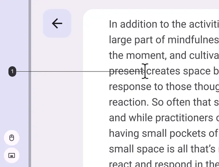
- An I-beam cursor indicates selectable text
Text selection
When selecting text using a mouse, trackpad, or stylus:
- Highlight the selected area using a single color
- Don’t show touch controls next to the highlighted area
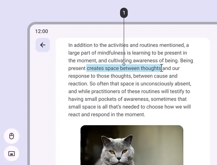
- Selected text shows a visible highlight
Text selection with touch control
When interacting using touch, always show touch controls, even if other inputs are connected.
When using a mouse, trackpad, or stylus, show the I-beam and context menu, even if it's a touch device.
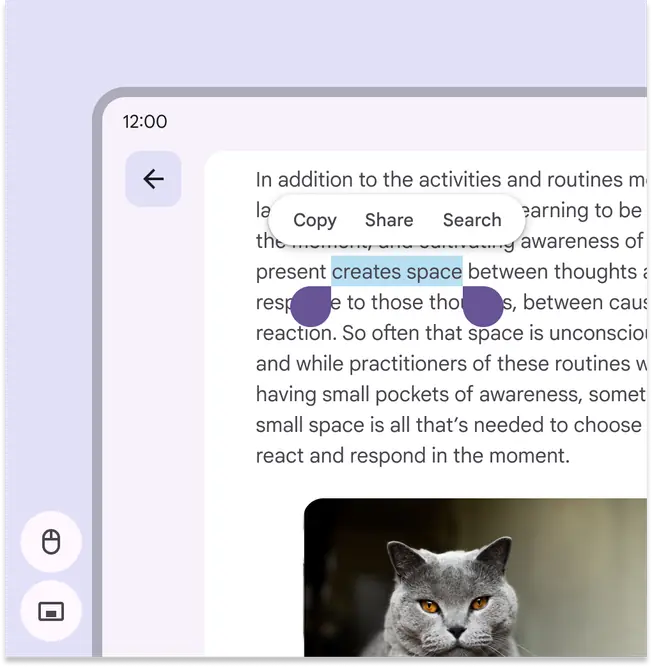
When using a touchscreen to select text, show touch controls
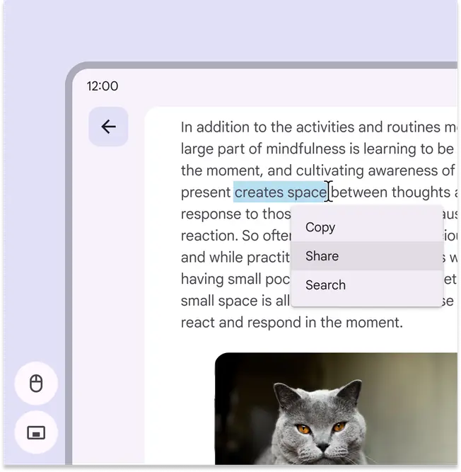
When using a mouse, trackpad, or stylus to select text, use the right-click context menu
Stylus input
When using a stylus, cursors are usually not necessary, unless they communicate tool properties such as brush size or shape.
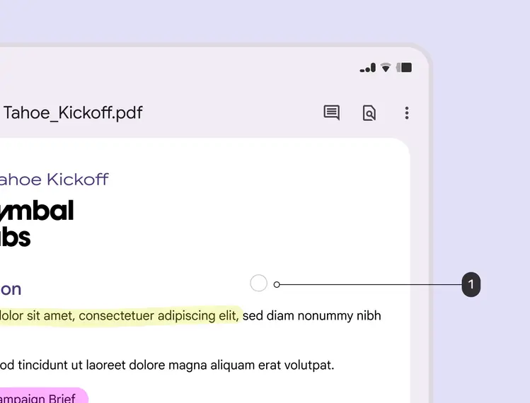
- The circle cursor indicates the selected stylus tool and size
Mouse wheel and trackpad gestures
When an external mouse or touchpad is used, the mouse wheel and trackpad gesture allow more actions.
Vertical scroll
When a cursor is positioned on a list, the mouse wheel and two-finger touchpad gesture should allow vertical scrolling of the list.
Scrolling a vertical list using the mouse wheel or trackpad gestures. Note that only the detail panel under the cursor scrolls.
Touch scroll & mouse text selection
Upon touch and drag gesture, the text area will scroll. With a mouse interaction, dragging in a text area will select the text.
On a touch screen, dragging upward scrolls the field down
When using a mouse, dragging upward selects text and images
Horizontal scroll
Mouse users should be able to scroll with a mouse wheel to navigate horizontally scrolling fields. Trackpad users should be able to scroll using a two-finger horizontal gesture.
Carousels can scroll horizontally using a scroll wheel or trackpad
Physical keyboard
When a physical keyboard is connected to a device, either externally or as a built-in laptop keyboard, users should be able to perform any actions that the virtual keyboard provides, and more.
Show and hide virtual keyboard
A virtual keyboard should appear or hide in response to the presence of a physical keyboard.
Do
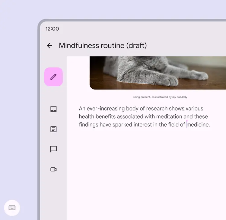
When a physical keyboard is attached, hide the virtual keyboard
Do
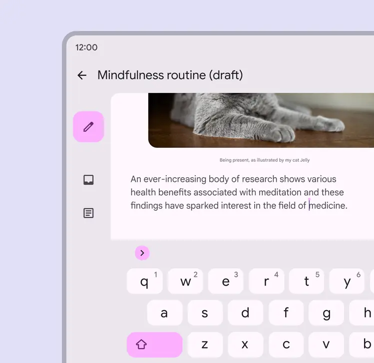
When a physical keyboard is removed, show the virtual keyboard
Common keyboard interactions
Enter key
People typically expect the Enter key on a physical keyboard to be enabled by developers to allow a common function like sending a message.
The Enter key typically triggers actions like sending a message
Spacebar control
People typically expect the Spacebar (or available media keys) to be enabled to play and pause music or video.
Pressing Space usually pauses and plays media
Tab focus
When keyboard users navigate a page using Tab, the focus on interactive items must follow a logical order. On most pages, that means left to right, top to bottom.
When focused from a keyboard or other input device, the focus state includes a ring-like keyboard focus indicator.
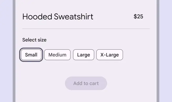
Tab focus includes a visible keyboard focus indicator
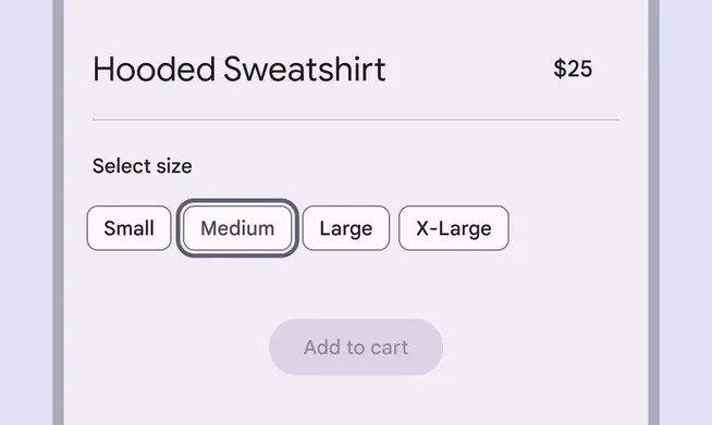
The focus state moves elements as the user presses Tab on their keyboard
Escape key
People typically expect the Escape key on a physical keyboard to dismiss elements, remove focus, or clear selections.
The Escape key should dismiss any visible modal elements like menus, dialogs, or bottom sheets
The Escape key should remove any visible focus indicators and set the focus order to 0
The Escape key should remove the text cursor when typing, but should not remove already-typed text