Search
Search lets people enter a keyword or phrase to get relevant information. Search bars can display suggested keywords or phrases as the user types.
Overview · Specs · Guidelines · Accessibility
Variants
When a person executes a search, results appear in a list below the search bar
| Variant | M3 | M3 Expressive |
|---|---|---|
| Search | Available | Available |
Configurations
Style
Search comes in two styles:
- Contained: Has an expressive look and feel. It uses a filled container to separate a search bar from a list of suggestions or results
- Divided (baseline): Doesn’t have the latest visual style, motion, or flexibility

The contained style has a persistent, filled container, expressive motion, and rounded shape

The divided (baseline) style uses a divider to separate the search bar from suggestions and results
Layout
Search suggestions and results appear in customizable lists, with two layout options: full-screen and docked. More on search layouts
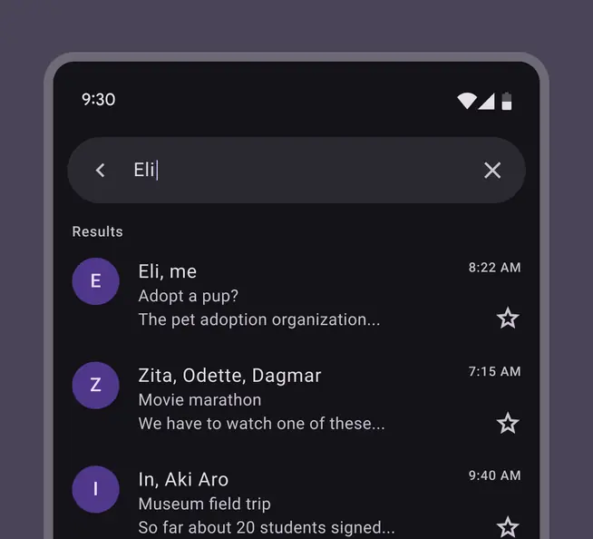
Full-screen layout in the contained style
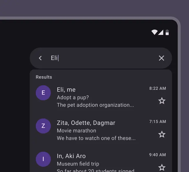
Docked layout in the contained style
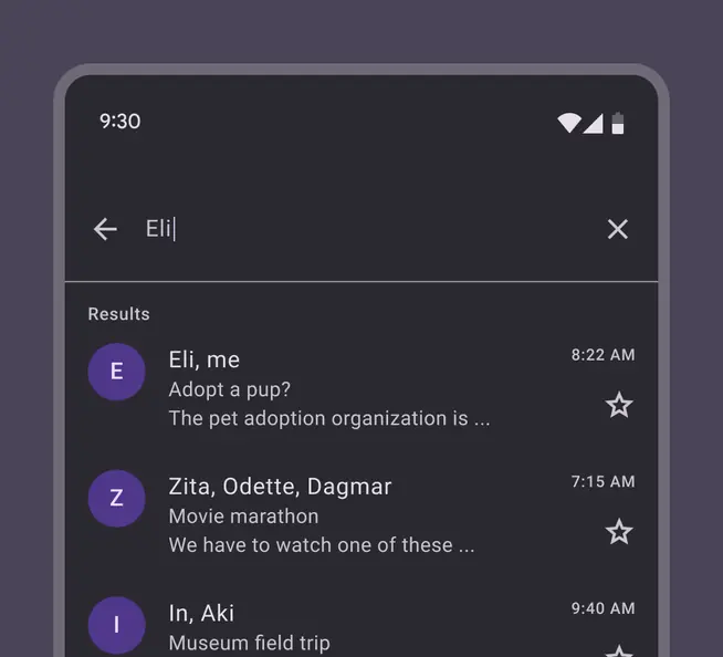
Full-screen layout in the divided style
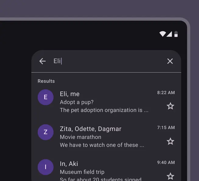
Docked layout in the divided style
| Category | Configuration | M3 | M3 Expressive |
|---|---|---|---|
| Style | Contained | -- | Available |
| Divided | Available | Not recommended. Use contained. | |
| Layout | Docked, full-screen | Available | Available |
Tokens & specs
Use the table's menu to select a token set. The search bar set only contains tokens for the unfocused search bar. The search view set contains all other tokens when interacting with search, including all styles and layouts. Learn more about design tokens
Design tokens
Token table
Machine-readable relationship table
Search tokens · 2 token sets · 85 tokens · live token table · DSDB TOKEN_TABLE.07341534518f78d0
- Default context: Theme: Light · Platform: Android · Audience: 3P · Font: Static · Contrast: Default · iOS dark theme elevation: None · iOS weight setting: Default
- Not configurable here (group default used): Motion scheme: Standard · Language height: Small
- Other contexts: Theme: Dark · Platform: Web, Compose · Contrast: Medium contrast, High contrast. "Other contexts" lists values that differ from the default when only that one context changes.
- Reference chain: aliases from the token to its source value (
token → alias → … → value). "—" means the token holds a literal value.
Search - Bar · md.comp.search-bar · 49 tokens
For baseline search bar and expressive search.
| Group | Token | Type | Reference chain | Resolved value | Other contexts |
|---|---|---|---|---|---|
| Layout and Text › Baseline | md.comp.search-bar.trailing-space | Length | md.sys.measurement.space200 | 16dp | — |
| Layout and Text › Baseline | md.comp.search-bar.leading-icon.leading-icon-label-space | Length | md.sys.measurement.space200 | 16dp | — |
| Layout and Text › Baseline | md.comp.search-bar.trailing-icon.label-trailing-icon-space | Length | md.sys.measurement.space200 | 16dp | — |
| Layout and Text › Baseline | md.comp.search-bar.leading-space | Length | md.sys.measurement.space200 | 16dp | — |
| Layout and Text › Common tokens | md.comp.search-bar.container.height | Length | — | 56dp | — |
| Layout and Text › Common tokens | md.comp.search-bar.container.shape | Shape | md.sys.shape.corner.full | Circular (fully rounded) | — |
| Layout and Text › Common tokens | md.comp.search-bar.avatar.size | Length | — | 30dp | — |
| Layout and Text › Common tokens | md.comp.search-bar.avatar.shape | Shape | md.sys.shape.corner.full | Circular (fully rounded) | — |
| Layout and Text › Common tokens | md.comp.search-bar.icon.size | Length | — | 24dp | — |
| Layout and Text › Common tokens | md.comp.search-bar.supporting-text.type | Typography | composite font names: md.comp.search-bar.supporting-text.font → md.sys.typescale.body-large.font → md.ref.typeface.plainfont weight: md.comp.search-bar.supporting-text.weight → md.sys.typescale.body-large.weight → md.ref.typeface.weight-regularfont size: md.comp.search-bar.supporting-text.size → md.sys.typescale.body-large.sizeline height: md.comp.search-bar.supporting-text.line-height → md.sys.typescale.body-large.line-heightfont tracking: md.comp.search-bar.supporting-text.tracking → md.sys.typescale.body-large.tracking | Roboto · weight 400 · size 16pt · line height 24pt · tracking 0.5pt | — |
| Layout and Text › Common tokens | md.comp.search-bar.supporting-text.font | Font names | md.sys.typescale.body-large.font → md.ref.typeface.plain | Roboto | — |
| Layout and Text › Common tokens | md.comp.search-bar.supporting-text.line-height | Line height | md.sys.typescale.body-large.line-height | 24pt | — |
| Layout and Text › Common tokens | md.comp.search-bar.supporting-text.size | Font size | md.sys.typescale.body-large.size | 16pt | — |
| Layout and Text › Common tokens | md.comp.search-bar.supporting-text.weight | Font weight | md.sys.typescale.body-large.weight → md.ref.typeface.weight-regular | 400 | — |
| Layout and Text › Common tokens | md.comp.search-bar.supporting-text.tracking | Font tracking | md.sys.typescale.body-large.tracking | 0.5pt | — |
| Layout and Text › Common tokens | md.comp.search-bar.input-text.type | Typography | composite font names: md.comp.search-bar.input-text.font → md.sys.typescale.body-large.font → md.ref.typeface.plainfont weight: md.comp.search-bar.input-text.weight → md.sys.typescale.body-large.weight → md.ref.typeface.weight-regularfont size: md.comp.search-bar.input-text.size → md.sys.typescale.body-large.sizeline height: md.comp.search-bar.input-text.line-height → md.sys.typescale.body-large.line-heightfont tracking: md.comp.search-bar.input-text.tracking → md.sys.typescale.body-large.tracking | Roboto · weight 400 · size 16pt · line height 24pt · tracking 0.5pt | — |
| Layout and Text › Common tokens | md.comp.search-bar.input-text.font | Font names | md.sys.typescale.body-large.font → md.ref.typeface.plain | Roboto | — |
| Layout and Text › Common tokens | md.comp.search-bar.input-text.line-height | Line height | md.sys.typescale.body-large.line-height | 24pt | — |
| Layout and Text › Common tokens | md.comp.search-bar.input-text.size | Font size | md.sys.typescale.body-large.size | 16pt | — |
| Layout and Text › Common tokens | md.comp.search-bar.input-text.weight | Font weight | md.sys.typescale.body-large.weight → md.ref.typeface.weight-regular | 400 | — |
| Layout and Text › Common tokens | md.comp.search-bar.input-text.tracking | Font tracking | md.sys.typescale.body-large.tracking | 0.5pt | — |
| Layout and Text › Common tokens | md.comp.search-bar.container.surface-tint-layer.color (deprecated) | Color | md.sys.color.surface-tint → md.sys.color.primary → md.ref.palette.primary40 | #6750A4 | Dark: #D0BCFF via md.ref.palette.primary80Medium contrast: #4F378B via md.ref.palette.primary30High contrast: #381E72 via md.ref.palette.primary20 |
| Layout and Text › Contained (expressive) | md.comp.search-bar.contained.trailing-margin | Length | md.sys.measurement.space300 | 24dp | — |
| Layout and Text › Contained (expressive) | md.comp.search-bar.contained.motion.spring | Custom composite | md.sys.motion.spring.fast.spatial → composite+2 variation axes | damping 0.9 · stiffness 1400 | — |
| Layout and Text › Contained (expressive) | md.comp.search-bar.contained.leading-space | Length | md.sys.measurement.space50 | 4dp | — |
| Layout and Text › Contained (expressive) | md.comp.search-bar.contained.trailing-space | Length | md.sys.measurement.space50 | 4dp | — |
| Layout and Text › Contained (expressive) | md.comp.search-bar.contained.no-actions.leading-space | Length | md.sys.measurement.space200 | 16dp | — |
| Layout and Text › Contained (expressive) | md.comp.search-bar.contained.no-actions.trailing-space | Length | md.sys.measurement.space200 | 16dp | — |
| Layout and Text › Contained (expressive) | md.comp.search-bar.contained.icon-label.gap | Length | md.sys.measurement.space50 | 4dp | — |
| Layout and Text › Contained (expressive) | md.comp.search-bar.contained.avatar.target-size | Length | — | 48dp | — |
| Layout and Text › Contained (expressive) | md.comp.search-bar.contained.trailing-actions.gap | Length | md.sys.measurement.space0 | 0dp | — |
| Layout and Text › Contained (expressive) | md.comp.search-bar.contained.trailing-actions.leading-space | Length | md.sys.measurement.space50 | 4dp | — |
| Layout and Text › Contained (expressive) | md.comp.search-bar.contained.trailing-actions.trailing-space | Length | md.sys.measurement.space50 | 4dp | — |
| Layout and Text › Contained (expressive) | md.comp.search-bar.contained.leading-margin | Length | md.sys.measurement.space300 | 24dp | — |
| Color › Hovered | md.comp.search-bar.hover.state-layer.opacity | Opacity | md.sys.state.hover.state-layer-opacity | 0.08 | — |
| Color › Hovered | md.comp.search-bar.hover.supporting-text.color | Color | md.sys.color.on-surface-variant → md.ref.palette.neutral-variant30 | #49454F | Dark: #CAC4D0 via md.ref.palette.neutral-variant80Medium contrast: #322F37 via md.ref.palette.neutral-variant20High contrast: #000000 via md.ref.palette.neutral-variant0 |
| Color › Hovered | md.comp.search-bar.hover.state-layer.color | Color | md.sys.color.on-surface → md.ref.palette.neutral10 | #1D1B20 | Dark: #E6E0E9 via md.ref.palette.neutral90Medium contrast: #000000 via md.ref.palette.neutral0High contrast: #000000 via md.ref.palette.neutral0 |
| Color › Enabled | md.comp.search-bar.container.color | Color | md.sys.color.surface-container-high → md.ref.palette.neutral92 | #ECE6F0 | Dark: #2B2930 via md.ref.palette.neutral17 |
| Color › Enabled | md.comp.search-bar.container.elevation | Elevation | md.sys.elevation.level3 | 6dp | — |
| Color › Enabled | md.comp.search-bar.leading-icon.color | Color | md.sys.color.on-surface → md.ref.palette.neutral10 | #1D1B20 | Dark: #E6E0E9 via md.ref.palette.neutral90Medium contrast: #000000 via md.ref.palette.neutral0High contrast: #000000 via md.ref.palette.neutral0 |
| Color › Enabled | md.comp.search-bar.trailing-icon.color | Color | md.sys.color.on-surface-variant → md.ref.palette.neutral-variant30 | #49454F | Dark: #CAC4D0 via md.ref.palette.neutral-variant80Medium contrast: #322F37 via md.ref.palette.neutral-variant20High contrast: #000000 via md.ref.palette.neutral-variant0 |
| Color › Enabled | md.comp.search-bar.supporting-text.color | Color | md.sys.color.on-surface-variant → md.ref.palette.neutral-variant30 | #49454F | Dark: #CAC4D0 via md.ref.palette.neutral-variant80Medium contrast: #322F37 via md.ref.palette.neutral-variant20High contrast: #000000 via md.ref.palette.neutral-variant0 |
| Color › Enabled | md.comp.search-bar.input-text.color | Color | md.sys.color.on-surface → md.ref.palette.neutral10 | #1D1B20 | Dark: #E6E0E9 via md.ref.palette.neutral90Medium contrast: #000000 via md.ref.palette.neutral0High contrast: #000000 via md.ref.palette.neutral0 |
| Color › Pressed | md.comp.search-bar.pressed.state-layer.opacity | Opacity | md.sys.state.pressed.state-layer-opacity | 0.1 | — |
| Color › Pressed | md.comp.search-bar.pressed.supporting-text.color | Color | md.sys.color.on-surface-variant → md.ref.palette.neutral-variant30 | #49454F | Dark: #CAC4D0 via md.ref.palette.neutral-variant80Medium contrast: #322F37 via md.ref.palette.neutral-variant20High contrast: #000000 via md.ref.palette.neutral-variant0 |
| Color › Pressed | md.comp.search-bar.pressed.state-layer.color | Color | md.sys.color.on-surface → md.ref.palette.neutral10 | #1D1B20 | Dark: #E6E0E9 via md.ref.palette.neutral90Medium contrast: #000000 via md.ref.palette.neutral0High contrast: #000000 via md.ref.palette.neutral0 |
| Color › Focused | md.comp.search-bar.focus.indicator.thickness | Length | md.sys.state.focus-indicator.thickness | 3dp | — |
| Color › Focused | md.comp.search-bar.focus.indicator.outline.offset | Length | md.sys.state.focus-indicator.outer-offset | 2dp | — |
| Color › Focused | md.comp.search-bar.focus.indicator.color | Color | md.sys.color.secondary → md.ref.palette.secondary40 | #625B71 | Dark: #CCC2DC via md.ref.palette.secondary80Medium contrast: #4A4458 via md.ref.palette.secondary30High contrast: #332D41 via md.ref.palette.secondary20 |
Search - View · md.comp.search-view · 36 tokens
For baseline search view and expressive search when activated.
| Group | Token | Type | Reference chain | Resolved value | Other contexts |
|---|---|---|---|---|---|
| Color | md.comp.search-view.contained.background.color | Color | md.sys.color.surface-container-low → md.ref.palette.neutral96 | #F7F2FA | Dark: #1D1B20 via md.ref.palette.neutral10 |
| Color | md.comp.search-view.container.elevation | Elevation | md.sys.elevation.level3 | 6dp | — |
| Color | md.comp.search-view.header.supporting-text.color | Color | md.sys.color.on-surface-variant → md.ref.palette.neutral-variant30 | #49454F | Dark: #CAC4D0 via md.ref.palette.neutral-variant80Medium contrast: #322F37 via md.ref.palette.neutral-variant20High contrast: #000000 via md.ref.palette.neutral-variant0 |
| Color | md.comp.search-view.header.input-text.color | Color | md.sys.color.on-surface → md.ref.palette.neutral10 | #1D1B20 | Dark: #E6E0E9 via md.ref.palette.neutral90Medium contrast: #000000 via md.ref.palette.neutral0High contrast: #000000 via md.ref.palette.neutral0 |
| Color | md.comp.search-view.header.leading-icon.color | Color | md.sys.color.on-surface → md.ref.palette.neutral10 | #1D1B20 | Dark: #E6E0E9 via md.ref.palette.neutral90Medium contrast: #000000 via md.ref.palette.neutral0High contrast: #000000 via md.ref.palette.neutral0 |
| Color | md.comp.search-view.header.trailing-icon.color | Color | md.sys.color.on-surface-variant → md.ref.palette.neutral-variant30 | #49454F | Dark: #CAC4D0 via md.ref.palette.neutral-variant80Medium contrast: #322F37 via md.ref.palette.neutral-variant20High contrast: #000000 via md.ref.palette.neutral-variant0 |
| Color | md.comp.search-view.divider.color | Color | md.sys.color.outline → md.ref.palette.neutral-variant50 | #79747E | Dark: #938F99 via md.ref.palette.neutral-variant60Medium contrast: #49454F via md.ref.palette.neutral-variant30High contrast: #322F37 via md.ref.palette.neutral-variant20 |
| Color | md.comp.search-view.container.color | Color | md.sys.color.surface-container-high → md.ref.palette.neutral92 | #ECE6F0 | Dark: #2B2930 via md.ref.palette.neutral17 |
| Layout and Text › Divided (baseline) | md.comp.search-view.full-screen.header.container.height | Length | — | 72dp | — |
| Layout and Text › Divided (baseline) | md.comp.search-view.docked.header.container.height | Length | — | 56dp | — |
| Layout and Text › Divided (baseline) | md.comp.search-view.leading-space | Length | md.sys.measurement.space200 | 16dp | — |
| Layout and Text › Divided (baseline) | md.comp.search-view.trailing-space | Length | md.sys.measurement.space200 | 16dp | — |
| Layout and Text › Divided (baseline) | md.comp.search-view.leading-icon.leading-icon-label-space | Length | md.sys.measurement.space200 | 16dp | — |
| Layout and Text › Divided (baseline) | md.comp.search-view.trailing-icon.label-trailing-icon-space | Length | md.sys.measurement.space200 | 16dp | — |
| Layout and Text › Divided (baseline) | md.comp.search-view.docked.container.shape | Shape | md.sys.shape.corner.extra-large | Rounded corners 28dp | — |
| Layout and Text › Common tokens | md.comp.search-view.header.supporting-text.type | Typography | composite font names: md.comp.search-view.header.supporting-text.font → md.sys.typescale.body-large.font → md.ref.typeface.plainfont weight: md.comp.search-view.header.supporting-text.weight → md.sys.typescale.body-large.weight → md.ref.typeface.weight-regularfont size: md.comp.search-view.header.supporting-text.size → md.sys.typescale.body-large.sizeline height: md.comp.search-view.header.supporting-text.line-height → md.sys.typescale.body-large.line-heightfont tracking: md.comp.search-view.header.supporting-text.tracking → md.sys.typescale.body-large.tracking | Roboto · weight 400 · size 16pt · line height 24pt · tracking 0.5pt | — |
| Layout and Text › Common tokens | md.comp.search-view.header.supporting-text.font | Font names | md.sys.typescale.body-large.font → md.ref.typeface.plain | Roboto | — |
| Layout and Text › Common tokens | md.comp.search-view.header.supporting-text.line-height | Line height | md.sys.typescale.body-large.line-height | 24pt | — |
| Layout and Text › Common tokens | md.comp.search-view.header.supporting-text.size | Font size | md.sys.typescale.body-large.size | 16pt | — |
| Layout and Text › Common tokens | md.comp.search-view.header.supporting-text.weight | Font weight | md.sys.typescale.body-large.weight → md.ref.typeface.weight-regular | 400 | — |
| Layout and Text › Common tokens | md.comp.search-view.header.supporting-text.tracking | Font tracking | md.sys.typescale.body-large.tracking | 0.5pt | — |
| Layout and Text › Common tokens | md.comp.search-view.header.input-text.type | Typography | composite font names: md.comp.search-view.header.input-text.font → md.sys.typescale.body-large.font → md.ref.typeface.plainfont weight: md.comp.search-view.header.input-text.weight → md.sys.typescale.body-large.weight → md.ref.typeface.weight-regularfont size: md.comp.search-view.header.input-text.size → md.sys.typescale.body-large.sizeline height: md.comp.search-view.header.input-text.line-height → md.sys.typescale.body-large.line-heightfont tracking: md.comp.search-view.header.input-text.tracking → md.sys.typescale.body-large.tracking | Roboto · weight 400 · size 16pt · line height 24pt · tracking 0.5pt | — |
| Layout and Text › Common tokens | md.comp.search-view.header.input-text.font | Font names | md.sys.typescale.body-large.font → md.ref.typeface.plain | Roboto | — |
| Layout and Text › Common tokens | md.comp.search-view.header.input-text.line-height | Line height | md.sys.typescale.body-large.line-height | 24pt | — |
| Layout and Text › Common tokens | md.comp.search-view.header.input-text.size | Font size | md.sys.typescale.body-large.size | 16pt | — |
| Layout and Text › Common tokens | md.comp.search-view.header.input-text.weight | Font weight | md.sys.typescale.body-large.weight → md.ref.typeface.weight-regular | 400 | — |
| Layout and Text › Common tokens | md.comp.search-view.header.input-text.tracking | Font tracking | md.sys.typescale.body-large.tracking | 0.5pt | — |
| Layout and Text › Common tokens | md.comp.search-view.full-screen.container.shape | Shape | md.sys.shape.corner.none | Rounded corners 0dp | — |
| Layout and Text › Contained (expressive) | md.comp.search-view.contained.trailing-margin | Length | md.sys.measurement.space150 | 12dp | — |
| Layout and Text › Contained (expressive) | md.comp.search-view.contained.docked.bar-results.gap | Length | md.sys.measurement.space25 | 2dp | — |
| Layout and Text › Contained (expressive) | md.comp.search-view.contained.docked.results.shape | Shape | md.sys.shape.corner.medium | Rounded corners 12dp | — |
| Layout and Text › Contained (expressive) | md.comp.search-view.contained.docked.bar.shape | Shape | md.sys.shape.corner.full | Circular (fully rounded) | — |
| Layout and Text › Contained (expressive) | md.comp.search-view.contained.full-screen.bar.container.height | Length | — | 56dp | — |
| Layout and Text › Contained (expressive) | md.comp.search-view.contained.icon-label.gap | Length | md.sys.measurement.space50 | 4dp | — |
| Layout and Text › Contained (expressive) | md.comp.search-view.contained.leading-margin | Length | md.sys.measurement.space150 | 12dp | — |
| Other | md.comp.search-view.container.surface-tint-layer.color (deprecated) | Color | md.sys.color.surface-tint → md.sys.color.primary → md.ref.palette.primary40 | #6750A4 | Dark: #D0BCFF via md.ref.palette.primary80Medium contrast: #4F378B via md.ref.palette.primary30High contrast: #381E72 via md.ref.palette.primary20 |
Anatomy
Search includes a search bar and a container for suggestions and results. The container is empty by default. Use the list component to add content. In the divided (baseline) style, a divider separates the search bar and results.
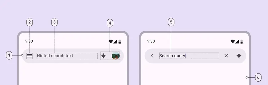
- Search bar container
- Leading icon
- Supporting text
- Trailing icon and avatar (optional)
- Input text
- Container for search suggestions or results
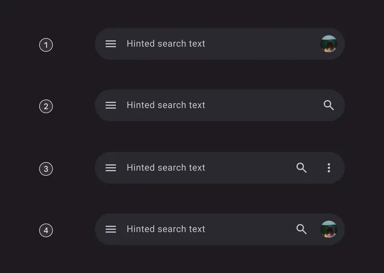
Examples
- With avatar
- With one trailing icon button
- With two trailing icon buttons
- With trailing icon button and avatar
Color
Color values are implemented through design tokens. For designers, this means working with color values that correspond with tokens. In implementation, a color value will be a token that references a value.
Full-screen layout
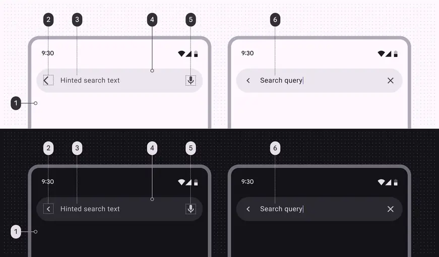
Full-screen search color roles used in light and dark themes:
- Surface container low
- On surface variant
- On surface variant
- Surface container high
- On surface variant
- On surface
Docked layout
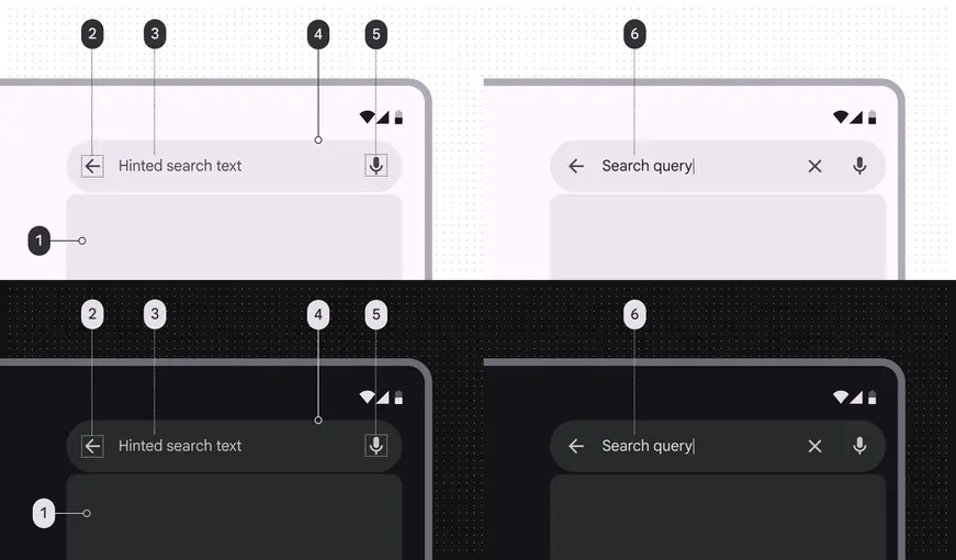
Docked search color roles used in light and dark themes:
- Surface container high
- On surface variant
- On surface variant
- Surface container high
- On surface variant
- On surface
States
States are visual representations used to communicate the status of a component or an interactive element. In focused search, individual elements maintain their own interaction states. Learn more about interaction states
Search bar
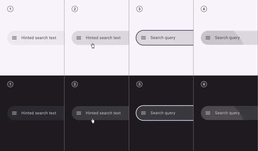
- Enabled
- Hovered
- Focused
- Pressed (ripple)
Search suggestions & results
Search includes a container for suggestions and results. The container is empty by default. Use the list component to add content.
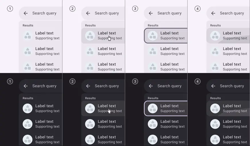
- Enabled
- Hovered
- Focused
- Pressed (ripple)
Measurements
Search bar
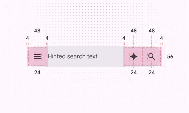
Unfocused search bar with leading and trailing icon measurements
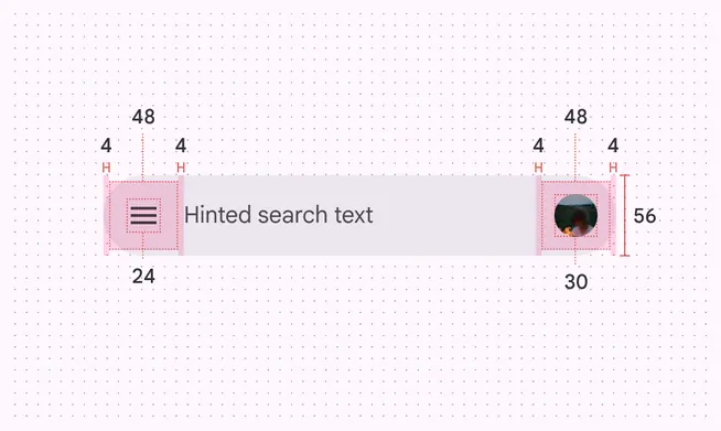
Unfocused search bar with avatar measurements
In M3 Expressive, the search bar expands when focused. The margins change from 24dp to 12dp.
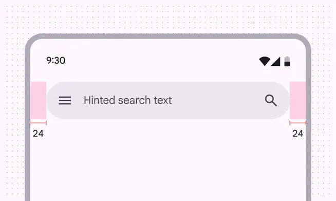
Unfocused search bar margin measurements
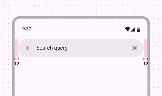
Focused search bar margin measurements
| Element | Attribute | Value |
|---|---|---|
| Container | Width | Min: 360dp, max: 720dp |
| Container | Height | 56dp |
| Container | Label alignment | Start-aligned |
| Container | Leading padding | Unfocused: 24dp, focused: 12dp |
| Container | Trailing padding | Unfocused: 24dp, focused: 12dp |
| Container | Leading icon and label padding (from tap target) | 4dp |
| Container | Label and trailing icon padding (from tap target) | 4dp |
| Avatar | Size | 30dp |
Focused search
Contained style
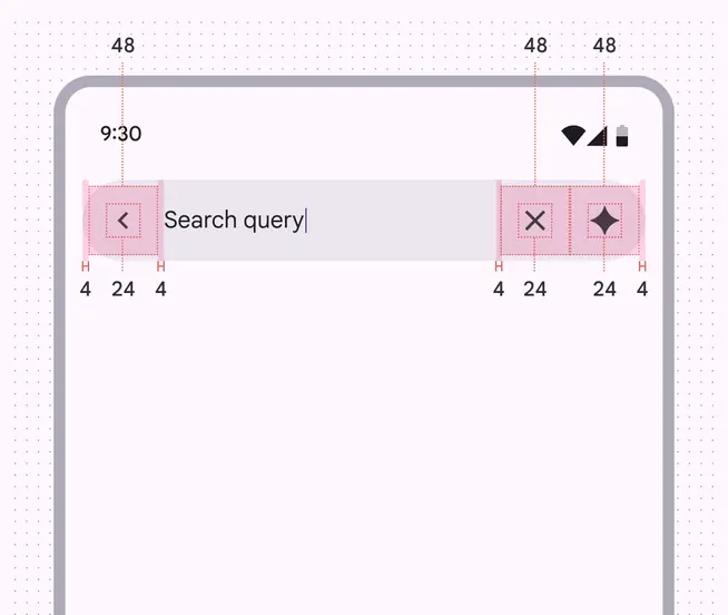
Full-screen search padding and size measurements for contained style
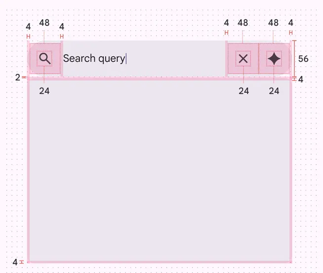
Docked search padding and size measurements for contained style
| Element | Attribute | Value |
|---|---|---|
| Full-screen container | Width | Full width |
| Full-screen container | Height | Full height |
| Docked container | Width | Min: 360dp, max: 720dp |
| Docked container | Height | Min: 240dp, max: 2/3 of screen height |
| Search bar container | Height | 56dp |
| Search bar container | Label alignment | Start-aligned |
| Search bar container | Leading padding | 16dp |
| Search bar container | Trailing padding | 16dp |
| Search bar container | Leading icon and label padding (from tap target) | 4dp |
| Search bar container | Leading icon and label padding (from tap target) | 4dp |
Divided style
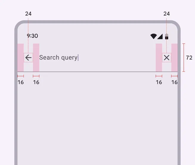
Full-screen search padding and size measurements for divided style
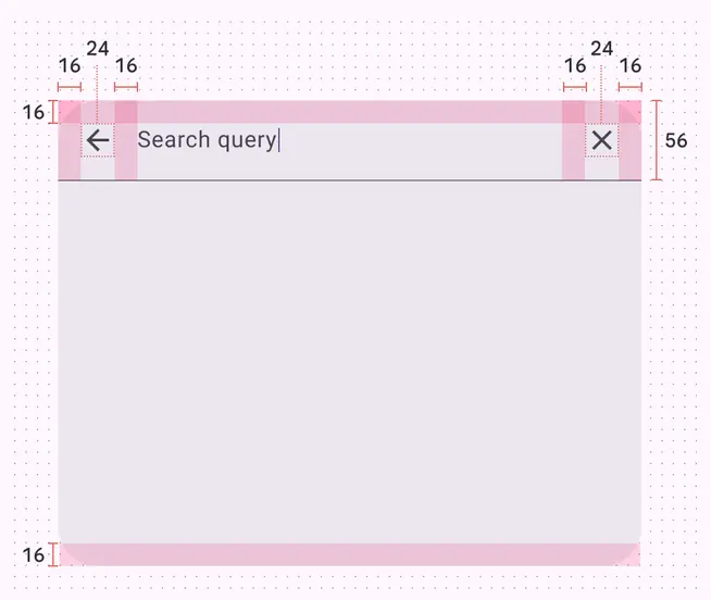
Docked search padding and size measurements for divided style