Color roles
There are 26 standard color roles organized into six groups: primary, secondary, tertiary, error, surface, and outline

What are color roles?
Color roles are like the "numbers" in a paint-by-number canvas. They're the connective tissue between elements of the UI and what color goes where.
Color roles are mapped to Material Components
You'll use these color roles whether you're using the static baseline scheme or dynamic color. If your product contains custom components, they'll need to be properly mapped to this set of color roles.
Color roles ensure accessibility
The color system is built on accessible color pairings. These color pairs provide an accessible minimum 3:1 contrast.
Color roles are tokenized
Roles are implemented in design and code through tokens. A design token represents a small, reusable design decision that’s part of a design system's visual style.
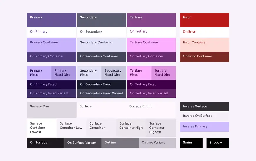
Diagram of all Material color roles, including optional add-on roles for surface colors and fixed accent colors
General concepts
Here are helpful-to-know words you'll see in the names of color roles:
- Surface – A role used for backgrounds and large, low-emphasis areas of the screen.
- Primary, Secondary, Tertiary – Accent color roles used to emphasize or de-emphasize foreground elements.
- Container – Roles used as a fill color for foreground elements like buttons. They should not be used for text or icons.
- On – Roles starting with this term indicate a color for text or icons on top of its paired parent color. For example, on primary is used for text and icons against the primary fill color.
- Variant – Roles ending with this term offer a lower emphasis alternative to its non-variant pair. For example, outline variant is a less emphasized version of the outline color.
Pairing and layering colors
To ensure accessible visual contrast in your app, apply colors only in the intended pairs or layering orders described in the following sections.
Combining colors improperly may break contrast necessary for visual accessibility, particularly when colors are adjusted through dynamic color features such as user-controlled contrast.
Do
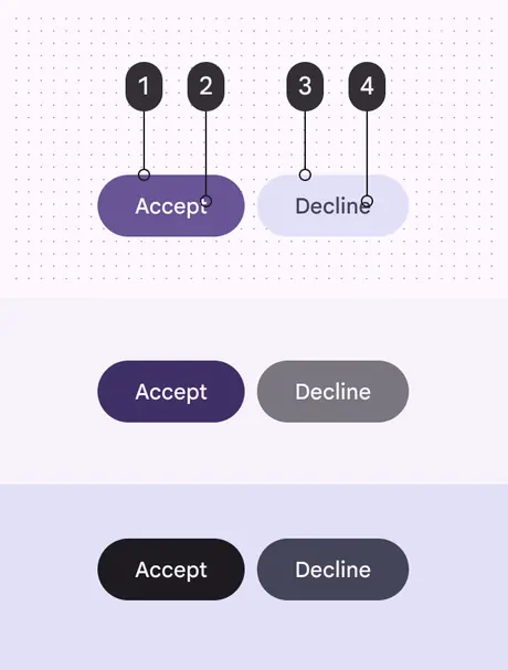
Pair and layer color roles as intended to ensure expected visual results and accessibility. In this example, the two buttons mapped with (1) primary, (2) on primary, (3) secondary container, and (4) on secondary container stay legible as the contrast level changes.
Don't
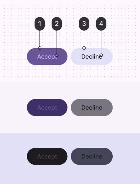
Improper color mappings can produce unintended visual results and break accessibility. In this example, the two buttons mapped with (1) primary, (2) primary container, (3) secondary container, and (4) on surface become illegible as the contrast level changes.
Accent color roles
Accent color roles include primary, secondary, and tertiary. Assign them to elements in the UI based on importance and needed emphasis. Use caution when changing color roles for visual effect.
- Primary roles are for important actions and elements needing the most emphasis, like a FAB to start a new message.
- Secondary roles are for elements that don’t need immediate attention and don’t need emphasis, like the selected state of a navigation icon or a dismissive button.
- Tertiary roles are for smaller elements that need special emphasis but don't require immediate attention, such as a badge or notification.
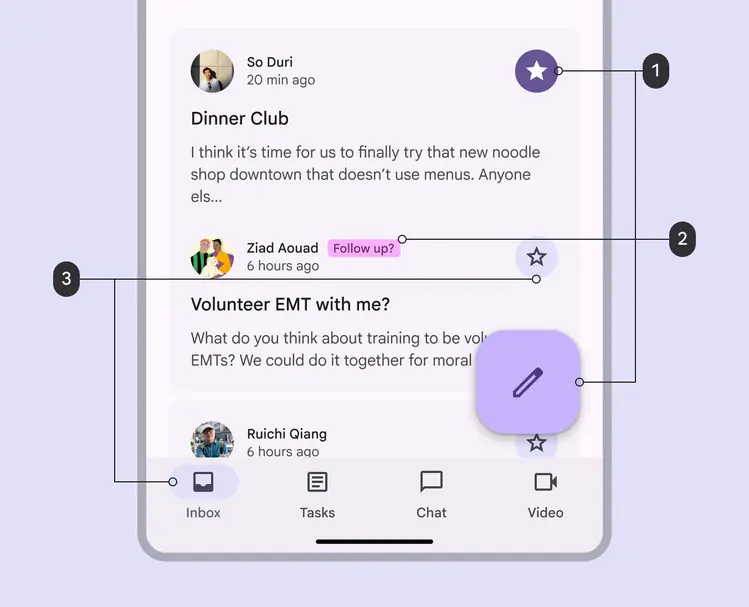
- Primary colors are used for the most important elements, like a starred message and FAB to start a new message
- Tertiary colors are used for smaller emphasized elements, like a badge suggesting a follow up
- Secondary colors are used for less urgent elements, like the background of an inactive star icon and the selection state of an inbox icon
Primary
Use primary roles for the most prominent components across the UI, such as the FAB, high-emphasis buttons, and active states.
Primary: High-emphasis fills, texts, and icons against surface
On primary: Text and icons against primary
Primary container: Standout fill color against surface, for key components like FAB
On primary container: Text and icons against primary container
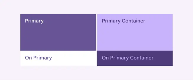
Primary color roles include primary and primary container, with their respective “On” colors
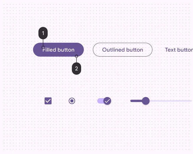
- On primary
- Primary
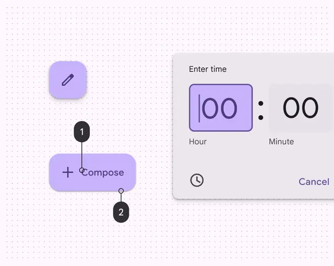
- On primary container
- Primary container
Secondary
Use secondary roles for less prominent components in the UI such as filter chips.
There are four secondary roles:
Secondary: Less prominent fills, text, and icons against surface
On secondary: Text and icons against secondary
Secondary container: Less prominent fill color against surface, for recessive components like tonal buttons
On secondary container: Text and icons against secondary container
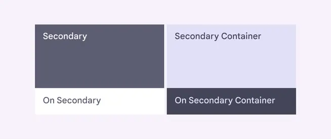
Secondary color roles include secondary and secondary container, with their respective "On" colors
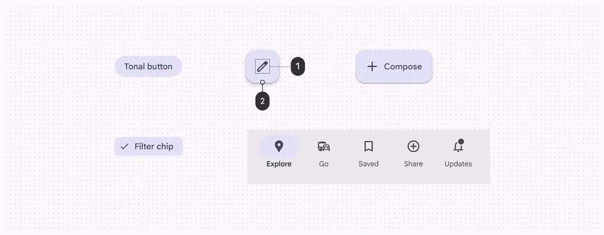
- Icon: On secondary container
- Button: Secondary container
Tertiary
Use tertiary roles for contrasting accents that balance primary and secondary colors or bring heightened attention to an element such as an input field.
There are four tertiary roles:
Tertiary: Complementary fills, text, and icons against surface
On tertiary: Text and icons against tertiary
Tertiary container: Complementary container color against surface, for components like input fields
On tertiary container: Text and icons against tertiary container
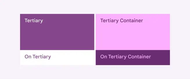
Tertiary color roles include tertiary and tertiary container, with their respective "On" colors
The tertiary color roles can be applied at the designer's discretion. They're intended to support broader color expression.
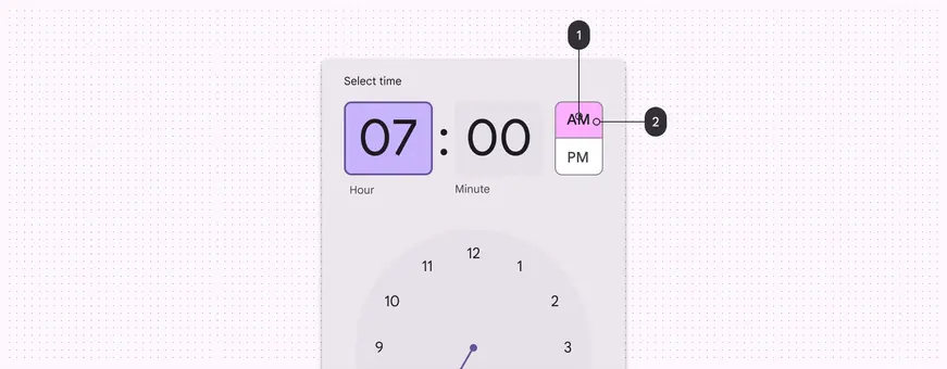
- On tertiary container
- Tertiary container
Error
Use error roles to communicate error states, such as an incorrect password entered into a text field.
There are four error roles:
Error: Attention-grabbing color against surface for fills, icons, and text, indicating urgency
On error: Text and icons against error
Error container: Attention-grabbing fill color against surface
On error container: Text and icons against error container
Error is an example of a static color (it doesn't change even in dynamic color schemes). Error color roles are made static by default with any dynamic color scheme. They still adapt to light and dark theme.
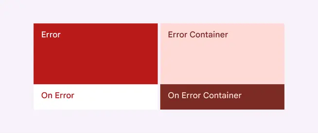
Error color roles include error and error container with their respective "On" colors.
Surface
Use surface roles for more neutral backgrounds, and container colors for components like cards, sheets, and dialogs.
There are three surface roles:
Surface: Default color for backgrounds
On surface: Text and icons against any surface or surface container color
On surface variant: Lower-emphasis color for text and icons against any surface or surface container color
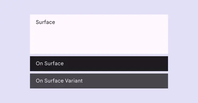
Surface and on surface roles in light theme
There are also five surface container roles named based on their level of emphasis:
Surface container lowest: Lowest-emphasis container color
Surface container low: Low-emphasis container color
Surface container: Default container color
Surface container high: High-emphasis container color
Surface container highest: Highest-emphasis container color
Surface container is the default role, but the others are especially helpful for creating hierarchy and nested containers in layouts for expanded screens.
The five surface container roles, shown in light and dark theme
The most common combination of surface roles uses surface for a background area and surface container for a navigation area.
Text and icons typically use on surface and on surface variant on all types of surfaces.
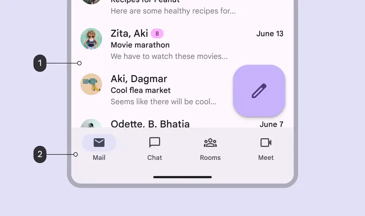
- Surface
- Surface container
All color mappings – but especially surface colors – should remain the same for layout regions across breakpoints. For example, the body area will use the surface color and the navigation area will use the surface container color on both mobile and tablet.
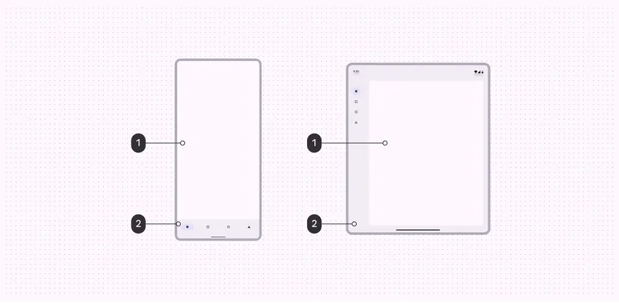
- Surface
- Surface container
Depending on necessary hierarchy, feature area, and design logic, you can use add-on surface colors in larger window class sizes as long as colors are consistently applied.
In this example, the body and navigation regions have the same color roles across breakpoints (surface and surface container, respectively) with the addition of other surface container colors at larger sizes.
By default, neutral-colored components such as navigation bars, menus, or dialogs are mapped to specific surface container roles, but these roles can be remapped by makers to suit user needs.
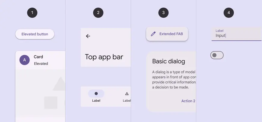
Default surface container roles applied to components:
- Surface container low
- Surface container
- Surface container high
- Surface container highest
Inverse colors
Inverse roles are applied selectively to components to achieve colors that are the reverse of those in the surrounding UI, creating a contrasting effect.
Inverse surface: Background fills for elements which contrast against surface
Inverse on surface: Text and icons against inverse surface
Inverse primary: Actionable elements, such as text buttons, against inverse surface
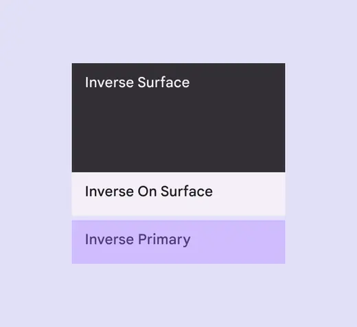
Inverse surface, inverse on surface, and inverse primary roles in the color scheme, shown in light theme
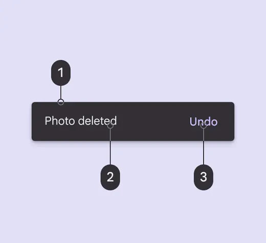
A snackbar which uses:
- Inverse surface for its background
- Inverse on surface for its text
- Inverse primary for its text button
Outline
There are two outline colors to be used against a surface:
Outline: Important boundaries, such as a text field outline
Outline variant: Decorative elements, such as dividers, and when other elements provide 4.5:1 contrast
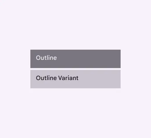
Outline and outline variant roles in the color scheme, shown in light theme
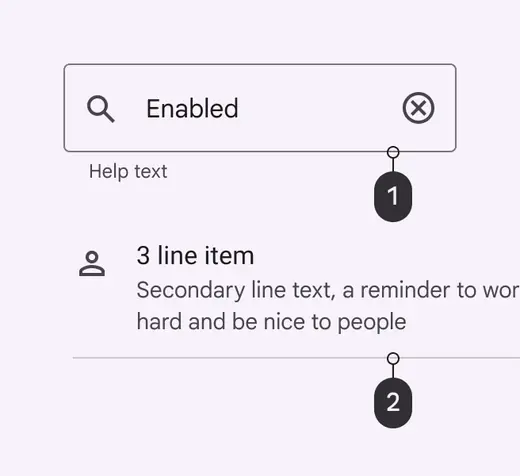
- A text field which uses outline for its container border
- A list item which uses outline variant for its divider line
Don't
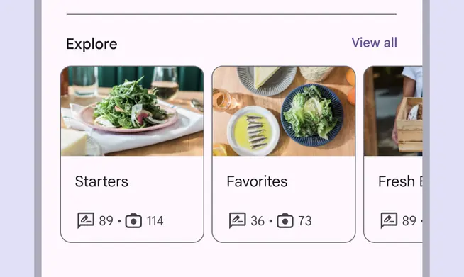
Don’t use the outline color for dividers since they have different contrast requirements. Instead, use outline variant.
Don't

Don’t use the outline color for components that contain multiple elements, such as cards. Instead, use outline variant.
Don't
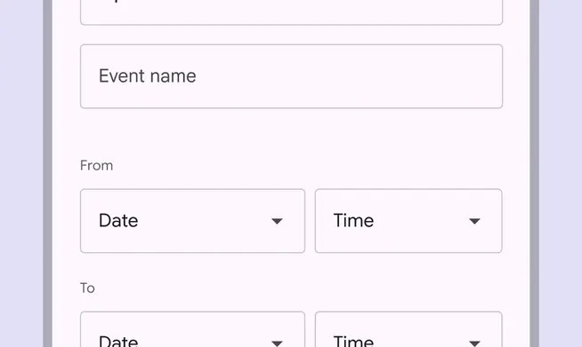
Don’t use the outline variant color to create visual hierarchy or define the visual boundary of targets. Instead, use the outline color or another color providing 3:1 contrast with the surface color.
Caution
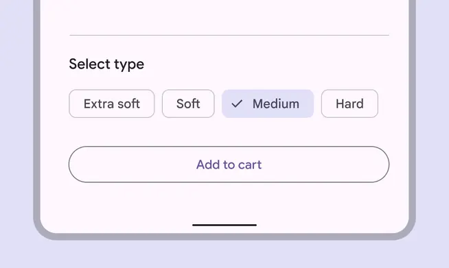
The outline variant color can be used for the border of targets like chips and buttons, provided that those targets contain elements inside them that provide visual contrast. In this example of chips and buttons, the icons and text inside the targets meet 4.5:1 contrast.
Add-on color roles
Most products won't need to use these add-on color roles. However, some products require the greater flexibility and control that add-on roles provide. If you aren't sure whether your product should use the add-on roles, it probably shouldn't and you can ignore them.
Fixed accent colors
Primary fixed, secondary fixed, and tertiary fixed are fill colors used against surface. These colors maintain the same tone in light and dark themes, as opposed to regular container colors, which change in tone between these themes. The fixed color role may be used instead of the equivalent container role in situations where such fixed behavior is desired.
The primary fixed dim, secondary fixed dim, and tertiary fixed dim roles provide a stronger, more emphasized tone relative to the equivalent fixed color. They may be used where a deeper color but the same fixed behavior is desired.
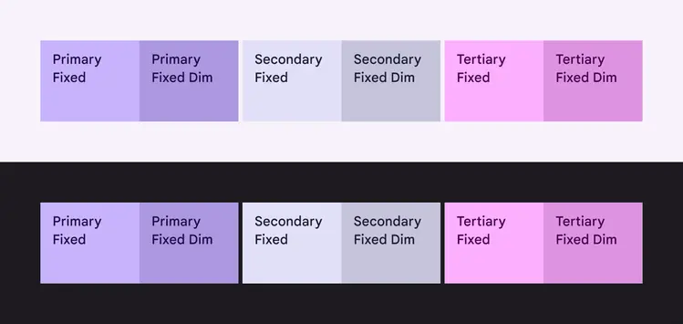
Fixed and fixed dim color roles for the primary, secondary, and tertiary color groups, shown in both light and dark themes. Note how the colors stay the same between themes.
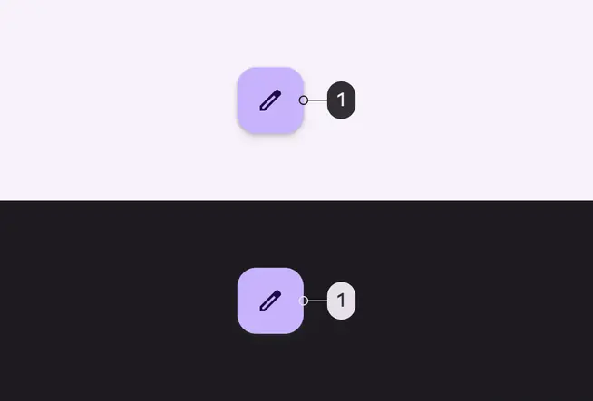
A FAB which uses primary fixed (1) for its container fill color, shown in light and dark themes. Note how the container color stays the same between themes.
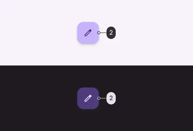
For comparison, a FAB which uses primary container (2) for its container fill color, shown in light and dark themes. Note how the container color changes tone between themes.
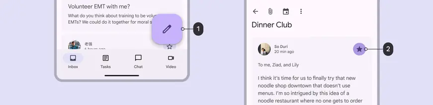
Examples of fixed and fixed dim colors in use:
- Primary fixed for a FAB container color
- Primary fixed dim for an icon button container
Don't
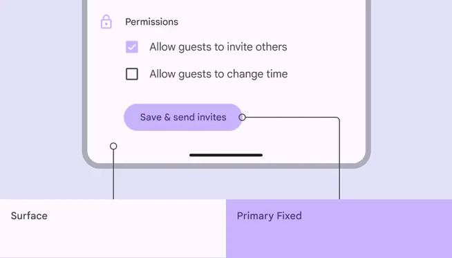
Fixed colors don't change based on light or dark theme, so they're likely to cause contrast issues. Avoid using them where contrast is necessary.
Do
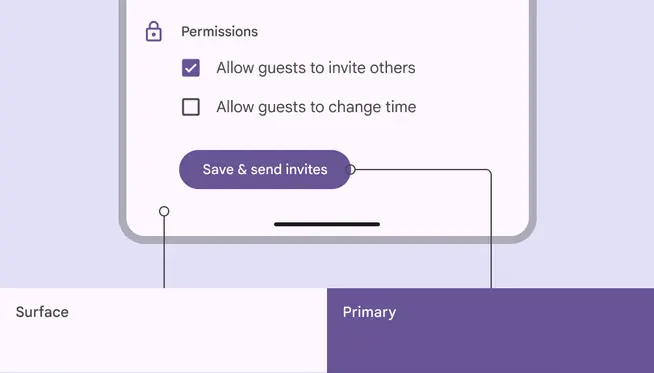
Use primary, secondary, and tertiary roles for accent colors where contrast is needed
On fixed accent colors
On fixed colors are used for text and icons which sit on top of the corresponding Fixed color. For example, on primary fixed is used for text and icons against the primary fixed color. The same usage applies for the equivalent secondary and tertiary colors.
On fixed variant colors are used for text and icons needing lower emphasis against the corresponding fixed color. For example, on primary fixed variant is used for low emphasis text and icons against the primary fixed color. The same usage applies for the equivalent secondary and tertiary colors.
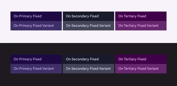
On fixed and on fixed variant color roles for the primary, secondary, and tertiary accent groups, shown in both light and dark themes
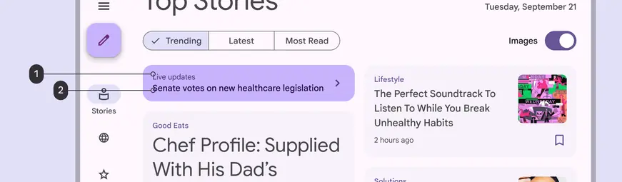
A customized banner which uses on primary fixed variant (1) for its deemphasized text and (2) on primary fixed for its emphasized text
Bright and dim surface roles
There are two add-on surface roles:
- Surface dim: Dimmest surface color in light and dark themes
- Surface bright: Brightest surface color in light and dark themes

Surface dim, surface, and surface bright in light theme

Surface dim, surface, and surface bright in dark theme
While the default surface color automatically inverts between light and dark themes (it’s a light color in light theme and it flips to a dark color in dark theme), the surface bright and surface dim colors invert in a slightly different way. More precisely, they keep their relative brightness across both light and dark theme.
For example, in an interface using the default surface role, the mapped area is the brightest in light theme and the dimmest in dark theme. In an interface using the surface bright role, the mapped area is the brightest in both light and dark theme.
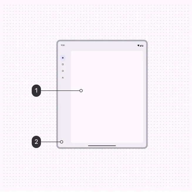
Light theme
- Surface
- Surface container
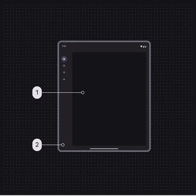
Dark theme
- Surface
- Surface container
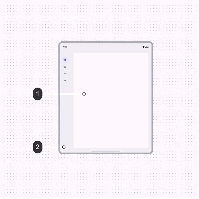
Light theme
- Surface bright
- Surface container
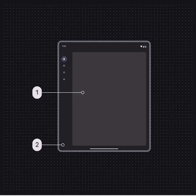
Dark theme
- Surface bright
- Surface container
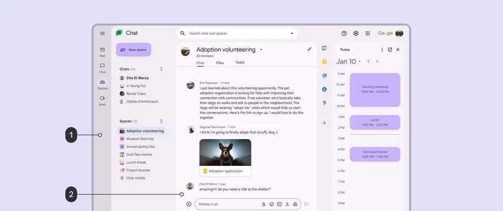
- Navigation rail with surface dim background
- Chat window with surface bright background