Cards
Cards display content and actions about a single subject.
Overview · Specs · Guidelines · Accessibility
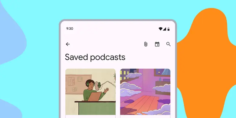
- Use cards to contain related elements
- Three variants: elevated, filled, outlined
- Contents can include anything from images to headlines, supporting text, buttons, and lists
- Can also contain other components
- Cards have flexible layouts and dimensions based on their contents
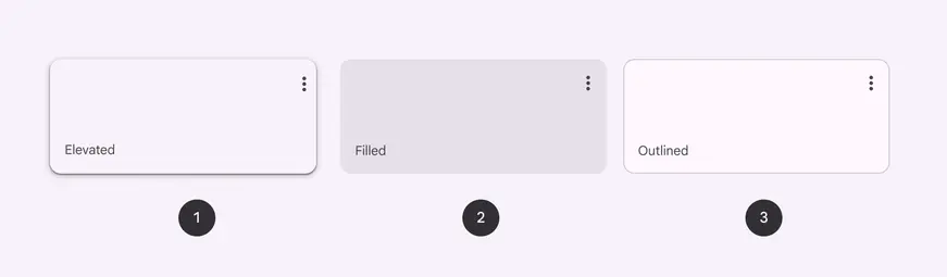
- Elevated card
- Filled card
- Outlined card
Availability & resources
| Type | Resource | Status |
|---|---|---|
| Design | Design Kit (Figma) | Available |
| Implementation | Flutter | Available |
| Implementation | Android Views (MDC-Android) | Available |
| Implementation | Jetpack Compose | Available |
| Implementation | Web | Unavailable |
Differences from M2
- Color: New color mappings and compatibility with dynamic color
- Elevation: Lower elevation and no shadow by default
- Variants: Three official card variants – elevated, filled, and outlined
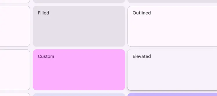
Cards have updated colors, elevation, and variants