Color system
Create accessible, personal color schemes communicating your product's hierarchy, state, and brand
Overview · How the system works

The Material color system includes:
- Built-in set of accessible color relationships
- 26+ color roles mapped to Material Components
- Built-in dark theme colors
- Static baseline color scheme with default colors assigned to each color role
- Dynamic color features including user-generated and content-based color
Learn about the value and function of Material 3’s dynamic color system and how it differs from past color systems
View transcript
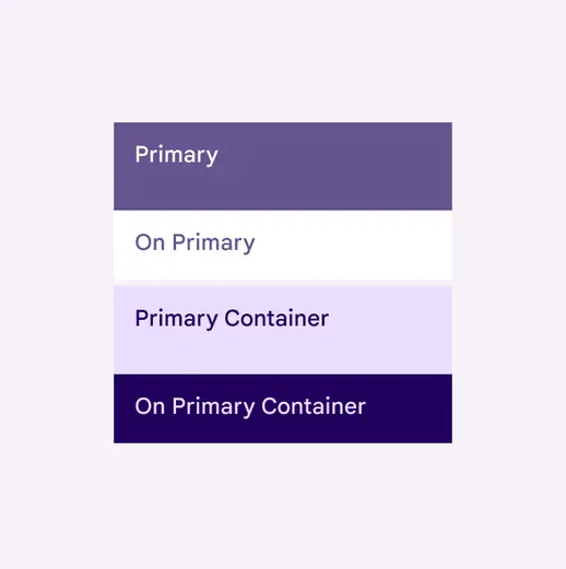
The baseline color scheme doesn't dynamically change
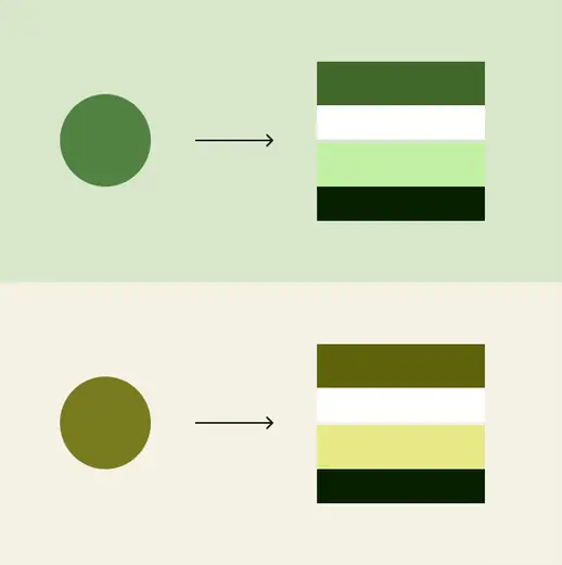
A dynamic color scheme changes the UI's colors based on different inputs, like a wallpaper
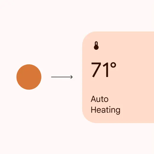
Specific colors, such as semantic colors, can be set to not dynamically change
Products with dynamic color can automatically generate and assign colors to each element in the UI.
This provides:
- Personalized UI
- Accessible contrast
- User-controlled contrast
- Automatic dark theme
The UI colors change dynamically
Resources
| Type | Link | Status |
|---|---|---|
| Design | Design Kit (Figma) | Available |
| Implementation | Android Views (MDC-Android) | Available |
| Implementation | Jetpack Compose | Available |
| Implementation | Flutter | Available |
| Tools | Material Theme Builder | Available |
What's new
May 2025
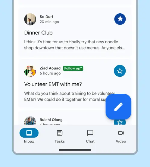
Three levels of contrast
Color roles support three levels of contrast so people can select the one that best suits their vision needs. Contrasts also are tokenized.
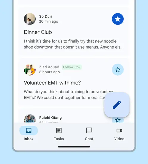
Standard contrast
Medium contrast
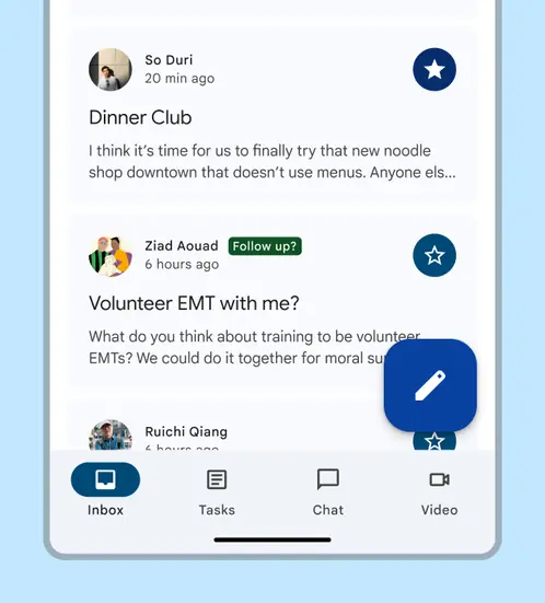
High contrast
August 2024
More colorful text and icons
The following color roles are updated in light theme to be more colorful while still having accessible color contrast:
- On primary container
- On secondary container
- On tertiary container
- On error container
Affected components:
Badges
Buttons
- Buttons
- Extended FAB
- FAB
- Icon buttons
- Segmented buttons
Chips
Lists
Menus
Navigation bar
Navigation drawer
Navigation rail
Switches
Toolbars
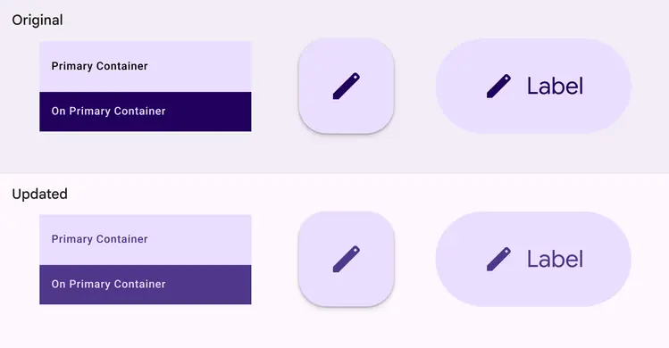
Colors used for text and icons now appear more colorful
Oct 2023
Reorganized guidelines
Same color system, explained in a new way. Updated sections include:
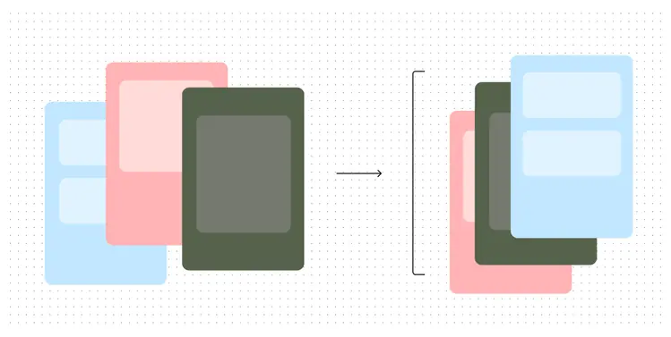
The guidelines have been reorganized and updated
Feb 2023
Tone-based surface colors
Tone-based surface color roles have replaced the previous approach of surfaces at +1 to +5 elevation. The new color roles are not tied to elevation and offer more flexibility and support for color features, such as user-controlled contrast.
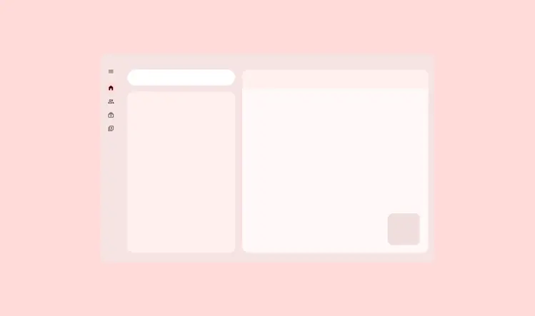
New tone-based surface colors offer more flexibility and support
Technical changes were made to align the color system with Android SysUI:
- Updated the default light theme surface from tone 99 to tone 98
- Updated the chroma for the neutral palette, increasing it from 4 to 6
- Slightly darkened surface roles in dark theme
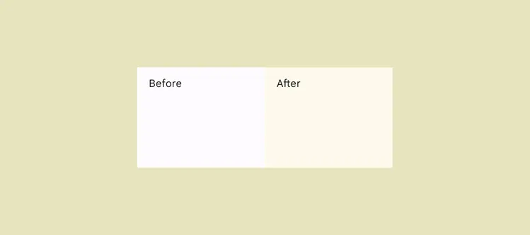
Changes in tone and chroma in the default light theme surface
Feb 2023
Additional accent colors
Additional accent colors in the scheme provide more flexibility and choice for color application. In particular, a new set of fixed colors for the primary, secondary, and tertiary accent groups provide colors which stay the same across light and dark themes.
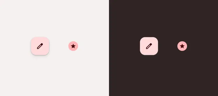
Additional accent colors provide more choice for color application