States
States show the interaction status of a component or UI element
Overview · State layers · Applying states

- States have two visual indicators to ensure accessibility
- States can be combined, such as selection and hover
- Apply states consistently across components
Resources
| Type | Link | Status |
|---|---|---|
| Design | Design Kit | Available |
1. Enabled
An enabled state communicates an interactive component or element.
2. Disabled
A disabled state communicates an inoperable component or element.
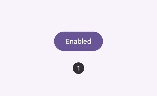
Enabled button
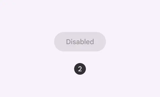
Disabled button
3. Hover
A hover state communicates when a user has placed a cursor above an interactive element.
4. Focused
A focused state communicates when a user has highlighted an element, using an input method such as a keyboard or voice.
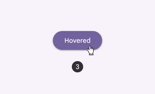
Hovered button
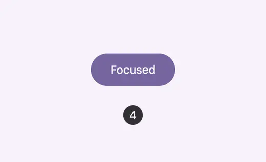
Focused button
5. Pressed
A pressed state communicates a user tap.
6. Dragged
A dragged state communicates when a user presses and moves an element.
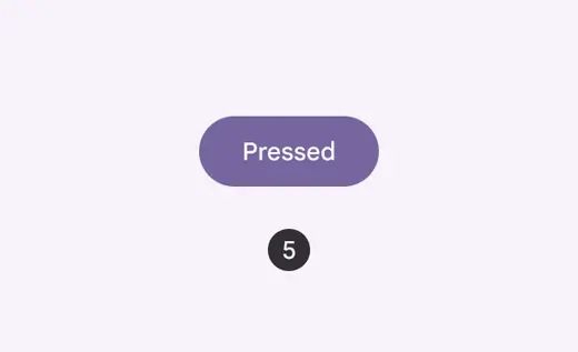
Pressed button
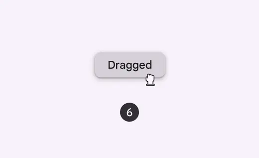
Dragged chip