Navigation drawer
Navigation drawers let people switch between UI views on larger devices. Navigation drawers provide access to destinations in your app.
Overview · Specs · Guidelines · Accessibility

Note
The navigation drawer is no longer recommended in the Material 3 Expressive update. For those who have updated, use an expanded navigation rail, which has mostly the same functionality of the navigation drawer and adapts better across breakpoints.
- Use standard navigation drawers in expanded, large, and extra-large breakpoints
- Use modal navigation drawers in compact and medium breakpoints
- Can be open or closed by default
- Two variants: standard and modal
- Put the most frequent destinations at the top and group related destinations together
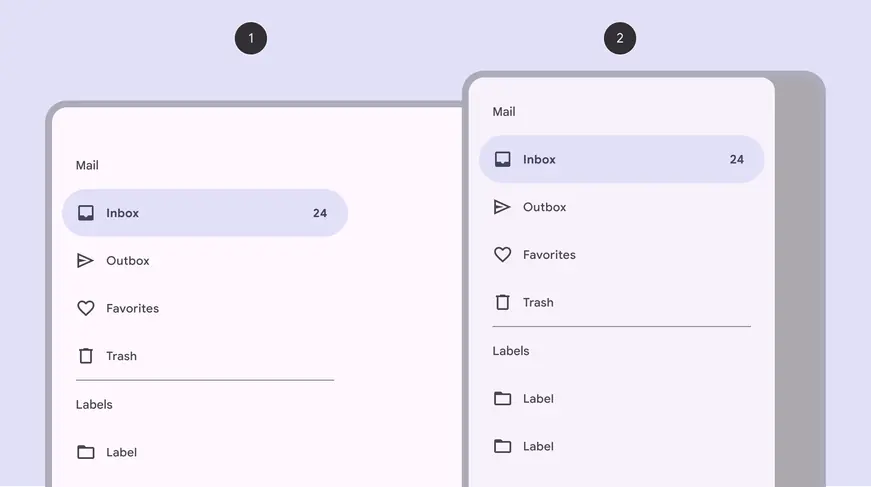
- Standard navigation drawer
- Modal navigation drawer
Availability & resources
| Type | Resource | Status |
|---|---|---|
| Design | Design Kit (Figma) | Available |
| Implementation | Flutter | Available |
| Implementation | Jetpack Compose | Available |
| Implementation | Android Views (MDC-Android) | Available |
| Implementation | Web | Unavailable |
M3 Expressive update
May 2025
The navigation drawer is no longer recommended. Use the expanded navigation rail instead. More on M3 Expressive
Differences from M2
- Color: New color mappings and compatibility with dynamic color
- Variants: Distinguishes two separate variants of navigation drawer: Standard and modal
- Shape: Rounded corners at the ending edge of the drawer
- States: Updated color and shape for indicating selected state
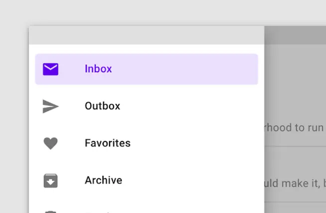
M2: Navigation drawer had square corners and a rectangular shape indicating the active destination
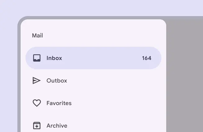
M3: Navigation drawer has rounded corners, new color mappings, and an updated style for indicating the active destination