Shape
The M3 shape system includes original shapes, a corner radius scale, and built-in shape morphing
Overview & principles · Corner radius scale · Shape morph
Material components use a corner radius scale to define all rectangular shapes, such as buttons, carousels, and dialogs.

M3 defines corner radii using a shape scale. This can be used to create both uniform and asymmetrical shapes.
Shape tokens
Material has shape corner tokens to define all corners, and corner-value tokens for individual corners. Learn more about design tokens
Design tokens
Token table
Machine-readable relationship table
Shape tokens · 1 token set · 24 tokens · live token table · DSDB TOKEN_TYPE_UNSPECIFIED.20543ce18892f7d9
- Default context: none
- Not configurable here (group default used): Theme: Light · Platform: Android · Audience: 1P Baseline · Motion scheme: Standard · Font: Static · Contrast: Default · iOS dark theme elevation: None · iOS weight setting: Default · Language height: Small
- Reference chain: aliases from the token to its source value (
token → alias → … → value). "—" means the token holds a literal value.
Shape · md.sys.shape · 24 tokens
Corner shape and directional modifier (like "top" or "end") tokens.
| Group | Token | Type | Reference chain | Resolved value |
|---|---|---|---|---|
| All tokens | md.sys.shape.corner.full | Shape | — | Circular (fully rounded) |
| All tokens | md.sys.shape.corner.extra-large.top | Shape | — | Rounded corners: top-left 28dp, top-right 28dp |
| All tokens | md.sys.shape.corner.extra-large | Shape | — | Rounded corners 28dp |
| All tokens | md.sys.shape.corner.large.top | Shape | — | Rounded corners: top-left 16dp, top-right 16dp |
| All tokens | md.sys.shape.corner.large.end | Shape | — | Rounded corners: top-right 16dp, bottom-right 16dp |
| All tokens | md.sys.shape.corner.large.start | Shape | — | Rounded corners: top-left 16dp, bottom-left 16dp |
| All tokens | md.sys.shape.corner.large | Shape | — | Rounded corners 16dp |
| All tokens | md.sys.shape.corner.medium | Shape | — | Rounded corners 12dp |
| All tokens | md.sys.shape.corner.small | Shape | — | Rounded corners 8dp |
| All tokens | md.sys.shape.corner.extra-small.top | Shape | — | Rounded corners: top-left 4dp, top-right 4dp |
| All tokens | md.sys.shape.corner.extra-small | Shape | — | Rounded corners 4dp |
| All tokens | md.sys.shape.corner.none | Shape | — | Rounded corners 0dp |
| All tokens | md.sys.shape.corner.large-increased | Shape | — | Rounded corners 20dp |
| All tokens | md.sys.shape.corner.extra-large-increased | Shape | — | Rounded corners 32dp |
| All tokens | md.sys.shape.corner.extra-extra-large | Shape | — | Rounded corners 48dp |
| All tokens | md.sys.shape.corner-value.none | Length | — | 0dp |
| All tokens | md.sys.shape.corner-value.extra-small | Length | — | 4dp |
| All tokens | md.sys.shape.corner-value.small | Length | — | 8dp |
| All tokens | md.sys.shape.corner-value.medium | Length | — | 12dp |
| All tokens | md.sys.shape.corner-value.large | Length | — | 16dp |
| All tokens | md.sys.shape.corner-value.large-increased | Length | — | 20dp |
| All tokens | md.sys.shape.corner-value.extra-large | Length | — | 28dp |
| All tokens | md.sys.shape.corner-value.extra-large-increased | Length | — | 32dp |
| All tokens | md.sys.shape.corner-value.extra-extra-large | Length | — | 48dp |
Corner radius scale
The Material 3 shape system uses a size-based scale with ten styles. Styles are assigned to components based on the desired amount of roundedness.
- None - 0dp
- Extra small - 4dp
- Small - 8dp
- Medium - 12dp
- Large - 16dp
- Large increased - 20dp
- Extra large - 28dp
- Extra large increased - 32dp
- Extra extra large - 48dp
- Full - fully rounded corners
Apply shape styles using tokens

Steps on the scale are named for the amount of roundedness applied to the corner
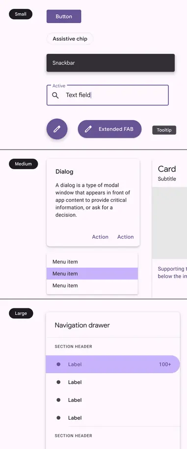
M2: Three-level shape scale based on the size of the component container
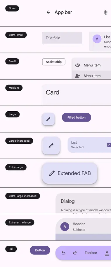
M3: Ten-level shape scale based on the roundedness of shape corners
Symmetry
Components can have either symmetric or asymmetric corner shapes. Symmetric shapes have the same values for all corners, while asymmetric shapes can have corners with different values.
Both symmetric and asymmetric shapes use the same 10-step scale.
Asymmetrical shapes are used in M3 components with closely-grouped items, such as menus and split buttons. These are called inner corners.
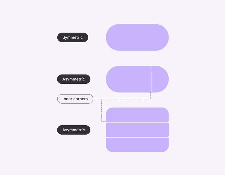
Inner corner component tokens always map to individual corner shape tokens
Customizing shapes
Generally, products should consistently use the Material 3 shape styles. However, customization is sometimes necessary, and even encouraged, for hero moments or custom components. Shapes can be customized at the style or component level.
Style changes
The corner radius shape style, like medium, can be customized to be a different size.
This applies the change to all components mapped to that shape style, unless they have an override.
Customizing the corner size of the medium style applies the change to all components using this style, such as cards and small FABs
Component changes
The style of a specific component, such as a button, can be changed by customizing which corner radius shape style it maps to.
For example, by default, buttons are mapped to the full corner radius shape style. If your product needs a less rounded shape, remap the token to another style in the shape scale, such as small or medium.
Remapping the shape for a component to a different style applies the change to just that component across the UI
The shape style family can be customized from rounded to cut. This makes the corner a straight line instead of curved.
Add extra padding to avoid cutting off content in information-dense components.
For example, a large cut corner on a card will clip content and images in the area more than a rounded corner of the same size.
Caution
Be careful not to apply large or full corners to information-dense components, such as cards
Do

Shapes can be intentionally rounder to add more visual variety
Do

Add unexpected moments by switching between square and fully rounded shapes
Adjust for optical roundness
When nesting rounded objects, avoid using the same corner radii for both objects. This can make the corners look unbalanced.
Instead, adjust the corner radii to be proportional to each other; this is called optical roundness. To calculate optical roundness:
- Outer radius - padding = inner radius
- For example: 48dp - 14dp = 34dp
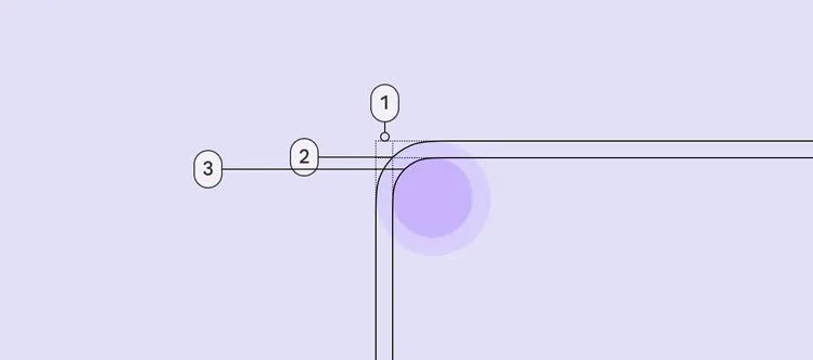
- Padding
- Outer radius
- Inner radius
Do
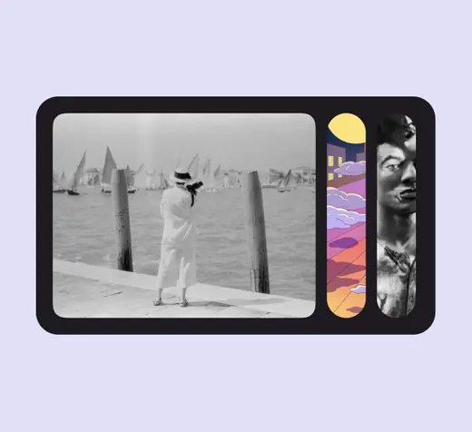
Use different corner radii values for nested components so they have optical roundness
Don't
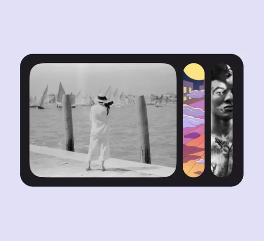
Avoid using the same corner radius value for nested objects
Using the shape library
The Material 3 shape library can be used to create more interesting containers. Use the shape library for mostly visual elements. Avoid applying unconventional shapes to text-heavy containers.
Shapes should be used sparingly to provide a stronger emphasis and moments of delight.

Leverage the Material shape library for moments of delight