Navigation bar
Navigation bars let people switch between UI views on smaller devices. They’re a common navigation component on handheld screens.
Overview · Specs · Guidelines · Accessibility

- Use navigation bars in compact or medium window sizes
- Can contain 3-5 destinations of equal importance
- Destinations don't change. They should be consistent across app screens.

Navigation bar for compact and medium window sizes
Availability & resources
| Type | Resource | Status |
|---|---|---|
| Design | Design Kit (Figma) | Available |
| Implementation | Flutter | Available |
| Implementation | Jetpack Compose | Available |
| Implementation | Jetpack Compose: Expressive | Available |
| Implementation | Android Views (MDC-Android) | Available |
| Implementation | Android Views (MDC-Android): Expressive | Available |
| Implementation | Web | Unavailable |
| Implementation | Web: Expressive | Unavailable |
M3 Expressive update
May 2025
A new flexible navigation bar was introduced to replace the baseline navigation bar. It’s shorter and supports horizontal navigation items in medium windows. More on M3 Expressive
Variants and naming:
Baseline navigation bar is no longer recommended
Added flexible navigation bar
- Shorter height
- Can be used in medium window sizes with horizontal navigation items
Color:
- Active label changed from on-surface-variant to secondary
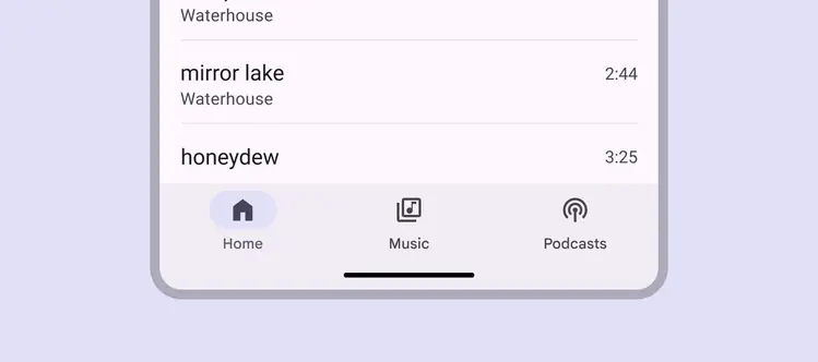
The flexible navigation bar is shorter and can be used in medium windows with horizontal nav items
Differences from M2
- Color: New color mappings and compatibility with dynamic color
- Elevation: No shadow
- Layout: Container height is taller
- States: The active destination can be indicated with a pill shape in a contrasting color
- Name: Bottom navigation has been renamed navigation bar
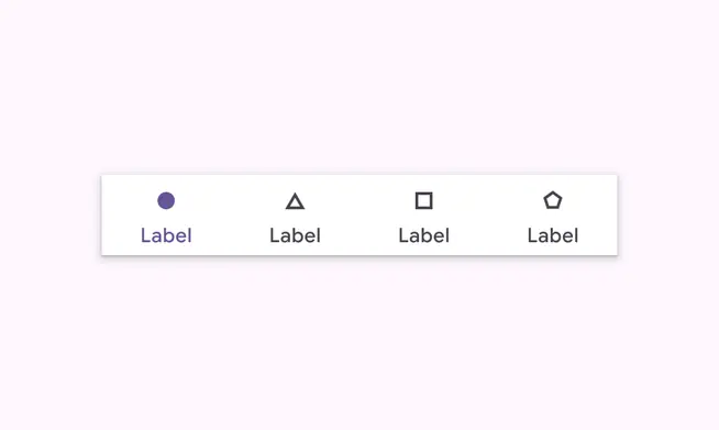
M2: A drop shadow indicates placement on top of content. Filled and regular weight icons indicate active states.
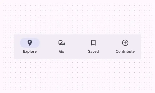
M3: Taller and no drop shadow. Filled icons and an active indicator indicate active state.