---
url: /components/split-button/overview.md
description: >-
Split buttons combine a primary action with a secondary action in a single
component.
---
# Split buttons
Split buttons combine a primary action with a secondary action in a single component.
**Overview** · [Specs](specs.md) · [Guidelines](guidelines.md) · [Accessibility](accessibility.md)
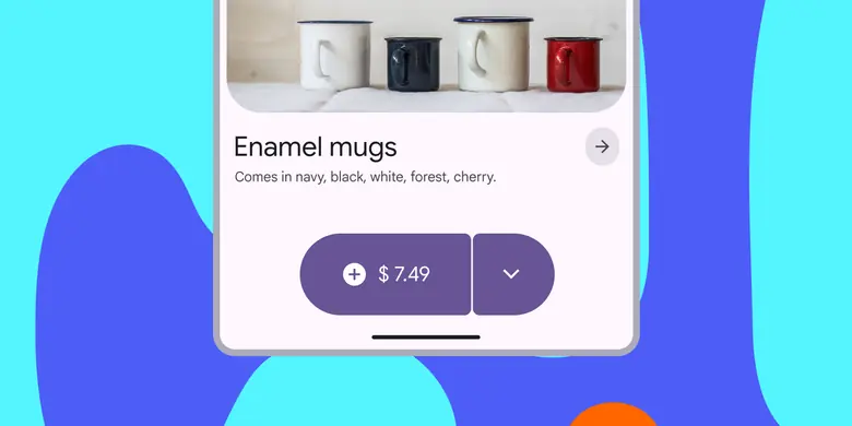
* Use to show an action with a menu of related actions
* Same size range as buttons and icon buttons: XS, S, M, L, XL
Split buttons are made of a common button and a menu icon button
## Availability & resources
| Type | Resource | Status |
| --- | --- | --- |
| Design | [Design Kit (Figma)](https://www.figma.com/community/file/1035203688168086460) | Available |
| Implementation | [Jetpack Compose: Expressive](https://developer.android.com/reference/kotlin/androidx/compose/material3/package-summary#SplitButtonLayout\(kotlin.Function0,kotlin.Function0,androidx.compose.ui.Modifier,androidx.compose.ui.unit.Dp\)) | Available |
| Implementation | [Android Views (MDC-Android): Expressive](https://github.com/material-components/material-components-android/blob/master/docs/components/Button.md#split-button) | Available |
| Implementation | Web: Expressive | Unavailable |
## M3 Expressive update
**May 2025**
The split button has a separate menu button that spins and changes shape when activated. It can be used alongside other buttons of the same size. [More on M3 Expressive](https://m3.material.io/blog/building-with-m3-expressive)
New component added to catalog.
Sizes:
* Extra small
* Small
* Medium
* Large
* Extra large
Color styles:
* Elevated
* Filled
* Tonal
* Outlined
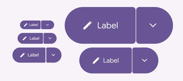
Split buttons have the same five recommended sizes as label and icon buttons