Spacing
Spacing is the distance around and between component and layout elements
Overview · Applying spacing · Tokens

- Apply spacing tokens to the margins, padding, and gaps of a component, UI element, or layout
- Adapt spacing to different values based on context, like mobile vs desktop, or density settings
- The spacing system is measured on an 8dp scale, where space100 = 8dp
- Spacing is applied to the flow of elements (horizontal, vertical), or in relation to the elements (leading, trailing, top, bottom, gap)
- More details on grid & spacing design principles
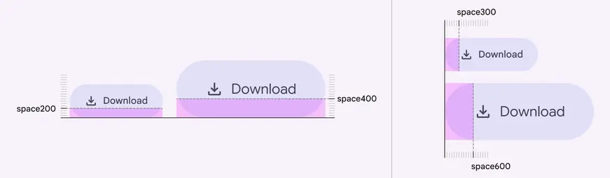
Spacing should adapt to component size, layout, form factor, and other contexts
Availability & resources
| Type | Resource | Status |
|---|---|---|
| Implementation | Android Views (MDC-Android) | Unavailable |
| Implementation | Jetpack Compose | Available |
| Implementation | Web | Unavailable |
| Implementation |
Spacing units
Spacing units follow an 8dp scale. Rather than defining every value, Material only defines the most recommended spacing unit values on the scale. The system can be extended to add more spacing units and patterns as needed. More on spacing tokens
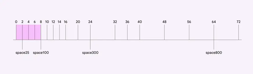
Spacing units are are created as a multiplier from the baseline unit of 8dp, which is space100
Component layouts
In components, spacing units define the padding and gaps between individual elements of a component, such as text, icons, and controls.
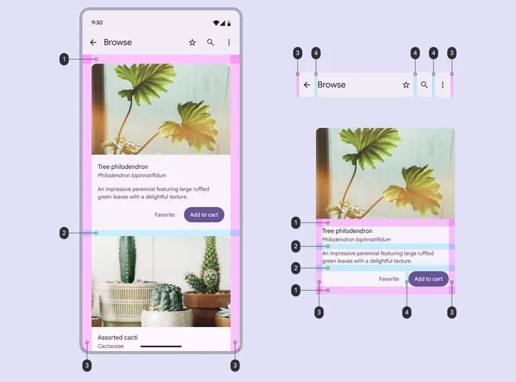
Spacing concepts for components:
- Vertical padding (top & bottom)
- Vertical gap
- Horizontal padding (leading & trailing)
- Horizontal gap
Page layouts
In layouts, spacing units standardize the overall composition of the page, like where text, UI elements, and components go.
Layouts use:
- Panes, spacers, and margins to structure the page
- Padding and gaps to organize content within the panes.
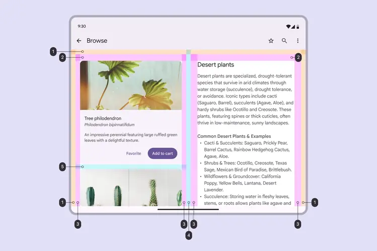
Spacing concepts for layouts:
- Margin
- Top padding
- Horizontal padding (leading & trailing)
- Spacer (gap)
- Vertical gap
Parts of spacing
Spacing has three categories: padding, gaps, and margins.
- Padding: Space inside an element
- Gap: Space between elements in a grid or container
- Margins: Space outside an element
The position of the spacing can be vertical, top, bottom, horizontal, leading, or trailing.
- Leading and trailing edges swap sides in right-to-left (RTL) languages. More on RTL layout design
For example, the search container has:
- 8dp vertical padding
- 8dp horizontal gaps
- 24dp horizontal margins (12dp when focused)
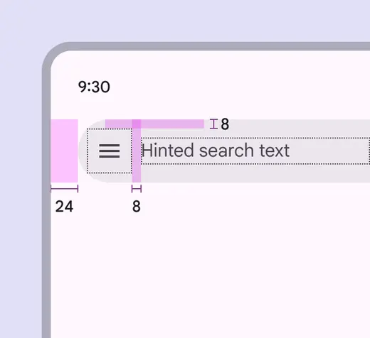
Search horizontal margins are 24dp by default to ensure accurate placement from the screen edge
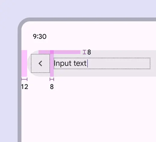
Search margins change to 12dp when focused, while the container padding and horizontal gaps remain the same
Padding
Padding is the spacing inside an element. It adds a buffer from the container edge to the content, like text and icons.
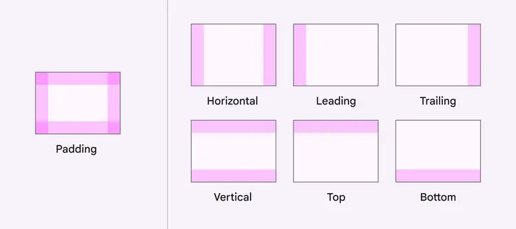
Padding can be horizontal or vertical, or on a specific edge: leading, trailing, top, or bottom
Gaps
Gaps are the spaces between elements in a grid or container. Horizontal gaps are between side-by-side elements, and vertical gaps are between stacked elements.
Use a horizontal gap and vertical gap for simple components where gaps are always the same size.
Complex components with many different gaps should define them by the elements on each side, like an icon-label gap.
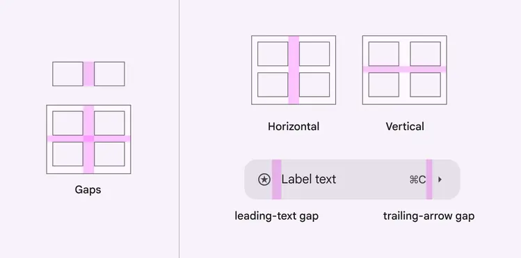
Gaps can be horizontal, vertical, or defined by the elements around it
Margins
Margins are the spacing outside an element. They add a buffer between the element and the parent container or screen edge.
Use padding & gaps before using margins:
- Material rarely uses margins in components; padding and gaps tend to apply spacing in a more uniform way
- Only use margins to apply further spacing beyond the parent container’s padding, or in layouts
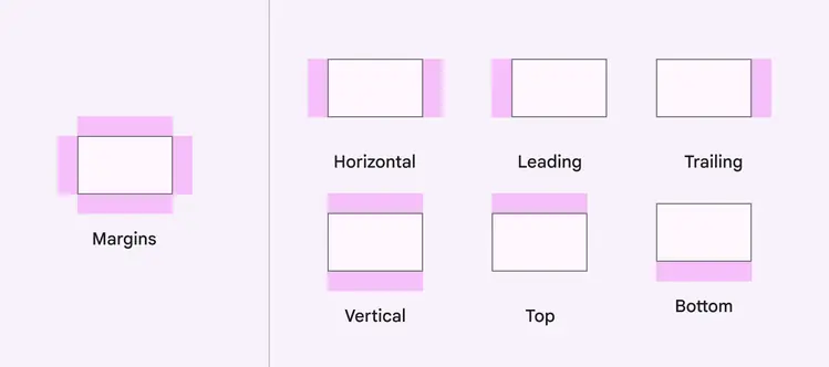
Margins can be horizontal or vertical, or on a specific edge: leading, trailing, top, or bottom
Do
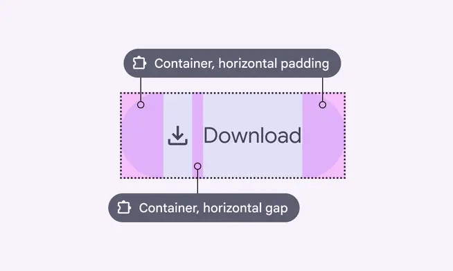
Define padding and gaps on the parent container to organize all elements inside
Don't
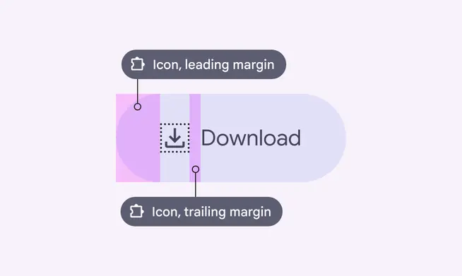
Avoid defining margins on child elements as they usually aren’t uniform, and require more tokens