Static color schemes
Static color schemes are ideal for branded products that should have a consistent, uniform design
Baseline · Custom brand
In a brand-based static scheme, the colors are hand-picked by your team to align with your product's brand color. Brand-based schemes are entirely created and maintained by your team, so this approach requires a larger investment of time and effort.
With a brand color scheme, end-users see
- An accessible UI with static colors
- A product that "looks like its brand"
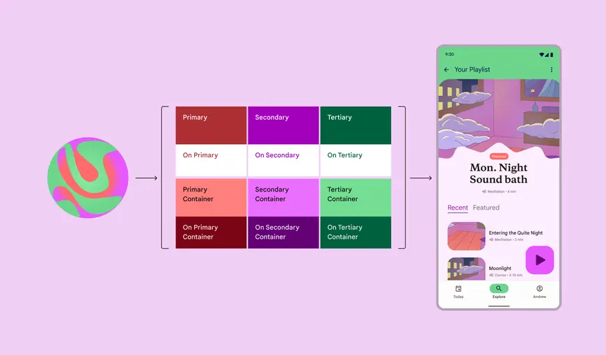
This example meditation app uses a static scheme created from its brand colors.
Create a custom brand color scheme
- Open your Figma design file. Select the Actions menu (or Ctrl/Command+K).
- Find the Material Theme Builder plugin and select Run. This will open a plugin dialog showing the default color scheme, including Core colors and Extended colors.
- Open the plugin's Settings (gear icon at lower right of dialog) and select the checkboxes for both New theme color diagram and Generate State Layers. This will create a handy visualization of your branded color scheme and also generate state layers essential for designing interactions. Learn more about state layers
- Navigate out of settings.
- Open the Current Theme dropdown at the top of the dialog and select + ADD NEW THEME.
- Give your theme a short name (this name will become the prefix of your color roles in Figma).
- Select ADD THEME.
- With Custom selected, select Primary. This opens a dialog prompting you to select a custom source color.
- Enter the Hex value for your brand color and hit Apply.
This will generate a full custom color scheme. You can use the scheme as-is or repeat steps 5 and 6 to set custom sources for the Secondary, Tertiary, Error, Neutral, and Neutral Variant colors.
Want to further adjust your brand color scheme? Check out Advanced customizations
Design with brand colors
Use brand colors in new design files
- Create your Figma file. Enable the M3 Design Kit in your Assets panel.
- Copy your scheme's color diagram and paste it into the file (this makes the color roles available in the Design panel on the right of the screen as part of your local styles)
- Apply your brand color roles to custom components and UI elements by hovering on the element's color property in the Design panel on the right of the screen and selecting the Style icon (four dots). This opens a selection dialog.
- Search for your theme's name to see your brand color roles
- Select the brand color role that most closely matches the use case and intent (see Color roles for more information on what color to use where)
- Repeat until all custom elements are using your brand color roles
Apply brand colors to an existing file or M3 Design Kit components
First, get your brand colors into your file
- Copy your scheme's color diagram and paste it into the file (this makes the color roles available in the Design panel on the right of the screen as part of your local styles)
Swap colors in M3 Design Kit components for your brand colors
- Find the Material Theme Builder plugin and select Run. This will open a plugin dialog showing the default color scheme, including Core colors and Extended colors.
- In the Current Theme dropdown at the top of the dialog, select your scheme
- Select the frames or M3 Design Kit components in your file that need a color update and then hit Swap in the bottom right of the dialog. This will automatically update their colors from baseline colors to your brand colors
Then, update any remaining non-brand color styles
- Manually change any hex values or non-brand color styles by selecting all and looking through the Selection colors in the Design panel on the right of the screen
- Any colors that don't start with your theme name need to be replaced with a corresponding brand color
- Hover on a non-brand color row in the Design panel and select the Style icon (four dots). This opens a selection dialog.
- Search for your theme name to see the brand color roles
- Select the brand color role that most closely matches that color's use case (see Color roles for more information on what color to use where) and select Use style to apply it to the selected objects
- Repeat until all non-brand colors in the file have been replaced with brand color roles
Need to make adjustments to the scheme? Check out Advanced customizations
Develop with brand colors
- Export your branded color scheme from the Material Theme Builder (Available for Jetpack Compose, Android Views, Flutter, Web, or as a JSON file)
- Android: Customize the default theme