Design for watches
Watches have special design considerations and interaction patterns
Overview · Foundations · Styles · Layout
Resources
| Type | Resource |
|---|---|
| Design | M3 Expressive on Wear OS |
| Design | Typography for Wear OS |
| Design | Color for Wear OS |
| Design | Motion for Wear OS |
| Implementation | Android Developers: Wear OS |
| Implementation | Jetpack Compose for Wear OS |
Typography
GM3 Expressive adds two type styles specially designed for watches. More on the type scale for Wear OS
Numerals
Numeral text styles display numbers, usually only a few digits at a time. This text can take on more expressive properties at larger display sizes without the accommodations usually required by text that must be localized.
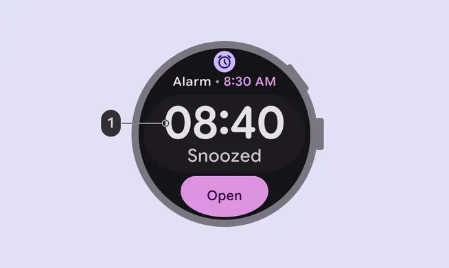
- Numeral Large
Arc text
Arc text is specially designed for text following a curved path on a round screen, such as page titles, confirmation overlays, or a call to action. It optimizes character spacing for text displayed along a curve at the top or bottom of a round screen.
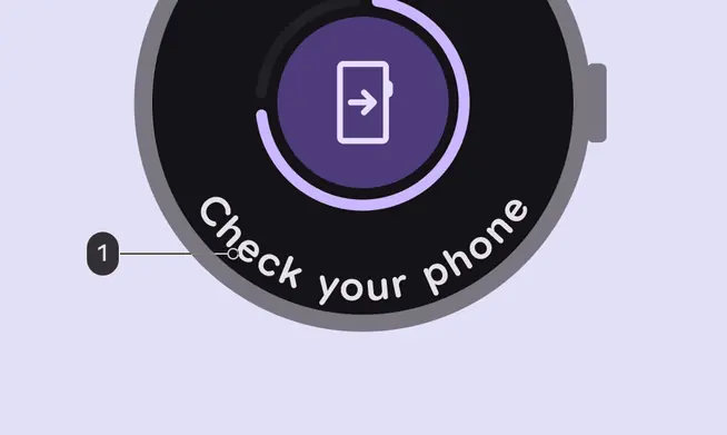
- Arc Large
Color
Material for Wear OS provides a custom color system to create vibrant experiences and clear visual hierarchy.
Build from black
Watches are designed with a black background, instead of the tinted background that phones use.
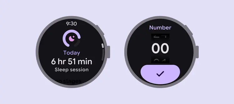
Watches use a black background to conserve battery
Color roles
Since watches are used throughout the day, color tokens for Wear OS are specifically tailored for dark themes in low-light environments and light themes for daylight environments.
More on color roles for Wear OS
Do
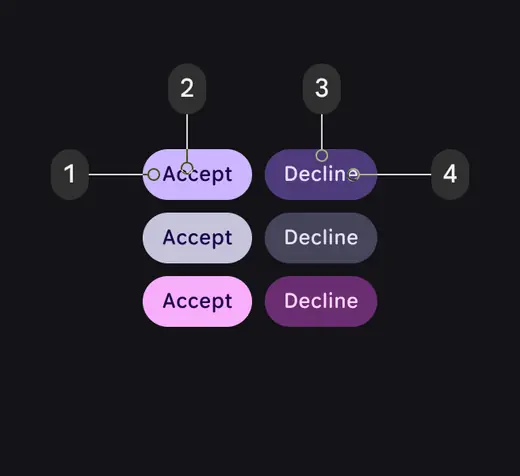
Buttons with (2) on primary on (1) primary and (4) on primary container on (3) primary container stay legible as the contrast level changes
Don't
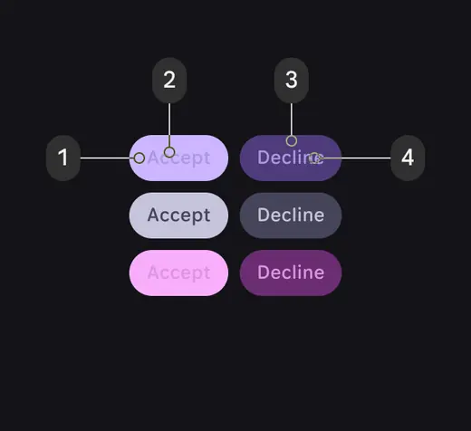
Buttons with (2) primary dim on (1) primary or (4) primary dim on (3) primary container become illegible as contrast levels shift
Recommended color combinations for Wear OS
Below are some common color pairings that can help establish priority, function, and elevation.
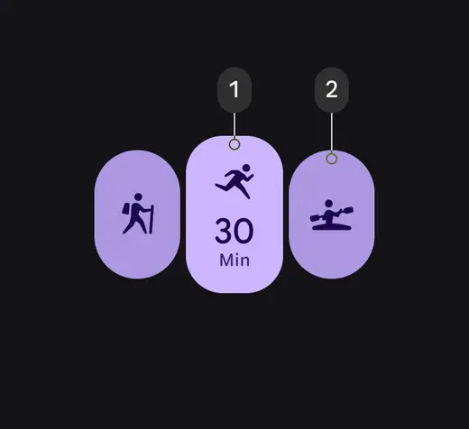
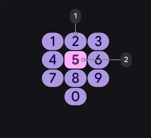
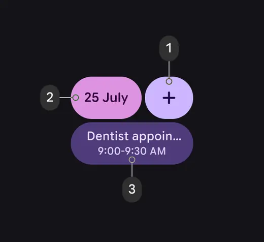
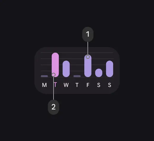
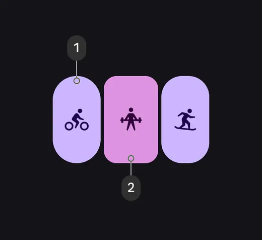
- Use primary dim to highlight important elements and tertiary to provide standout feedback, such as tap responses
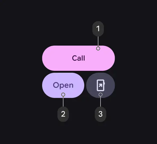
- When the main action isn't clear, use tertiary and primary for main actions and secondary container for complementary actions
- Use secondary and primary container to show two equally important options or containers, while maintaining contrast
- Primary
- Primary dim
- Primary dim
- Tertiary
- Tertiary
- Primary
- Secondary container
- Primary
- Tertiary
- Primary container
- Primary dim
- Tertiary dim
- Primary
- Tertiary dim
Motion and transitions
Expressive motion makes interactions feel more alive, fluid, and natural. Use transitions give intuitive feedback to show how an app works, such as standard patterns for changes in state or hierarchy.
More on shape and motion for Wear OS
Use expressive motion to show items selected
Haptics
Haptics are tactile effects used to grab a person’s attention for something important, or add emphasis to an interaction on the screen. You can use haptics to provide responsive feedback to scrolling and selecting items from a list, or controlling volume.
Use system-defined patterns and tokens (when available) to reinforce interaction expectations. Synchronize haptics with UI motion and sound to provide richer feedback.
- Use stronger haptics for key interactions, such as a payment confirmation
- Use subtler haptics for precision interactions, such as scrolling through a list
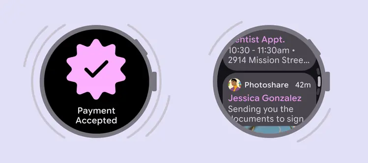
Use stronger haptics for key interactions and subtler feedback for precision interactions