Layout overview
Layout is the visual and strategic arrangement of elements on a screen
Overview · Parts of layout · Adaptive design
Parts of layout
Windows
A window frames and contains an app or product.
Many systems support multi-window views, which display multiple apps at once.
Multi-window support guide for Android
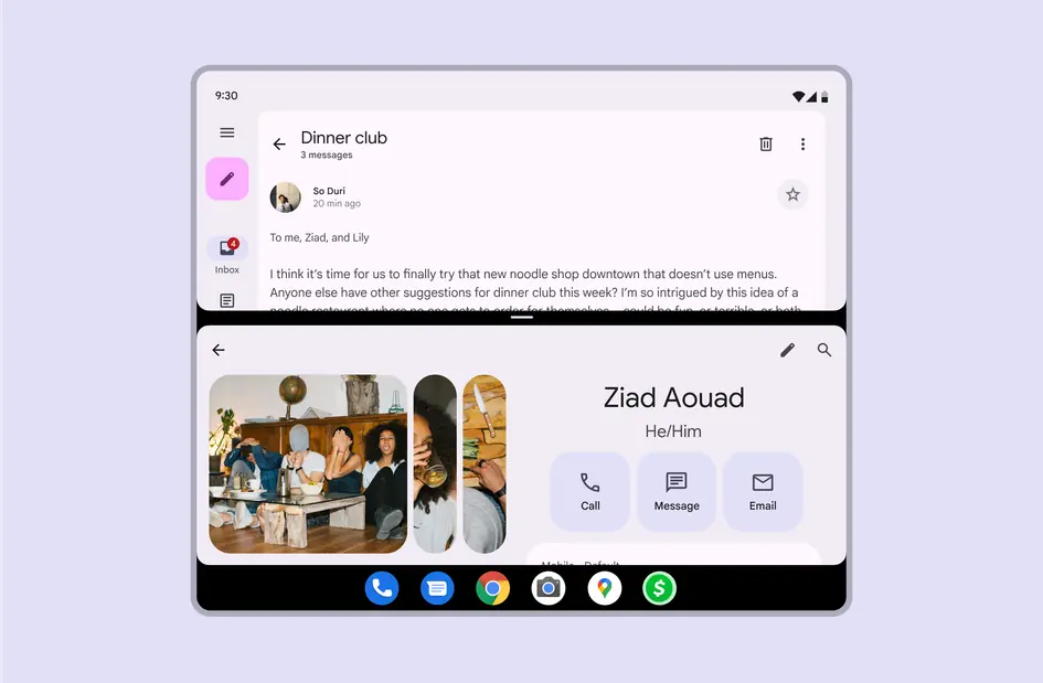
Two windows can be shown at once with a taskbar underneath
On desktop, windows can be resized and moved around freely. They should adapt to various screen sizes.
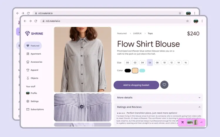
Windows can be moved around, resized, and adapt to different screen sizes
Grids
The layout grid is the foundation for every layout. It provides a structural framework for organizing components, content, and actions.
Use the grid to:
- Group related information in columns
- Apply spacing consistently
- Create focal points for primary actions
- Align building blocks like bars, rails, and panes
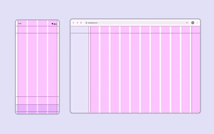
Column count, width, and spacing dynamically adjust to different breakpoints
Layout scaffold
Bars
Bars help people navigate through a product. Use bars to:
- Frame the main content
- Contain an app bar or navigation bar
- Span one or multiple panes

1. App bars are placed at the top of the screen to help people navigate by providing a description of the screen and 1–2 essential actions, like search or back navigation
Rails
Rails are the next level in layout after bars, filling the perimeter space surrounding panes, or floating above them. They contain key elements such as navigation rails, toolbars, chat inputs, FABs, and other primary controls.
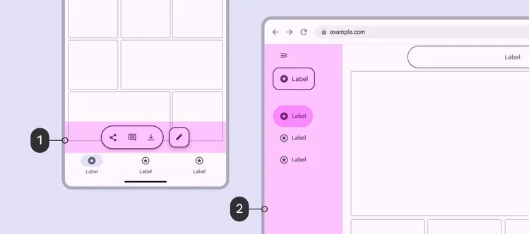
- On mobile, the rail region can contain a toolbar
- On desktop, the rail region can contain the navigation rail
Panes
Just like panes of glass that make up a window in the real world, panes in Material make up most of the layout in a window.
All content must be in a pane. A layout can contain 1–3 panes of various widths, which adapt dynamically to the breakpoint (formerly window size class) and the person’s language setting. For right-to-left (RTL) languages, navigation components will be on the right.
People can navigate to or between panes. Presenting multiple panes at once can make a product more efficient and easier to use.
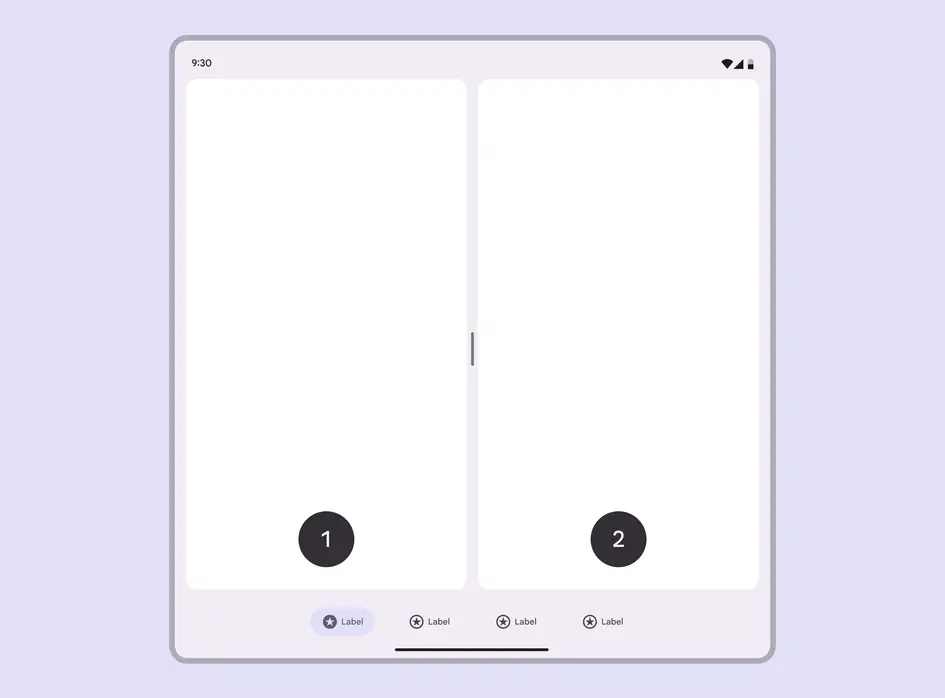
- First pane
- Second pane
Containment
On most devices, panes can blend in with the background. This is called implicit grouping, and helps show relationships between panes.
Explicit grouping uses distinct colors or outlines to visually delineate content.
More on spacing to group content

In multiple-pane layouts, use color to show emphasis and close spacing to group related content
In spatial environments, panes use a container color to separate them from the passthrough or virtual environment.
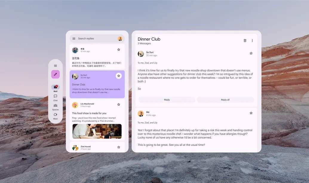
Use contrast between panes and the background to create a spatial effect in XR
Drag handles
Drag handles can be used to resize panes in a layout. They can:
- Adjust the width of flexible panes
- Fully collapse and expand fixed panes to quickly switch between a single and two-pane layout
Drag handles can adjust pane size in a list-detail layout
Rulers
Rulers are a set of global alignment lines. They help to align elements across all layers of the layout.
How to implement rulers in Compose
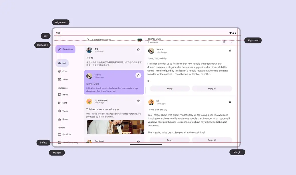
Rulers ensure global alignment across a product, keeping margins and placement consistent