Canonical layout examples
Canonical layout examples are designs for common screen layouts across all breakpoints
Overview · Feed · List-detail · Supporting pane
Many layouts can be split into a list view and a detail view.
Key use cases for this layout include parent-child pairings of information like:
- Text message + conversation
- File browser + open folder
- Musical artist + album detail
- Settings + category detail
- Email inbox + selected email
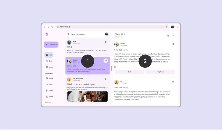
- List
- Detail
Usage
Use the list-detail layout for quickly accessing details of an item from a long list of content.
Examples include:
- Showing a series of conversations and a text message
- Browsing files and seeing their details
- Browsing multiple albums and seeing individual track information
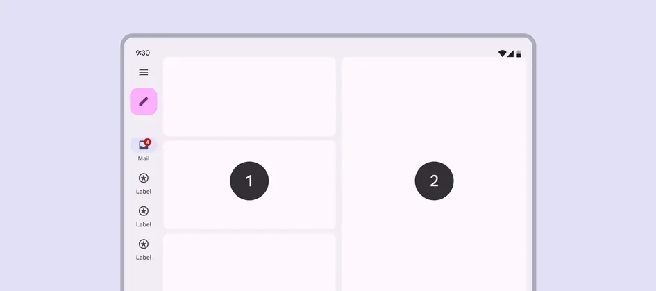
Simplified diagram of:
- List area
- Detail area
Dividing space
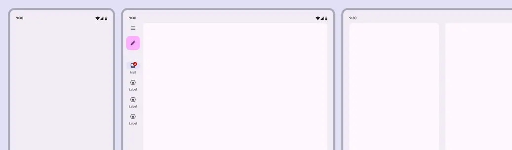
The most basic list-detail views for compact, medium, and expanded layouts
A list-detail layout uses two panes. Depending on the breakpoint, the two panes may appear together in the same layout or across separate layouts.
List-detail layouts use the same pane guidance as all single and two-pane layouts, including special behavior for foldables.
| Breakpoint (dp) | Visible panes |
|---|---|
| Compact (0-599) | 1 pane |
| Medium (600-839) | 1 (recommended) or 2 panes |
| Expanded (840+) | 2 panes |
| Large (1200-1599) | 2 panes |
| Extra-large (1600+) | 2 panes |
Across breakpoints
Compact
- Use a single-pane layout
- Only one view is visible at a time, either list or detail
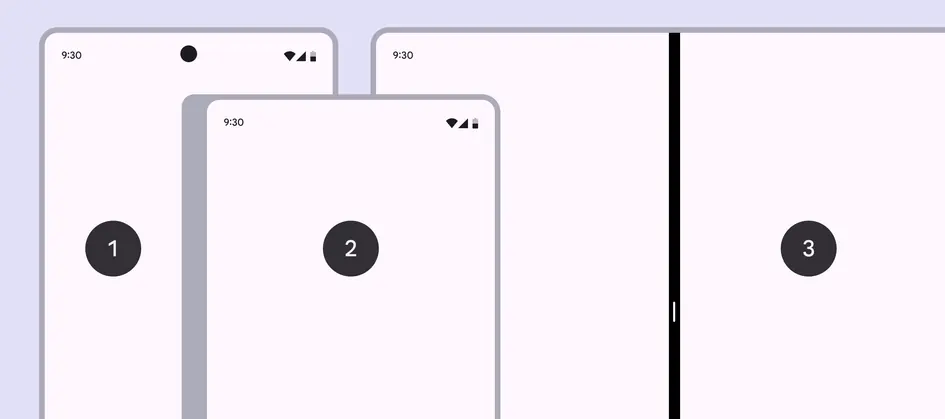
- Phone in portrait orientation
- Closed foldable
- Tablet in split-screen mode
Medium
- Use a single-pane layout for information-dense content or deep focus
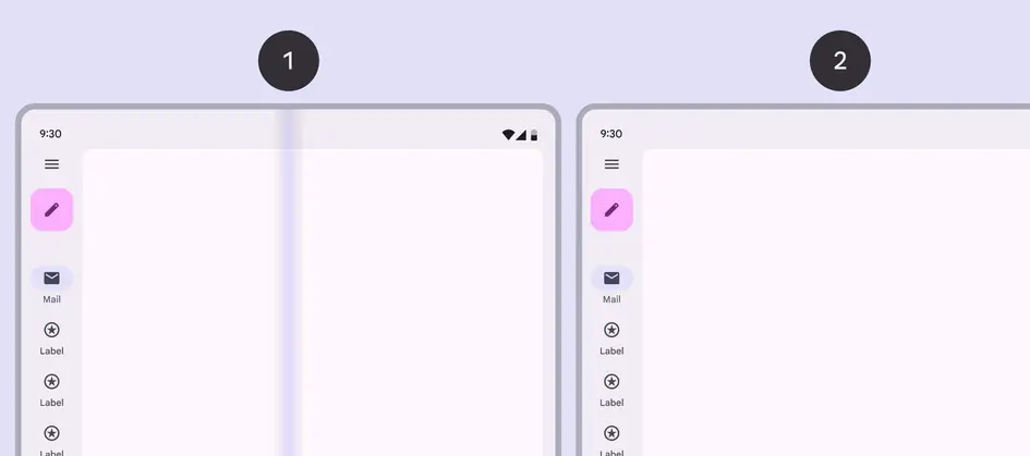
- Foldable open flat
- Tablet in portrait orientation
- Use a two-pane layout to browse collections and switch between items quickly
- To maximize horizontal space for two-pane layouts, use a bottom navigation bar or modal navigation rail
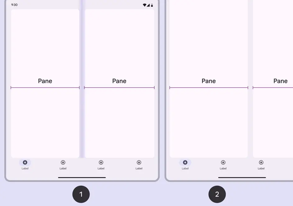
- Foldable open flat
- Tablet in portrait orientation
Expanded, large, & extra-large
- Use a two-pane layout
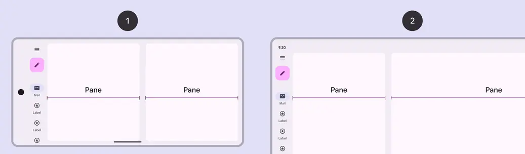
- Phone in landscape orientation
- Tablet in landscape orientation
Behavior
Single vs two-pane
- Back button: Appears in detail view only for single-pane layouts
- Selected state: Appears only in list view for two-pane layouts
- Visual focus: Use explicit and implicit grouping to direct focus in two-pane layouts
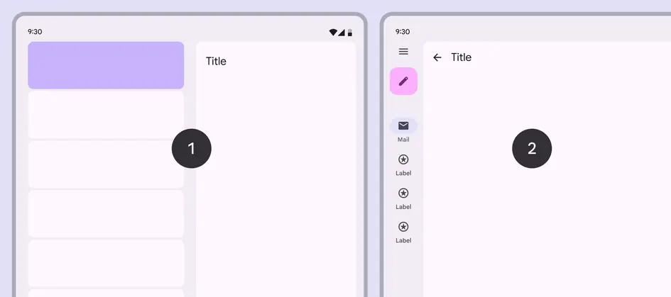
- Use a selection state in two-pane layouts only
- Use a back button in single-pane layouts only
Transitioning between layouts
The amount of available space is dynamic and changes based on how someone uses a device, such as rotating or unfolding it, or entering multi-window mode.
A two-pane layout adapts to a single-pane layout when a device rotates from an expanded to medium breakpoint
No selected list item
A single-pane layout shows a list view, while a two-pane layout shows placeholder content in the detail pane.
In some cases, such as multi-select, the most recently used pane should stay visible when switching to single-pane layout.
If no item is selected when a foldable opens, the detail pane displays an empty state
Selected list item
When switching from a single- to two-pane layout, both panes should be shown and the selected item’s details are visible.
When going from a two- to single-pane layout, the view depends on the product:
- The detail pane should typically show in a single-pane layout, and an app bar appears
- If the product supports selection without deep navigation, like multi-select, the list view can show with the item selected
- Consistency is key: If a layout showed the list view previously, it should return to that view when returning to a single pane
If an item is selected when a foldable opens, the detail pane shows that item
When a foldable closes with an item selected, the single pane shows the detail view
Persistent states
In most cases, a state should be saved when navigating between detail views. This includes read and unread content.
Detail views should retain their scroll position when navigating to other items