Breakpoints
Breakpoints ensure layouts work across a wide range of devices
Overview · Compact · Medium · Expanded · Large & extra-large
These breakpoints are most useful for creating web experiences tailored to laptop and desktop devices. Some products may not need large and extra-large breakpoints. Consider your platform’s conventions and users when making decisions on which breakpoints to design for.
- Layouts for large breakpoints are for screen widths from 1200dp to 1599dp
- Layouts for extra-large breakpoints are for screen widths of 1600dp and larger
A two-pane layout is recommended for large and extra-large breakpoints
Navigation
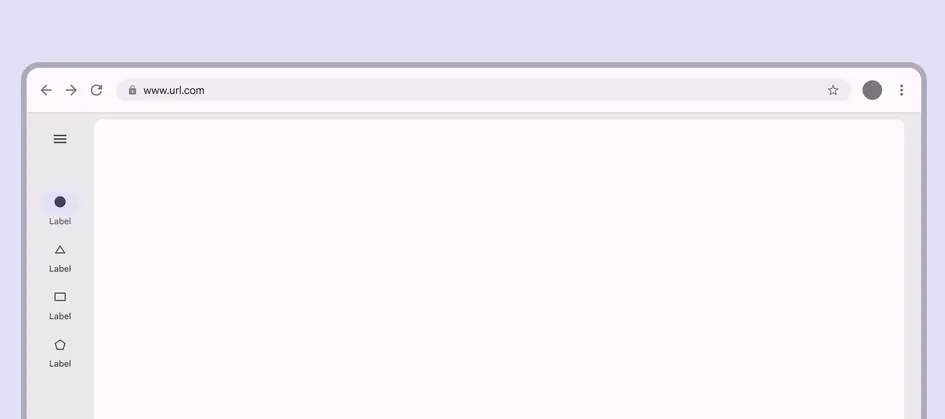
Use a navigation rail, either collapsed or expanded, depending on the amount of content.
For sorting, filtering, or secondary navigation, use tabs or other components directly in the pane.
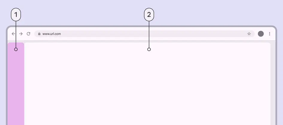
- Collapsed navigation area
- Single-pane layout
An expanded navigation rail is best suited for extra-large windows, where there's still plenty of room for content. Consider collapsing the navigation rail when space is needed, or when on pages deeper in the page hierarchy.
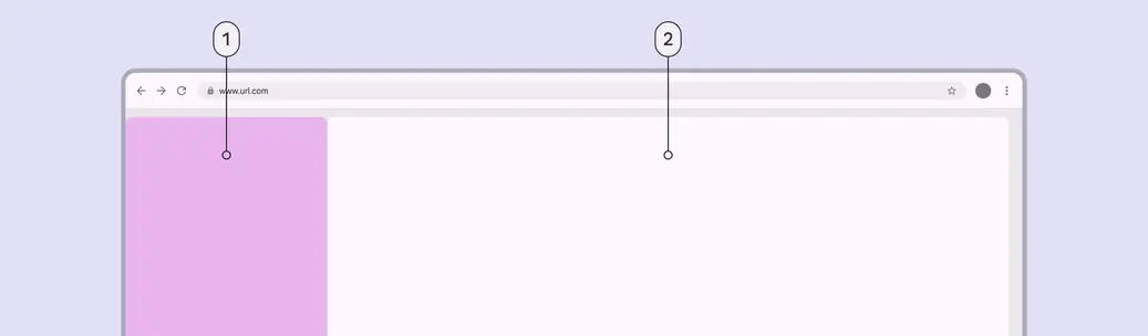
- Expanded navigation area
- Single-pane layout
Panes
A two-pane layout is often best for large and extra-large breakpoints.
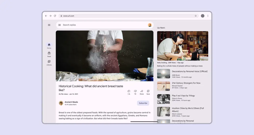
However, a single-pane layout can work when displaying visually- or information-dense content, such as videos.
Only use a single-pane layout for dense content or media
When using a fixed-and-flexible layout, the fixed pane should have a width of 412dp by default.
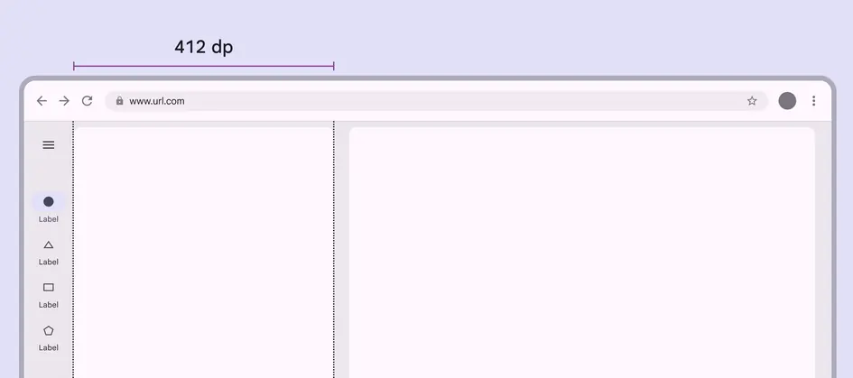
Fixed panes should be 412dp in large and extra-large layouts
When using a split-pane layout, the spacer should be visually centered by default, even when using an expanded navigation rail.
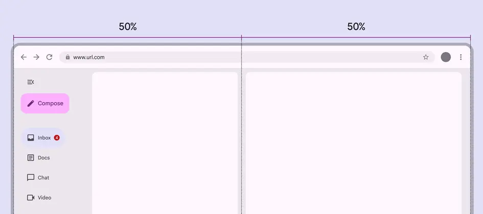
In split-pane layouts, navigation components shrink the leading pane, so the spacer remains centered
Additional panes
The extra-large breakpoint supports using a standard side sheet as a third pane. When the side sheet is present, the navigation rail can remain visible, collapse, or hide completely. Don't use more than three panes.
Note: Fixed panes in this window size are recommended to be 412dp, but side sheets have a default maximum width of 400dp.
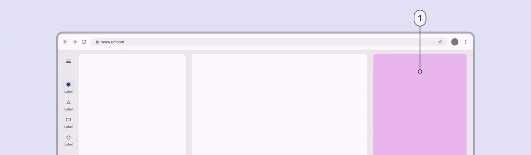
- Standard side sheet (third pane)
Spacing
Large and extra-large layouts have a leading and trailing margin of 24dp.
The spacer between panes is 24dp.
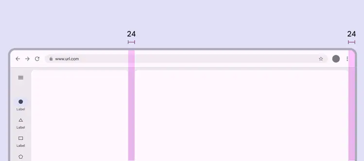
Use 24dp for margins and spacers in large and extra-large layouts
Special considerations
Large and extra-large layouts will need to transition dynamically to a smaller layout when:
- The app goes from full-screen to split-screen
- Multi-window mode is initiated
- A free-form window is resized
Pay attention to typographic elements such as line length to ensure readability on large and extra-large layouts.
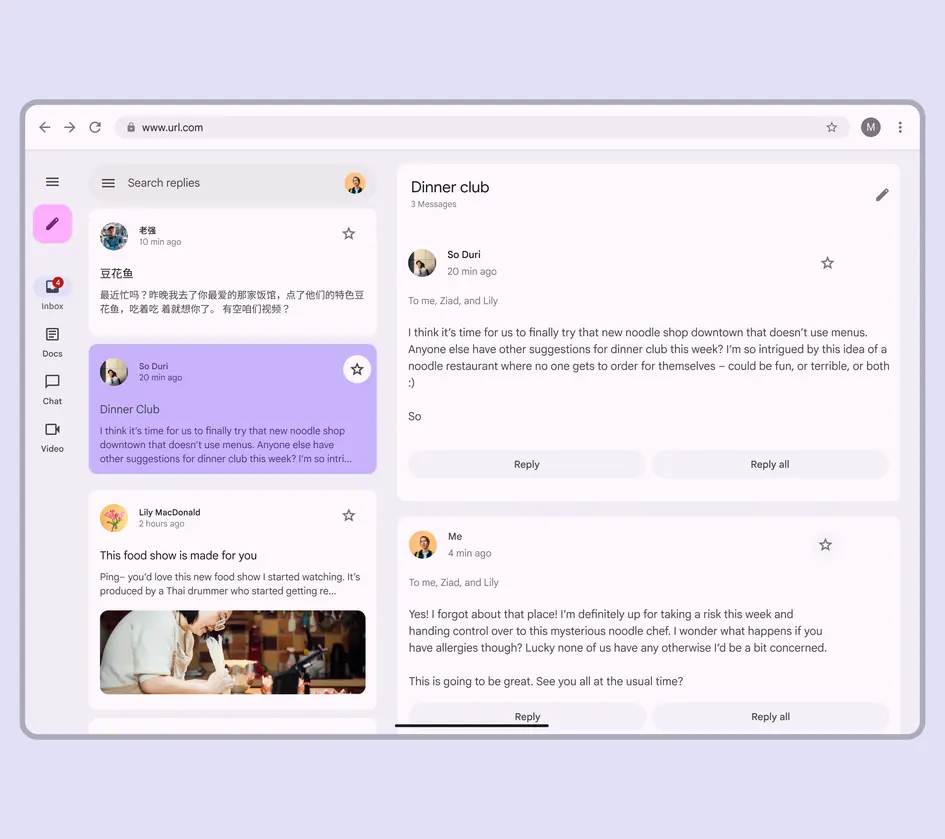
Consider how a large layout should change at smaller breakpoints