Breakpoints
Breakpoints ensure layouts work across a wide range of devices
Overview · Compact · Medium · Expanded · Large & extra-large
Layouts for expanded breakpoints are for screen widths from 840dp to 1199dp.
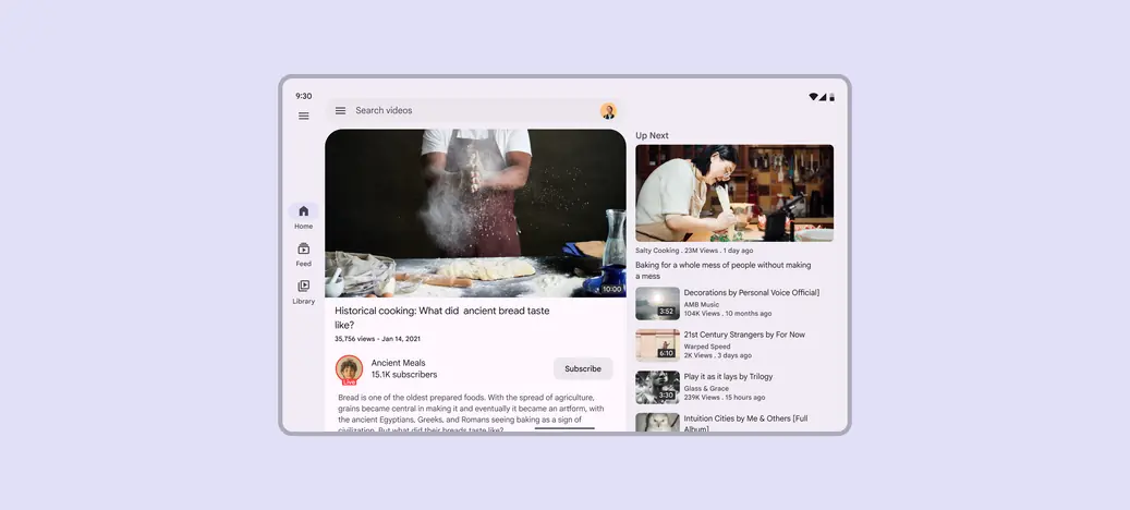
Two-pane layouts are often best for expanded breakpoints
Navigation
Place navigation components close to edges of the window where they’re easier to reach. Use a navigation rail, either collapsed or expanded.
The navigation rail can be hidden in secondary destinations as long as the primary destination can still be accessed using a back button.
For sorting, filtering, or secondary navigation, use tabs or other components directly in the pane.
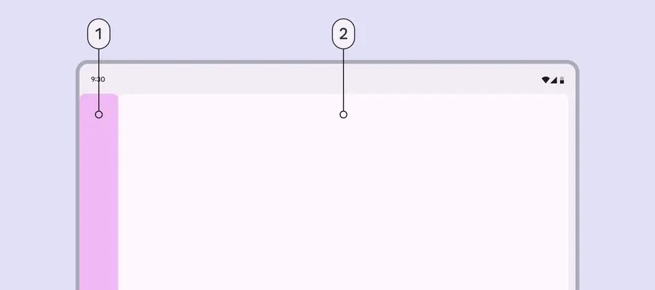
- Navigation area
- Single pane
Panes
Use a single-pane or two-pane layout.
A two-pane layout is often best for expanded breakpoints. However, a single-pane layout can work when displaying visually- or information-dense content, such as videos.
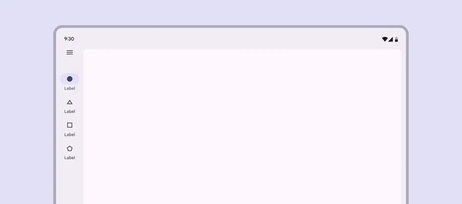
At an expanded breakpoint, reserve single-pane layouts for information-dense content
When using a fixed-and-flexible layout, the fixed pane should have a width of 360dp by default.
In a fixed-and-flexible layout, the fixed pane is 360dp by default
A split-pane layout uses two flexible panes and visually centers the spacer by default.
The navigation and first pane are 50% of the window width to keep the spacer visually centered
Spacing
Expanded layouts have a leading and trailing margin of 24dp.
The spacer between panes is 24dp.
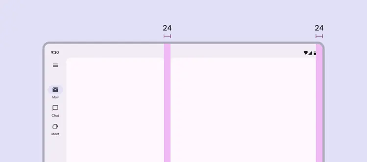
Use 24dp for margins and spacer in an expanded layout
Special considerations
An expanded layout will need to transition dynamically to a compact or medium layout when:
- A foldable device is folded
- A tablet is rotated from landscape to portrait
- The app goes from full-screen to split-screen
- Multi-window mode is initiated
- A free-form window is resized
Consider how an expanded layout should change at medium and compact breakpoints