Designing
Implement intuitive, accessible layouts, considering structure, color, and flow
Overview · Color contrast · Structure · Flow · Elements
Hierarchy
When navigation is easy, users understand where they are in your app and what’s important. To emphasize which information is important, multiple visual and textual cues like color, shape, text, and motion add clarity.
Types of feedback
Visual feedback (such as labels, colors, and icons) and touch feedback show users what is available in the UI.
Navigation
Navigation can have clear task flows with minimal steps, easy-to-locate controls and clear labeling. Focus control, or the ability to control keyboard and reading focus, can be implemented for frequently used tasks.
Every added button, image, and line of text increases the complexity of a UI. You can simplify how your UI is understood by using:
- Clearly visible elements
- Sufficient contrast and size
- A clear hierarchy of importance
- Key information that is discernable at a glance
Levels of importance
To convey an item’s relative level of importance:
- Place important actions at the top or bottom of the screen (reachable with shortcuts)
- Place related items of a similar hierarchy next to each other
Visual hierarchy
To enable the screen reader to read out content in the intended order, it’s important for designers to collaborate with developers – both for writing out the HTML in the correct order, and understanding how screen readers will interpret designs.
While CSS determines the layout and appearance of a page, screen readers rely on the top-down structure of HTML on any platform (mobile or web). This structure creates a map for the screen reader to follow when reading the content.
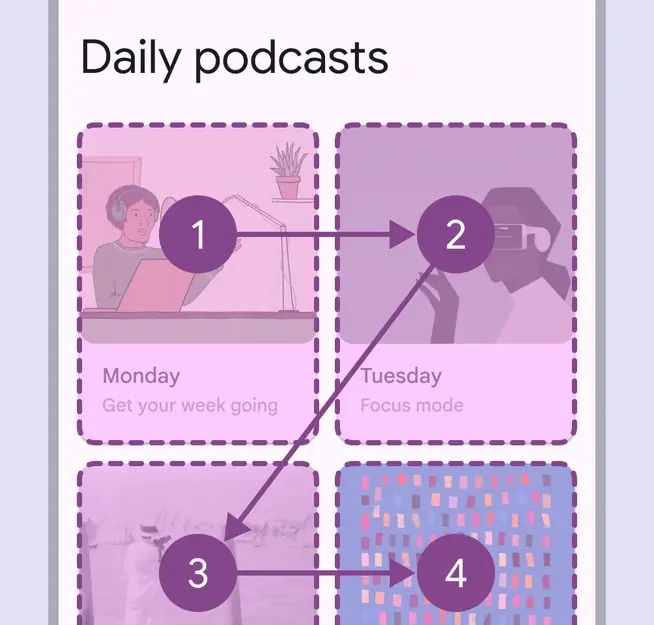
An example of how content hierarchy in a screen can be identified in a logical reading order to optimize for the ways assistive tech, such as screen readers, may interpret information
Web landmarks and headings
Define content and UI layout to improve navigation and comprehension.
Assistive technologies (AT) rely on clear, delineated structures to process page information, navigating primarily through the use of headings and landmarks. Many assistive technologies, such as screen readers, translate a design into a linear experience, which means that many users interact with content in hierarchical, predetermined order. Therefore, thinking through structural decisions in advance can improve the accessibility of a product.
For web only: Landmarks and headings help assistive-technology users orient themselves to a web page and allow for easy navigation and traversal across large sections of a document or page.
By classifying and labeling sections of a page, structural information that is conveyed visually through layout design can also be represented in code.
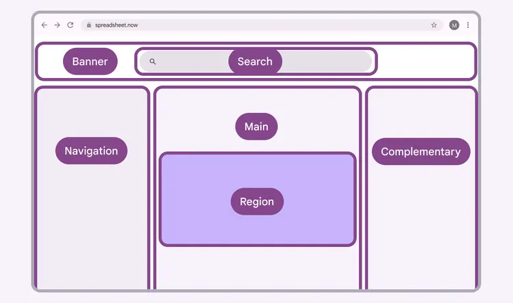
Example of a page diagram mapping the areas for a UI in order to consider the relative landmarks and headings
Identifying landmarks and headings
1. Define landmarks
Landmarks are large blocks of content that establish the high-level structure of your layout. They're a set of Accessible Rich Internet Applications (ARIA) roles that provide easy access to, and important meaning for, common content areas of a web page.
There are eight landmark roles: navigation, search, main, banner, complementary, contentinfo, region, and form.
The eight landmark roles in the W3C ARIA guidelines include:
- Navigation: Contains lists of navigation links (there can be multiple, in which case you should differentiate in label)
- Search: A search field
- Main: The main content area as defined by UX. There should be only one.
- Banner: Typically the header; content repeated from page to page, often contains navigation and toolbars. There should be only one.
- Complementary: A sidebar or aside to main content that can stand alone without the main content
- Contentinfo: Typically the footer; contains information describing the site and its content (for example, copyright). There should be only one.
- Region: Content regions are important content blocks. They can be nested inside the “main” landmark. Regions should be labeled with names that make the purpose of that region clear.
- Form: Takes and stores user info.
Add accessibility labels
Add clear and specific labels to any landmark roles that appear multiple times (regions or navigation typically). This will help users differentiate information.
Labels should be added to all regions, as well as any landmark where a label will enhance meaning. For example, explaining the contents or purpose of a sidebar.
Don't repeat the landmark role within a label.
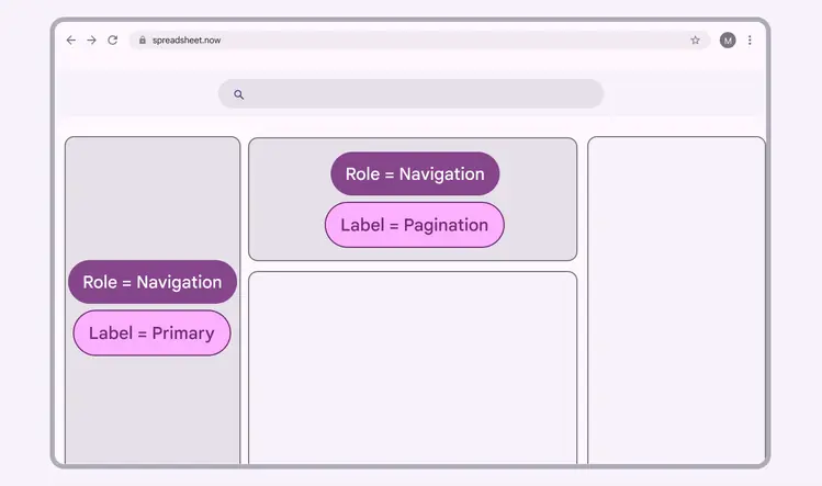
This layout has two areas assigned the navigation role. Each landmark should get a unique label to help users tell the difference between elements.
2. Define headings
Assistive technology users often navigate web pages with the help of headings. They create a clear hierarchy to help users navigate and take action.
- Identify headings based on content hierarchy, rather than visual styling
- Headings should not skip a level, for example, don't go from H2 to H4 without using an H3
- Map content on your pages to headings (H1–H6) in sequential order based on the hierarchy of your content
- A single H1 for the page title is recommended
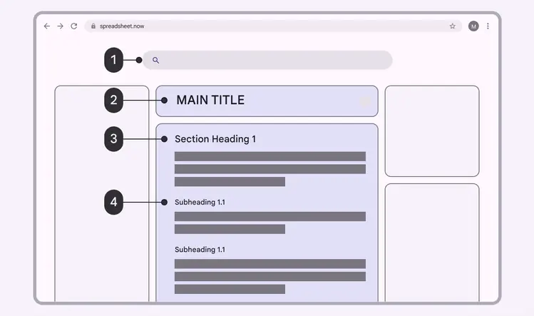
Example of headings marked up in code
Consider hierarchy in addition to style
Ensure that headings correspond with meaningful titles. If they don't, consider changing the titles in the UI to benefit the experience of all users or adding a label for assistive tech.
Heading levels are informed by the layout's information architecture—the structural hierarchy that’s applied to a set of items. The page’s visual styling does not need to match the heading levels in terms of prominence and visual hierarchy.
Target sizes
Material Design’s target guidelines can help users who aren’t able to see the screen, or who have difficulty with small touch targets, to tap elements in your app.
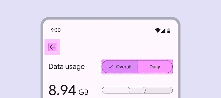
Touch and pointer target sizes
Touch targets are the parts of the screen that respond to user input, extending beyond the visual bounds of an element. For example, an icon may appear to be 24 x 24dp, but the padding surrounding it comprises the full 48 x 48dp touch target.
For most platforms, consider making touch targets at least 48 x 48dp. A touch target this size results in a physical size of about 9mm, regardless of screen size. The recommended target size for touchscreen elements is 7-10mm. It may be appropriate to use larger touch targets to accommodate a larger spectrum of users.
Note: iOS recommends 44 x 44dp targets.
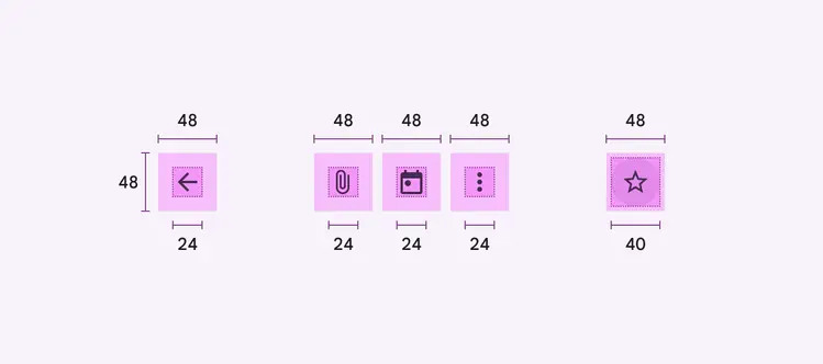
Icons: 24dp
Star icon: 40dp
Touch target on both: 48dp
Pointer targets
Pointer targets are similar to touch targets, but are implemented by motion-tracking pointer devices such as a mouse or a stylus.
Consider making pointer targets minimums 44 x 44dp.
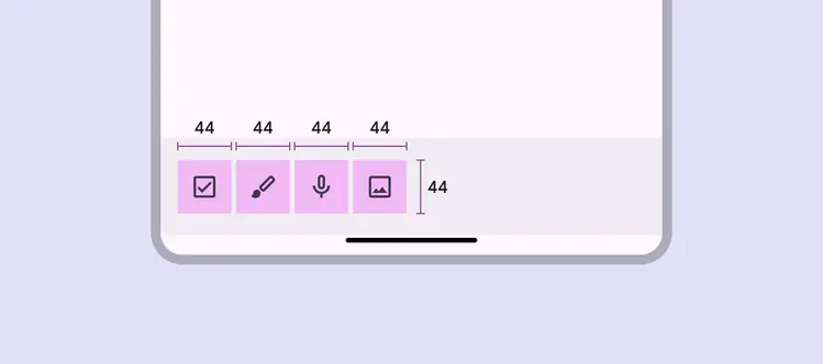
Recommended target size for pointers: 44dp
Target spacing
In most cases, targets separated by 8dp of space or more promote balanced information density and usability.
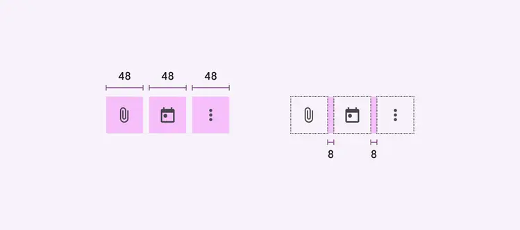
Two groups of icons showing their overall spacing and the spacing between each other
Touch target size: 48dp
Padding: 8dp