Tabs
Tabs organize content across different screens, data sets, and other interactions.
Overview · Specs · Guidelines · Accessibility
Usage
Tabs organize groups of related content that are at the same level of hierarchy.

Tab labels can include icons and text. Text labels should be short.
There are two variants of tabs:
- Primary tabs
- Secondary tabs
Primary tabs are placed at the top of the content pane under an app bar. They display the main content destinations.
Secondary tabs are used within a content area to further separate related content and establish hierarchy.
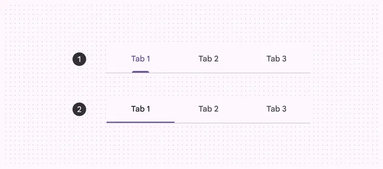
- Primary tabs
- Secondary tabs
Related content
Use tabs to group related content, not sequential content.
Do
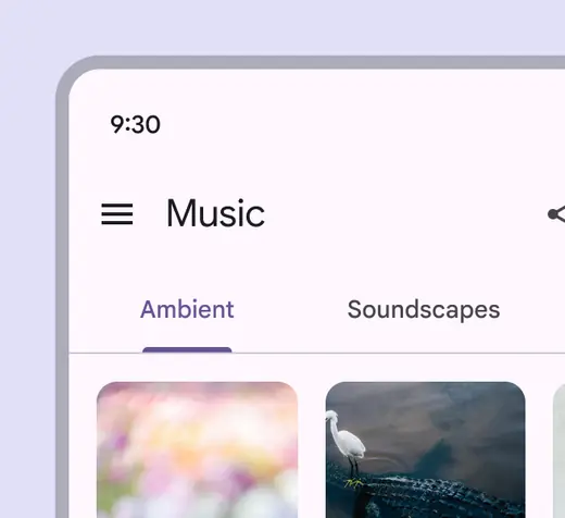
Utilize tabs to categorize related groups of content into clearly defined sets
Don't
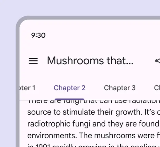
Don’t use tabs to move through sequential content that needs to be read in a particular order. Instead, create hierarchy within the content using techniques like typography style and open space.
Anatomy
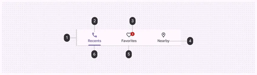
- Container
- Icon (optional)
- Badge (optional)
- Label
- Divider
- Active indicator
Container
The container holds multiple tabs. Its contents can be fixed or scrollable.
The container should always extend the full width of the window and be divided into equal sections, one for each tab.
The container is defined by a divider on the bottom edge to separate it from the content below. Content may scroll under the container.

The container is the area that contains the tabs directly under the title above
Icon (optional)
Icons communicate the kind of content within a tab. Icons should be simple and recognizable.

Tabs can use a combination of labels and icons
Icons alone aren’t as effective as text labels at communicating complex content.
Use caution when representing tab content with icons alone, as an icon’s meaning may not be clear.
Do

Use icons that are globally recognized when using icons alone
Don't
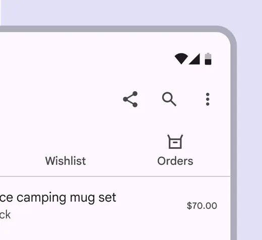
Don’t use tabs with both icons and text labels on only some tabs, but not others
Label
Text labels should clearly and succinctly describe the content within the tab.
Tab labels appear in a single row. Labels can use a second line if needed, with truncated text. Alternatively, scrollable tabs can allow room for longer titles.

Tab labels should be short and succinct. There should be a clear relationship to the title above.
When using scrollable tabs, the first visible tab should be offset by 52dp from the left side of the device for both web and mobile. The width of each tab is defined by the length of its text label.
Avoid using inconsistent padding on each tab.
Do
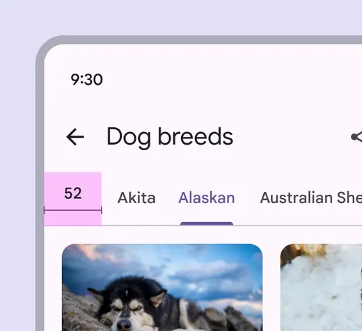
Offset the first scrollable tab 52dp from the leading edge so it's clear that more content is available
Don't
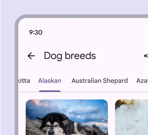
Don’t truncate labels unless required, as truncated text can impede comprehension
Badges (optional)
Badges can be used on primary or secondary tabs to show notifications or updates related to a specific tab. Limit badge content to four characters, including a "+".
Once the user views the relevant content in the tab, the badge value should update or the badge should disappear entirely.
Small and large badges can both be used with tabs. Read the badge guidance for more details.

Badges are used to highlight notifications related to tab specific content
Active indicator
To differentiate an active tab from an inactive tab, apply an underline and color change to the active tab’s text and icon.
An underline and color change differentiate an active tab from the inactive ones
Choosing the tab variant
Primary tabs should be used when just one set of tabs are needed.
Secondary tabs are necessary when a screen requires more than one level of tabs. These tabs use a simpler style of indicator, but their function is identical to primary tabs.

Tabs can be joined with components like app bars, embedded in a specific UI region, or nested within components like cards and sheets. Tabs control the UI region displayed below them.
Placement
Tabs are displayed in a single row, with each tab connected to the content it represents. As a set, all tabs are unified by a shared topic.
Secondary tabs should always be placed below primary tabs.

Secondary tabs are found within other content to assist users with greater detail
Responsive layout
For fixed tabs, the maximum width for each tab should be determined by the width of the widest tab. The group of tabs should use a fluid margin and align to the center or leading edge of the body region.
Avoid using more than four tabs at once. At five or more tabs, the container becomes cramped.
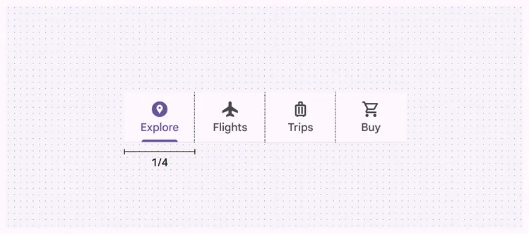
Tabs can grow in width in relation to the number of items contained within
Behavior
States
By default, tabs inherit enabled states with one active state.The inactive and active states of a tab can inherit a hover, focus, and pressed states.
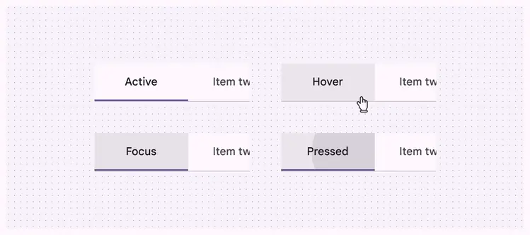
Active, hover, focused, and pressed states
Fixed tabs
Fixed tabs display all tabs in a set simultaneously. They are best for switching between related content quickly, such as between transportation methods in a map. To navigate between fixed tabs, tap an individual tab, or swipe left or right in the content area.
Fixed tabs allow users to see all possible kinds of content available
Tap a tab
Navigate to a tab by tapping on it.
Tapping on a tab directly
Swipe within the content area
To navigate between tabs, users can swipe left or right within the content area.
Users can swipe between fixed tabs to see related content quickly
Use caution when placing other swipeable content (such as interactive maps or list items) in the content area.
Do
Use different gesture directions when using tabs
Don't
Avoid placing swipeable items in the content area of a UI that has tabs, as the user may mistakenly swipe the wrong component
Scrollable tabs
When a set of tabs cannot fit on screen, use scrollable tabs. Scrollable tabs can use longer text labels and a larger number of tabs. They are best used for browsing on touch interfaces.
Padding should remain the same when using scrolllable tabs and long labels
Scrolling content
When a screen scrolls up and down through content, tabs can either be fixed to the top of the screen, or scroll off the screen. If they scroll off the screen, they will return when the user scrolls upward.
Tabs can be use to create elevation
Do
Tabs can scroll offscreen on scroll, and reappear when the page is scrolled up
Don't
Don’t scroll tabs behind an app bar. When tabs are attached to a component, they should appear and move as a single unit.