Sliders
Sliders let users make selections from a range of values. There are four configurations: continuous, discrete, centered, range selection.
Overview · Specs · Guidelines · Accessibility
Use cases
People should be able to do the following using assistive technology:
- Navigate to a slider
- Select a range by controlling a handle along a track
- Get appropriate feedback based on input type
Interaction & style
The slider handle shrinks in width and the value appears to provide a visual cue to the user that the handle is being pressed.
Touch
When tapped or dragged, the handle width shrinks to provide interaction feedback, and the value appears.
Cursor
When hovered, the cursor changes. When clicked and dragged, the handle width shrinks, and the value appears.
The slider handle changes width during interaction
Focus and navigation
Initial focus lands directly on the handle, since it’s the primary interactive element of the slider.
The slider value can then be adjusted using the arrow keys or other keyboard navigation options.
Use arrow keys to change the slider value
Color contrast
Use visual anchors so the end of the slider’s inactive track has at least 3:1 contrast with the background. The stop indicator makes the end easily visible on most backgrounds.

A stop indicator on the inactive track makes it easier to identify the end of the slider on a low-contrast background
Alternatively, icons or other elements that have a 3:1 contrast with the background can be used to indicate the ends of the slider’s inactive track.
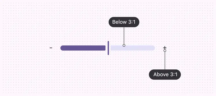
Icons make it easier to identify the ends of the slider on a low-contrast background
Keyboard navigation
| Keys | Actions |
|---|---|
| Tab | Moves focus to the slider handle |
| Arrows | Increase and decrease the value by one value or one stop indicator |
| Space & Arrows | Increase and decrease the value by one interval or one stop indicator |
| Home or End | Set the slider to the first and last values on the slider |
Labeling elements
The accessibility label for a slider is typically the same as the slider's adjacent text label. It should have the slider role.
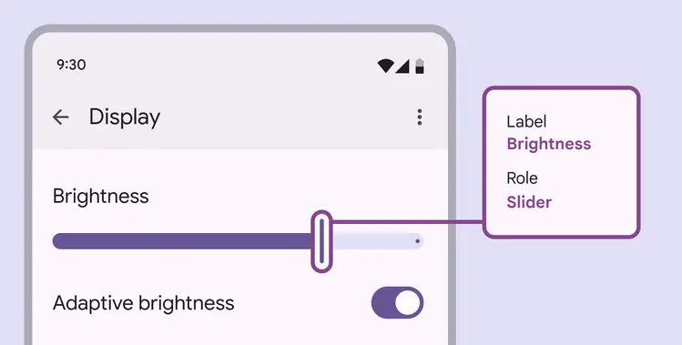
A slider’s accessibility label should match the adjacent UI text
If the UI text is correctly linked to the slider, assistive tech (such as a screenreader) will read the UI text followed by the component’s role.
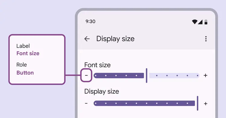
Icon buttons placed outside the slider should have the button role