Radio button
Radio buttons allow users to select one option from a set.
Overview · Specs · Guidelines · Accessibility
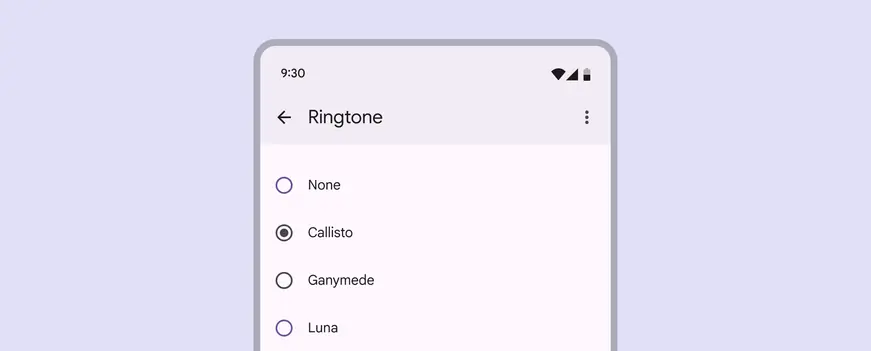
Radio buttons
Usage
Radio buttons are the recommended way to allow users to make a single selection from a list of options.
Only one radio button can be selected at a time.
Radio buttons should always be accompanied by clear inline labels
Use radio buttons to:
- Select a single option from a set
- Expose all available options
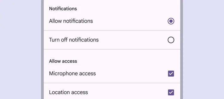
Radio buttons are single-select, unlike checkboxes which are multi-select
Do
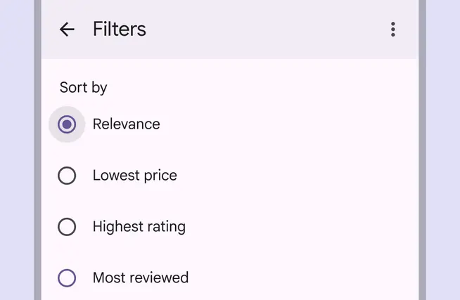
Use radio buttons when only one option can be selected from a list
Do
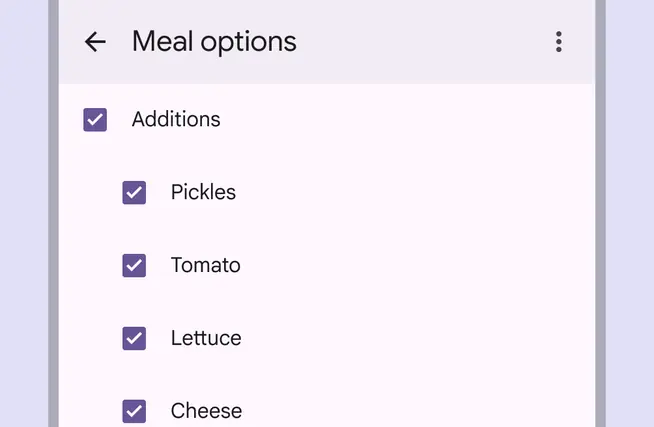
Use checkboxes when multiple options can be selected from a list
Avoid nesting radio buttons or using radio buttons to select multiple options.
Don't
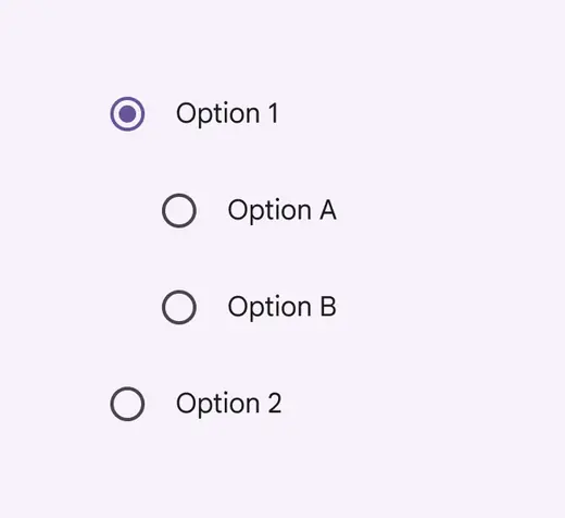
Don’t nest radio buttons
Don't
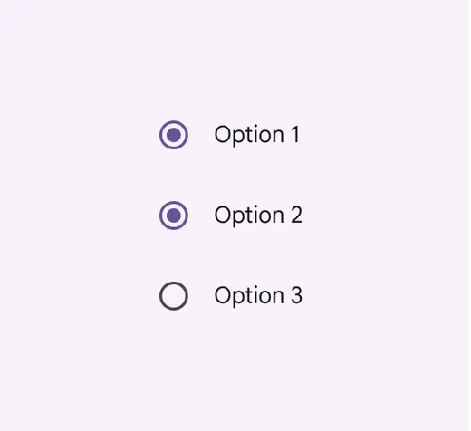
Don’t allow radio buttons to select multiple options
Alternate selection controls
Radio buttons are one of several selection controls, which allow people to make choices such as selecting options or switching settings on or off.
Switches and checkboxes are alternative selection controls that can be used to change settings or preferences.
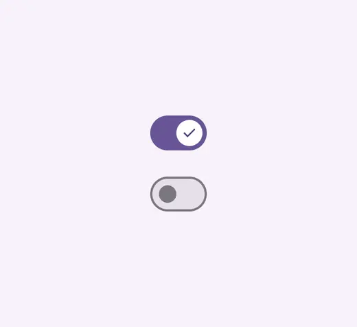
Switches
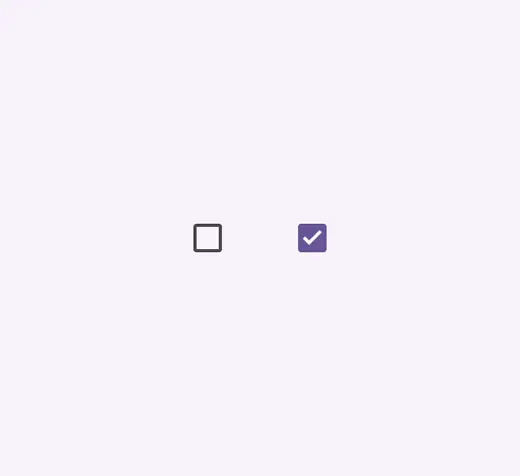
Checkboxes
Use radio buttons when there are five or fewer options.
Consider using a drop-down menu instead of radio buttons when it’s important to save space on a screen. However, drop-down menus require additional steps for a person, both in the number of clicks and cognitive effort.
Do
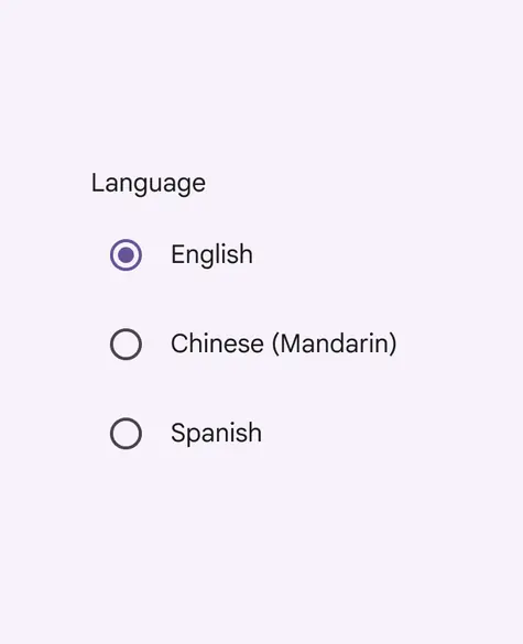
Use radio buttons when there are five or fewer options
Do
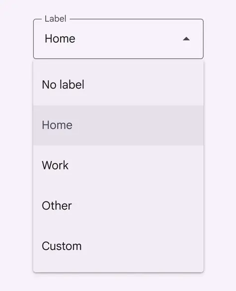
Consider using a drop-down menu instead of radio buttons when space is constrained
Anatomy

- Selected icon
- Adjacent label text
- Unselected icon
Adjacent label text
Always pair radio buttons with an adjacent label describing what the radio button selects.
Because only one radio button can be selected at a time, each choice must have its own label.
Radio button always need label text
Placement
Radio buttons are often arranged in stacked layouts.
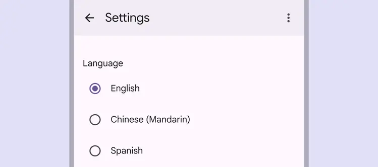
Radio buttons should be vertically listed and have one option always selected.
Do
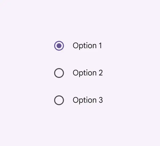
Radio buttons should always have one option pre-selected
Caution
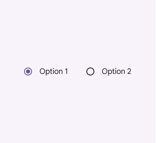
Avoid using horizontal radio button lists
Behavior
A radio button is successfully selected when a person clicks or taps either the radio button icon or the label.
Radio buttons should take effect immediately, unless they're in a dialog or page that needs to be saved