Navigation rail
Navigation rails let people switch between UI views on mid-sized devices. They can contain 3-7 destinations plus an optional FAB.
Overview · Specs · Guidelines · Accessibility
Variants
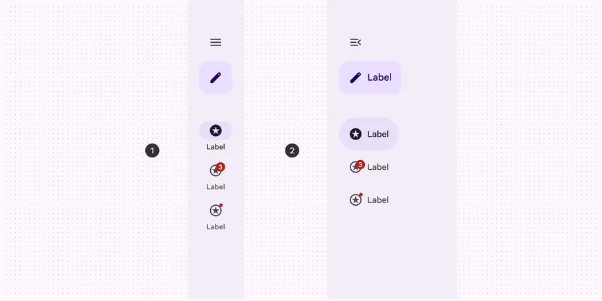
- Collapsed navigation rail
- Expanded navigation rail
Baseline variants
The baseline navigation rail is no longer recommended, and should be replaced by the collapsed navigation rail. View baseline tokens
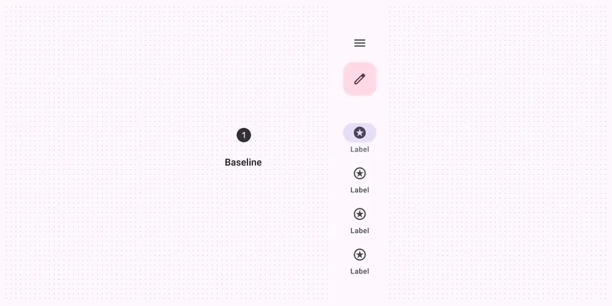
- The baseline navigation rail is no longer recommended
| Variant | M3 | M3 Expressive |
|---|---|---|
| Collapsed navigation rail | -- | Available |
| Expanded navigation rail | -- | Available |
| Navigation rail (baseline) | Available | Not recommended. Use collapsed navigation rail. |
Configurations
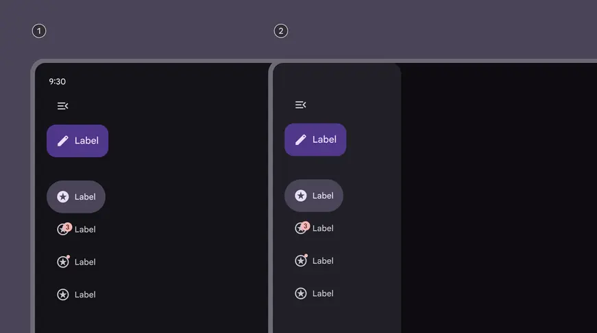
- Expanded layout: standard
- Expanded layout: modal
| Category | Configuration | M3 | M3 Expressive |
|---|---|---|---|
| Expanded layout | Standard (default) | Available as navigation drawer | Available |
| Expanded layout | Modal | Available as navigation drawer | Available |
| Expanded behavior | Hide when collapsed | -- | Available |
Tokens & specs
Browse the component elements, attributes, tokens, and their values. Learn about design tokens
Design tokens
Token table
Machine-readable relationship table
Navigation rail tokens · 6 token sets · 53 tokens · live token table · DSDB TOKEN_TABLE.5b55bd7cc1ea6e29
- Default context: Theme: Light · Platform: Android · Audience: 3P · Contrast: Default · iOS dark theme elevation: None · iOS weight setting: Default
- Not configurable here (group default used): Motion scheme: Standard · Font: Static · Language height: Small
- Other contexts: Theme: Dark · Contrast: Medium contrast, High contrast. "Other contexts" lists values that differ from the default when only that one context changes.
- Reference chain: aliases from the token to its source value (
token → alias → … → value). "—" means the token holds a literal value.
Nav rail - Common · md.comp.nav-rail · 14 tokens
Common tokens for nav rail.
| Group | Token | Type | Reference chain | Resolved value | Other contexts |
|---|---|---|---|---|---|
| Enabled | md.comp.nav-rail.item.active.label-text.color | Color | md.sys.color.secondary → md.ref.palette.secondary40 | #625B71 | Dark: #CCC2DC via md.ref.palette.secondary80Medium contrast: #4A4458 via md.ref.palette.secondary30High contrast: #332D41 via md.ref.palette.secondary20 |
| Enabled | md.comp.nav-rail.item.inactive.label-text.color | Color | md.sys.color.on-surface-variant → md.ref.palette.neutral-variant30 | #49454F | Dark: #CAC4D0 via md.ref.palette.neutral-variant80Medium contrast: #322F37 via md.ref.palette.neutral-variant20High contrast: #000000 via md.ref.palette.neutral-variant0 |
| Enabled | md.comp.nav-rail.item.active.icon.color | Color | md.sys.color.on-secondary-container → md.ref.palette.secondary30 | #4A4458 | Dark: #E8DEF8 via md.ref.palette.secondary90Medium contrast: #FFFFFF via md.ref.palette.secondary100High contrast: #FFFFFF via md.ref.palette.secondary100 |
| Enabled | md.comp.nav-rail.item.inactive.icon.color | Color | md.sys.color.on-surface-variant → md.ref.palette.neutral-variant30 | #49454F | Dark: #CAC4D0 via md.ref.palette.neutral-variant80Medium contrast: #322F37 via md.ref.palette.neutral-variant20High contrast: #000000 via md.ref.palette.neutral-variant0 |
| Enabled | md.comp.nav-rail.item.active.indicator.color | Color | md.sys.color.secondary-container → md.ref.palette.secondary90 | #E8DEF8 | Dark: #4A4458 via md.ref.palette.secondary30Medium contrast: #625B71 via md.ref.palette.secondary40High contrast: #4A4458 via md.ref.palette.secondary30 |
| Hovered | md.comp.nav-rail.item.active.hovered.state-layer.opacity | Opacity | md.sys.state.hover.state-layer-opacity | 0.08 | — |
| Hovered | md.comp.nav-rail.item.inactive.hovered.state-layer.color | Color | md.sys.color.on-secondary-container → md.ref.palette.secondary30 | #4A4458 | Dark: #E8DEF8 via md.ref.palette.secondary90Medium contrast: #FFFFFF via md.ref.palette.secondary100High contrast: #FFFFFF via md.ref.palette.secondary100 |
| Hovered | md.comp.nav-rail.item.active.hovered.state-layer.color | Color | md.sys.color.on-secondary-container → md.ref.palette.secondary30 | #4A4458 | Dark: #E8DEF8 via md.ref.palette.secondary90Medium contrast: #FFFFFF via md.ref.palette.secondary100High contrast: #FFFFFF via md.ref.palette.secondary100 |
| Focused | md.comp.nav-rail.item.active.focused.state-layer.opacity | Opacity | md.sys.state.focus.state-layer-opacity | 0.1 | — |
| Focused | md.comp.nav-rail.item.inactive.focused.state-layer.color | Color | md.sys.color.on-secondary-container → md.ref.palette.secondary30 | #4A4458 | Dark: #E8DEF8 via md.ref.palette.secondary90Medium contrast: #FFFFFF via md.ref.palette.secondary100High contrast: #FFFFFF via md.ref.palette.secondary100 |
| Focused | md.comp.nav-rail.item.active.focused.state-layer.color | Color | md.sys.color.on-secondary-container → md.ref.palette.secondary30 | #4A4458 | Dark: #E8DEF8 via md.ref.palette.secondary90Medium contrast: #FFFFFF via md.ref.palette.secondary100High contrast: #FFFFFF via md.ref.palette.secondary100 |
| Pressed | md.comp.nav-rail.item.active.pressed.state-layer.color | Color | md.sys.color.on-secondary-container → md.ref.palette.secondary30 | #4A4458 | Dark: #E8DEF8 via md.ref.palette.secondary90Medium contrast: #FFFFFF via md.ref.palette.secondary100High contrast: #FFFFFF via md.ref.palette.secondary100 |
| Pressed | md.comp.nav-rail.item.active.pressed.state-layer.opacity | Opacity | md.sys.state.pressed.state-layer-opacity | 0.1 | — |
| Pressed | md.comp.nav-rail.item.inactive.pressed.state-layer.color | Color | md.sys.color.on-secondary-container → md.ref.palette.secondary30 | #4A4458 | Dark: #E8DEF8 via md.ref.palette.secondary90Medium contrast: #FFFFFF via md.ref.palette.secondary100High contrast: #FFFFFF via md.ref.palette.secondary100 |
Nav rail - Collapsed · md.comp.nav-rail.collapsed · 7 tokens
For collapsed nav rail.
| Group | Token | Type | Reference chain | Resolved value | Other contexts |
|---|---|---|---|---|---|
| All tokens | md.comp.nav-rail.collapsed.container.width | Length | — | 96dp | — |
| All tokens | md.comp.nav-rail.collapsed.narrow.container.width | Length | — | 80dp | — |
| All tokens | md.comp.nav-rail.collapsed.container.elevation | Elevation | md.sys.elevation.level0 | 0dp | — |
| All tokens | md.comp.nav-rail.collapsed.container.shape | Shape | md.sys.shape.corner.none | Rounded corners 0dp | — |
| All tokens | md.comp.nav-rail.collapsed.container.color | Color | md.sys.color.surface → md.ref.palette.neutral98 | #FEF7FF | Dark: #141218 via md.ref.palette.neutral6 |
| All tokens | md.comp.nav-rail.collapsed.item.vertical-space | Length | md.sys.measurement.space50 | 4dp | — |
| All tokens | md.comp.nav-rail.collapsed.top-space | Length | — | 44dp | — |
Nav rail - Expanded · md.comp.nav-rail.expanded · 11 tokens
For expanded nav rail.
| Group | Token | Type | Reference chain | Resolved value | Other contexts |
|---|---|---|---|---|---|
| All tokens | md.comp.nav-rail.expanded.container.width.minimum | Length | — | 220dp | — |
| All tokens | md.comp.nav-rail.expanded.container.width.maximum | Length | — | 360dp | — |
| All tokens | md.comp.nav-rail.expanded.top-space | Length | — | 44dp | — |
| All tokens | md.comp.nav-rail.expanded.container.elevation | Elevation | md.sys.elevation.level0 | 0dp | — |
| All tokens | md.comp.nav-rail.expanded.modal.container.elevation | Elevation | md.sys.elevation.level2 | 3dp | — |
| All tokens | md.comp.nav-rail.expanded.container.color | Color | md.sys.color.surface → md.ref.palette.neutral98 | #FEF7FF | Dark: #141218 via md.ref.palette.neutral6 |
| All tokens | md.comp.nav-rail.expanded.modal.container.color | Color | md.sys.color.surface-container → md.ref.palette.neutral94 | #F3EDF7 | Dark: #211F26 via md.ref.palette.neutral12 |
| All tokens | md.comp.nav-rail.expanded.container.shape | Shape | md.sys.shape.corner.none | Rounded corners 0dp | — |
| All tokens | md.comp.nav-rail.expanded.modal.container.shape | Shape | md.sys.shape.corner.large | Rounded corners 16dp | — |
| All tokens | md.comp.nav-rail.expanded.between-item-space (deprecated) | Length | — | 0dp | — |
| All tokens | md.comp.nav-rail.expanded.vertical.trailing-space (deprecated) | Length | — | 20dp | — |
Nav rail item - Common · md.comp.nav-rail.item · 10 tokens
Common tokens for all nav items.
| Group | Token | Type | Reference chain | Resolved value | Other contexts |
|---|---|---|---|---|---|
| All tokens | md.comp.nav-rail.item.icon.size | Length | — | 24dp | — |
| All tokens | md.comp.nav-rail.item.active-indicator.shape | Shape | md.sys.shape.corner.full | Circular (fully rounded) | — |
| All tokens | md.comp.nav-rail.item.active-indicator.leading-space | Length | md.sys.measurement.space200 | 16dp | — |
| All tokens | md.comp.nav-rail.item.active-indicator.icon-label-space | Length | md.sys.measurement.space100 | 8dp | — |
| All tokens | md.comp.nav-rail.item.active-indicator.trailing-space | Length | md.sys.measurement.space200 | 16dp | — |
| All tokens | md.comp.nav-rail.item.container.height | Length | — | 64dp | — |
| All tokens | md.comp.nav-rail.item.short.container.height | Length | — | 56dp | — |
| All tokens | md.comp.nav-rail.item.container.shape | Shape | md.sys.shape.corner.none | Rounded corners 0dp | — |
| All tokens | md.comp.nav-rail.item.container.vertical-space | Length | md.sys.measurement.space75 | 6dp | — |
| All tokens | md.comp.nav-rail.item.header-space-minimum | Length | md.sys.measurement.space500 | 40dp | — |
Nav rail item - Vertical · md.comp.nav-rail.item.vertical · 6 tokens
For vertical nav rail items, where elements are stacked.
| Group | Token | Type | Reference chain | Resolved value | Other contexts |
|---|---|---|---|---|---|
| All tokens | md.comp.nav-rail.item.vertical.active-indicator.height | Length | — | 32dp | — |
| All tokens | md.comp.nav-rail.item.vertical.active-indicator.width | Length | — | 56dp | — |
| All tokens | md.comp.nav-rail.item.vertical.label-text.font | Typography | md.sys.typescale.label-medium → compositefont names: md.sys.typescale.label-medium.font → md.ref.typeface.plainfont weight: md.sys.typescale.label-medium.weight → md.ref.typeface.weight-mediumfont size: md.sys.typescale.label-medium.sizeline height: md.sys.typescale.label-medium.line-heightfont tracking: md.sys.typescale.label-medium.tracking | Roboto · weight 500 · size 12pt · line height 16pt · tracking 0.5pt | — |
| All tokens | md.comp.nav-rail.item.vertical.icon-label-space | Length | md.sys.measurement.space50 | 4dp | — |
| All tokens | md.comp.nav-rail.item.vertical.leading-space | Length | md.sys.measurement.space200 | 16dp | — |
| All tokens | md.comp.nav-rail.item.vertical.trailing-space | Length | md.sys.measurement.space200 | 16dp | — |
Nav rail item - Horizontal · md.comp.nav-rail.item.horizontal · 5 tokens
For horizontal nav rail items, where elements are side-by-side.
| Group | Token | Type | Reference chain | Resolved value | Other contexts |
|---|---|---|---|---|---|
| All tokens | md.comp.nav-rail.item.horizontal.label-text.font | Typography | md.sys.typescale.label-large → compositefont names: md.sys.typescale.label-large.font → md.ref.typeface.plainfont weight: md.sys.typescale.label-large.weight → md.ref.typeface.weight-mediumfont size: md.sys.typescale.label-large.sizeline height: md.sys.typescale.label-large.line-heightfont tracking: md.sys.typescale.label-large.tracking | Roboto · weight 500 · size 14pt · line height 20pt · tracking 0.1pt | — |
| All tokens | md.comp.nav-rail.item.horizontal.active-indicator.height | Length | — | 56dp | — |
| All tokens | md.comp.nav-rail.item.horizontal.full-width.leading-space | Length | md.sys.measurement.space200 | 16dp | — |
| All tokens | md.comp.nav-rail.item.horizontal.full-width.trailing-space | Length | md.sys.measurement.space200 | 16dp | — |
| All tokens | md.comp.nav-rail.item.horizontal.icon-label-space | Length | md.sys.measurement.space100 | 8dp | — |
Anatomy
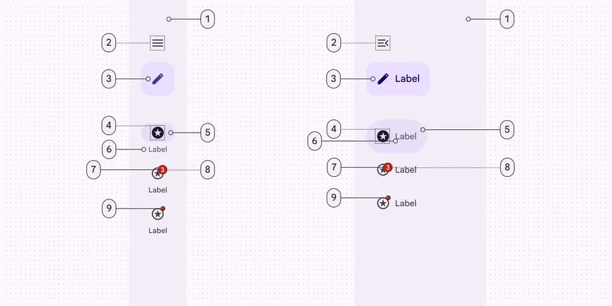
Collapsed and expanded navigation rail elements:
- Container
- Menu (optional)
- FAB or Extended FAB (optional)
- Icon
- Active indicator
- Label text
- Large badge (optional)
- Large badge label (optional)
- Small badge (optional)
Color
Color values are implemented through design tokens. For designers, this means working with color values that correspond with tokens; in implementation, a color value will be a token that references a value. Learn more about design tokens
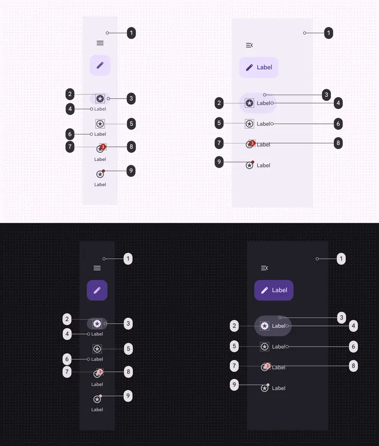
Navigation rail color roles used for light and dark schemes:
- Surface container (optional)
- On secondary container
- Secondary container
- Secondary (vertical), On secondary container (horizontal)
- On surface variant
- On surface variant
- Error
- On error
- Error
States
States are visual representations used to communicate the status of a component or an interactive element.
The navigation item’s target area always spans the full width of the nav rail, even if the item container hugs its contents.
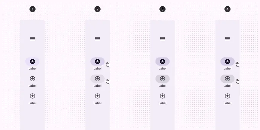
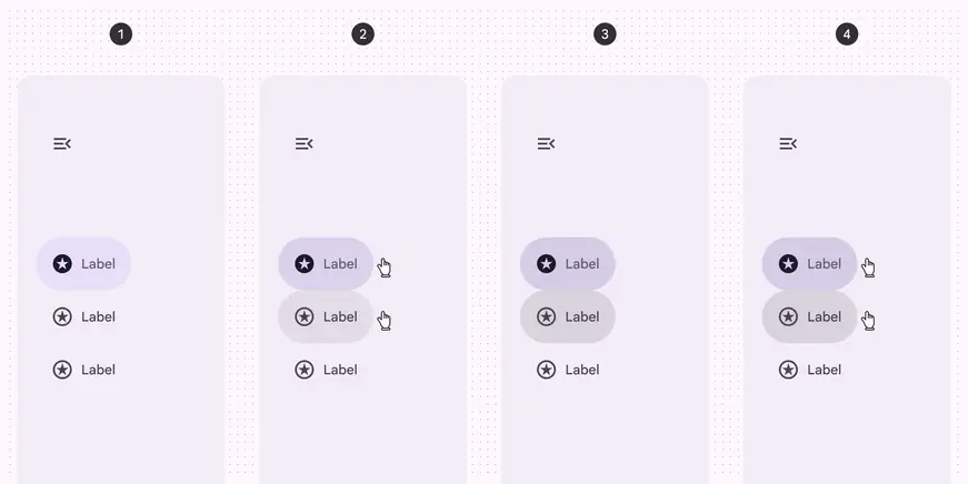
- Enabled
- Hovered
- Focused
- Pressed
Measurements
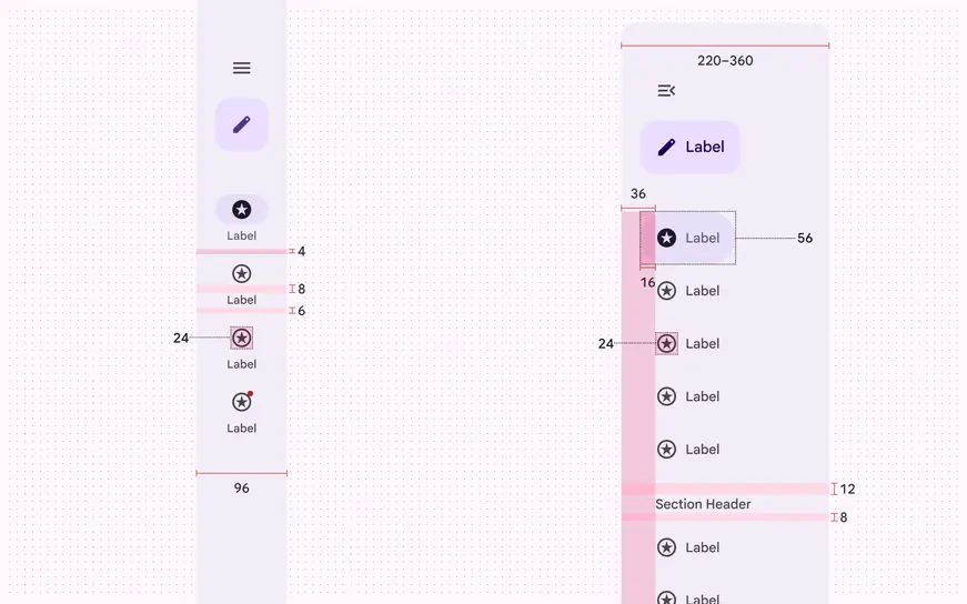
Navigation rail padding and size measurements
Common layouts
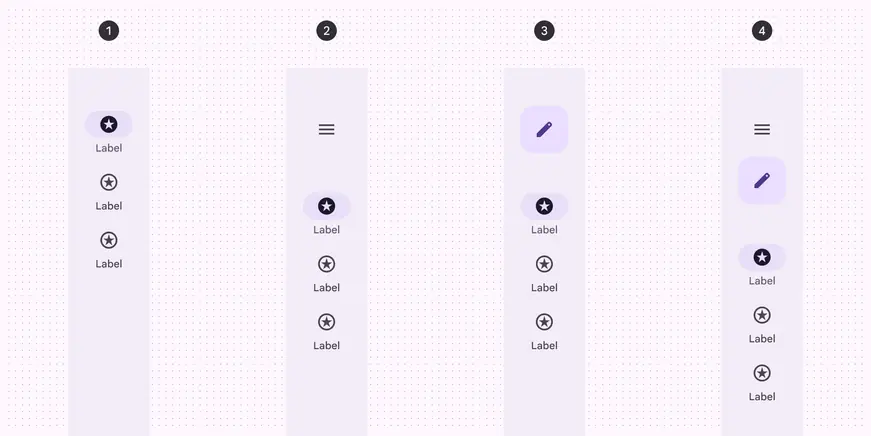
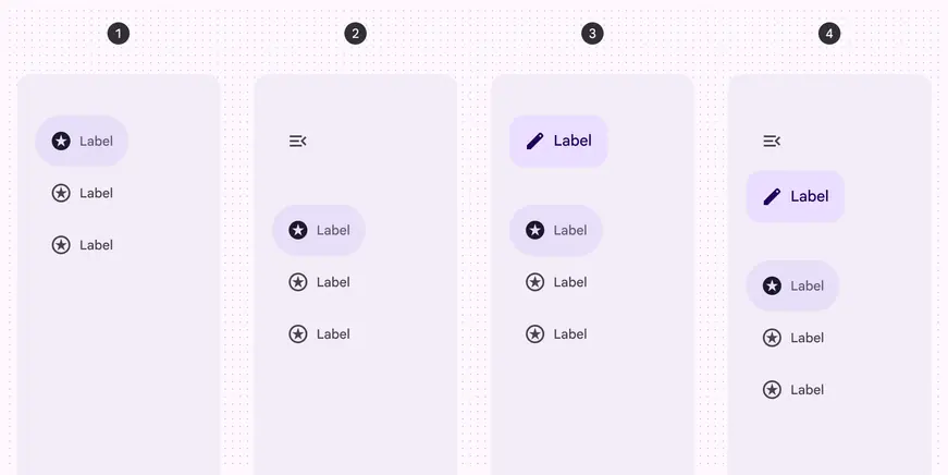
- Three navigation items
- Three navigation items with a menu
- Three navigation items with a FAB
- Three navigation items with a menu and FAB
Baseline navigation rail

- Container
- Menu icon (optional)
- Icon
- Active indicator
- Label text
- Large badge label (optional)
- Large badge (optional)
- Badge (optional)
Tokens & specs
Design tokens
Token table
Machine-readable relationship table
Navigation rail tokens · 7 token sets · 124 tokens · live token table · DSDB TOKEN_TABLE.5b55bd7cc1ea6e29
- Default context: none
- Not configurable here (group default used): Theme: Light · Platform: Android · Audience: 1P Baseline · Motion scheme: Standard · Font: Static · Contrast: Default · iOS dark theme elevation: None · iOS weight setting: Default · Language height: Small
- Reference chain: aliases from the token to its source value (
token → alias → … → value). "—" means the token holds a literal value.
Navigation rail (baseline) · md.comp.navigation-rail · 71 tokens
For baseline navigation rails. For expressive, use all nav rail token sets`md.comp.nav-rail` and corresponding `.collapsed` and `.item` token sets.
| Group | Token | Type | Reference chain | Resolved value |
|---|---|---|---|---|
| Enabled › Container | md.comp.navigation-rail.container.color | Color | md.sys.color.surface → md.ref.palette.neutral100 | #FFFFFF |
| Enabled › Container | md.comp.navigation-rail.container.shape | Shape | md.sys.shape.corner.none | Rounded corners 0dp |
| Enabled › Container | md.comp.navigation-rail.container.width | Length | — | 80dp |
| Enabled › Container | md.comp.navigation-rail.container.elevation | Elevation | md.sys.elevation.level0 | 0dp |
| Enabled › Label text | md.comp.navigation-rail.label-text.font | Font names | md.sys.typescale.label-medium.font → md.ref.typeface.plain | Google Sans Text |
| Enabled › Label text | md.comp.navigation-rail.label-text.line-height | Line height | md.sys.typescale.label-medium.line-height | 16pt |
| Enabled › Label text | md.comp.navigation-rail.label-text.size | Font size | md.sys.typescale.label-medium.size | 12pt |
| Enabled › Label text | md.comp.navigation-rail.label-text.weight | Font weight | md.sys.typescale.label-medium.weight → md.ref.typeface.weight-medium | 500 |
| Enabled › Label text | md.comp.navigation-rail.active.label-text.weight | Font weight | md.sys.typescale.label-medium.weight.prominent → md.ref.typeface.weight-bold | 700 |
| Enabled › Label text | md.comp.navigation-rail.label-text.tracking | Font tracking | md.sys.typescale.label-medium.tracking | 0.1pt |
| Enabled › Label text | md.comp.navigation-rail.label-text.type | Typography | composite font names: md.comp.navigation-rail.label-text.font → md.sys.typescale.label-medium.font → md.ref.typeface.plainfont weight: md.comp.navigation-rail.label-text.weight → md.sys.typescale.label-medium.weight → md.ref.typeface.weight-mediumfont size: md.comp.navigation-rail.label-text.size → md.sys.typescale.label-medium.sizeline height: md.comp.navigation-rail.label-text.line-height → md.sys.typescale.label-medium.line-heightfont tracking: md.comp.navigation-rail.label-text.tracking → md.sys.typescale.label-medium.tracking | Google Sans Text · weight 500 · size 12pt · line height 16pt · tracking 0.1pt |
| Enabled › Label text | md.comp.navigation-rail.active.label-text.color | Color | md.sys.color.on-surface → md.ref.palette.neutral10 | #1F1F1F |
| Enabled › Label text | md.comp.navigation-rail.inactive.label-text.color | Color | md.sys.color.on-surface-variant → md.ref.palette.neutral-variant30 | #444746 |
| Enabled › Label text | md.comp.navigation-rail.label-text.font-family (deprecated) | Font names | md.sys.typescale.label-medium.font → md.ref.typeface.plain | Google Sans Text |
| Enabled › Label text | md.comp.navigation-rail.label-text.font-size (deprecated) | Font size | md.sys.typescale.label-medium.size | 12pt |
| Enabled › Label text | md.comp.navigation-rail.label-text.letter-spacing (deprecated) | Font tracking | md.sys.typescale.label-medium.tracking | 0.1pt |
| Enabled › Icon | md.comp.navigation-rail.icon.size | Length | — | 24dp |
| Enabled › Icon | md.comp.navigation-rail.active.icon.color | Color | md.sys.color.on-secondary-container → md.ref.palette.secondary30 | #004A77 |
| Enabled › Icon | md.comp.navigation-rail.inactive.icon.color | Color | md.sys.color.on-surface-variant → md.ref.palette.neutral-variant30 | #444746 |
| Enabled › Icon | md.comp.navigation-rail.menu.icon.color (deprecated) | Color | md.sys.color.on-surface-variant → md.ref.palette.neutral-variant30 | #444746 |
| Enabled › Icon | md.comp.navigation-rail.menu.icon.size (deprecated) | Length | — | 24dp |
| Enabled › [Deprecated] Badge | md.comp.navigation-rail.badge.color (deprecated) | Color | md.sys.color.error → md.ref.palette.error40 | #B3261E |
| Enabled › [Deprecated] Badge | md.comp.navigation-rail.badge.size (deprecated) | Length | — | 6dp |
| Enabled › [Deprecated] Badge | md.comp.navigation-rail.badge.shape (deprecated) | Shape | — | Rounded corners 3dp |
| Enabled › Active indicator | md.comp.navigation-rail.active-indicator.color | Color | md.sys.color.secondary-container → md.ref.palette.secondary90 | #C2E7FF |
| Enabled › Active indicator | md.comp.navigation-rail.active-indicator.height | Length | — | 32dp |
| Enabled › Active indicator | md.comp.navigation-rail.no-label.active-indicator.height | Length | — | 56dp |
| Enabled › Active indicator | md.comp.navigation-rail.active-indicator.shape | Shape | md.sys.shape.corner.full | Circular (fully rounded) |
| Enabled › Active indicator | md.comp.navigation-rail.no-label.active-indicator.shape | Shape | md.sys.shape.corner.full | Circular (fully rounded) |
| Enabled › Active indicator | md.comp.navigation-rail.active-indicator.width | Length | — | 56dp |
| Enabled › [Deprecated] Large badge | md.comp.navigation-rail.large-badge.size (deprecated) | Length | — | 16dp |
| Enabled › [Deprecated] Large badge | md.comp.navigation-rail.large-badge.shape (deprecated) | Shape | — | Rounded corners 8dp |
| Enabled › [Deprecated] Large badge | md.comp.navigation-rail.large-badge.color (deprecated) | Color | md.sys.color.error → md.ref.palette.error40 | #B3261E |
| Enabled › [Deprecated] Large badge label | md.comp.navigation-rail.large-badge-label.font-family (deprecated) | Font names | md.sys.typescale.label-small.font → md.ref.typeface.plain | Google Sans Text |
| Enabled › [Deprecated] Large badge label | md.comp.navigation-rail.large-badge-label.font (deprecated) | Font names | md.sys.typescale.label-small.font → md.ref.typeface.plain | Google Sans Text |
| Enabled › [Deprecated] Large badge label | md.comp.navigation-rail.large-badge-label.line-height (deprecated) | Line height | md.sys.typescale.label-small.line-height | 16pt |
| Enabled › [Deprecated] Large badge label | md.comp.navigation-rail.large-badge-label.size (deprecated) | Font size | md.sys.typescale.label-small.size | 11pt |
| Enabled › [Deprecated] Large badge label | md.comp.navigation-rail.large-badge-label.weight (deprecated) | Font weight | md.sys.typescale.label-small.weight → md.ref.typeface.weight-medium | 500 |
| Enabled › [Deprecated] Large badge label | md.comp.navigation-rail.large-badge-label.tracking (deprecated) | Font tracking | md.sys.typescale.label-small.tracking | 0.1pt |
| Enabled › [Deprecated] Large badge label | md.comp.navigation-rail.large-badge-label.type (deprecated) | Typography | composite font names: md.comp.navigation-rail.large-badge-label.font → md.sys.typescale.label-small.font → md.ref.typeface.plainfont weight: md.comp.navigation-rail.large-badge-label.weight → md.sys.typescale.label-small.weight → md.ref.typeface.weight-mediumfont size: md.comp.navigation-rail.large-badge-label.size → md.sys.typescale.label-small.sizeline height: md.comp.navigation-rail.large-badge-label.line-height → md.sys.typescale.label-small.line-heightfont tracking: md.comp.navigation-rail.large-badge-label.tracking → md.sys.typescale.label-small.tracking | Google Sans Text · weight 500 · size 11pt · line height 16pt · tracking 0.1pt |
| Enabled › [Deprecated] Large badge label | md.comp.navigation-rail.large-badge-label.color (deprecated) | Color | md.sys.color.on-error → md.ref.palette.error100 | #FFFFFF |
| Hovered › Label text | md.comp.navigation-rail.active.hover.label-text.color | Color | md.sys.color.on-surface → md.ref.palette.neutral10 | #1F1F1F |
| Hovered › Label text | md.comp.navigation-rail.inactive.hover.label-text.color | Color | md.sys.color.on-surface → md.ref.palette.neutral10 | #1F1F1F |
| Hovered › State layer | md.comp.navigation-rail.active.hover.state-layer.color | Color | md.sys.color.on-surface → md.ref.palette.neutral10 | #1F1F1F |
| Hovered › State layer | md.comp.navigation-rail.inactive.hover.state-layer.color | Color | md.sys.color.on-surface → md.ref.palette.neutral10 | #1F1F1F |
| Hovered › State layer | md.comp.navigation-rail.hover.state-layer.opacity | Opacity | md.sys.state.hover.state-layer-opacity | 0.08 |
| Hovered › State layer | md.comp.navigation-rail.menu.hover.state-layer.color (deprecated) | Color | md.sys.color.on-surface → md.ref.palette.neutral10 | #1F1F1F |
| Hovered › State layer | md.comp.navigation-rail.menu.hover.state-layer.opacity (deprecated) | Opacity | md.sys.state.hover.state-layer-opacity | 0.08 |
| Hovered › Icon | md.comp.navigation-rail.active.hover.icon.color | Color | md.sys.color.on-secondary-container → md.ref.palette.secondary30 | #004A77 |
| Hovered › Icon | md.comp.navigation-rail.inactive.hover.icon.color | Color | md.sys.color.on-surface → md.ref.palette.neutral10 | #1F1F1F |
| Hovered › Icon | md.comp.navigation-rail.menu.hover.icon.color (deprecated) | Color | md.sys.color.on-surface → md.ref.palette.neutral10 | #1F1F1F |
| Focused › Label text | md.comp.navigation-rail.active.focus.label-text.color | Color | md.sys.color.on-surface → md.ref.palette.neutral10 | #1F1F1F |
| Focused › Label text | md.comp.navigation-rail.inactive.focus.label-text.color | Color | md.sys.color.on-surface → md.ref.palette.neutral10 | #1F1F1F |
| Focused › State layer | md.comp.navigation-rail.active.focus.state-layer.color | Color | md.sys.color.on-surface → md.ref.palette.neutral10 | #1F1F1F |
| Focused › State layer | md.comp.navigation-rail.inactive.focus.state-layer.color | Color | md.sys.color.on-surface → md.ref.palette.neutral10 | #1F1F1F |
| Focused › State layer | md.comp.navigation-rail.focus.state-layer.opacity | Opacity | md.sys.state.focus.state-layer-opacity | 0.1 |
| Focused › State layer | md.comp.navigation-rail.menu.focus.state-layer.color (deprecated) | Color | md.sys.color.on-surface → md.ref.palette.neutral10 | #1F1F1F |
| Focused › State layer | md.comp.navigation-rail.menu.focus.state-layer.opacity (deprecated) | Opacity | md.sys.state.focus.state-layer-opacity | 0.1 |
| Focused › Icon | md.comp.navigation-rail.active.focus.icon.color | Color | md.sys.color.on-secondary-container → md.ref.palette.secondary30 | #004A77 |
| Focused › Icon | md.comp.navigation-rail.inactive.focus.icon.color | Color | md.sys.color.on-surface → md.ref.palette.neutral10 | #1F1F1F |
| Focused › Icon | md.comp.navigation-rail.menu.focus.icon.color (deprecated) | Color | md.sys.color.on-surface → md.ref.palette.neutral10 | #1F1F1F |
| Pressed (ripple) › Label text | md.comp.navigation-rail.active.pressed.label-text.color | Color | md.sys.color.on-surface → md.ref.palette.neutral10 | #1F1F1F |
| Pressed (ripple) › Label text | md.comp.navigation-rail.inactive.pressed.label-text.color | Color | md.sys.color.on-surface → md.ref.palette.neutral10 | #1F1F1F |
| Pressed (ripple) › State layer | md.comp.navigation-rail.active.pressed.state-layer.color | Color | md.sys.color.on-surface → md.ref.palette.neutral10 | #1F1F1F |
| Pressed (ripple) › State layer | md.comp.navigation-rail.inactive.pressed.state-layer.color | Color | md.sys.color.on-surface → md.ref.palette.neutral10 | #1F1F1F |
| Pressed (ripple) › State layer | md.comp.navigation-rail.pressed.state-layer.opacity | Opacity | md.sys.state.pressed.state-layer-opacity | 0.1 |
| Pressed (ripple) › State layer | md.comp.navigation-rail.menu.pressed.state-layer.color (deprecated) | Color | md.sys.color.on-surface → md.ref.palette.neutral10 | #1F1F1F |
| Pressed (ripple) › State layer | md.comp.navigation-rail.menu.pressed.state-layer.opacity (deprecated) | Opacity | md.sys.state.pressed.state-layer-opacity | 0.1 |
| Pressed (ripple) › Icon | md.comp.navigation-rail.active.pressed.icon.color | Color | md.sys.color.on-secondary-container → md.ref.palette.secondary30 | #004A77 |
| Pressed (ripple) › Icon | md.comp.navigation-rail.inactive.pressed.icon.color | Color | md.sys.color.on-surface → md.ref.palette.neutral10 | #1F1F1F |
| Pressed (ripple) › Icon | md.comp.navigation-rail.menu.pressed.icon.color (deprecated) | Color | md.sys.color.on-surface → md.ref.palette.neutral10 | #1F1F1F |
Nav rail item - Horizontal · md.comp.nav-rail.item.horizontal · 5 tokens
For horizontal nav rail items, where elements are side-by-side.
| Group | Token | Type | Reference chain | Resolved value |
|---|---|---|---|---|
| All tokens | md.comp.nav-rail.item.horizontal.label-text.font | Typography | md.sys.typescale.label-large → compositefont names: md.sys.typescale.label-large.font → md.ref.typeface.plainfont weight: md.sys.typescale.label-large.weight → md.ref.typeface.weight-mediumfont size: md.sys.typescale.label-large.sizeline height: md.sys.typescale.label-large.line-heightfont tracking: md.sys.typescale.label-large.tracking | Google Sans Text · weight 500 · size 14pt · line height 20pt · tracking 0pt |
| All tokens | md.comp.nav-rail.item.horizontal.active-indicator.height | Length | — | 56dp |
| All tokens | md.comp.nav-rail.item.horizontal.full-width.leading-space | Length | md.sys.measurement.space200 | 16dp |
| All tokens | md.comp.nav-rail.item.horizontal.full-width.trailing-space | Length | md.sys.measurement.space200 | 16dp |
| All tokens | md.comp.nav-rail.item.horizontal.icon-label-space | Length | md.sys.measurement.space100 | 8dp |
Nav rail item - Common · md.comp.nav-rail.item · 10 tokens
Common tokens for all nav items.
| Group | Token | Type | Reference chain | Resolved value |
|---|---|---|---|---|
| All tokens | md.comp.nav-rail.item.icon.size | Length | — | 24dp |
| All tokens | md.comp.nav-rail.item.active-indicator.shape | Shape | md.sys.shape.corner.full | Circular (fully rounded) |
| All tokens | md.comp.nav-rail.item.active-indicator.leading-space | Length | md.sys.measurement.space200 | 16dp |
| All tokens | md.comp.nav-rail.item.active-indicator.icon-label-space | Length | md.sys.measurement.space100 | 8dp |
| All tokens | md.comp.nav-rail.item.active-indicator.trailing-space | Length | md.sys.measurement.space200 | 16dp |
| All tokens | md.comp.nav-rail.item.container.height | Length | — | 64dp |
| All tokens | md.comp.nav-rail.item.short.container.height | Length | — | 56dp |
| All tokens | md.comp.nav-rail.item.container.shape | Shape | md.sys.shape.corner.none | Rounded corners 0dp |
| All tokens | md.comp.nav-rail.item.container.vertical-space | Length | md.sys.measurement.space75 | 6dp |
| All tokens | md.comp.nav-rail.item.header-space-minimum | Length | md.sys.measurement.space500 | 40dp |
Nav rail - Common · md.comp.nav-rail · 14 tokens
Common tokens for nav rail.
| Group | Token | Type | Reference chain | Resolved value |
|---|---|---|---|---|
| Enabled | md.comp.nav-rail.item.active.label-text.color | Color | md.sys.color.secondary → md.ref.palette.secondary40 | #00639B |
| Enabled | md.comp.nav-rail.item.inactive.label-text.color | Color | md.sys.color.on-surface-variant → md.ref.palette.neutral-variant30 | #444746 |
| Enabled | md.comp.nav-rail.item.active.icon.color | Color | md.sys.color.on-secondary-container → md.ref.palette.secondary30 | #004A77 |
| Enabled | md.comp.nav-rail.item.inactive.icon.color | Color | md.sys.color.on-surface-variant → md.ref.palette.neutral-variant30 | #444746 |
| Enabled | md.comp.nav-rail.item.active.indicator.color | Color | md.sys.color.secondary-container → md.ref.palette.secondary90 | #C2E7FF |
| Hovered | md.comp.nav-rail.item.active.hovered.state-layer.opacity | Opacity | md.sys.state.hover.state-layer-opacity | 0.08 |
| Hovered | md.comp.nav-rail.item.inactive.hovered.state-layer.color | Color | md.sys.color.on-secondary-container → md.ref.palette.secondary30 | #004A77 |
| Hovered | md.comp.nav-rail.item.active.hovered.state-layer.color | Color | md.sys.color.on-secondary-container → md.ref.palette.secondary30 | #004A77 |
| Focused | md.comp.nav-rail.item.active.focused.state-layer.opacity | Opacity | md.sys.state.focus.state-layer-opacity | 0.1 |
| Focused | md.comp.nav-rail.item.inactive.focused.state-layer.color | Color | md.sys.color.on-secondary-container → md.ref.palette.secondary30 | #004A77 |
| Focused | md.comp.nav-rail.item.active.focused.state-layer.color | Color | md.sys.color.on-secondary-container → md.ref.palette.secondary30 | #004A77 |
| Pressed | md.comp.nav-rail.item.active.pressed.state-layer.color | Color | md.sys.color.on-secondary-container → md.ref.palette.secondary30 | #004A77 |
| Pressed | md.comp.nav-rail.item.active.pressed.state-layer.opacity | Opacity | md.sys.state.pressed.state-layer-opacity | 0.1 |
| Pressed | md.comp.nav-rail.item.inactive.pressed.state-layer.color | Color | md.sys.color.on-secondary-container → md.ref.palette.secondary30 | #004A77 |
Nav rail - Collapsed · md.comp.nav-rail.collapsed · 7 tokens
For collapsed nav rail.
| Group | Token | Type | Reference chain | Resolved value |
|---|---|---|---|---|
| All tokens | md.comp.nav-rail.collapsed.container.width | Length | — | 96dp |
| All tokens | md.comp.nav-rail.collapsed.narrow.container.width | Length | — | 80dp |
| All tokens | md.comp.nav-rail.collapsed.container.elevation | Elevation | md.sys.elevation.level0 | 0dp |
| All tokens | md.comp.nav-rail.collapsed.container.shape | Shape | md.sys.shape.corner.none | Rounded corners 0dp |
| All tokens | md.comp.nav-rail.collapsed.container.color | Color | md.sys.color.surface → md.ref.palette.neutral100 | #FFFFFF |
| All tokens | md.comp.nav-rail.collapsed.item.vertical-space | Length | md.sys.measurement.space50 | 4dp |
| All tokens | md.comp.nav-rail.collapsed.top-space | Length | — | 44dp |
Nav rail - Expanded · md.comp.nav-rail.expanded · 11 tokens
For expanded nav rail.
| Group | Token | Type | Reference chain | Resolved value |
|---|---|---|---|---|
| All tokens | md.comp.nav-rail.expanded.container.width.minimum | Length | — | 220dp |
| All tokens | md.comp.nav-rail.expanded.container.width.maximum | Length | — | 360dp |
| All tokens | md.comp.nav-rail.expanded.top-space | Length | — | 44dp |
| All tokens | md.comp.nav-rail.expanded.container.elevation | Elevation | md.sys.elevation.level0 | 0dp |
| All tokens | md.comp.nav-rail.expanded.modal.container.elevation | Elevation | md.sys.elevation.level2 | 3dp |
| All tokens | md.comp.nav-rail.expanded.container.color | Color | md.sys.color.surface → md.ref.palette.neutral100 | #FFFFFF |
| All tokens | md.comp.nav-rail.expanded.modal.container.color | Color | md.sys.color.surface-container | #F0F4F9 |
| All tokens | md.comp.nav-rail.expanded.container.shape | Shape | md.sys.shape.corner.none | Rounded corners 0dp |
| All tokens | md.comp.nav-rail.expanded.modal.container.shape | Shape | md.sys.shape.corner.large | Rounded corners 16dp |
| All tokens | md.comp.nav-rail.expanded.between-item-space (deprecated) | Length | — | 0dp |
| All tokens | md.comp.nav-rail.expanded.vertical.trailing-space (deprecated) | Length | — | 20dp |
Nav rail item - Vertical · md.comp.nav-rail.item.vertical · 6 tokens
For vertical nav rail items, where elements are stacked.
| Group | Token | Type | Reference chain | Resolved value |
|---|---|---|---|---|
| All tokens | md.comp.nav-rail.item.vertical.active-indicator.height | Length | — | 32dp |
| All tokens | md.comp.nav-rail.item.vertical.active-indicator.width | Length | — | 56dp |
| All tokens | md.comp.nav-rail.item.vertical.label-text.font | Typography | md.sys.typescale.label-medium → compositefont names: md.sys.typescale.label-medium.font → md.ref.typeface.plainfont weight: md.sys.typescale.label-medium.weight → md.ref.typeface.weight-mediumfont size: md.sys.typescale.label-medium.sizeline height: md.sys.typescale.label-medium.line-heightfont tracking: md.sys.typescale.label-medium.tracking | Google Sans Text · weight 500 · size 12pt · line height 16pt · tracking 0.1pt |
| All tokens | md.comp.nav-rail.item.vertical.icon-label-space | Length | md.sys.measurement.space50 | 4dp |
| All tokens | md.comp.nav-rail.item.vertical.leading-space | Length | md.sys.measurement.space200 | 16dp |
| All tokens | md.comp.nav-rail.item.vertical.trailing-space | Length | md.sys.measurement.space200 | 16dp |
Color
Color values are implemented through design tokens. For design, this means working with color values that correspond with tokens. For implementation, a color value will be a token that references a value. Learn more about design tokens
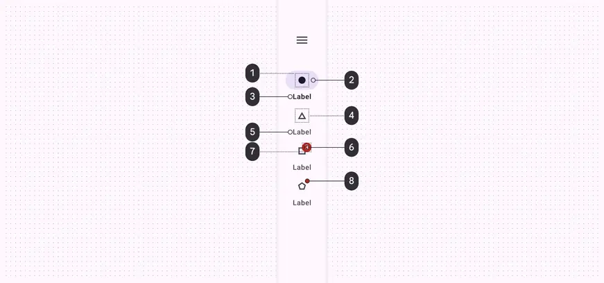
Navigation rail color roles used for light and dark themes:
- On secondary container
- Secondary container
- On surface
- On surface variant
- On surface variant
- Error
- On error
- Error
States
States are visual representations used to communicate the status of a component or interactive element.
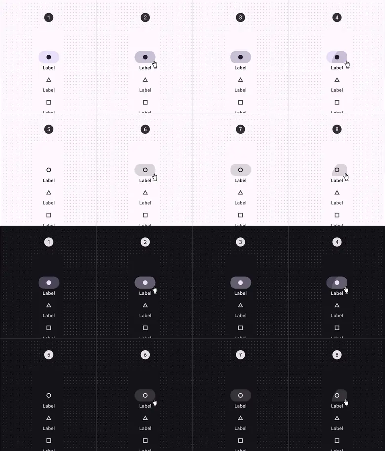
Navigation rail states:
- Enabled (on active destination)
- Hovered (on active destination)
- Focused (on active destination)
- Pressed (on active destination)
- Enabled (on inactive destination)
- Hovered (on inactive destination)
- Focused (on inactive destination)
- Pressed (on inactive destination)
Measurements
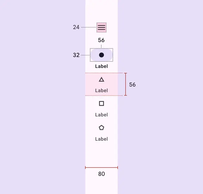
Navigation rail size measurements
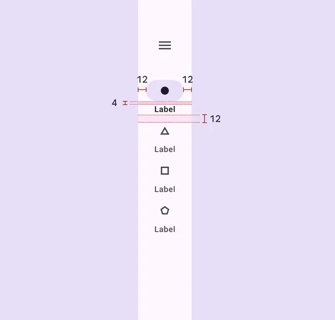
Navigation rail padding and margin measurements
Configurations
Common arrangements of elements within a navigation rail.
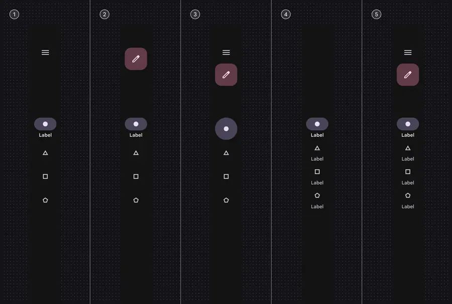
- With a menu
- With a FAB
- With menu and FAB, without labels
- All destinations with text labels
- With menu, FAB, and label text for all destinations