Menus
Menus display a list of choices on a temporary surface. Menus can open from a variety of components, including icon buttons and text fields.
Overview · Specs · Guidelines · Accessibility

- Use a menu to show a temporary set of actions. To show actions on screen at all times, use a toolbar instead
- Menus can open from many components, including icon buttons, split buttons, and text fields
- Context menus provide actions for a specific element, like an image or highlighted text, and usually open with a secondary click
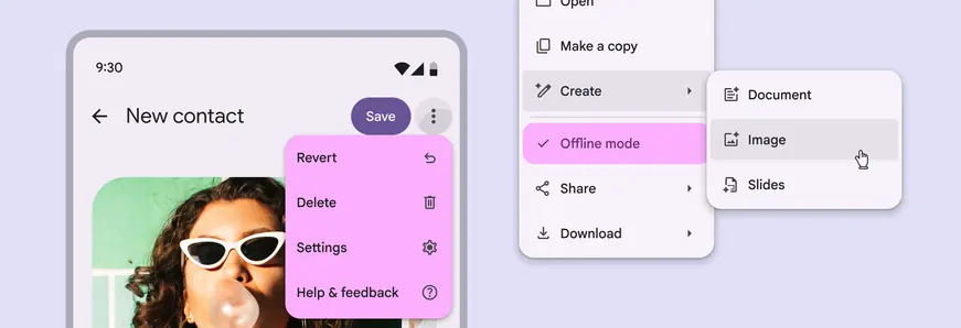
Vertical menus can include vibrant colors, gaps, dividers, and submenus to organize a list of choices
Availability & resources
| Type | Resource | Status |
|---|---|---|
| Design | Design Kit (Figma) | Available |
| Implementation | Flutter | Available |
| Implementation | Jetpack Compose | Available |
| Implementation | Jetpack Compose: Expressive | Available |
| Implementation | Android Views (MDC-Android) | Available |
| Implementation | Android Views (MDC-Android): Expressive | Unavailable |
| Implementation | Web | Available |
| Implementation | Web: Expressive | Unavailable |
M3 Expressive update
November 2025
Vertical menus were introduced with new shapes, color styles, selection states, and refined submenu motion. Gaps can be used for a more flexible layout on Android. More on M3 Expressive
Variants:
- Added vertical menus, recommended for new designs
- Baseline menu is still available
Color styles:
- Standard
- Vibrant
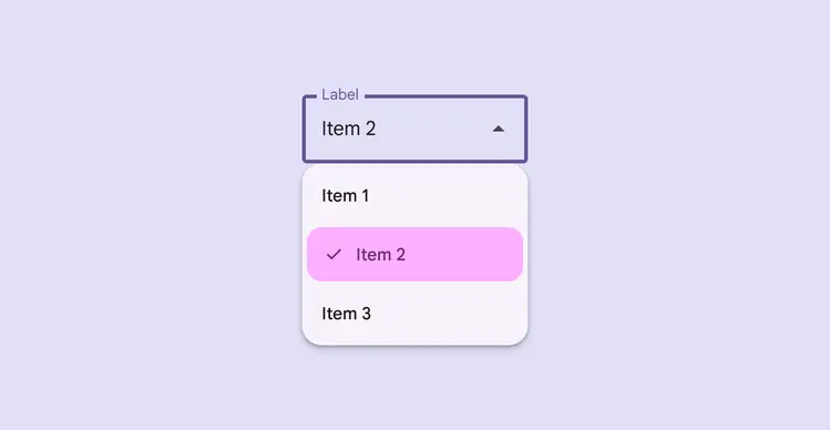
Vibrant colors help selected menu items stand out
Differences from M2
- Color: New color mappings and compatibility with dynamic color
- Variants: Dropdown menu and exposed dropdown menu are now both referred to as menu, since they differ only in the element which opens the menu surface
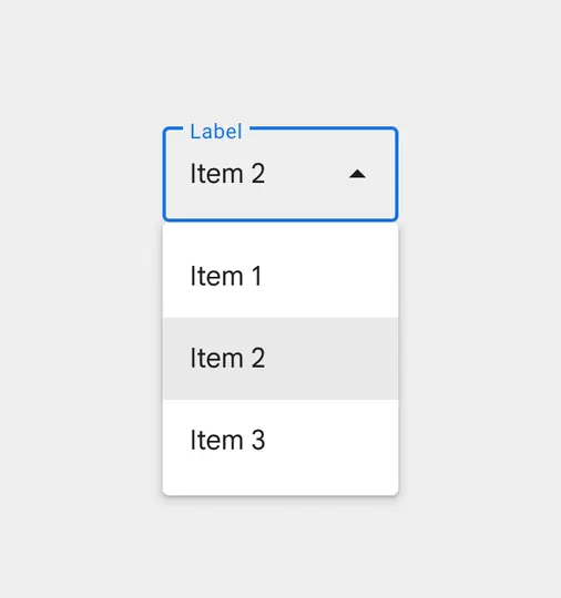
M2: Former menu colors don’t contrast with the background
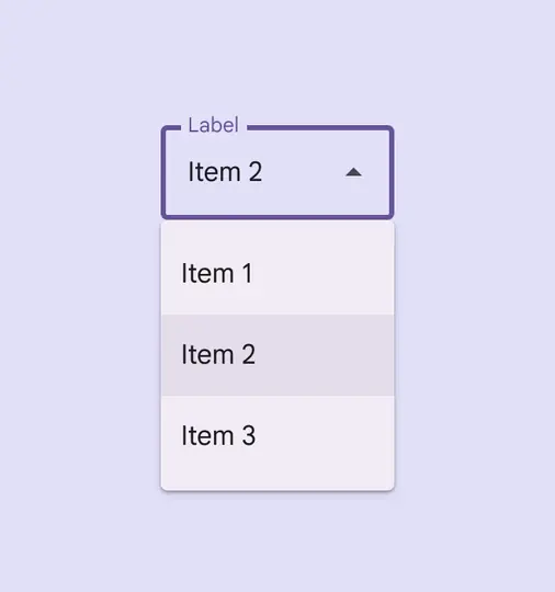
M3: Menus feature new color mappings and dynamic color