Lists
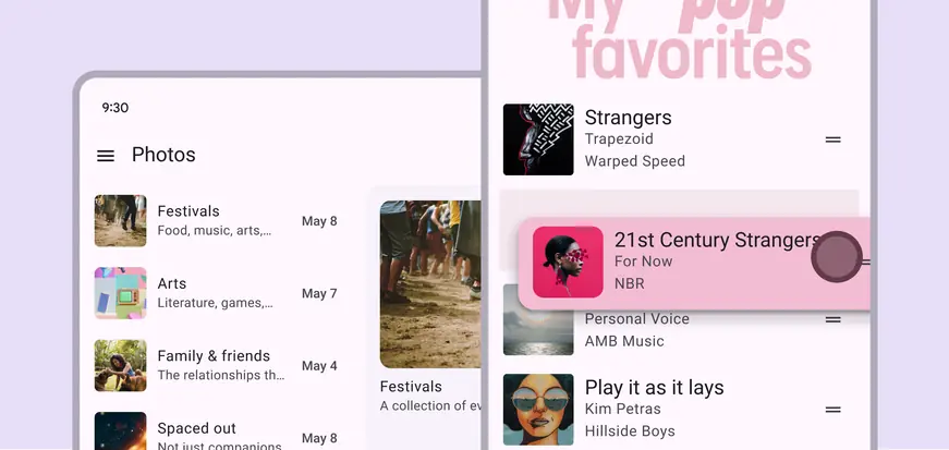
Lists are continuous, vertical indexes of text or images.
Overview · Specs · Guidelines · Accessibility
Variants
Expressive lists
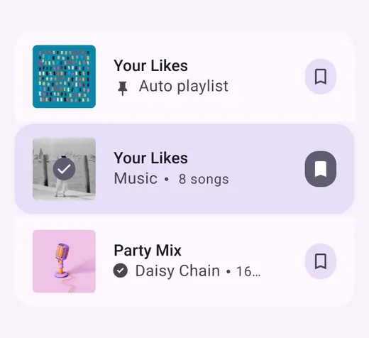
Use the expressive list variant for more flexible styling, highlighted selection states, and customizable slots.
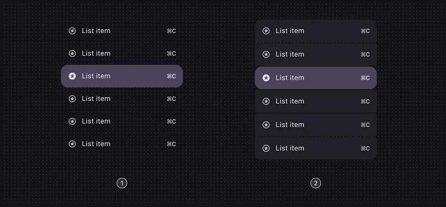
An expressive list has a segmented style and round corners
Baseline lists
Baseline lists are still available to use, but don’t have the latest visual style, selection treatment, and slot functionality.
On web, expressive lists are built on top of baseline lists.
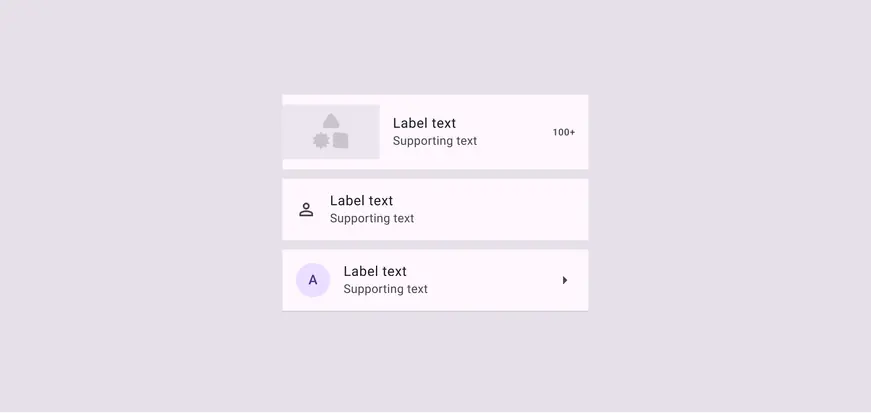
Baseline list items have square corners and standard colors
| Variants | M3 | M3 Expressive |
|---|---|---|
| Lists (expressive) | -- | Available |
| Lists (baseline) | Available | Not recommended. Use expressive lists instead. |
Configurations
Styles
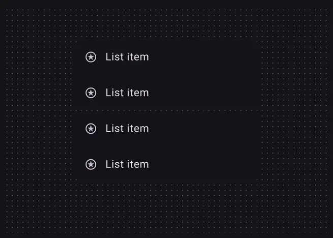
The standard and segmented styles are a visual choice, and don’t affect a list’s behavior.
- Standard
- Segmented
List selection
A list can have only one selection mode at a time. For example, a single-action list can change to a multi-select list, but can’t be both at once.
In a single-action list, each item is a single tappable area
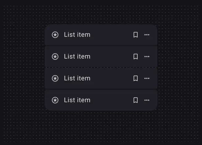
Multi-action list items include a primary action, and one or more secondary actions
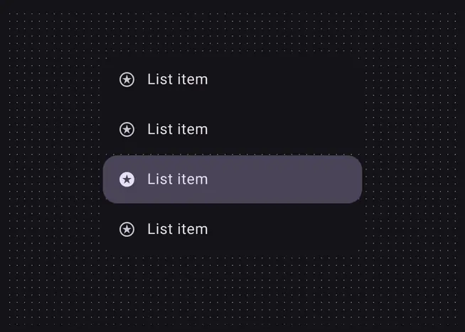
A single-select list
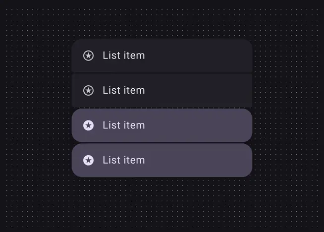
A multi-select list
List interactions
Lists can:
More on list interaction accessibility
A list can expand to include multiple items
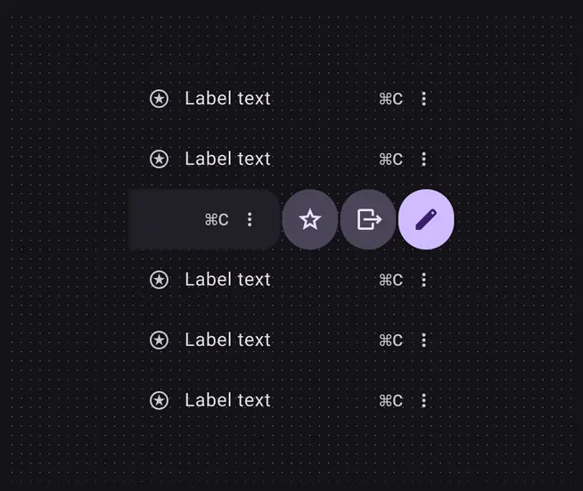
A list item can be swiped to reveal more actions
| Category | Configuration | M3 | M3 Expressive |
|---|---|---|---|
| Styles | Standard | Available | Available |
| Styles | Segmented | -- | Available |
| Selection modes | Single-action, multi-action, single-select, multi-select | Available | Available |
| Interactions | Expand, swipe* | Available | Available |
* Swipe-to-reveal interactions are only available on Android Views
Tokens & specs
Use the table's menu to select a token set. The common set combines baseline tokens with new expressive shapes and sizes. The expand set has tokens for the expand interaction. Learn about design tokens
Design tokens
Token table
Machine-readable relationship table
Lists tokens · 2 token sets · 179 tokens · live token table · DSDB TOKEN_TABLE.6c818a16475113bd
- Default context: Theme: Light · Platform: Android · Audience: 3P · Font: Static · Contrast: Default · iOS dark theme elevation: None · iOS weight setting: Default
- Not configurable here (group default used): Motion scheme: Standard · Language height: Small
- Other contexts: Theme: Dark · Contrast: Medium contrast, High contrast. "Other contexts" lists values that differ from the default when only that one context changes.
- Reference chain: aliases from the token to its source value (
token → alias → … → value). "—" means the token holds a literal value.
List - Common · md.comp.list · 171 tokens
Common baseline and expressive list tokens.
| Group | Token | Type | Reference chain | Resolved value | Other contexts |
|---|---|---|---|---|---|
| Color › Enabled - Selected | md.comp.list.list-item.selected.label-text.color | Color | md.sys.color.on-secondary-container → md.ref.palette.secondary30 | #4A4458 | Dark: #E8DEF8 via md.ref.palette.secondary90Medium contrast: #FFFFFF via md.ref.palette.secondary100High contrast: #FFFFFF via md.ref.palette.secondary100 |
| Color › Enabled - Selected | md.comp.list.list-item.selected.supporting-text.color | Color | md.sys.color.on-secondary-container → md.ref.palette.secondary30 | #4A4458 | Dark: #E8DEF8 via md.ref.palette.secondary90Medium contrast: #FFFFFF via md.ref.palette.secondary100High contrast: #FFFFFF via md.ref.palette.secondary100 |
| Color › Enabled - Selected | md.comp.list.list-item.selected.trailing-supporting-text.color | Color | md.sys.color.on-secondary-container → md.ref.palette.secondary30 | #4A4458 | Dark: #E8DEF8 via md.ref.palette.secondary90Medium contrast: #FFFFFF via md.ref.palette.secondary100High contrast: #FFFFFF via md.ref.palette.secondary100 |
| Color › Enabled - Selected | md.comp.list.list-item.selected.leading-icon.color | Color | md.sys.color.on-secondary-container → md.ref.palette.secondary30 | #4A4458 | Dark: #E8DEF8 via md.ref.palette.secondary90Medium contrast: #FFFFFF via md.ref.palette.secondary100High contrast: #FFFFFF via md.ref.palette.secondary100 |
| Color › Enabled - Selected | md.comp.list.list-item.selected.trailing-icon.color | Color | md.sys.color.on-secondary-container → md.ref.palette.secondary30 | #4A4458 | Dark: #E8DEF8 via md.ref.palette.secondary90Medium contrast: #FFFFFF via md.ref.palette.secondary100High contrast: #FFFFFF via md.ref.palette.secondary100 |
| Color › Enabled - Selected | md.comp.list.list-item.selected.overline.color | Color | md.sys.color.on-secondary-container → md.ref.palette.secondary30 | #4A4458 | Dark: #E8DEF8 via md.ref.palette.secondary90Medium contrast: #FFFFFF via md.ref.palette.secondary100High contrast: #FFFFFF via md.ref.palette.secondary100 |
| Color › Enabled - Selected | md.comp.list.list-item.selected.container.color | Color | md.sys.color.secondary-container → md.ref.palette.secondary90 | #E8DEF8 | Dark: #4A4458 via md.ref.palette.secondary30Medium contrast: #625B71 via md.ref.palette.secondary40High contrast: #4A4458 via md.ref.palette.secondary30 |
| Color › Disabled | md.comp.list.list-item.disabled.state-layer.opacity | Opacity | — | 0.1 | — |
| Color › Disabled | md.comp.list.list-item.disabled.label-text.color | Color | md.sys.color.on-surface → md.ref.palette.neutral10 | #1D1B20 | Dark: #E6E0E9 via md.ref.palette.neutral90Medium contrast: #000000 via md.ref.palette.neutral0High contrast: #000000 via md.ref.palette.neutral0 |
| Color › Disabled | md.comp.list.list-item.disabled.label-text.opacity | Opacity | — | 0.38 | — |
| Color › Disabled | md.comp.list.list-item.disabled.supporting-text.color | Color | md.sys.color.on-surface → md.ref.palette.neutral10 | #1D1B20 | Dark: #E6E0E9 via md.ref.palette.neutral90Medium contrast: #000000 via md.ref.palette.neutral0High contrast: #000000 via md.ref.palette.neutral0 |
| Color › Disabled | md.comp.list.list-item.disabled.supporting-text.opacity | Opacity | — | 0.38 | — |
| Color › Disabled | md.comp.list.list-item.disabled.overline.color | Color | md.sys.color.on-surface → md.ref.palette.neutral10 | #1D1B20 | Dark: #E6E0E9 via md.ref.palette.neutral90Medium contrast: #000000 via md.ref.palette.neutral0High contrast: #000000 via md.ref.palette.neutral0 |
| Color › Disabled | md.comp.list.list-item.disabled.overline.opacity | Opacity | — | 0.38 | — |
| Color › Disabled | md.comp.list.list-item.disabled.leading-icon.color | Color | md.sys.color.on-surface → md.ref.palette.neutral10 | #1D1B20 | Dark: #E6E0E9 via md.ref.palette.neutral90Medium contrast: #000000 via md.ref.palette.neutral0High contrast: #000000 via md.ref.palette.neutral0 |
| Color › Disabled | md.comp.list.list-item.disabled.leading-icon.opacity | Opacity | — | 0.38 | — |
| Color › Disabled | md.comp.list.list-item.disabled.trailing-icon.color | Color | md.sys.color.on-surface → md.ref.palette.neutral10 | #1D1B20 | Dark: #E6E0E9 via md.ref.palette.neutral90Medium contrast: #000000 via md.ref.palette.neutral0High contrast: #000000 via md.ref.palette.neutral0 |
| Color › Disabled | md.comp.list.list-item.disabled.trailing-icon.opacity | Opacity | — | 0.38 | — |
| Color › Disabled | md.comp.list.list-item.disabled.state-layer.color | Color | md.sys.color.on-surface → md.ref.palette.neutral10 | #1D1B20 | Dark: #E6E0E9 via md.ref.palette.neutral90Medium contrast: #000000 via md.ref.palette.neutral0High contrast: #000000 via md.ref.palette.neutral0 |
| Color › Disabled - Selected | md.comp.list.list-item.selected.disabled.container.opacity | Opacity | — | 0.38 | — |
| Color › Disabled - Selected | md.comp.list.list-item.selected.disabled.label-text.color | Color | md.sys.color.on-surface → md.ref.palette.neutral10 | #1D1B20 | Dark: #E6E0E9 via md.ref.palette.neutral90Medium contrast: #000000 via md.ref.palette.neutral0High contrast: #000000 via md.ref.palette.neutral0 |
| Color › Disabled - Selected | md.comp.list.list-item.selected.disabled.label-text.opacity | Opacity | — | 0.38 | — |
| Color › Disabled - Selected | md.comp.list.list-item.selected.disabled.supporting-text.color | Color | md.sys.color.on-surface → md.ref.palette.neutral10 | #1D1B20 | Dark: #E6E0E9 via md.ref.palette.neutral90Medium contrast: #000000 via md.ref.palette.neutral0High contrast: #000000 via md.ref.palette.neutral0 |
| Color › Disabled - Selected | md.comp.list.list-item.selected.disabled.supporting-text.opacity | Opacity | — | 0.38 | — |
| Color › Disabled - Selected | md.comp.list.list-item.selected.disabled.trailing-supporting-text.color | Color | md.sys.color.on-surface → md.ref.palette.neutral10 | #1D1B20 | Dark: #E6E0E9 via md.ref.palette.neutral90Medium contrast: #000000 via md.ref.palette.neutral0High contrast: #000000 via md.ref.palette.neutral0 |
| Color › Disabled - Selected | md.comp.list.list-item.selected.disabled.trailing-supporting-text.opacity | Opacity | — | 0.38 | — |
| Color › Disabled - Selected | md.comp.list.list-item.selected.disabled.overline.color | Color | md.sys.color.on-surface → md.ref.palette.neutral10 | #1D1B20 | Dark: #E6E0E9 via md.ref.palette.neutral90Medium contrast: #000000 via md.ref.palette.neutral0High contrast: #000000 via md.ref.palette.neutral0 |
| Color › Disabled - Selected | md.comp.list.list-item.selected.disabled.overline.opacity | Opacity | — | 0.38 | — |
| Color › Disabled - Selected | md.comp.list.list-item.selected.disabled.state-layer.color | Color | md.sys.color.on-surface → md.ref.palette.neutral10 | #1D1B20 | Dark: #E6E0E9 via md.ref.palette.neutral90Medium contrast: #000000 via md.ref.palette.neutral0High contrast: #000000 via md.ref.palette.neutral0 |
| Color › Disabled - Selected | md.comp.list.list-item.selected.disabled.state-layer.opacity | Opacity | — | 0.1 | — |
| Color › Disabled - Selected | md.comp.list.list-item.selected.disabled.leading-icon.color | Color | md.sys.color.on-surface → md.ref.palette.neutral10 | #1D1B20 | Dark: #E6E0E9 via md.ref.palette.neutral90Medium contrast: #000000 via md.ref.palette.neutral0High contrast: #000000 via md.ref.palette.neutral0 |
| Color › Disabled - Selected | md.comp.list.list-item.selected.disabled.leading-icon.opacity | Opacity | — | 0.38 | — |
| Color › Disabled - Selected | md.comp.list.list-item.selected.disabled.trailing-icon.color | Color | md.sys.color.on-surface → md.ref.palette.neutral10 | #1D1B20 | Dark: #E6E0E9 via md.ref.palette.neutral90Medium contrast: #000000 via md.ref.palette.neutral0High contrast: #000000 via md.ref.palette.neutral0 |
| Color › Disabled - Selected | md.comp.list.list-item.selected.disabled.trailing-icon.opacity | Opacity | — | 0.38 | — |
| Color › Disabled - Selected | md.comp.list.list-item.selected.disabled.container.color | Color | md.sys.color.on-surface → md.ref.palette.neutral10 | #1D1B20 | Dark: #E6E0E9 via md.ref.palette.neutral90Medium contrast: #000000 via md.ref.palette.neutral0High contrast: #000000 via md.ref.palette.neutral0 |
| Color › Hovered | md.comp.list.list-item.hover.state-layer.color | Color | md.sys.color.on-surface → md.ref.palette.neutral10 | #1D1B20 | Dark: #E6E0E9 via md.ref.palette.neutral90Medium contrast: #000000 via md.ref.palette.neutral0High contrast: #000000 via md.ref.palette.neutral0 |
| Color › Hovered | md.comp.list.list-item.hover.state-layer.opacity | Opacity | md.sys.state.hover.state-layer-opacity | 0.08 | — |
| Color › Hovered | md.comp.list.list-item.hover.label-text.color | Color | md.sys.color.on-surface → md.ref.palette.neutral10 | #1D1B20 | Dark: #E6E0E9 via md.ref.palette.neutral90Medium contrast: #000000 via md.ref.palette.neutral0High contrast: #000000 via md.ref.palette.neutral0 |
| Color › Hovered | md.comp.list.list-item.hover.leading-icon.icon.color | Color | md.sys.color.on-surface-variant → md.ref.palette.neutral-variant30 | #49454F | Dark: #CAC4D0 via md.ref.palette.neutral-variant80Medium contrast: #322F37 via md.ref.palette.neutral-variant20High contrast: #000000 via md.ref.palette.neutral-variant0 |
| Color › Hovered | md.comp.list.list-item.hover.trailing-icon.icon.color | Color | md.sys.color.on-surface-variant → md.ref.palette.neutral-variant30 | #49454F | Dark: #CAC4D0 via md.ref.palette.neutral-variant80Medium contrast: #322F37 via md.ref.palette.neutral-variant20High contrast: #000000 via md.ref.palette.neutral-variant0 |
| Color › Hovered - Selected | md.comp.list.list-item.selected.hover.state-layer.opacity | Opacity | md.sys.state.hover.state-layer-opacity | 0.08 | — |
| Color › Hovered - Selected | md.comp.list.list-item.selected.hover.label-text.color | Color | md.sys.color.on-secondary-container → md.ref.palette.secondary30 | #4A4458 | Dark: #E8DEF8 via md.ref.palette.secondary90Medium contrast: #FFFFFF via md.ref.palette.secondary100High contrast: #FFFFFF via md.ref.palette.secondary100 |
| Color › Hovered - Selected | md.comp.list.list-item.selected.hover.leading-icon.color | Color | md.sys.color.on-surface → md.ref.palette.neutral10 | #1D1B20 | Dark: #E6E0E9 via md.ref.palette.neutral90Medium contrast: #000000 via md.ref.palette.neutral0High contrast: #000000 via md.ref.palette.neutral0 |
| Color › Hovered - Selected | md.comp.list.list-item.selected.hover.trailing-icon.color | Color | md.sys.color.on-surface → md.ref.palette.neutral10 | #1D1B20 | Dark: #E6E0E9 via md.ref.palette.neutral90Medium contrast: #000000 via md.ref.palette.neutral0High contrast: #000000 via md.ref.palette.neutral0 |
| Color › Hovered - Selected | md.comp.list.list-item.selected.hover.state-layer.color | Color | md.sys.color.on-surface → md.ref.palette.neutral10 | #1D1B20 | Dark: #E6E0E9 via md.ref.palette.neutral90Medium contrast: #000000 via md.ref.palette.neutral0High contrast: #000000 via md.ref.palette.neutral0 |
| Color › Focused | md.comp.list.list-item.focus.state-layer.color | Color | md.sys.color.on-surface → md.ref.palette.neutral10 | #1D1B20 | Dark: #E6E0E9 via md.ref.palette.neutral90Medium contrast: #000000 via md.ref.palette.neutral0High contrast: #000000 via md.ref.palette.neutral0 |
| Color › Focused | md.comp.list.list-item.focus.state-layer.opacity | Opacity | md.sys.state.focus.state-layer-opacity | 0.1 | — |
| Color › Focused | md.comp.list.list-item.focus.label-text.color | Color | md.sys.color.on-surface → md.ref.palette.neutral10 | #1D1B20 | Dark: #E6E0E9 via md.ref.palette.neutral90Medium contrast: #000000 via md.ref.palette.neutral0High contrast: #000000 via md.ref.palette.neutral0 |
| Color › Focused | md.comp.list.list-item.focus.leading-icon.icon.color | Color | md.sys.color.on-surface-variant → md.ref.palette.neutral-variant30 | #49454F | Dark: #CAC4D0 via md.ref.palette.neutral-variant80Medium contrast: #322F37 via md.ref.palette.neutral-variant20High contrast: #000000 via md.ref.palette.neutral-variant0 |
| Color › Focused | md.comp.list.list-item.focus.trailing-icon.icon.color | Color | md.sys.color.on-surface-variant → md.ref.palette.neutral-variant30 | #49454F | Dark: #CAC4D0 via md.ref.palette.neutral-variant80Medium contrast: #322F37 via md.ref.palette.neutral-variant20High contrast: #000000 via md.ref.palette.neutral-variant0 |
| Color › Focused › Focus indicator | md.comp.list.focus.indicator.thickness | Length | md.sys.state.focus-indicator.thickness | 3dp | — |
| Color › Focused › Focus indicator | md.comp.list.focus.indicator.outline.offset | Length | md.sys.state.focus-indicator.inner-offset | -3dp | — |
| Color › Focused › Focus indicator | md.comp.list.focus.indicator.color | Color | md.sys.color.secondary → md.ref.palette.secondary40 | #625B71 | Dark: #CCC2DC via md.ref.palette.secondary80Medium contrast: #4A4458 via md.ref.palette.secondary30High contrast: #332D41 via md.ref.palette.secondary20 |
| Color › Focused - Selected | md.comp.list.list-item.selected.focus.state-layer.color | Color | md.sys.color.on-surface → md.ref.palette.neutral10 | #1D1B20 | Dark: #E6E0E9 via md.ref.palette.neutral90Medium contrast: #000000 via md.ref.palette.neutral0High contrast: #000000 via md.ref.palette.neutral0 |
| Color › Focused - Selected | md.comp.list.list-item.selected.focus.state-layer.opacity | Opacity | md.sys.state.focus.state-layer-opacity | 0.1 | — |
| Color › Focused - Selected | md.comp.list.list-item.selected.focus.label-text.color | Color | md.sys.color.on-secondary-container → md.ref.palette.secondary30 | #4A4458 | Dark: #E8DEF8 via md.ref.palette.secondary90Medium contrast: #FFFFFF via md.ref.palette.secondary100High contrast: #FFFFFF via md.ref.palette.secondary100 |
| Color › Focused - Selected | md.comp.list.list-item.selected.focus.leading-icon.color | Color | md.sys.color.on-surface → md.ref.palette.neutral10 | #1D1B20 | Dark: #E6E0E9 via md.ref.palette.neutral90Medium contrast: #000000 via md.ref.palette.neutral0High contrast: #000000 via md.ref.palette.neutral0 |
| Color › Focused - Selected | md.comp.list.list-item.selected.focus.trailing-icon.color | Color | md.sys.color.on-surface → md.ref.palette.neutral10 | #1D1B20 | Dark: #E6E0E9 via md.ref.palette.neutral90Medium contrast: #000000 via md.ref.palette.neutral0High contrast: #000000 via md.ref.palette.neutral0 |
| Color › Pressed (ripple) | md.comp.list.list-item.pressed.state-layer.color | Color | md.sys.color.on-surface → md.ref.palette.neutral10 | #1D1B20 | Dark: #E6E0E9 via md.ref.palette.neutral90Medium contrast: #000000 via md.ref.palette.neutral0High contrast: #000000 via md.ref.palette.neutral0 |
| Color › Pressed (ripple) | md.comp.list.list-item.pressed.state-layer.opacity | Opacity | md.sys.state.pressed.state-layer-opacity | 0.1 | — |
| Color › Pressed (ripple) | md.comp.list.list-item.pressed.label-text.color | Color | md.sys.color.on-surface → md.ref.palette.neutral10 | #1D1B20 | Dark: #E6E0E9 via md.ref.palette.neutral90Medium contrast: #000000 via md.ref.palette.neutral0High contrast: #000000 via md.ref.palette.neutral0 |
| Color › Pressed (ripple) | md.comp.list.list-item.pressed.leading-icon.icon.color | Color | md.sys.color.on-surface-variant → md.ref.palette.neutral-variant30 | #49454F | Dark: #CAC4D0 via md.ref.palette.neutral-variant80Medium contrast: #322F37 via md.ref.palette.neutral-variant20High contrast: #000000 via md.ref.palette.neutral-variant0 |
| Color › Pressed (ripple) | md.comp.list.list-item.pressed.trailing-icon.icon.color | Color | md.sys.color.on-surface-variant → md.ref.palette.neutral-variant30 | #49454F | Dark: #CAC4D0 via md.ref.palette.neutral-variant80Medium contrast: #322F37 via md.ref.palette.neutral-variant20High contrast: #000000 via md.ref.palette.neutral-variant0 |
| Color › Pressed - Selected | md.comp.list.list-item.selected.pressed.state-layer.color | Color | md.sys.color.on-surface → md.ref.palette.neutral10 | #1D1B20 | Dark: #E6E0E9 via md.ref.palette.neutral90Medium contrast: #000000 via md.ref.palette.neutral0High contrast: #000000 via md.ref.palette.neutral0 |
| Color › Pressed - Selected | md.comp.list.list-item.selected.pressed.state-layer.opacity | Opacity | md.sys.state.pressed.state-layer-opacity | 0.1 | — |
| Color › Pressed - Selected | md.comp.list.list-item.selected.pressed.label-text.color | Color | md.sys.color.on-secondary-container → md.ref.palette.secondary30 | #4A4458 | Dark: #E8DEF8 via md.ref.palette.secondary90Medium contrast: #FFFFFF via md.ref.palette.secondary100High contrast: #FFFFFF via md.ref.palette.secondary100 |
| Color › Pressed - Selected | md.comp.list.list-item.selected.pressed.trailing-icon.color | Color | md.sys.color.on-surface → md.ref.palette.neutral10 | #1D1B20 | Dark: #E6E0E9 via md.ref.palette.neutral90Medium contrast: #000000 via md.ref.palette.neutral0High contrast: #000000 via md.ref.palette.neutral0 |
| Color › Pressed - Selected | md.comp.list.list-item.selected.pressed.leading-icon.color | Color | md.sys.color.on-surface → md.ref.palette.neutral10 | #1D1B20 | Dark: #E6E0E9 via md.ref.palette.neutral90Medium contrast: #000000 via md.ref.palette.neutral0High contrast: #000000 via md.ref.palette.neutral0 |
| Color › Dragged (baseline only) | md.comp.list.list-item.dragged.label-text.color | Color | md.sys.color.on-surface → md.ref.palette.neutral10 | #1D1B20 | Dark: #E6E0E9 via md.ref.palette.neutral90Medium contrast: #000000 via md.ref.palette.neutral0High contrast: #000000 via md.ref.palette.neutral0 |
| Color › Dragged (baseline only) | md.comp.list.list-item.selected.dragged.label-text.color | Color | md.sys.color.on-secondary-container → md.ref.palette.secondary30 | #4A4458 | Dark: #E8DEF8 via md.ref.palette.secondary90Medium contrast: #FFFFFF via md.ref.palette.secondary100High contrast: #FFFFFF via md.ref.palette.secondary100 |
| Color › Dragged (baseline only) | md.comp.list.list-item.dragged.state-layer.color | Color | md.sys.color.on-surface → md.ref.palette.neutral10 | #1D1B20 | Dark: #E6E0E9 via md.ref.palette.neutral90Medium contrast: #000000 via md.ref.palette.neutral0High contrast: #000000 via md.ref.palette.neutral0 |
| Color › Dragged (baseline only) | md.comp.list.list-item.dragged.state-layer.opacity | Opacity | md.sys.state.dragged.state-layer-opacity | 0.16 | — |
| Color › Dragged (baseline only) | md.comp.list.list-item.selected.dragged.state-layer.color | Color | md.sys.color.on-surface → md.ref.palette.neutral10 | #1D1B20 | Dark: #E6E0E9 via md.ref.palette.neutral90Medium contrast: #000000 via md.ref.palette.neutral0High contrast: #000000 via md.ref.palette.neutral0 |
| Color › Dragged (baseline only) | md.comp.list.list-item.selected.dragged.state-layer.opacity | Opacity | md.sys.state.dragged.state-layer-opacity | 0.16 | — |
| Color › Dragged (baseline only) | md.comp.list.list-item.dragged.leading-icon.icon.color | Color | md.sys.color.on-surface-variant → md.ref.palette.neutral-variant30 | #49454F | Dark: #CAC4D0 via md.ref.palette.neutral-variant80Medium contrast: #322F37 via md.ref.palette.neutral-variant20High contrast: #000000 via md.ref.palette.neutral-variant0 |
| Color › Dragged (baseline only) | md.comp.list.list-item.selected.dragged.leading-icon.color | Color | md.sys.color.on-surface → md.ref.palette.neutral10 | #1D1B20 | Dark: #E6E0E9 via md.ref.palette.neutral90Medium contrast: #000000 via md.ref.palette.neutral0High contrast: #000000 via md.ref.palette.neutral0 |
| Color › Dragged (baseline only) | md.comp.list.list-item.dragged.trailing-icon.icon.color | Color | md.sys.color.on-surface-variant → md.ref.palette.neutral-variant30 | #49454F | Dark: #CAC4D0 via md.ref.palette.neutral-variant80Medium contrast: #322F37 via md.ref.palette.neutral-variant20High contrast: #000000 via md.ref.palette.neutral-variant0 |
| Color › Dragged (baseline only) | md.comp.list.list-item.selected.dragged.trailing-icon.color | Color | md.sys.color.on-surface → md.ref.palette.neutral10 | #1D1B20 | Dark: #E6E0E9 via md.ref.palette.neutral90Medium contrast: #000000 via md.ref.palette.neutral0High contrast: #000000 via md.ref.palette.neutral0 |
| Color › Dragged (baseline only) | md.comp.list.list-item.dragged.container.elevation | Elevation | md.sys.elevation.level4 | 8dp | — |
| Color › Enabled | md.comp.list.list-item.container.color | Color | md.sys.color.surface → md.ref.palette.neutral98 | #FEF7FF | Dark: #141218 via md.ref.palette.neutral6 |
| Color › Enabled | md.comp.list.list-item.segmented.container.color | Color | md.sys.color.surface → md.ref.palette.neutral98 | #FEF7FF | Dark: #141218 via md.ref.palette.neutral6 |
| Color › Enabled | md.comp.list.list-item.label-text.color | Color | md.sys.color.on-surface → md.ref.palette.neutral10 | #1D1B20 | Dark: #E6E0E9 via md.ref.palette.neutral90Medium contrast: #000000 via md.ref.palette.neutral0High contrast: #000000 via md.ref.palette.neutral0 |
| Color › Enabled | md.comp.list.list-item.supporting-text.color | Color | md.sys.color.on-surface-variant → md.ref.palette.neutral-variant30 | #49454F | Dark: #CAC4D0 via md.ref.palette.neutral-variant80Medium contrast: #322F37 via md.ref.palette.neutral-variant20High contrast: #000000 via md.ref.palette.neutral-variant0 |
| Color › Enabled | md.comp.list.list-item.overline.color | Color | md.sys.color.on-surface-variant → md.ref.palette.neutral-variant30 | #49454F | Dark: #CAC4D0 via md.ref.palette.neutral-variant80Medium contrast: #322F37 via md.ref.palette.neutral-variant20High contrast: #000000 via md.ref.palette.neutral-variant0 |
| Color › Enabled | md.comp.list.divider.color (deprecated) | Color | md.sys.color.outline → md.ref.palette.neutral-variant50 | #79747E | Dark: #938F99 via md.ref.palette.neutral-variant60Medium contrast: #49454F via md.ref.palette.neutral-variant30High contrast: #322F37 via md.ref.palette.neutral-variant20 |
| Color › Enabled | md.comp.list.divider.height (deprecated) | Length | — | 1dp | — |
| Color › Enabled | md.comp.list.list-item.container.height (deprecated) | Length | — | 56dp | — |
| Color › Enabled | md.comp.list.md.comp.list.list-item.one-line.container.height (deprecated) | Length | — | 56dp | — |
| Color › Enabled | md.comp.list.md.comp.list.list-item.three-line.container.height (deprecated) | Length | — | 88dp | — |
| Color › Enabled | md.comp.list.md.comp.list.list-item.two-line.container.height (deprecated) | Length | — | 72dp | — |
| Color › Enabled | md.comp.list.list-item.leading-icon.color | Color | md.sys.color.on-surface-variant → md.ref.palette.neutral-variant30 | #49454F | Dark: #CAC4D0 via md.ref.palette.neutral-variant80Medium contrast: #322F37 via md.ref.palette.neutral-variant20High contrast: #000000 via md.ref.palette.neutral-variant0 |
| Color › Enabled | md.comp.list.list-item.trailing-icon.color | Color | md.sys.color.on-surface-variant → md.ref.palette.neutral-variant30 | #49454F | Dark: #CAC4D0 via md.ref.palette.neutral-variant80Medium contrast: #322F37 via md.ref.palette.neutral-variant20High contrast: #000000 via md.ref.palette.neutral-variant0 |
| Color › Enabled | md.comp.list.list-item.unselected.trailing-icon.color | Color | md.sys.color.on-surface → md.ref.palette.neutral10 | #1D1B20 | Dark: #E6E0E9 via md.ref.palette.neutral90Medium contrast: #000000 via md.ref.palette.neutral0High contrast: #000000 via md.ref.palette.neutral0 |
| Color › Enabled | md.comp.list.list-item.trailing-supporting-text.color | Color | md.sys.color.on-surface-variant → md.ref.palette.neutral-variant30 | #49454F | Dark: #CAC4D0 via md.ref.palette.neutral-variant80Medium contrast: #322F37 via md.ref.palette.neutral-variant20High contrast: #000000 via md.ref.palette.neutral-variant0 |
| Color › Enabled | md.comp.list.list-item.leading-avatar.color | Color | md.sys.color.primary-container → md.ref.palette.primary90 | #EADDFF | Dark: #4F378B via md.ref.palette.primary30Medium contrast: #6750A4 via md.ref.palette.primary40High contrast: #4F378B via md.ref.palette.primary30 |
| Color › Enabled | md.comp.list.list-item.leading-avatar-label.color | Color | md.sys.color.on-primary-container → md.ref.palette.primary30 | #4F378B | Dark: #EADDFF via md.ref.palette.primary90Medium contrast: #FFFFFF via md.ref.palette.primary100High contrast: #FFFFFF via md.ref.palette.primary100 |
| Color › Enabled | md.comp.list.list-item.container.elevation | Elevation | md.sys.elevation.level0 | 0dp | — |
| Spacing | md.comp.list.list-item.trailing-space | Length | md.sys.measurement.space200 | 16dp | — |
| Spacing | md.comp.list.list-item.top-space | Length | md.sys.measurement.space125 | 10dp | — |
| Spacing | md.comp.list.list-item.bottom-space | Length | md.sys.measurement.space125 | 10dp | — |
| Spacing | md.comp.list.list-item.between-space | Length | md.sys.measurement.space150 | 12dp | — |
| Spacing | md.comp.list.divider.leading-space | Length | md.sys.measurement.space200 | 16dp | — |
| Spacing | md.comp.list.divider.trailing-space | Length | md.sys.measurement.space200 | 16dp | — |
| Spacing | md.comp.list.divider.top-space | Length | md.sys.measurement.space0 | 0dp | — |
| Spacing | md.comp.list.divider.bottom-space | Length | md.sys.measurement.space0 | 0dp | — |
| Spacing | md.comp.list.segmented.gap | Length | md.sys.measurement.space25 | 2dp | — |
| Spacing | md.comp.list.list-item.leading-space | Length | md.sys.measurement.space200 | 16dp | — |
| Shape | md.comp.list.list-item.container.shape | Shape | md.sys.shape.corner.none | Rounded corners 0dp | — |
| Shape | md.comp.list.list-item.container.expressive.shape | Shape | md.sys.shape.corner.extra-small | Rounded corners 4dp | — |
| Shape | md.comp.list.list-item.disabled.container.expressive.shape | Shape | md.sys.shape.corner.extra-small | Rounded corners 4dp | — |
| Shape | md.comp.list.list-item.hovered.container.expressive.shape | Shape | md.sys.shape.corner.medium | Rounded corners 12dp | — |
| Shape | md.comp.list.list-item.focused.container.expressive.shape | Shape | md.sys.shape.corner.large | Rounded corners 16dp | — |
| Shape | md.comp.list.list-item.pressed.container.expressive.shape | Shape | md.sys.shape.corner.large | Rounded corners 16dp | — |
| Shape | md.comp.list.list-item.dragged.container.expressive.shape | Shape | md.sys.shape.corner.large | Rounded corners 16dp | — |
| Shape | md.comp.list.list-item.selected.container.expressive.shape | Shape | md.sys.shape.corner.large | Rounded corners 16dp | — |
| Shape | md.comp.list.list-item.selected.disabled.container.expressive.shape | Shape | md.sys.shape.corner.large | Rounded corners 16dp | — |
| Shape | md.comp.list.list-item.selected.hovered.container.expressive.shape | Shape | md.sys.shape.corner.large | Rounded corners 16dp | — |
| Shape | md.comp.list.list-item.selected.focused.container.expressive.shape | Shape | md.sys.shape.corner.large | Rounded corners 16dp | — |
| Shape | md.comp.list.list-item.selected.pressed.container.expressive.shape | Shape | md.sys.shape.corner.large | Rounded corners 16dp | — |
| Shape | md.comp.list.list-item.selected.dragged.container.expressive.shape | Shape | md.sys.shape.corner.large | Rounded corners 16dp | — |
| Shape | md.comp.list.list-item.leading-avatar.shape | Shape | md.sys.shape.corner.full | Circular (fully rounded) | — |
| Shape | md.comp.list.list-item.leading-video.shape | Shape | md.sys.shape.corner.small | Rounded corners 8dp | — |
| Shape | md.comp.list.list-item.leading-image.shape | Shape | md.sys.shape.corner.none | Rounded corners 0dp | — |
| Shape | md.comp.list.list-item.leading-image.expressive.shape | Shape | md.sys.shape.corner.small | Rounded corners 8dp | — |
| Shape | md.comp.list.list-item.selected.container.shape | Shape | md.sys.shape.corner.large | Rounded corners 16dp | — |
| Shape | md.comp.list.container.shape | Shape | md.sys.shape.corner.large | Rounded corners 16dp | — |
| Size and typography | md.comp.list.list-item.leading-avatar-label.type | Typography | composite font names: md.comp.list.list-item.leading-avatar-label.font → md.sys.typescale.title-medium.font → md.ref.typeface.plainfont weight: md.comp.list.list-item.leading-avatar-label.weight → md.sys.typescale.title-medium.weight → md.ref.typeface.weight-mediumfont size: md.comp.list.list-item.leading-avatar-label.size → md.sys.typescale.title-medium.sizeline height: md.comp.list.list-item.leading-avatar-label.line-height → md.sys.typescale.title-medium.line-heightfont tracking: md.comp.list.list-item.leading-avatar-label.tracking → md.sys.typescale.title-medium.tracking | Roboto · weight 500 · size 16pt · line height 24pt · tracking 0.15pt | — |
| Size and typography | md.comp.list.list-item.leading-avatar.size | Length | — | 40dp | — |
| Size and typography | md.comp.list.list-item.leading-avatar-label.font | Font names | md.sys.typescale.title-medium.font → md.ref.typeface.plain | Roboto | — |
| Size and typography | md.comp.list.list-item.leading-avatar-label.line-height | Line height | md.sys.typescale.title-medium.line-height | 24pt | — |
| Size and typography | md.comp.list.list-item.leading-avatar-label.size | Font size | md.sys.typescale.title-medium.size | 16pt | — |
| Size and typography | md.comp.list.list-item.leading-avatar-label.tracking | Font tracking | md.sys.typescale.title-medium.tracking | 0.15pt | — |
| Size and typography | md.comp.list.list-item.leading-avatar-label.weight | Font weight | md.sys.typescale.title-medium.weight → md.ref.typeface.weight-medium | 500 | — |
| Size and typography | md.comp.list.list-item.leading-icon.size | Length | — | 24dp | — |
| Size and typography | md.comp.list.list-item.leading-icon.expressive.size | Length | — | 20dp | — |
| Size and typography | md.comp.list.list-item.leading-image.width | Length | — | 56dp | — |
| Size and typography | md.comp.list.list-item.leading-image.height | Length | — | 56dp | — |
| Size and typography | md.comp.list.list-item.leading-video.width | Length | — | 100dp | — |
| Size and typography | md.comp.list.list-item.small.leading-video.width | Length | — | 100dp | — |
| Size and typography | md.comp.list.list-item.small.leading-video.height | Length | — | 56dp | — |
| Size and typography | md.comp.list.list-item.large.leading-video.width | Length | — | 114dp | — |
| Size and typography | md.comp.list.list-item.large.leading-video.height | Length | — | 64dp | — |
| Size and typography | md.comp.list.list-item.one-line.container.height | Length | — | 56dp | — |
| Size and typography | md.comp.list.list-item.two-line.container.height | Length | — | 72dp | — |
| Size and typography | md.comp.list.list-item.three-line.container.height | Length | — | 88dp | — |
| Size and typography | md.comp.list.list-item.trailing-icon.size | Length | — | 24dp | — |
| Size and typography | md.comp.list.list-item.trailing-icon.expressive.size | Length | — | 20dp | — |
| Size and typography | md.comp.list.list-item.label-text.type | Typography | composite font names: md.comp.list.list-item.label-text.font → md.sys.typescale.body-large.font → md.ref.typeface.plainfont weight: md.comp.list.list-item.label-text.weight → md.sys.typescale.body-large.weight → md.ref.typeface.weight-regularfont size: md.comp.list.list-item.label-text.size → md.sys.typescale.body-large.sizeline height: md.comp.list.list-item.label-text.line-height → md.sys.typescale.body-large.line-heightfont tracking: md.comp.list.list-item.label-text.tracking → md.sys.typescale.body-large.tracking | Roboto · weight 400 · size 16pt · line height 24pt · tracking 0.5pt | — |
| Size and typography | md.comp.list.list-item.label-text.font | Font names | md.sys.typescale.body-large.font → md.ref.typeface.plain | Roboto | — |
| Size and typography | md.comp.list.list-item.label-text.line-height | Line height | md.sys.typescale.body-large.line-height | 24pt | — |
| Size and typography | md.comp.list.list-item.label-text.size | Font size | md.sys.typescale.body-large.size | 16pt | — |
| Size and typography | md.comp.list.list-item.label-text.tracking | Font tracking | md.sys.typescale.body-large.tracking | 0.5pt | — |
| Size and typography | md.comp.list.list-item.label-text.weight | Font weight | md.sys.typescale.body-large.weight → md.ref.typeface.weight-regular | 400 | — |
| Size and typography | md.comp.list.list-item.trailing-supporting-text.type | Typography | composite font names: md.comp.list.list-item.trailing-supporting-text.font → md.sys.typescale.label-small.font → md.ref.typeface.plainfont weight: md.comp.list.list-item.trailing-supporting-text.weight → md.sys.typescale.label-small.weight → md.ref.typeface.weight-mediumfont size: md.comp.list.list-item.trailing-supporting-text.size → md.sys.typescale.label-small.sizeline height: md.comp.list.list-item.trailing-supporting-text.line-height → md.sys.typescale.label-small.line-heightfont tracking: md.comp.list.list-item.trailing-supporting-text.tracking → md.sys.typescale.label-small.tracking | Roboto · weight 500 · size 11pt · line height 16pt · tracking 0.5pt | — |
| Size and typography | md.comp.list.list-item.trailing-supporting-text.font | Font names | md.sys.typescale.label-small.font → md.ref.typeface.plain | Roboto | — |
| Size and typography | md.comp.list.list-item.trailing-supporting-text.line-height | Line height | md.sys.typescale.label-small.line-height | 16pt | — |
| Size and typography | md.comp.list.list-item.trailing-supporting-text.size | Font size | md.sys.typescale.label-small.size | 11pt | — |
| Size and typography | md.comp.list.list-item.trailing-supporting-text.tracking | Font tracking | md.sys.typescale.label-small.tracking | 0.5pt | — |
| Size and typography | md.comp.list.list-item.trailing-supporting-text.weight | Font weight | md.sys.typescale.label-small.weight → md.ref.typeface.weight-medium | 500 | — |
| Size and typography | md.comp.list.list-item.supporting-text.type | Typography | composite font names: md.comp.list.list-item.supporting-text.font → md.sys.typescale.body-medium.font → md.ref.typeface.plainfont weight: md.comp.list.list-item.supporting-text.weight → md.sys.typescale.body-medium.weight → md.ref.typeface.weight-regularfont size: md.comp.list.list-item.supporting-text.size → md.sys.typescale.body-medium.sizeline height: md.comp.list.list-item.supporting-text.line-height → md.sys.typescale.body-medium.line-heightfont tracking: md.comp.list.list-item.supporting-text.tracking → md.sys.typescale.body-medium.tracking | Roboto · weight 400 · size 14pt · line height 20pt · tracking 0.25pt | — |
| Size and typography | md.comp.list.list-item.supporting-text.font | Font names | md.sys.typescale.body-medium.font → md.ref.typeface.plain | Roboto | — |
| Size and typography | md.comp.list.list-item.supporting-text.line-height | Line height | md.sys.typescale.body-medium.line-height | 20pt | — |
| Size and typography | md.comp.list.list-item.supporting-text.size | Font size | md.sys.typescale.body-medium.size | 14pt | — |
| Size and typography | md.comp.list.list-item.supporting-text.tracking | Font tracking | md.sys.typescale.body-medium.tracking | 0.25pt | — |
| Size and typography | md.comp.list.list-item.supporting-text.weight | Font weight | md.sys.typescale.body-medium.weight → md.ref.typeface.weight-regular | 400 | — |
| Size and typography | md.comp.list.list-item.overline.type | Typography | composite font names: md.comp.list.list-item.overline.font → md.sys.typescale.label-small.font → md.ref.typeface.plainfont weight: md.comp.list.list-item.overline.weight → md.sys.typescale.label-small.weight → md.ref.typeface.weight-mediumfont size: md.comp.list.list-item.overline.size → md.sys.typescale.label-small.sizeline height: md.comp.list.list-item.overline.line-height → md.sys.typescale.label-small.line-heightfont tracking: md.comp.list.list-item.overline.tracking → md.sys.typescale.label-small.tracking | Roboto · weight 500 · size 11pt · line height 16pt · tracking 0.5pt | — |
| Size and typography | md.comp.list.list-item.overline.font | Font names | md.sys.typescale.label-small.font → md.ref.typeface.plain | Roboto | — |
| Size and typography | md.comp.list.list-item.overline.line-height | Line height | md.sys.typescale.label-small.line-height | 16pt | — |
| Size and typography | md.comp.list.list-item.overline.size | Font size | md.sys.typescale.label-small.size | 11pt | — |
| Size and typography | md.comp.list.list-item.overline.tracking | Font tracking | md.sys.typescale.label-small.tracking | 0.5pt | — |
| Size and typography | md.comp.list.list-item.overline.weight | Font weight | md.sys.typescale.label-small.weight → md.ref.typeface.weight-medium | 500 | — |
List - Expand · md.comp.list.expand · 8 tokens
For list items that can expand and collapse.
| Group | Token | Type | Reference chain | Resolved value | Other contexts |
|---|---|---|---|---|---|
| Color | md.comp.list.expand.expanded.list-item.segmented.container.color | Color | md.sys.color.surface → md.ref.palette.neutral98 | #FEF7FF | Dark: #141218 via md.ref.palette.neutral6 |
| Color | md.comp.list.expand.collapsed.list-item.trailing-icon.container.color | Color | md.sys.color.surface → md.ref.palette.neutral98 | #FEF7FF | Dark: #141218 via md.ref.palette.neutral6 |
| Color | md.comp.list.expand.collapsed.list-item.trailing-icon.icon.color | Color | md.sys.color.on-surface → md.ref.palette.neutral10 | #1D1B20 | Dark: #E6E0E9 via md.ref.palette.neutral90Medium contrast: #000000 via md.ref.palette.neutral0High contrast: #000000 via md.ref.palette.neutral0 |
| Color | md.comp.list.expand.expanded.list-item.trailing-icon.container.color | Color | md.sys.color.surface-container → md.ref.palette.neutral94 | #F3EDF7 | Dark: #211F26 via md.ref.palette.neutral12 |
| Color | md.comp.list.expand.expanded.list-item.trailing-icon.icon.color | Color | md.sys.color.on-surface → md.ref.palette.neutral10 | #1D1B20 | Dark: #E6E0E9 via md.ref.palette.neutral90Medium contrast: #000000 via md.ref.palette.neutral0High contrast: #000000 via md.ref.palette.neutral0 |
| Color | md.comp.list.expand.expanded.list-item.container.color | Color | md.sys.color.surface → md.ref.palette.neutral98 | #FEF7FF | Dark: #141218 via md.ref.palette.neutral6 |
| Shape | md.comp.list.expand.trailing-icon.shape | Shape | md.sys.shape.corner.full | Circular (fully rounded) | — |
| Shape | md.comp.list.expand.container.shape | Shape | md.sys.shape.corner.large | Rounded corners 16dp | — |
Anatomy
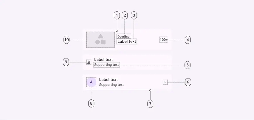
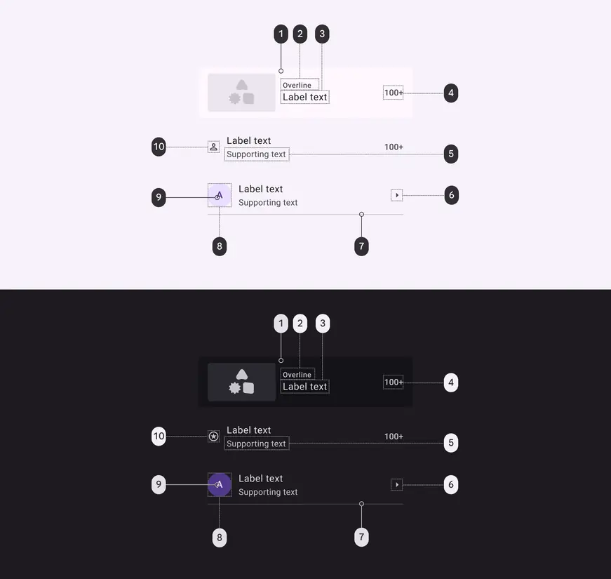
Container and label text are required. All other elements are optional:
- Container
- Overline
- Label text
- Trailing text
- Supporting text
- Trailing icon
- Divider
- Leading avatar
- Leading icon
- Leading media - image or video
Flexibility & slots
The M3 Design Kit includes lists with custom slots for designing flexible item layouts. Think of a custom list as a container with three different slots: leading, content, and trailing. Each slot can hold a different element.
Slot accessibility
Slots are not accessible by default. Consider the following:
- Elements must follow the rules, structure, and interaction patterns for lists
- Use standard list item padding
- Target size must be at least 48x48dp
- Don't add interactive elements that make the list item difficult to navigate, especially for people using screen readers
More on required accessibility guidelines
Caution
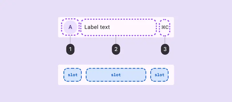
Reserve the use of slots for use cases that maintain the list’s accessibility and functionality
- Leading slot
- Content slot
- Trailing slot
Caution
Slots require custom code implementation that you must create and maintain
The leading and trailing slot positions must be a smaller width than the content section.
1. Leading slots can contain:
- Visual elements: Avatar, icon, image, or video thumbnail
- Selection controls: Checkbox, radio button, or switch
- Customizations: Badge or larger image
2. Content slots must be the largest-width slot and can contain:
- Default content: Label text, supporting text
- Optional add-ons: Badge, icon, in-line label, or more text elements
- Avoid long lines of text to preserve readability
3. Trailing slots can contain:
- Action elements or text: Icon, icon button, or trailing text
- Selection controls: Checkbox, radio button, or switch
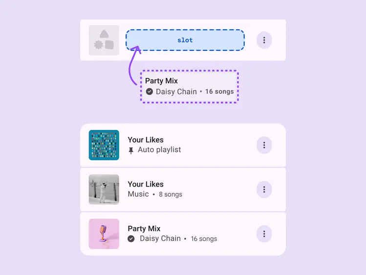
The content slot must be the largest section, placed in the middle of the list item
Selection lists
For selection lists, use only one selection interaction per list item.
Do
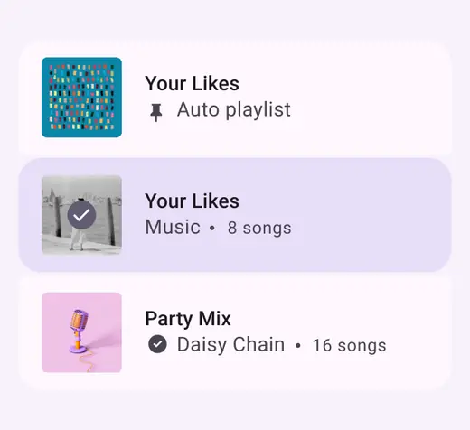
Use only one selection interaction per list item
Don't
Don't use multiple selection interactions in one item
Color
Color values are implemented through design tokens. For designers, this means working with color values that correspond with tokens. In implementation, a color value will be a token that references a value. Learn more about design tokens
List color roles used for light and dark themes:
- Surface
- On surface variant
- On surface
- On surface variant
- On surface variant
- On surface variant
- Outline variant
- Primary container
- On primary container
- On surface variant
States
States are visual representations used to communicate the status of a component or an interactive element. Learn more about interaction states
More on list focus
Default list items
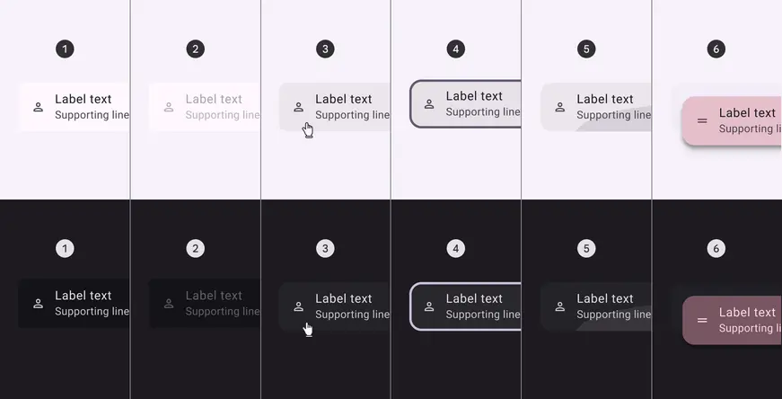
- Enabled
- Disabled
- Hovered
- Focused
- Pressed
- Dragged
Selected list items
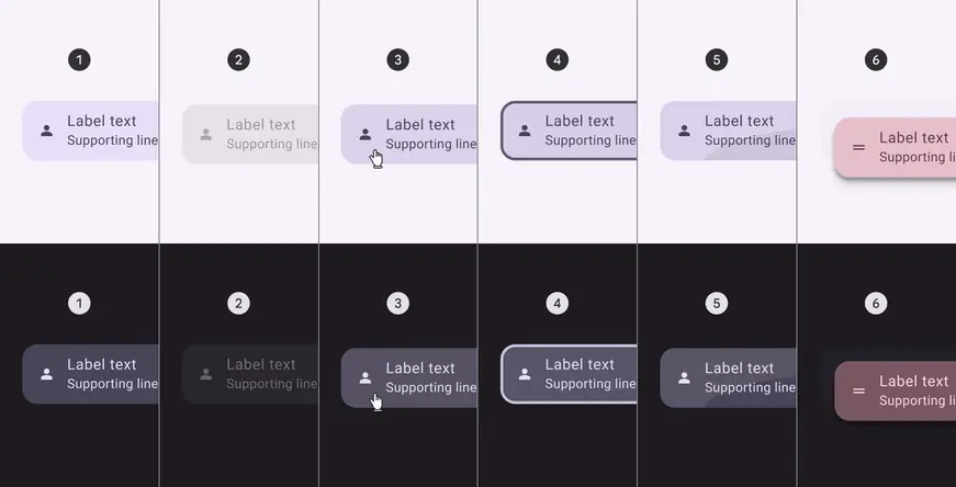
- Enabled
- Disabled
- Hovered
- Focused
- Pressed
- Dragged
Measurements
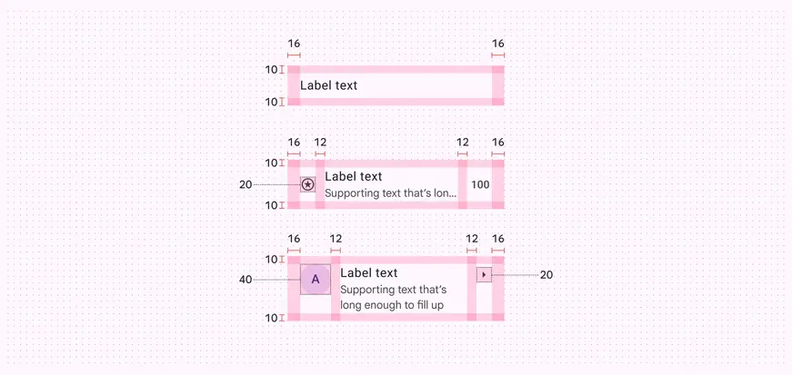
List item alignment, padding, and size measurements. The icon button height is dynamic, and automatically adjusts to fill the list item height.
Shape morphing
When a list item is selected, the corner shape changes to highlight the active item:
- Unselected corner radius: 4dp inner, 16dp outer
- Selected corner radius: 16dp
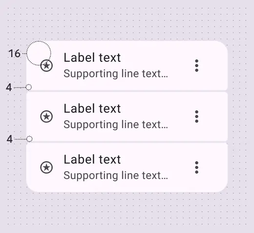
Unselected list items have a 4dp inner corner radius, and 16dp outer corner radius
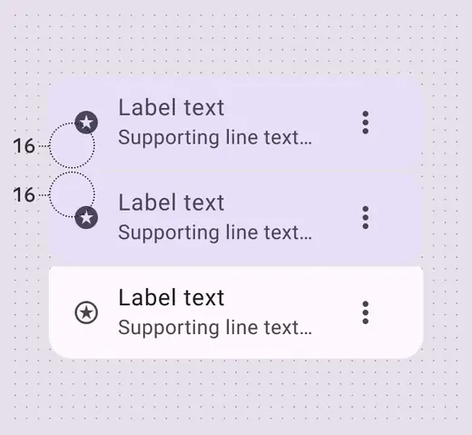
Selected list items have a 16dp corner radius all around
List (baseline)
The baseline list variant is available and continues to work in existing products. However, the expressive list variant is recommended for new designs.
Tokens & specs
Baseline list tokens are in the common token set. Note: This set also includes several expressive tokens.
Design tokens
Token table
Machine-readable relationship table
Lists tokens · 1 token set · 171 tokens · live token table · DSDB TOKEN_TABLE.6c818a16475113bd
- Default context: Theme: Light · Platform: Android · Audience: 3P · Font: Static · Contrast: Default · iOS dark theme elevation: None · iOS weight setting: Default
- Not configurable here (group default used): Motion scheme: Standard · Language height: Small
- Other contexts: Theme: Dark · Contrast: Medium contrast, High contrast. "Other contexts" lists values that differ from the default when only that one context changes.
- Reference chain: aliases from the token to its source value (
token → alias → … → value). "—" means the token holds a literal value.
List - Common · md.comp.list · 171 tokens
Common baseline and expressive list tokens.
| Group | Token | Type | Reference chain | Resolved value | Other contexts |
|---|---|---|---|---|---|
| Color › Enabled - Selected | md.comp.list.list-item.selected.label-text.color | Color | md.sys.color.on-secondary-container → md.ref.palette.secondary30 | #4A4458 | Dark: #E8DEF8 via md.ref.palette.secondary90Medium contrast: #FFFFFF via md.ref.palette.secondary100High contrast: #FFFFFF via md.ref.palette.secondary100 |
| Color › Enabled - Selected | md.comp.list.list-item.selected.supporting-text.color | Color | md.sys.color.on-secondary-container → md.ref.palette.secondary30 | #4A4458 | Dark: #E8DEF8 via md.ref.palette.secondary90Medium contrast: #FFFFFF via md.ref.palette.secondary100High contrast: #FFFFFF via md.ref.palette.secondary100 |
| Color › Enabled - Selected | md.comp.list.list-item.selected.trailing-supporting-text.color | Color | md.sys.color.on-secondary-container → md.ref.palette.secondary30 | #4A4458 | Dark: #E8DEF8 via md.ref.palette.secondary90Medium contrast: #FFFFFF via md.ref.palette.secondary100High contrast: #FFFFFF via md.ref.palette.secondary100 |
| Color › Enabled - Selected | md.comp.list.list-item.selected.leading-icon.color | Color | md.sys.color.on-secondary-container → md.ref.palette.secondary30 | #4A4458 | Dark: #E8DEF8 via md.ref.palette.secondary90Medium contrast: #FFFFFF via md.ref.palette.secondary100High contrast: #FFFFFF via md.ref.palette.secondary100 |
| Color › Enabled - Selected | md.comp.list.list-item.selected.trailing-icon.color | Color | md.sys.color.on-secondary-container → md.ref.palette.secondary30 | #4A4458 | Dark: #E8DEF8 via md.ref.palette.secondary90Medium contrast: #FFFFFF via md.ref.palette.secondary100High contrast: #FFFFFF via md.ref.palette.secondary100 |
| Color › Enabled - Selected | md.comp.list.list-item.selected.overline.color | Color | md.sys.color.on-secondary-container → md.ref.palette.secondary30 | #4A4458 | Dark: #E8DEF8 via md.ref.palette.secondary90Medium contrast: #FFFFFF via md.ref.palette.secondary100High contrast: #FFFFFF via md.ref.palette.secondary100 |
| Color › Enabled - Selected | md.comp.list.list-item.selected.container.color | Color | md.sys.color.secondary-container → md.ref.palette.secondary90 | #E8DEF8 | Dark: #4A4458 via md.ref.palette.secondary30Medium contrast: #625B71 via md.ref.palette.secondary40High contrast: #4A4458 via md.ref.palette.secondary30 |
| Color › Disabled | md.comp.list.list-item.disabled.state-layer.opacity | Opacity | — | 0.1 | — |
| Color › Disabled | md.comp.list.list-item.disabled.label-text.color | Color | md.sys.color.on-surface → md.ref.palette.neutral10 | #1D1B20 | Dark: #E6E0E9 via md.ref.palette.neutral90Medium contrast: #000000 via md.ref.palette.neutral0High contrast: #000000 via md.ref.palette.neutral0 |
| Color › Disabled | md.comp.list.list-item.disabled.label-text.opacity | Opacity | — | 0.38 | — |
| Color › Disabled | md.comp.list.list-item.disabled.supporting-text.color | Color | md.sys.color.on-surface → md.ref.palette.neutral10 | #1D1B20 | Dark: #E6E0E9 via md.ref.palette.neutral90Medium contrast: #000000 via md.ref.palette.neutral0High contrast: #000000 via md.ref.palette.neutral0 |
| Color › Disabled | md.comp.list.list-item.disabled.supporting-text.opacity | Opacity | — | 0.38 | — |
| Color › Disabled | md.comp.list.list-item.disabled.overline.color | Color | md.sys.color.on-surface → md.ref.palette.neutral10 | #1D1B20 | Dark: #E6E0E9 via md.ref.palette.neutral90Medium contrast: #000000 via md.ref.palette.neutral0High contrast: #000000 via md.ref.palette.neutral0 |
| Color › Disabled | md.comp.list.list-item.disabled.overline.opacity | Opacity | — | 0.38 | — |
| Color › Disabled | md.comp.list.list-item.disabled.leading-icon.color | Color | md.sys.color.on-surface → md.ref.palette.neutral10 | #1D1B20 | Dark: #E6E0E9 via md.ref.palette.neutral90Medium contrast: #000000 via md.ref.palette.neutral0High contrast: #000000 via md.ref.palette.neutral0 |
| Color › Disabled | md.comp.list.list-item.disabled.leading-icon.opacity | Opacity | — | 0.38 | — |
| Color › Disabled | md.comp.list.list-item.disabled.trailing-icon.color | Color | md.sys.color.on-surface → md.ref.palette.neutral10 | #1D1B20 | Dark: #E6E0E9 via md.ref.palette.neutral90Medium contrast: #000000 via md.ref.palette.neutral0High contrast: #000000 via md.ref.palette.neutral0 |
| Color › Disabled | md.comp.list.list-item.disabled.trailing-icon.opacity | Opacity | — | 0.38 | — |
| Color › Disabled | md.comp.list.list-item.disabled.state-layer.color | Color | md.sys.color.on-surface → md.ref.palette.neutral10 | #1D1B20 | Dark: #E6E0E9 via md.ref.palette.neutral90Medium contrast: #000000 via md.ref.palette.neutral0High contrast: #000000 via md.ref.palette.neutral0 |
| Color › Disabled - Selected | md.comp.list.list-item.selected.disabled.container.opacity | Opacity | — | 0.38 | — |
| Color › Disabled - Selected | md.comp.list.list-item.selected.disabled.label-text.color | Color | md.sys.color.on-surface → md.ref.palette.neutral10 | #1D1B20 | Dark: #E6E0E9 via md.ref.palette.neutral90Medium contrast: #000000 via md.ref.palette.neutral0High contrast: #000000 via md.ref.palette.neutral0 |
| Color › Disabled - Selected | md.comp.list.list-item.selected.disabled.label-text.opacity | Opacity | — | 0.38 | — |
| Color › Disabled - Selected | md.comp.list.list-item.selected.disabled.supporting-text.color | Color | md.sys.color.on-surface → md.ref.palette.neutral10 | #1D1B20 | Dark: #E6E0E9 via md.ref.palette.neutral90Medium contrast: #000000 via md.ref.palette.neutral0High contrast: #000000 via md.ref.palette.neutral0 |
| Color › Disabled - Selected | md.comp.list.list-item.selected.disabled.supporting-text.opacity | Opacity | — | 0.38 | — |
| Color › Disabled - Selected | md.comp.list.list-item.selected.disabled.trailing-supporting-text.color | Color | md.sys.color.on-surface → md.ref.palette.neutral10 | #1D1B20 | Dark: #E6E0E9 via md.ref.palette.neutral90Medium contrast: #000000 via md.ref.palette.neutral0High contrast: #000000 via md.ref.palette.neutral0 |
| Color › Disabled - Selected | md.comp.list.list-item.selected.disabled.trailing-supporting-text.opacity | Opacity | — | 0.38 | — |
| Color › Disabled - Selected | md.comp.list.list-item.selected.disabled.overline.color | Color | md.sys.color.on-surface → md.ref.palette.neutral10 | #1D1B20 | Dark: #E6E0E9 via md.ref.palette.neutral90Medium contrast: #000000 via md.ref.palette.neutral0High contrast: #000000 via md.ref.palette.neutral0 |
| Color › Disabled - Selected | md.comp.list.list-item.selected.disabled.overline.opacity | Opacity | — | 0.38 | — |
| Color › Disabled - Selected | md.comp.list.list-item.selected.disabled.state-layer.color | Color | md.sys.color.on-surface → md.ref.palette.neutral10 | #1D1B20 | Dark: #E6E0E9 via md.ref.palette.neutral90Medium contrast: #000000 via md.ref.palette.neutral0High contrast: #000000 via md.ref.palette.neutral0 |
| Color › Disabled - Selected | md.comp.list.list-item.selected.disabled.state-layer.opacity | Opacity | — | 0.1 | — |
| Color › Disabled - Selected | md.comp.list.list-item.selected.disabled.leading-icon.color | Color | md.sys.color.on-surface → md.ref.palette.neutral10 | #1D1B20 | Dark: #E6E0E9 via md.ref.palette.neutral90Medium contrast: #000000 via md.ref.palette.neutral0High contrast: #000000 via md.ref.palette.neutral0 |
| Color › Disabled - Selected | md.comp.list.list-item.selected.disabled.leading-icon.opacity | Opacity | — | 0.38 | — |
| Color › Disabled - Selected | md.comp.list.list-item.selected.disabled.trailing-icon.color | Color | md.sys.color.on-surface → md.ref.palette.neutral10 | #1D1B20 | Dark: #E6E0E9 via md.ref.palette.neutral90Medium contrast: #000000 via md.ref.palette.neutral0High contrast: #000000 via md.ref.palette.neutral0 |
| Color › Disabled - Selected | md.comp.list.list-item.selected.disabled.trailing-icon.opacity | Opacity | — | 0.38 | — |
| Color › Disabled - Selected | md.comp.list.list-item.selected.disabled.container.color | Color | md.sys.color.on-surface → md.ref.palette.neutral10 | #1D1B20 | Dark: #E6E0E9 via md.ref.palette.neutral90Medium contrast: #000000 via md.ref.palette.neutral0High contrast: #000000 via md.ref.palette.neutral0 |
| Color › Hovered | md.comp.list.list-item.hover.state-layer.color | Color | md.sys.color.on-surface → md.ref.palette.neutral10 | #1D1B20 | Dark: #E6E0E9 via md.ref.palette.neutral90Medium contrast: #000000 via md.ref.palette.neutral0High contrast: #000000 via md.ref.palette.neutral0 |
| Color › Hovered | md.comp.list.list-item.hover.state-layer.opacity | Opacity | md.sys.state.hover.state-layer-opacity | 0.08 | — |
| Color › Hovered | md.comp.list.list-item.hover.label-text.color | Color | md.sys.color.on-surface → md.ref.palette.neutral10 | #1D1B20 | Dark: #E6E0E9 via md.ref.palette.neutral90Medium contrast: #000000 via md.ref.palette.neutral0High contrast: #000000 via md.ref.palette.neutral0 |
| Color › Hovered | md.comp.list.list-item.hover.leading-icon.icon.color | Color | md.sys.color.on-surface-variant → md.ref.palette.neutral-variant30 | #49454F | Dark: #CAC4D0 via md.ref.palette.neutral-variant80Medium contrast: #322F37 via md.ref.palette.neutral-variant20High contrast: #000000 via md.ref.palette.neutral-variant0 |
| Color › Hovered | md.comp.list.list-item.hover.trailing-icon.icon.color | Color | md.sys.color.on-surface-variant → md.ref.palette.neutral-variant30 | #49454F | Dark: #CAC4D0 via md.ref.palette.neutral-variant80Medium contrast: #322F37 via md.ref.palette.neutral-variant20High contrast: #000000 via md.ref.palette.neutral-variant0 |
| Color › Hovered - Selected | md.comp.list.list-item.selected.hover.state-layer.opacity | Opacity | md.sys.state.hover.state-layer-opacity | 0.08 | — |
| Color › Hovered - Selected | md.comp.list.list-item.selected.hover.label-text.color | Color | md.sys.color.on-secondary-container → md.ref.palette.secondary30 | #4A4458 | Dark: #E8DEF8 via md.ref.palette.secondary90Medium contrast: #FFFFFF via md.ref.palette.secondary100High contrast: #FFFFFF via md.ref.palette.secondary100 |
| Color › Hovered - Selected | md.comp.list.list-item.selected.hover.leading-icon.color | Color | md.sys.color.on-surface → md.ref.palette.neutral10 | #1D1B20 | Dark: #E6E0E9 via md.ref.palette.neutral90Medium contrast: #000000 via md.ref.palette.neutral0High contrast: #000000 via md.ref.palette.neutral0 |
| Color › Hovered - Selected | md.comp.list.list-item.selected.hover.trailing-icon.color | Color | md.sys.color.on-surface → md.ref.palette.neutral10 | #1D1B20 | Dark: #E6E0E9 via md.ref.palette.neutral90Medium contrast: #000000 via md.ref.palette.neutral0High contrast: #000000 via md.ref.palette.neutral0 |
| Color › Hovered - Selected | md.comp.list.list-item.selected.hover.state-layer.color | Color | md.sys.color.on-surface → md.ref.palette.neutral10 | #1D1B20 | Dark: #E6E0E9 via md.ref.palette.neutral90Medium contrast: #000000 via md.ref.palette.neutral0High contrast: #000000 via md.ref.palette.neutral0 |
| Color › Focused | md.comp.list.list-item.focus.state-layer.color | Color | md.sys.color.on-surface → md.ref.palette.neutral10 | #1D1B20 | Dark: #E6E0E9 via md.ref.palette.neutral90Medium contrast: #000000 via md.ref.palette.neutral0High contrast: #000000 via md.ref.palette.neutral0 |
| Color › Focused | md.comp.list.list-item.focus.state-layer.opacity | Opacity | md.sys.state.focus.state-layer-opacity | 0.1 | — |
| Color › Focused | md.comp.list.list-item.focus.label-text.color | Color | md.sys.color.on-surface → md.ref.palette.neutral10 | #1D1B20 | Dark: #E6E0E9 via md.ref.palette.neutral90Medium contrast: #000000 via md.ref.palette.neutral0High contrast: #000000 via md.ref.palette.neutral0 |
| Color › Focused | md.comp.list.list-item.focus.leading-icon.icon.color | Color | md.sys.color.on-surface-variant → md.ref.palette.neutral-variant30 | #49454F | Dark: #CAC4D0 via md.ref.palette.neutral-variant80Medium contrast: #322F37 via md.ref.palette.neutral-variant20High contrast: #000000 via md.ref.palette.neutral-variant0 |
| Color › Focused | md.comp.list.list-item.focus.trailing-icon.icon.color | Color | md.sys.color.on-surface-variant → md.ref.palette.neutral-variant30 | #49454F | Dark: #CAC4D0 via md.ref.palette.neutral-variant80Medium contrast: #322F37 via md.ref.palette.neutral-variant20High contrast: #000000 via md.ref.palette.neutral-variant0 |
| Color › Focused › Focus indicator | md.comp.list.focus.indicator.thickness | Length | md.sys.state.focus-indicator.thickness | 3dp | — |
| Color › Focused › Focus indicator | md.comp.list.focus.indicator.outline.offset | Length | md.sys.state.focus-indicator.inner-offset | -3dp | — |
| Color › Focused › Focus indicator | md.comp.list.focus.indicator.color | Color | md.sys.color.secondary → md.ref.palette.secondary40 | #625B71 | Dark: #CCC2DC via md.ref.palette.secondary80Medium contrast: #4A4458 via md.ref.palette.secondary30High contrast: #332D41 via md.ref.palette.secondary20 |
| Color › Focused - Selected | md.comp.list.list-item.selected.focus.state-layer.color | Color | md.sys.color.on-surface → md.ref.palette.neutral10 | #1D1B20 | Dark: #E6E0E9 via md.ref.palette.neutral90Medium contrast: #000000 via md.ref.palette.neutral0High contrast: #000000 via md.ref.palette.neutral0 |
| Color › Focused - Selected | md.comp.list.list-item.selected.focus.state-layer.opacity | Opacity | md.sys.state.focus.state-layer-opacity | 0.1 | — |
| Color › Focused - Selected | md.comp.list.list-item.selected.focus.label-text.color | Color | md.sys.color.on-secondary-container → md.ref.palette.secondary30 | #4A4458 | Dark: #E8DEF8 via md.ref.palette.secondary90Medium contrast: #FFFFFF via md.ref.palette.secondary100High contrast: #FFFFFF via md.ref.palette.secondary100 |
| Color › Focused - Selected | md.comp.list.list-item.selected.focus.leading-icon.color | Color | md.sys.color.on-surface → md.ref.palette.neutral10 | #1D1B20 | Dark: #E6E0E9 via md.ref.palette.neutral90Medium contrast: #000000 via md.ref.palette.neutral0High contrast: #000000 via md.ref.palette.neutral0 |
| Color › Focused - Selected | md.comp.list.list-item.selected.focus.trailing-icon.color | Color | md.sys.color.on-surface → md.ref.palette.neutral10 | #1D1B20 | Dark: #E6E0E9 via md.ref.palette.neutral90Medium contrast: #000000 via md.ref.palette.neutral0High contrast: #000000 via md.ref.palette.neutral0 |
| Color › Pressed (ripple) | md.comp.list.list-item.pressed.state-layer.color | Color | md.sys.color.on-surface → md.ref.palette.neutral10 | #1D1B20 | Dark: #E6E0E9 via md.ref.palette.neutral90Medium contrast: #000000 via md.ref.palette.neutral0High contrast: #000000 via md.ref.palette.neutral0 |
| Color › Pressed (ripple) | md.comp.list.list-item.pressed.state-layer.opacity | Opacity | md.sys.state.pressed.state-layer-opacity | 0.1 | — |
| Color › Pressed (ripple) | md.comp.list.list-item.pressed.label-text.color | Color | md.sys.color.on-surface → md.ref.palette.neutral10 | #1D1B20 | Dark: #E6E0E9 via md.ref.palette.neutral90Medium contrast: #000000 via md.ref.palette.neutral0High contrast: #000000 via md.ref.palette.neutral0 |
| Color › Pressed (ripple) | md.comp.list.list-item.pressed.leading-icon.icon.color | Color | md.sys.color.on-surface-variant → md.ref.palette.neutral-variant30 | #49454F | Dark: #CAC4D0 via md.ref.palette.neutral-variant80Medium contrast: #322F37 via md.ref.palette.neutral-variant20High contrast: #000000 via md.ref.palette.neutral-variant0 |
| Color › Pressed (ripple) | md.comp.list.list-item.pressed.trailing-icon.icon.color | Color | md.sys.color.on-surface-variant → md.ref.palette.neutral-variant30 | #49454F | Dark: #CAC4D0 via md.ref.palette.neutral-variant80Medium contrast: #322F37 via md.ref.palette.neutral-variant20High contrast: #000000 via md.ref.palette.neutral-variant0 |
| Color › Pressed - Selected | md.comp.list.list-item.selected.pressed.state-layer.color | Color | md.sys.color.on-surface → md.ref.palette.neutral10 | #1D1B20 | Dark: #E6E0E9 via md.ref.palette.neutral90Medium contrast: #000000 via md.ref.palette.neutral0High contrast: #000000 via md.ref.palette.neutral0 |
| Color › Pressed - Selected | md.comp.list.list-item.selected.pressed.state-layer.opacity | Opacity | md.sys.state.pressed.state-layer-opacity | 0.1 | — |
| Color › Pressed - Selected | md.comp.list.list-item.selected.pressed.label-text.color | Color | md.sys.color.on-secondary-container → md.ref.palette.secondary30 | #4A4458 | Dark: #E8DEF8 via md.ref.palette.secondary90Medium contrast: #FFFFFF via md.ref.palette.secondary100High contrast: #FFFFFF via md.ref.palette.secondary100 |
| Color › Pressed - Selected | md.comp.list.list-item.selected.pressed.trailing-icon.color | Color | md.sys.color.on-surface → md.ref.palette.neutral10 | #1D1B20 | Dark: #E6E0E9 via md.ref.palette.neutral90Medium contrast: #000000 via md.ref.palette.neutral0High contrast: #000000 via md.ref.palette.neutral0 |
| Color › Pressed - Selected | md.comp.list.list-item.selected.pressed.leading-icon.color | Color | md.sys.color.on-surface → md.ref.palette.neutral10 | #1D1B20 | Dark: #E6E0E9 via md.ref.palette.neutral90Medium contrast: #000000 via md.ref.palette.neutral0High contrast: #000000 via md.ref.palette.neutral0 |
| Color › Dragged (baseline only) | md.comp.list.list-item.dragged.label-text.color | Color | md.sys.color.on-surface → md.ref.palette.neutral10 | #1D1B20 | Dark: #E6E0E9 via md.ref.palette.neutral90Medium contrast: #000000 via md.ref.palette.neutral0High contrast: #000000 via md.ref.palette.neutral0 |
| Color › Dragged (baseline only) | md.comp.list.list-item.selected.dragged.label-text.color | Color | md.sys.color.on-secondary-container → md.ref.palette.secondary30 | #4A4458 | Dark: #E8DEF8 via md.ref.palette.secondary90Medium contrast: #FFFFFF via md.ref.palette.secondary100High contrast: #FFFFFF via md.ref.palette.secondary100 |
| Color › Dragged (baseline only) | md.comp.list.list-item.dragged.state-layer.color | Color | md.sys.color.on-surface → md.ref.palette.neutral10 | #1D1B20 | Dark: #E6E0E9 via md.ref.palette.neutral90Medium contrast: #000000 via md.ref.palette.neutral0High contrast: #000000 via md.ref.palette.neutral0 |
| Color › Dragged (baseline only) | md.comp.list.list-item.dragged.state-layer.opacity | Opacity | md.sys.state.dragged.state-layer-opacity | 0.16 | — |
| Color › Dragged (baseline only) | md.comp.list.list-item.selected.dragged.state-layer.color | Color | md.sys.color.on-surface → md.ref.palette.neutral10 | #1D1B20 | Dark: #E6E0E9 via md.ref.palette.neutral90Medium contrast: #000000 via md.ref.palette.neutral0High contrast: #000000 via md.ref.palette.neutral0 |
| Color › Dragged (baseline only) | md.comp.list.list-item.selected.dragged.state-layer.opacity | Opacity | md.sys.state.dragged.state-layer-opacity | 0.16 | — |
| Color › Dragged (baseline only) | md.comp.list.list-item.dragged.leading-icon.icon.color | Color | md.sys.color.on-surface-variant → md.ref.palette.neutral-variant30 | #49454F | Dark: #CAC4D0 via md.ref.palette.neutral-variant80Medium contrast: #322F37 via md.ref.palette.neutral-variant20High contrast: #000000 via md.ref.palette.neutral-variant0 |
| Color › Dragged (baseline only) | md.comp.list.list-item.selected.dragged.leading-icon.color | Color | md.sys.color.on-surface → md.ref.palette.neutral10 | #1D1B20 | Dark: #E6E0E9 via md.ref.palette.neutral90Medium contrast: #000000 via md.ref.palette.neutral0High contrast: #000000 via md.ref.palette.neutral0 |
| Color › Dragged (baseline only) | md.comp.list.list-item.dragged.trailing-icon.icon.color | Color | md.sys.color.on-surface-variant → md.ref.palette.neutral-variant30 | #49454F | Dark: #CAC4D0 via md.ref.palette.neutral-variant80Medium contrast: #322F37 via md.ref.palette.neutral-variant20High contrast: #000000 via md.ref.palette.neutral-variant0 |
| Color › Dragged (baseline only) | md.comp.list.list-item.selected.dragged.trailing-icon.color | Color | md.sys.color.on-surface → md.ref.palette.neutral10 | #1D1B20 | Dark: #E6E0E9 via md.ref.palette.neutral90Medium contrast: #000000 via md.ref.palette.neutral0High contrast: #000000 via md.ref.palette.neutral0 |
| Color › Dragged (baseline only) | md.comp.list.list-item.dragged.container.elevation | Elevation | md.sys.elevation.level4 | 8dp | — |
| Color › Enabled | md.comp.list.list-item.container.color | Color | md.sys.color.surface → md.ref.palette.neutral98 | #FEF7FF | Dark: #141218 via md.ref.palette.neutral6 |
| Color › Enabled | md.comp.list.list-item.segmented.container.color | Color | md.sys.color.surface → md.ref.palette.neutral98 | #FEF7FF | Dark: #141218 via md.ref.palette.neutral6 |
| Color › Enabled | md.comp.list.list-item.label-text.color | Color | md.sys.color.on-surface → md.ref.palette.neutral10 | #1D1B20 | Dark: #E6E0E9 via md.ref.palette.neutral90Medium contrast: #000000 via md.ref.palette.neutral0High contrast: #000000 via md.ref.palette.neutral0 |
| Color › Enabled | md.comp.list.list-item.supporting-text.color | Color | md.sys.color.on-surface-variant → md.ref.palette.neutral-variant30 | #49454F | Dark: #CAC4D0 via md.ref.palette.neutral-variant80Medium contrast: #322F37 via md.ref.palette.neutral-variant20High contrast: #000000 via md.ref.palette.neutral-variant0 |
| Color › Enabled | md.comp.list.list-item.overline.color | Color | md.sys.color.on-surface-variant → md.ref.palette.neutral-variant30 | #49454F | Dark: #CAC4D0 via md.ref.palette.neutral-variant80Medium contrast: #322F37 via md.ref.palette.neutral-variant20High contrast: #000000 via md.ref.palette.neutral-variant0 |
| Color › Enabled | md.comp.list.divider.color (deprecated) | Color | md.sys.color.outline → md.ref.palette.neutral-variant50 | #79747E | Dark: #938F99 via md.ref.palette.neutral-variant60Medium contrast: #49454F via md.ref.palette.neutral-variant30High contrast: #322F37 via md.ref.palette.neutral-variant20 |
| Color › Enabled | md.comp.list.divider.height (deprecated) | Length | — | 1dp | — |
| Color › Enabled | md.comp.list.list-item.container.height (deprecated) | Length | — | 56dp | — |
| Color › Enabled | md.comp.list.md.comp.list.list-item.one-line.container.height (deprecated) | Length | — | 56dp | — |
| Color › Enabled | md.comp.list.md.comp.list.list-item.three-line.container.height (deprecated) | Length | — | 88dp | — |
| Color › Enabled | md.comp.list.md.comp.list.list-item.two-line.container.height (deprecated) | Length | — | 72dp | — |
| Color › Enabled | md.comp.list.list-item.leading-icon.color | Color | md.sys.color.on-surface-variant → md.ref.palette.neutral-variant30 | #49454F | Dark: #CAC4D0 via md.ref.palette.neutral-variant80Medium contrast: #322F37 via md.ref.palette.neutral-variant20High contrast: #000000 via md.ref.palette.neutral-variant0 |
| Color › Enabled | md.comp.list.list-item.trailing-icon.color | Color | md.sys.color.on-surface-variant → md.ref.palette.neutral-variant30 | #49454F | Dark: #CAC4D0 via md.ref.palette.neutral-variant80Medium contrast: #322F37 via md.ref.palette.neutral-variant20High contrast: #000000 via md.ref.palette.neutral-variant0 |
| Color › Enabled | md.comp.list.list-item.unselected.trailing-icon.color | Color | md.sys.color.on-surface → md.ref.palette.neutral10 | #1D1B20 | Dark: #E6E0E9 via md.ref.palette.neutral90Medium contrast: #000000 via md.ref.palette.neutral0High contrast: #000000 via md.ref.palette.neutral0 |
| Color › Enabled | md.comp.list.list-item.trailing-supporting-text.color | Color | md.sys.color.on-surface-variant → md.ref.palette.neutral-variant30 | #49454F | Dark: #CAC4D0 via md.ref.palette.neutral-variant80Medium contrast: #322F37 via md.ref.palette.neutral-variant20High contrast: #000000 via md.ref.palette.neutral-variant0 |
| Color › Enabled | md.comp.list.list-item.leading-avatar.color | Color | md.sys.color.primary-container → md.ref.palette.primary90 | #EADDFF | Dark: #4F378B via md.ref.palette.primary30Medium contrast: #6750A4 via md.ref.palette.primary40High contrast: #4F378B via md.ref.palette.primary30 |
| Color › Enabled | md.comp.list.list-item.leading-avatar-label.color | Color | md.sys.color.on-primary-container → md.ref.palette.primary30 | #4F378B | Dark: #EADDFF via md.ref.palette.primary90Medium contrast: #FFFFFF via md.ref.palette.primary100High contrast: #FFFFFF via md.ref.palette.primary100 |
| Color › Enabled | md.comp.list.list-item.container.elevation | Elevation | md.sys.elevation.level0 | 0dp | — |
| Spacing | md.comp.list.list-item.trailing-space | Length | md.sys.measurement.space200 | 16dp | — |
| Spacing | md.comp.list.list-item.top-space | Length | md.sys.measurement.space125 | 10dp | — |
| Spacing | md.comp.list.list-item.bottom-space | Length | md.sys.measurement.space125 | 10dp | — |
| Spacing | md.comp.list.list-item.between-space | Length | md.sys.measurement.space150 | 12dp | — |
| Spacing | md.comp.list.divider.leading-space | Length | md.sys.measurement.space200 | 16dp | — |
| Spacing | md.comp.list.divider.trailing-space | Length | md.sys.measurement.space200 | 16dp | — |
| Spacing | md.comp.list.divider.top-space | Length | md.sys.measurement.space0 | 0dp | — |
| Spacing | md.comp.list.divider.bottom-space | Length | md.sys.measurement.space0 | 0dp | — |
| Spacing | md.comp.list.segmented.gap | Length | md.sys.measurement.space25 | 2dp | — |
| Spacing | md.comp.list.list-item.leading-space | Length | md.sys.measurement.space200 | 16dp | — |
| Shape | md.comp.list.list-item.container.shape | Shape | md.sys.shape.corner.none | Rounded corners 0dp | — |
| Shape | md.comp.list.list-item.container.expressive.shape | Shape | md.sys.shape.corner.extra-small | Rounded corners 4dp | — |
| Shape | md.comp.list.list-item.disabled.container.expressive.shape | Shape | md.sys.shape.corner.extra-small | Rounded corners 4dp | — |
| Shape | md.comp.list.list-item.hovered.container.expressive.shape | Shape | md.sys.shape.corner.medium | Rounded corners 12dp | — |
| Shape | md.comp.list.list-item.focused.container.expressive.shape | Shape | md.sys.shape.corner.large | Rounded corners 16dp | — |
| Shape | md.comp.list.list-item.pressed.container.expressive.shape | Shape | md.sys.shape.corner.large | Rounded corners 16dp | — |
| Shape | md.comp.list.list-item.dragged.container.expressive.shape | Shape | md.sys.shape.corner.large | Rounded corners 16dp | — |
| Shape | md.comp.list.list-item.selected.container.expressive.shape | Shape | md.sys.shape.corner.large | Rounded corners 16dp | — |
| Shape | md.comp.list.list-item.selected.disabled.container.expressive.shape | Shape | md.sys.shape.corner.large | Rounded corners 16dp | — |
| Shape | md.comp.list.list-item.selected.hovered.container.expressive.shape | Shape | md.sys.shape.corner.large | Rounded corners 16dp | — |
| Shape | md.comp.list.list-item.selected.focused.container.expressive.shape | Shape | md.sys.shape.corner.large | Rounded corners 16dp | — |
| Shape | md.comp.list.list-item.selected.pressed.container.expressive.shape | Shape | md.sys.shape.corner.large | Rounded corners 16dp | — |
| Shape | md.comp.list.list-item.selected.dragged.container.expressive.shape | Shape | md.sys.shape.corner.large | Rounded corners 16dp | — |
| Shape | md.comp.list.list-item.leading-avatar.shape | Shape | md.sys.shape.corner.full | Circular (fully rounded) | — |
| Shape | md.comp.list.list-item.leading-video.shape | Shape | md.sys.shape.corner.small | Rounded corners 8dp | — |
| Shape | md.comp.list.list-item.leading-image.shape | Shape | md.sys.shape.corner.none | Rounded corners 0dp | — |
| Shape | md.comp.list.list-item.leading-image.expressive.shape | Shape | md.sys.shape.corner.small | Rounded corners 8dp | — |
| Shape | md.comp.list.list-item.selected.container.shape | Shape | md.sys.shape.corner.large | Rounded corners 16dp | — |
| Shape | md.comp.list.container.shape | Shape | md.sys.shape.corner.large | Rounded corners 16dp | — |
| Size and typography | md.comp.list.list-item.leading-avatar-label.type | Typography | composite font names: md.comp.list.list-item.leading-avatar-label.font → md.sys.typescale.title-medium.font → md.ref.typeface.plainfont weight: md.comp.list.list-item.leading-avatar-label.weight → md.sys.typescale.title-medium.weight → md.ref.typeface.weight-mediumfont size: md.comp.list.list-item.leading-avatar-label.size → md.sys.typescale.title-medium.sizeline height: md.comp.list.list-item.leading-avatar-label.line-height → md.sys.typescale.title-medium.line-heightfont tracking: md.comp.list.list-item.leading-avatar-label.tracking → md.sys.typescale.title-medium.tracking | Roboto · weight 500 · size 16pt · line height 24pt · tracking 0.15pt | — |
| Size and typography | md.comp.list.list-item.leading-avatar.size | Length | — | 40dp | — |
| Size and typography | md.comp.list.list-item.leading-avatar-label.font | Font names | md.sys.typescale.title-medium.font → md.ref.typeface.plain | Roboto | — |
| Size and typography | md.comp.list.list-item.leading-avatar-label.line-height | Line height | md.sys.typescale.title-medium.line-height | 24pt | — |
| Size and typography | md.comp.list.list-item.leading-avatar-label.size | Font size | md.sys.typescale.title-medium.size | 16pt | — |
| Size and typography | md.comp.list.list-item.leading-avatar-label.tracking | Font tracking | md.sys.typescale.title-medium.tracking | 0.15pt | — |
| Size and typography | md.comp.list.list-item.leading-avatar-label.weight | Font weight | md.sys.typescale.title-medium.weight → md.ref.typeface.weight-medium | 500 | — |
| Size and typography | md.comp.list.list-item.leading-icon.size | Length | — | 24dp | — |
| Size and typography | md.comp.list.list-item.leading-icon.expressive.size | Length | — | 20dp | — |
| Size and typography | md.comp.list.list-item.leading-image.width | Length | — | 56dp | — |
| Size and typography | md.comp.list.list-item.leading-image.height | Length | — | 56dp | — |
| Size and typography | md.comp.list.list-item.leading-video.width | Length | — | 100dp | — |
| Size and typography | md.comp.list.list-item.small.leading-video.width | Length | — | 100dp | — |
| Size and typography | md.comp.list.list-item.small.leading-video.height | Length | — | 56dp | — |
| Size and typography | md.comp.list.list-item.large.leading-video.width | Length | — | 114dp | — |
| Size and typography | md.comp.list.list-item.large.leading-video.height | Length | — | 64dp | — |
| Size and typography | md.comp.list.list-item.one-line.container.height | Length | — | 56dp | — |
| Size and typography | md.comp.list.list-item.two-line.container.height | Length | — | 72dp | — |
| Size and typography | md.comp.list.list-item.three-line.container.height | Length | — | 88dp | — |
| Size and typography | md.comp.list.list-item.trailing-icon.size | Length | — | 24dp | — |
| Size and typography | md.comp.list.list-item.trailing-icon.expressive.size | Length | — | 20dp | — |
| Size and typography | md.comp.list.list-item.label-text.type | Typography | composite font names: md.comp.list.list-item.label-text.font → md.sys.typescale.body-large.font → md.ref.typeface.plainfont weight: md.comp.list.list-item.label-text.weight → md.sys.typescale.body-large.weight → md.ref.typeface.weight-regularfont size: md.comp.list.list-item.label-text.size → md.sys.typescale.body-large.sizeline height: md.comp.list.list-item.label-text.line-height → md.sys.typescale.body-large.line-heightfont tracking: md.comp.list.list-item.label-text.tracking → md.sys.typescale.body-large.tracking | Roboto · weight 400 · size 16pt · line height 24pt · tracking 0.5pt | — |
| Size and typography | md.comp.list.list-item.label-text.font | Font names | md.sys.typescale.body-large.font → md.ref.typeface.plain | Roboto | — |
| Size and typography | md.comp.list.list-item.label-text.line-height | Line height | md.sys.typescale.body-large.line-height | 24pt | — |
| Size and typography | md.comp.list.list-item.label-text.size | Font size | md.sys.typescale.body-large.size | 16pt | — |
| Size and typography | md.comp.list.list-item.label-text.tracking | Font tracking | md.sys.typescale.body-large.tracking | 0.5pt | — |
| Size and typography | md.comp.list.list-item.label-text.weight | Font weight | md.sys.typescale.body-large.weight → md.ref.typeface.weight-regular | 400 | — |
| Size and typography | md.comp.list.list-item.trailing-supporting-text.type | Typography | composite font names: md.comp.list.list-item.trailing-supporting-text.font → md.sys.typescale.label-small.font → md.ref.typeface.plainfont weight: md.comp.list.list-item.trailing-supporting-text.weight → md.sys.typescale.label-small.weight → md.ref.typeface.weight-mediumfont size: md.comp.list.list-item.trailing-supporting-text.size → md.sys.typescale.label-small.sizeline height: md.comp.list.list-item.trailing-supporting-text.line-height → md.sys.typescale.label-small.line-heightfont tracking: md.comp.list.list-item.trailing-supporting-text.tracking → md.sys.typescale.label-small.tracking | Roboto · weight 500 · size 11pt · line height 16pt · tracking 0.5pt | — |
| Size and typography | md.comp.list.list-item.trailing-supporting-text.font | Font names | md.sys.typescale.label-small.font → md.ref.typeface.plain | Roboto | — |
| Size and typography | md.comp.list.list-item.trailing-supporting-text.line-height | Line height | md.sys.typescale.label-small.line-height | 16pt | — |
| Size and typography | md.comp.list.list-item.trailing-supporting-text.size | Font size | md.sys.typescale.label-small.size | 11pt | — |
| Size and typography | md.comp.list.list-item.trailing-supporting-text.tracking | Font tracking | md.sys.typescale.label-small.tracking | 0.5pt | — |
| Size and typography | md.comp.list.list-item.trailing-supporting-text.weight | Font weight | md.sys.typescale.label-small.weight → md.ref.typeface.weight-medium | 500 | — |
| Size and typography | md.comp.list.list-item.supporting-text.type | Typography | composite font names: md.comp.list.list-item.supporting-text.font → md.sys.typescale.body-medium.font → md.ref.typeface.plainfont weight: md.comp.list.list-item.supporting-text.weight → md.sys.typescale.body-medium.weight → md.ref.typeface.weight-regularfont size: md.comp.list.list-item.supporting-text.size → md.sys.typescale.body-medium.sizeline height: md.comp.list.list-item.supporting-text.line-height → md.sys.typescale.body-medium.line-heightfont tracking: md.comp.list.list-item.supporting-text.tracking → md.sys.typescale.body-medium.tracking | Roboto · weight 400 · size 14pt · line height 20pt · tracking 0.25pt | — |
| Size and typography | md.comp.list.list-item.supporting-text.font | Font names | md.sys.typescale.body-medium.font → md.ref.typeface.plain | Roboto | — |
| Size and typography | md.comp.list.list-item.supporting-text.line-height | Line height | md.sys.typescale.body-medium.line-height | 20pt | — |
| Size and typography | md.comp.list.list-item.supporting-text.size | Font size | md.sys.typescale.body-medium.size | 14pt | — |
| Size and typography | md.comp.list.list-item.supporting-text.tracking | Font tracking | md.sys.typescale.body-medium.tracking | 0.25pt | — |
| Size and typography | md.comp.list.list-item.supporting-text.weight | Font weight | md.sys.typescale.body-medium.weight → md.ref.typeface.weight-regular | 400 | — |
| Size and typography | md.comp.list.list-item.overline.type | Typography | composite font names: md.comp.list.list-item.overline.font → md.sys.typescale.label-small.font → md.ref.typeface.plainfont weight: md.comp.list.list-item.overline.weight → md.sys.typescale.label-small.weight → md.ref.typeface.weight-mediumfont size: md.comp.list.list-item.overline.size → md.sys.typescale.label-small.sizeline height: md.comp.list.list-item.overline.line-height → md.sys.typescale.label-small.line-heightfont tracking: md.comp.list.list-item.overline.tracking → md.sys.typescale.label-small.tracking | Roboto · weight 500 · size 11pt · line height 16pt · tracking 0.5pt | — |
| Size and typography | md.comp.list.list-item.overline.font | Font names | md.sys.typescale.label-small.font → md.ref.typeface.plain | Roboto | — |
| Size and typography | md.comp.list.list-item.overline.line-height | Line height | md.sys.typescale.label-small.line-height | 16pt | — |
| Size and typography | md.comp.list.list-item.overline.size | Font size | md.sys.typescale.label-small.size | 11pt | — |
| Size and typography | md.comp.list.list-item.overline.tracking | Font tracking | md.sys.typescale.label-small.tracking | 0.5pt | — |
| Size and typography | md.comp.list.list-item.overline.weight | Font weight | md.sys.typescale.label-small.weight → md.ref.typeface.weight-medium | 500 | — |
Color
Color values are implemented through design tokens. For designers, this means working with color values that correspond with tokens. In implementation, a color value will be a token that references a value. Learn more about design tokens
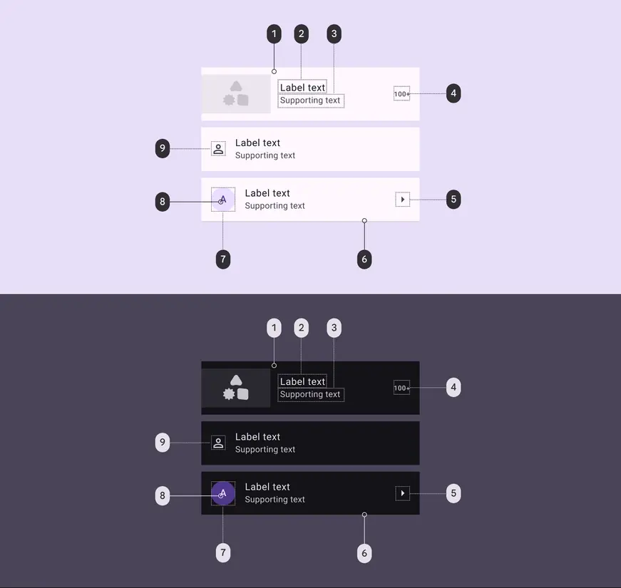
List color roles used for light and dark themes:
- Surface
- On surface
- On surface variant
- On surface variant
- On surface variant
- Outline variant
- Primary container
- On primary container
- On surface variant
States
States are visual representations used to communicate the status of a component or interactive element.
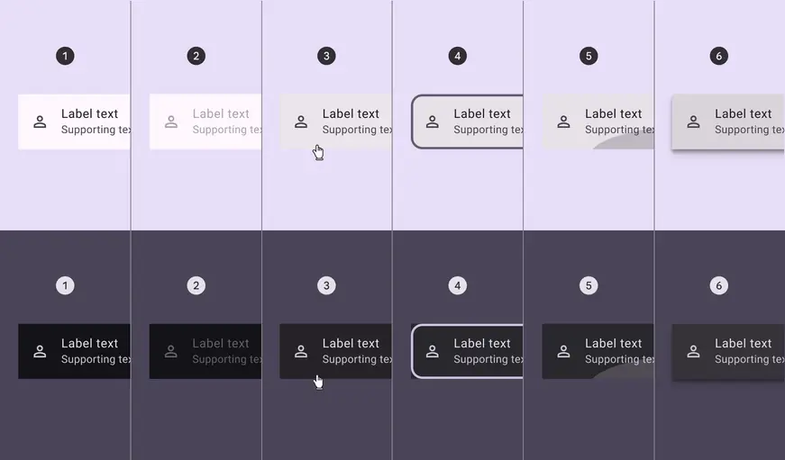
1. Enabled
2. Disabled
3. Hovered
4. Focused
5. Pressed
6. Dragged
Layout
One-line lists
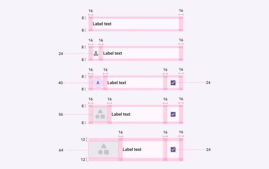
Baseline one-line list alignment, padding, and size measurements
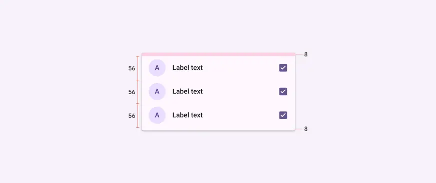
Baseline list item measurements and padding
Two-line lists
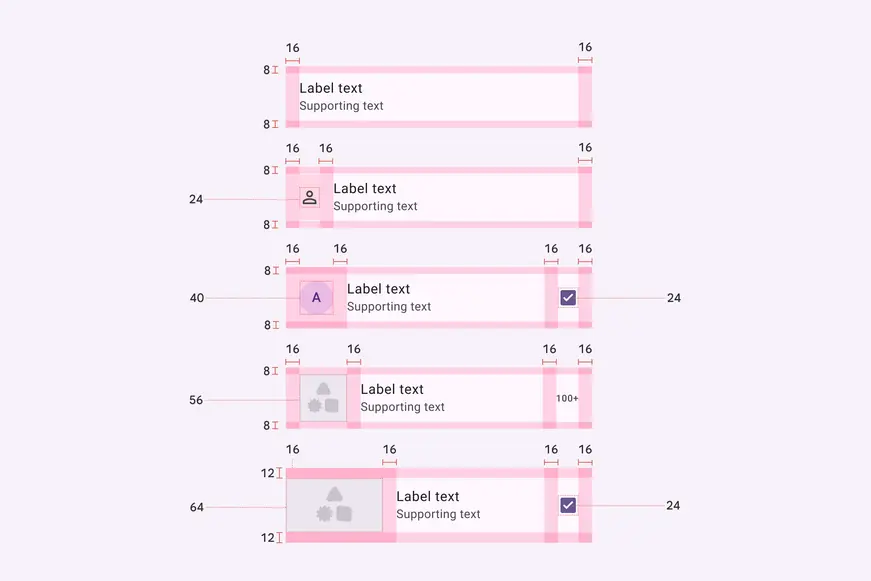
Baseline two-line list alignment, padding, and size measurements
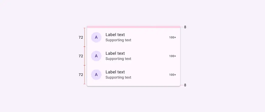
Baseline list item measurements and padding
Three-line lists
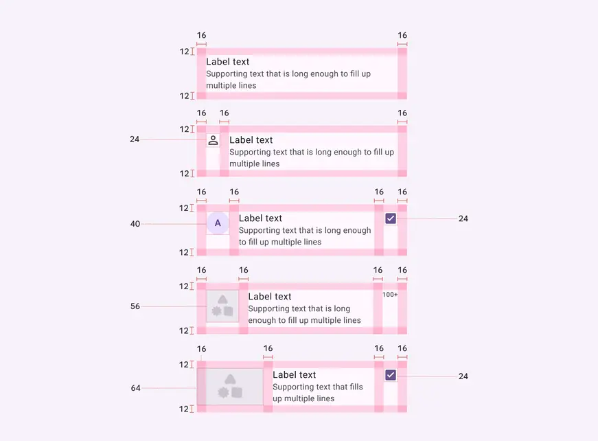
Baseline three-line list alignment, padding, and size measurements
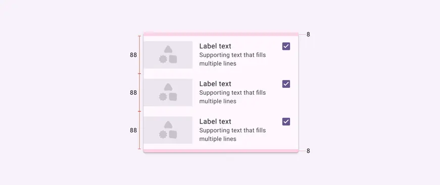
Baseline list item measurements and padding
| Attribute | Value |
|---|---|
| Label alignment | Center |
| Label alignment when height is 88dp or taller | Top |
| Label left padding | 16dp |
| Leading element alignment (vertical) | Center |
| Leading element alignment (vertical) when height is 88dp or taller | Top |
| Leading element left padding | 16dp |
| Leading icon alignment (vertical) | Top |
| Leading icon top padding | 8dp |
| Leading icon top padding when height is 88dp or taller | 12dp |
| Trailing element alignment (vertical) | Center |
| Trailing element alignment (vertical) when height is 88dp or taller | Top |
| Trailing element left padding | 16dp |
| Trailing element right padding | 24dp |
| Padding above/below divider | 0dp |
| Targets | 48dp |
| Divider full-width | 100% |
| Divider inset left padding | 16dp |
| Divider inset right padding | 24dp |
Configurations
Leading avatar
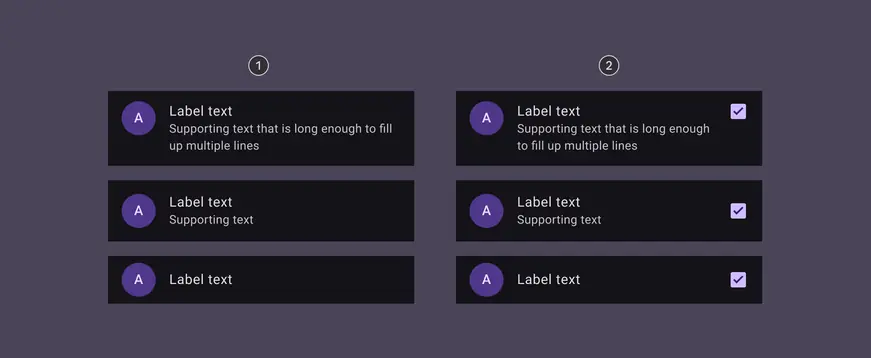
- With leading avatar
- With leading avatar and trailing checkbox
Leading image or thumbnail
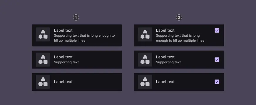
- With leading image
- With leading image and trailing checkbox
Leading video
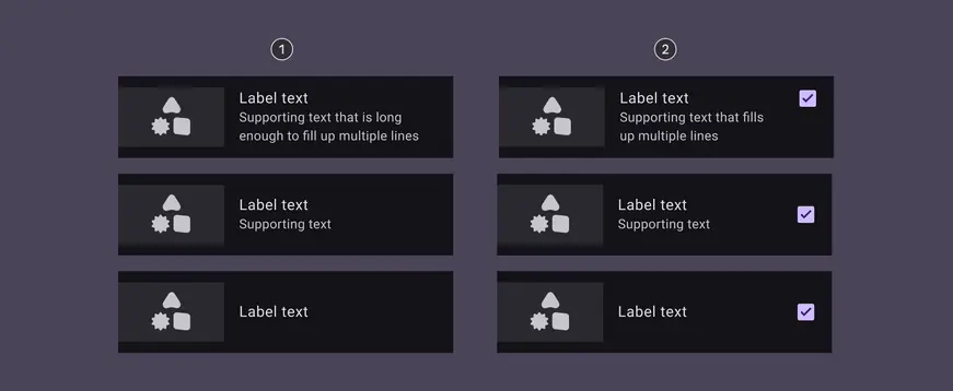
- With leading video
- With leading video and trailing checkbox
Leading icon
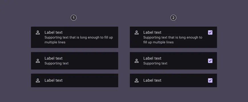
- With leading icon
- With leading icon and trailing checkbox
Text-only
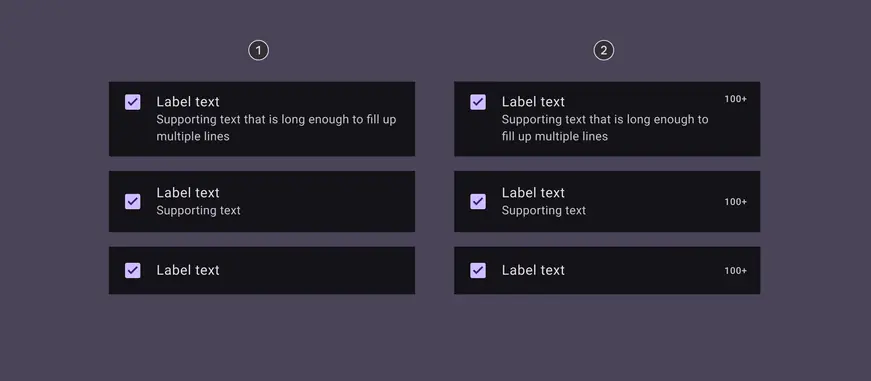
- With text only
- With text and trailing checkbox
Leading checkbox
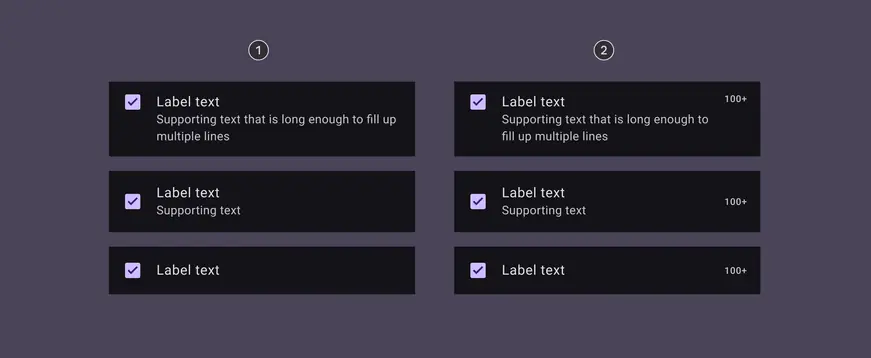
- With leading checkbox
- With leading checkbox and trailing text
Leading radio button
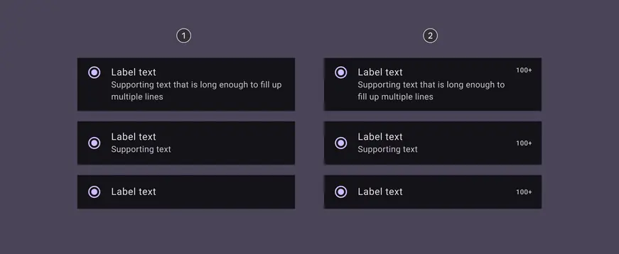
- With leading radio button
- With leading radio button and trailing text
Trailing switch
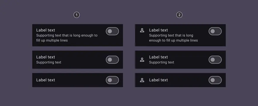
- With trailing switch
- With leading icon and trailing switch