Lists
Lists are continuous, vertical indexes of text or images.
Overview · Specs · Guidelines · Accessibility
Use cases
People should be able to do the following with assistive technology:
- Navigate to a list item
- Select a list item
Indicate selection with more than color
To make selected items clear for everyone, don't rely on color as the only visual cue.
Use an additional indicator that an item is selected such as:
- Radio buttons or checkboxes
- Leading or trailing icons
- A visual style not related to color, like underlined text
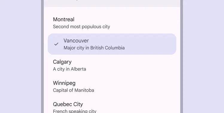
Use two visual cues to show a list item is selected, like a leading checkmark and filled color
Interaction & style
Touch
When a person taps on a list item, a touch ripple appears, indicating interaction feedback.
A ripple appears when a person taps on a list item to select it
Cursor
When hovered, the hover state provides a visual cue that a list item is interactive.
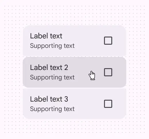
Cursor: Hover
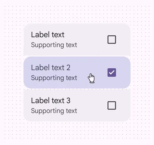
Cursor: Selected
Keyboard & switch
When a person tabs to a single-action list, a focus indicator appears, providing a visual cue that the first list item is now focused and action can be taken.
When a person interacts with the focused list item via Space or Enter, the action is performed.
Tab key navigates to the list. Space or Enter keys activate items.
Swipe
List items that can be swiped should include alternative ways to access hidden actions, such as a more icon.
Swipe alternatives can be:
- Single tap
- Double tap
- Long press
- Other single-point interactions
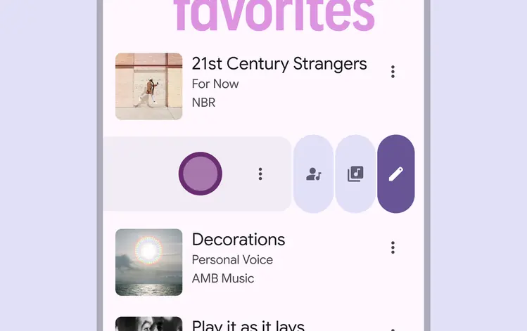
List items can reveal more actions from swiping or using an accessible secondary action such as a double tap
Focus
Single-action lists
The first element in a list should always receive focus, unless the list has a selected element. In that case, focus should go to the selected list item instead.
After an element is focused, a person should be able to navigate within the list using arrow keys.
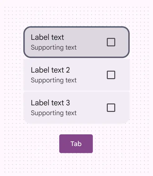
Tab key focuses on the first item or the selected item
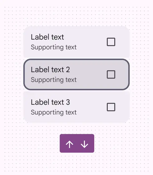
Arrow keys navigate up and down through list items
All list items must be able to be activated using the Space or Enter key.
More on single-action lists
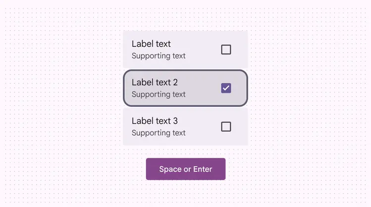
Space or Enter keys activate an element in a list
Multi-action lists
Multi-action list items contain a primary action and at least one supplementary action.
The list item as a whole isn't selectable; only the individual actions are.
A person should be able to use a keyboard to:
- Tab to the list item, which focuses the first element
- Move between between all focusable elements in the list using the Up, Down, Left, and Right arrow keys
- Activate a focused element using Space or Enter
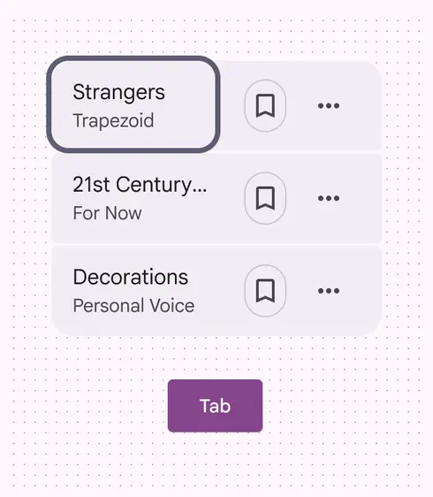
Tab brings the focus to the first action
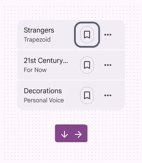
Down and Right arrow keys move focus to the next action of the list item, or to the first action in the next item
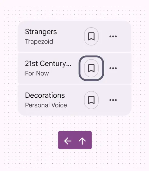
Up and Left arrow keys move focus to the previous action of the list item
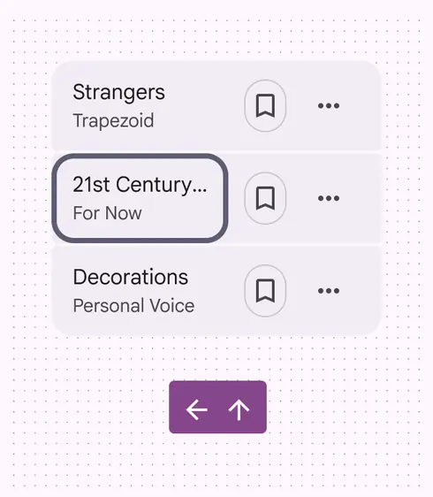
If the focus is on a list item’s first action, the Up and Left arrows move focus back to the last action of the previous item
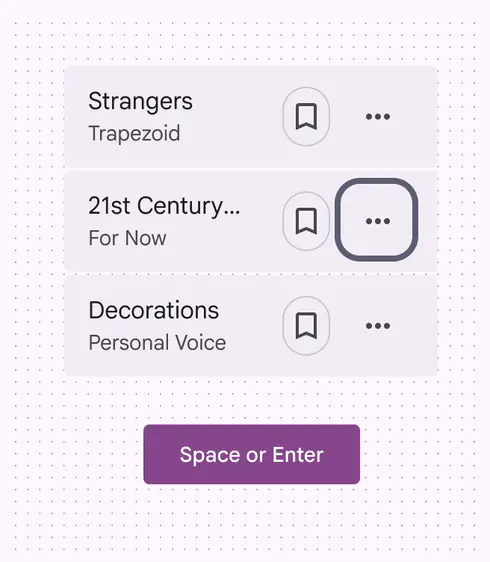
The Space or Enter key activates a selected action in a list
Keyboard navigation
| Keys | Actions |
|---|---|
| Tab | To move focus to the first list item, last list item, or outside of the list component |
| Down and right arrow keys | Moves to the next element in the list; if the focused element is the last in the list, it wraps back to the top of the list |
| Up and left arrow keys | Moves to the previous element in the list; if the focused element is the first in the list, it wraps back to the bottom of the list |
| Space or Enter | To select a list item not yet selected |
Labeling elements
Accessibility labels are used with assistive devices like screen readers.
The accessibility label for a list item is typically the same as the label text and supporting text.
Some labels, roles, and states are dependent on platform.
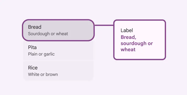
A list item’s label text and supporting text is used for its accessibility label
Platform-specific labels
Single-select lists
| Trait | Web | Android Views (MDC-Android) | Jetpack Compose |
|---|---|---|---|
| Aria label | Container label: Should describe selection type List item: Should match the visible label text | List item: Should match the visible label text | List item: Should match the visible label text |
| Role | Container: List box List item: Option | List item: Radio button | List item: Radio button |
| State | Selected or Not-selected | Checked or Not-checked | Checked or Not-checked |
Multi-select lists
| Trait | Web | Android Views (MDC-Android) | Jetpack Compose |
|---|---|---|---|
| Aria label | Container label: Should describe selection type List item: Should match the visible label text | List item: Should match the visible label text | List item: Should match the visible label text |
| Role | Container: List box List item: Option | List item: Checkbox | List item: Checkbox |
| State | Selected or Not-selected | Checked or Not-checked | Checked or Not-checked |
On web, a list container’s accessibility label describes the type of selection that can be made, and the role is List box.
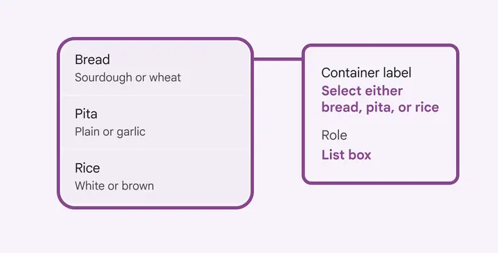
On web, a list container’s role is List box
On Jetpack Compose, the role applies to the list item as a whole.
If a list isn't selectable, the label text is read out without a role.
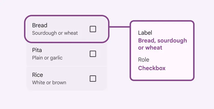
When selectable, the role Checkbox applies to the entire list item on Jetpack Compose
On Android Views (MDC-Android), components contained within the list should be labeled according to that component’s specific guidelines:
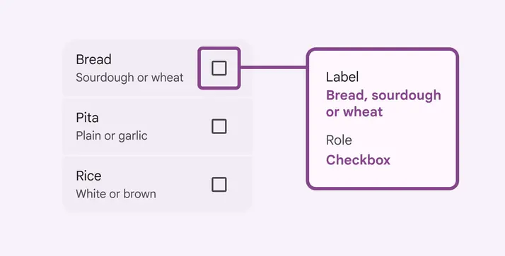
On Android Views (MDC-Android), the accessibility label and role are applied to the interactive component by default