FABs
Floating action buttons (FABs) help people take primary actions. They’re used to represent the most important action on a screen, such as Create or Reply.
Overview · Specs · Guidelines · Accessibility
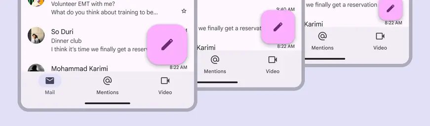
FABs have multiple sizes that scale with the breakpoint
Usage
Use a FAB for the most important action on a screen; it appears in front of all other content.
The FAB can be aligned left, center, or right. It can be positioned above the navigation bar, or nested within it.
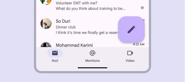
FABs can use dynamic color
There are three FAB sizes:
- FAB
- Medium FAB (most recommended)
- Large FAB
Choose the FAB size based on the visual hierarchy of your layout.
Note: The small FAB is no longer recommended.
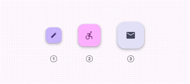
- FAB
- Medium FAB
- Large FAB
The FAB is the smallest size, and is best used in compact windows where other actions may be present on screen.
The medium FAB is recommended for most situations, and works best in compact and medium windows. Use it for important actions without taking up too much space.
A large FAB is useful in any window size when the layout calls for a clear and prominent primary action, but is best suited for expanded and larger breakpoints, where its size helps draw attention.
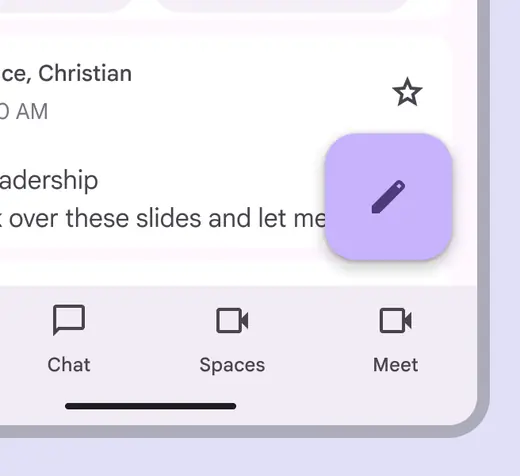
Use a medium FAB in most breakpoints
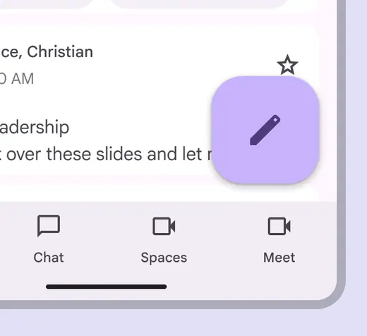
Use a large FAB when the primary action needs to be prominent
Do
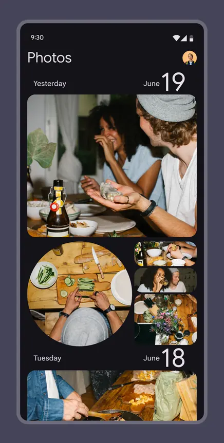
FABs are not needed on every screen, such as when images represent primary actions
Don't
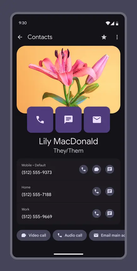
Don't display multiple FABs on a single screen
A FAB can transform into an extended FAB on larger screens, or it can transition into a FAB menu when selected. Use a FAB menu when there are many kinds of actions relevant to the FAB.

Use the extended FAB when label text is necessary

Use the FAB menu when there are many kinds of actions relevant to the FAB
Actions
A FAB can trigger an action on the current screen, or it can perform an action that creates a new screen.
A FAB promotes an important, constructive action such as:
- Create
- Favorite
- Share
- Start a process
Do
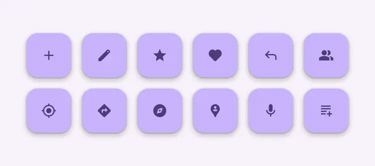
Use FABs for primary, positive actions
Avoid using a FAB for minor or destructive actions, such as:
- Archive or trash
- Alerts or errors
- Limited tasks like cutting text
- Controls better suited to a toolbar, like to adjust volume or font color
Don't
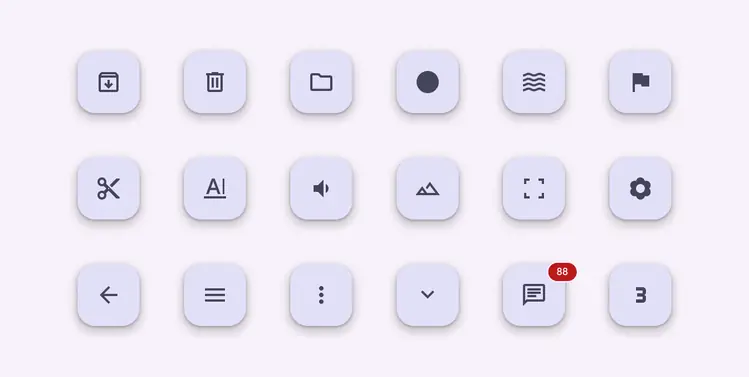
Don’t use FABs for minor, overflow, unclear, or destructive actions
Anatomy

- Container
- Icon
Container
The FAB is typically displayed in a square container. The container shouldn’t be covered by other elements, such as badges.
The container must have sufficient color contrast with the surface it’s placed on.

A FAB container color needs to stand out from its background
Icon
An icon in a FAB should be clear and understandable. When hovering over a FAB on web products, FABs should display a tooltip with an accompanying icon text label. Use a filled icon instead of an outlined icon.
A FAB shouldn't contain notifications or actions found elsewhere on a screen.
Do
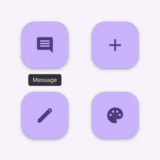
Use clear and simple icons such as add, message, or edit
Don't
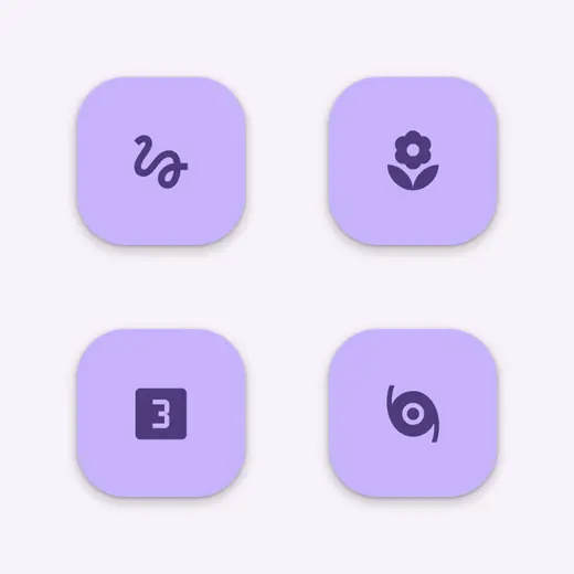
Don’t use confusing or open-ended icons to symbolize less common actions
Adaptive design
In compact and medium breakpoints, the best place for the FAB is typically the lower right corner of a screen, since it’s easy to reach and is less likely to cover important content.
In expanded breakpoints, consider placing the FAB in the upper left corner, like in the navigation rail. This positions it as one of the first interactive elements people see when they land on the page.
Adjust the size of the FAB based on the context. Use a medium FAB for mobile layouts, and large FAB for tablets and large screens.
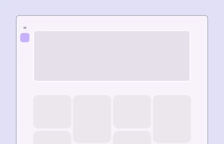
For large screens, place the FAB in the upper left corner
Do
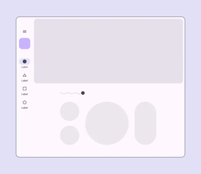
A FAB can be used within a navigation component, such as a navigation rail
Don't
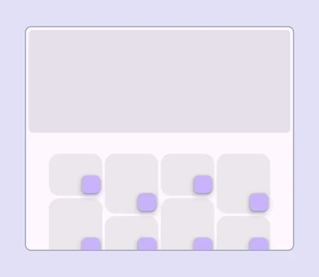
Individual components, such as cards, shouldn’t have their own FAB
Behaviors
Appearing
When a FAB animates on screen, it expands outward from a central point. The icon within it can be animated as well.
While FABs should be relevant to screen content, they aren't attached to the surface on which content appears. FABs move separately from other UI elements because of their relative importance.
Screen transitions
FABs can morph to launch related actions. When a screen changes its layout, the FAB should disappear and reappear during the transition.
Reappearance
The FAB should only reappear if it's relevant to the new screen. It should reappear in the same position, if possible.
FAB animating on screen
Expanding
The FAB can expand and adapt to any shape using a container transform transition pattern. This includes a surface that's part of the app structure, or a surface that spans the entire screen.
The FAB can also transition into a FAB menu.
More on FAB menus
FABs can expand and adapt to any shape
Scrolling
FABs remain in place on scroll.
Extended FABs can collapse into a FAB on scroll and expand on reaching the bottom of the view.
FABs stay in place above a scrolling background
Moving across tabs
When tabs are present, the FAB should briefly disappear, then reappear when the new content moves into place. This shows that the FAB is not connected to any particular tab.
Do
The FAB should disappear and reappear when switching pages
Don't animate the FAB with body content.
Don't
Don’t keep the FAB on screen when switching pages