Extended FABs
Extended floating action buttons (extended FABs) help people take primary actions, just like FABs. They’re wider than FABs and include a text label, providing more detail and a larger target surface.
Overview · Specs · Guidelines · Accessibility
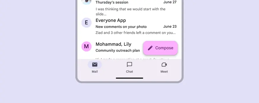
Extended FABs are more prominent than regular FABs
Usage
Use an extended FAB on screens with long, scrolling views that require persistent access to an action, such as a checkout screen.
Use it when label text helps understand the main action, or to add further emphasis to the button.
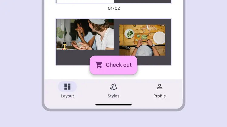
Extended FABs ensure the main action is visible at all times
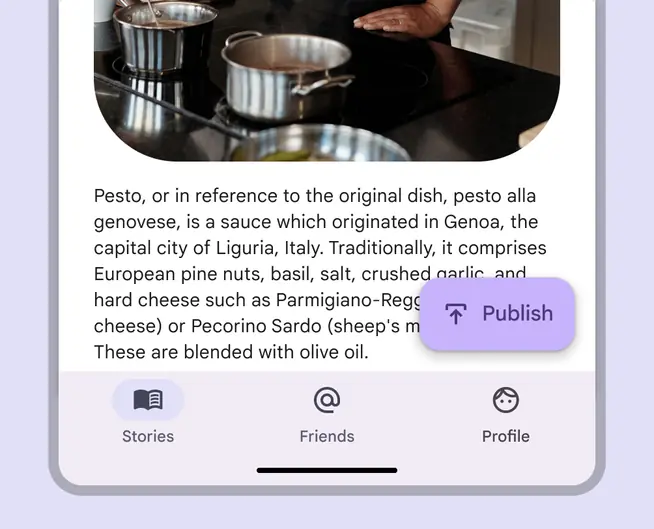
Use an extended FAB to provide constant access to a primary action above long-scrolling surface content
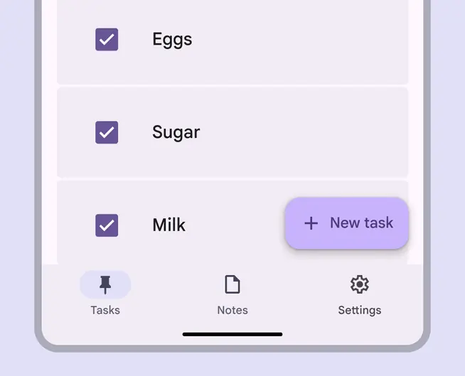
Use an extended FAB to emphasize a page’s primary action
Additional emphasis
The extended FAB can provide more emphasis and clarity to a product’s primary action.
Since it has room for both a text label and icon, the extended FAB can be effective where an icon alone is ambiguous. However, the relationship between an extended FAB's icon and label should be clear.
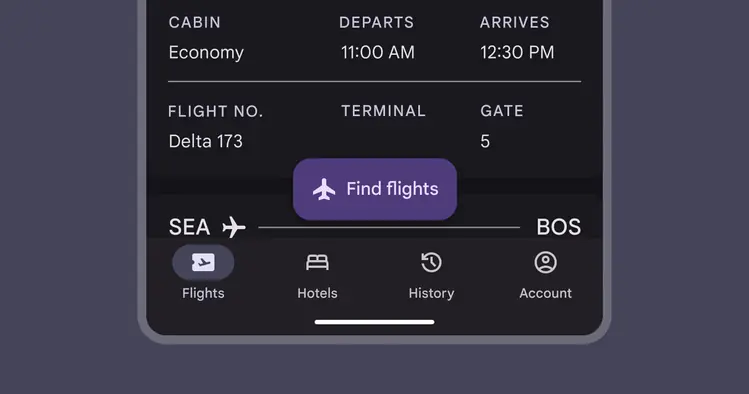
An extended FAB can be effective where an icon alone is too vague
Like the regular FAB, only one extended FAB should be used per screen.
Multiple FABs compete for attention.
If additional high-level actions are required, consider adding more buttons elsewhere on the page.
Do
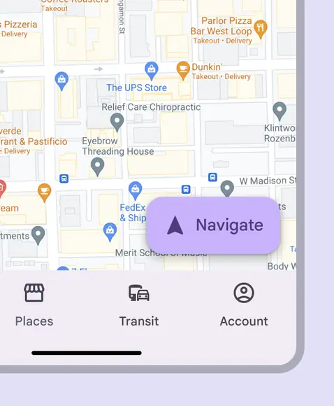
Only show one prominent action at a time with the extended FAB
Don't
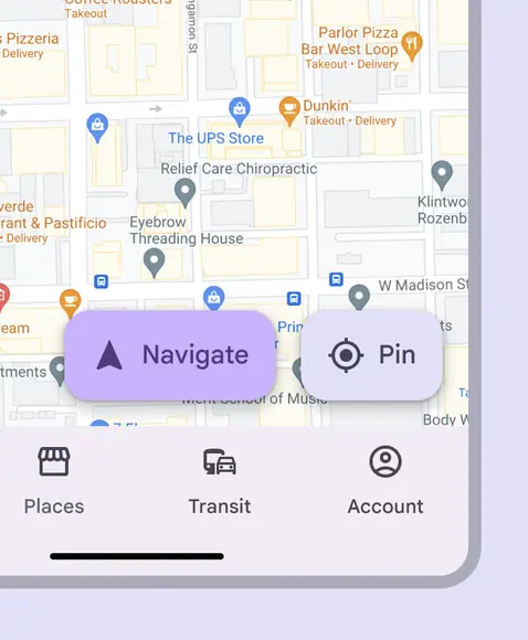
Don’t use multiple extended FABs in one screen as it disrupts visual hierarchy
The extended FAB shouldn't be used as an option in a set of actions.
Instead, use filled buttons for a similar level of emphasis.
Do
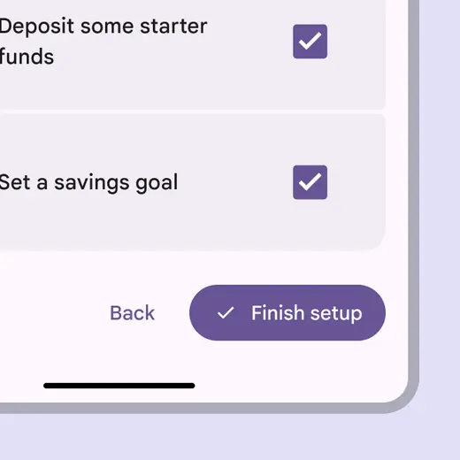
Use a button with appropriate styling to emphasize it in a group of buttons
Don't
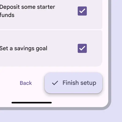
Don’t use the extended FAB to convey an option in a set of actions
Choosing a size
There are three variants of extended FABs: small, medium, and large.
Choose an appropriately-sized extended FAB to add the right amount of emphasis for an action.
In compact windows with one prominent action, the large extended FAB can be appropriate.
In larger breakpoints, use a medium or large extended FAB.
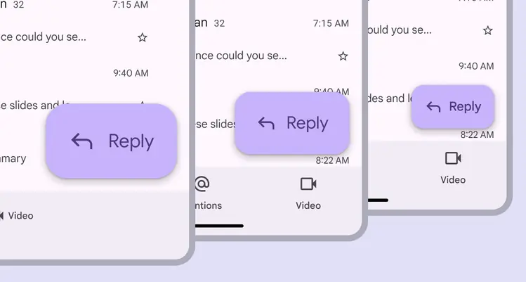
There are three sizes of extended FABs
Anatomy
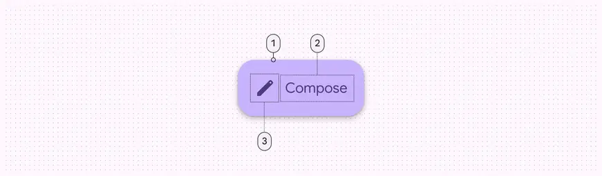
- Container
- Label text
- Icon (optional)
Container
The extended FAB container is a rounded rectangle that hugs its contents.
The extended FAB grows and shrinks with text length.
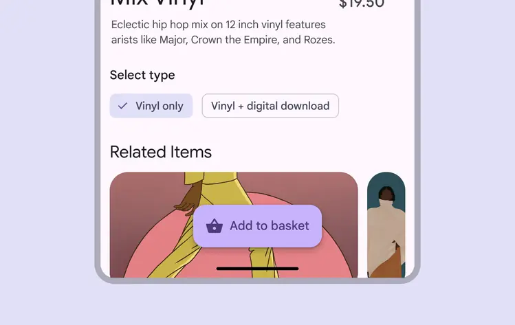
The extended FAB container hugs the icon and text
Icon (optional)
An extended FAB's icon should intuitively represent its action.
Do
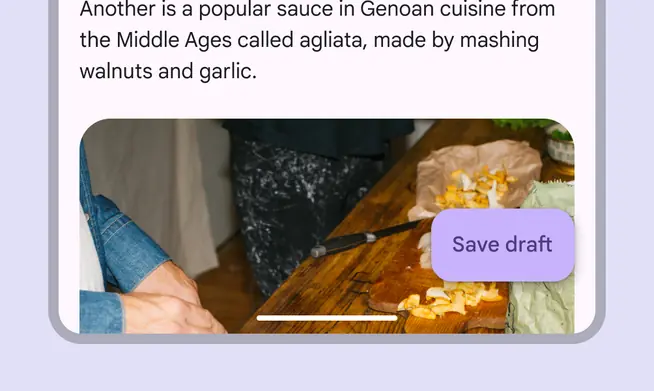
Unlike standard FABs, extended FABs don't require an icon
Don't
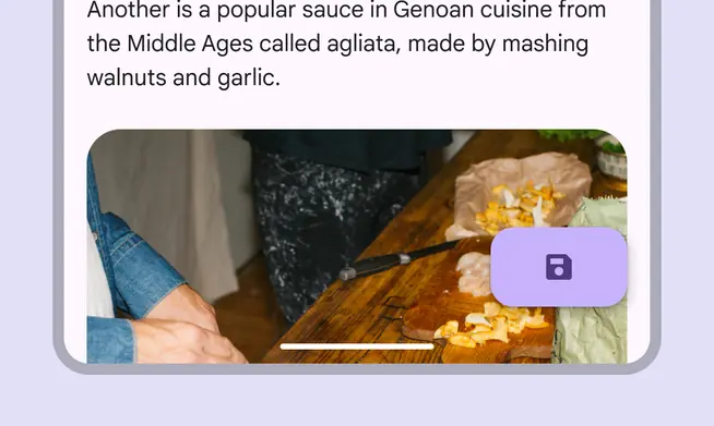
An extended FAB can't have an icon without a text label
Label text
The extended FAB’s label should clearly describe its action.
Use 1–2 words at most. Keep in mind that localization may increase the amount of characters and width of the extended FAB.
Do
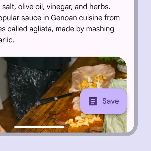
Shorten the text as much as needed. Include an icon for additional context.
Don't
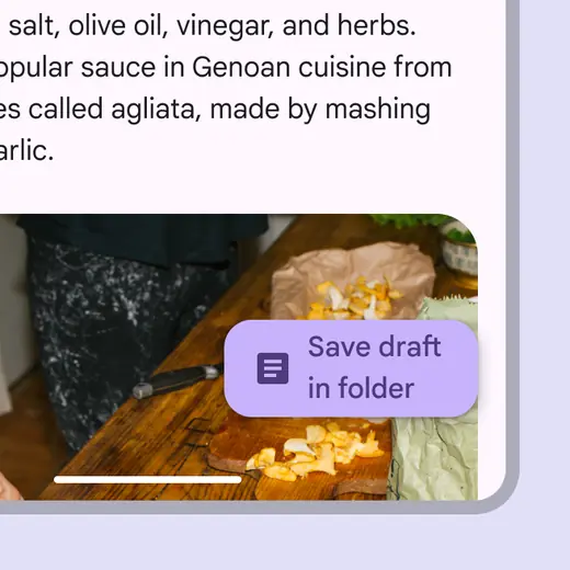
Avoid wrapping or truncating text
Placement
Do
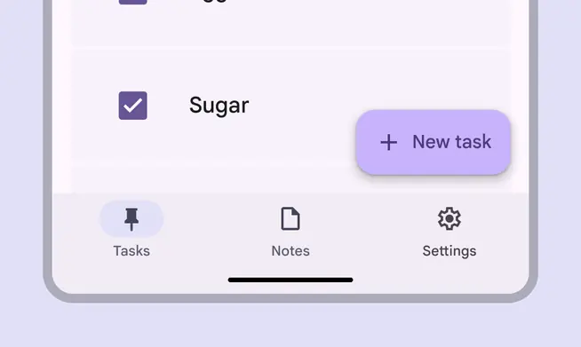
Place the extended FAB above the rest of the UI, off of elements like app bars
Don't
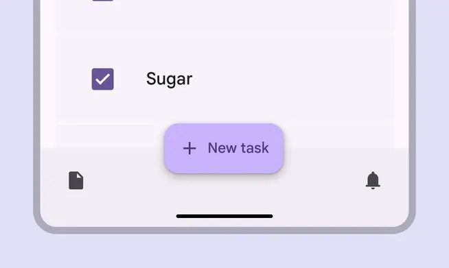
Don’t place the extended FAB on top of toolbars. It disrupts the consistency of the elevation and surface layers.
Don't
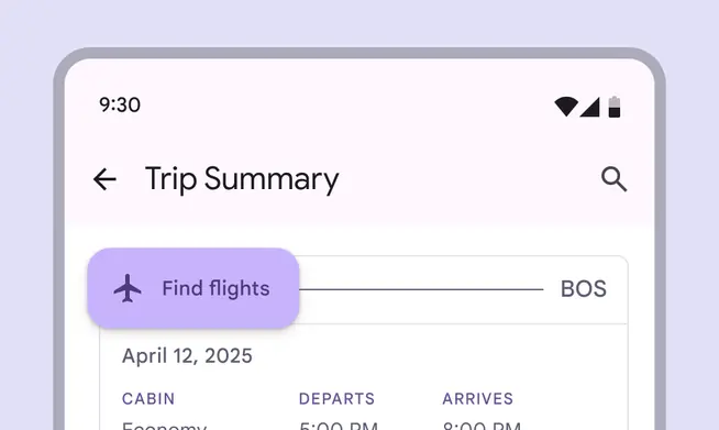
Don’t place the extended FAB in the upper half of a mobile screen, as it disrupts the reading of the UI
Don't
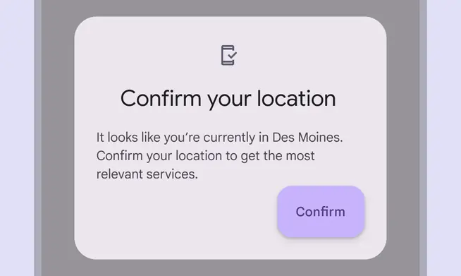
Don’t place extended FABs on cards or inside other containers
Avoid putting other floating components, like the floating toolbar, on screen with the extended FAB.
Don't
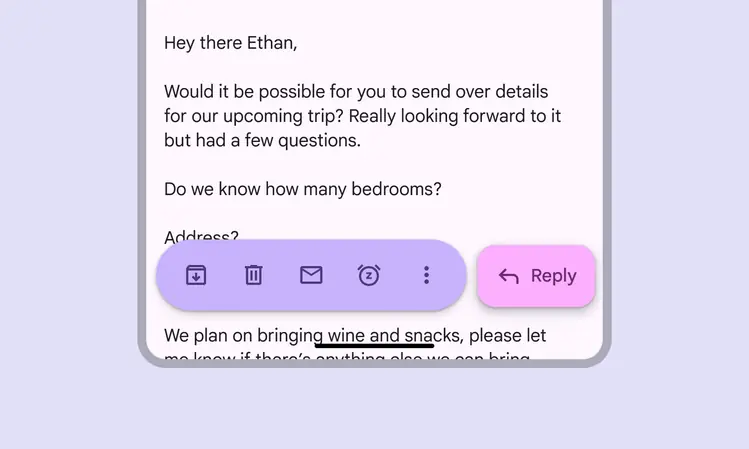
Floating toolbars can be paired with FABs, but not extended FABs
Responsive layout
The FAB and extended FAB can transform into each other depending on available space and layout.
In a collapsed navigation rail, a FAB would be used. When the rail is expanded, the FAB can transform into an extended FAB.
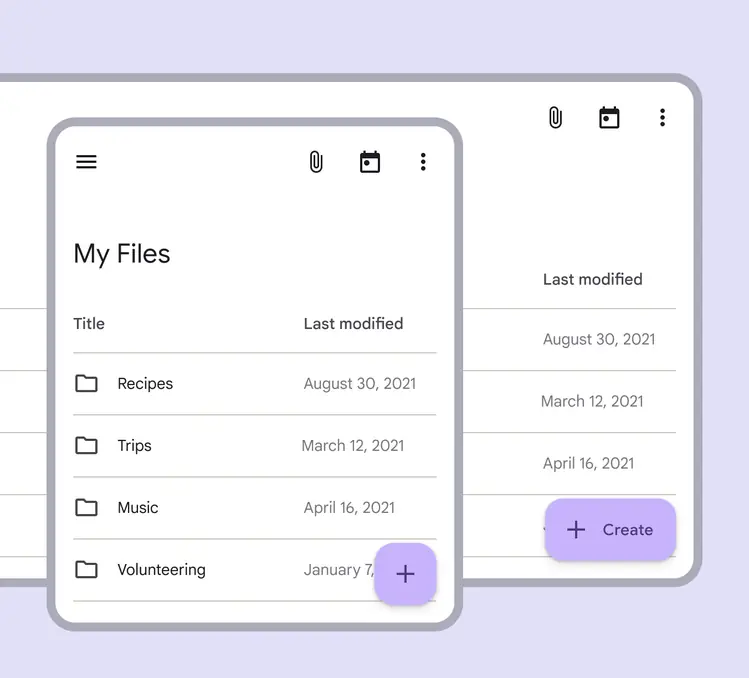
When space is limited, an extended FAB can transform into a FAB
Right-to-left languages
Extended FABs should mirror their elements in right-to-left (RTL) languages.
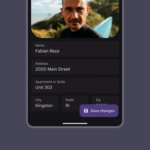
Icons should be placed to the left of labels for left-to-right (LTR) languages
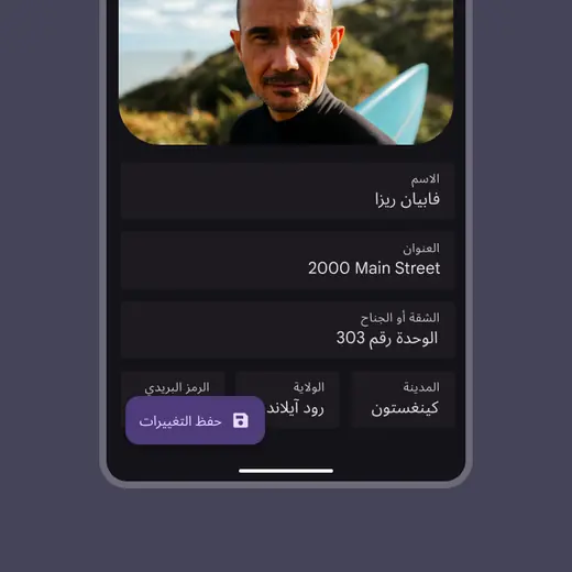
Icons should be placed to the right of labels for RTL languages
Breakpoints
In compact and medium breakpoints, the extended FAB should be placed at the bottom of the screen, either center-aligned or aligned to the trailing edge of the window.
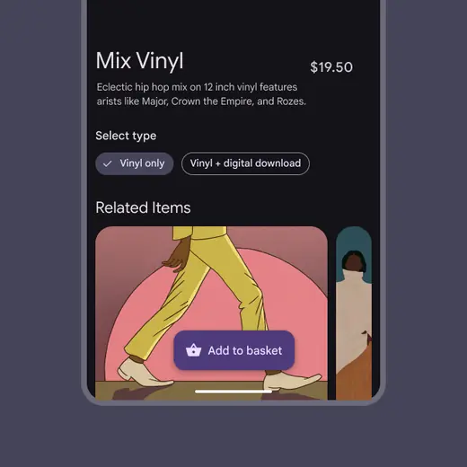
The extended FAB can be center-aligned
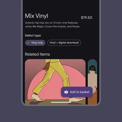
The extended FAB can be aligned to the trailing edge of the window
In expanded and larger breakpoints, the extended FAB should appear either:
- At the bottom right edge of the window, in both LTR and RTL languages
- Within the navigation rail

The extended FAB can be right-aligned in both LTR and RTL languages
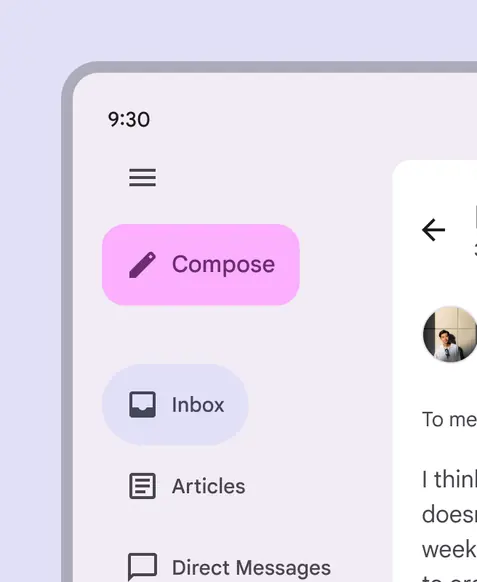
The extended FAB can be at the top of the expanded navigation rail
Behavior
Appearing
The extended FAB surface expands when appearing on screen using an enter and exit transition pattern.
An extended FAB expands when appearing on screen
Expanding
The extended FAB can expand and adapt to any shape using a container transform transition pattern.
This includes a surface that is part of the app structure, or a surface that spans the entire screen.
An extended FAB can expand and adapt to any shape
Transforming
The extended FAB can transform into a FAB on scroll to temporarily take up less space on screen.
An extended FAB can transform into a FAB
Scrolling
The extended FAB can transform into a FAB when scrolling down, and back to an extended FAB when scrolling up.
An extended FAB collapses and expands when scrolling
When the FAB switches to an extended FAB, the following transitions occur:
- The FAB shape changes
- FAB icon moves to the left
- FAB text label fades in
FAB switches to an extended FAB