Buttons
Buttons help people take action, such as sending an email, sharing a document, or liking a comment. Common buttons prompt most actions in a UI.
Overview · Specs · Guidelines · Accessibility

- Two variants: default and toggle
- Can contain an optional leading icon
- Five color options: elevated, filled, tonal, outlined, and text
- Five size recommendations: extra small, small, medium, large, and extra large
- Two shape options: round and square
- Keep labels concise and use sentence case
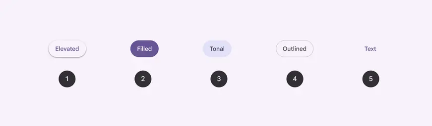
- Elevated button
- Filled button
- Filled tonal button
- Outlined button
- Text button
Availability & resources
| Type | Resource | Status |
|---|---|---|
| Design | Design Kit (Figma) | Available |
| Implementation | Flutter | Available |
| Implementation | Jetpack Compose | Available |
| Implementation | Jetpack Compose: Expressive | Available |
| Implementation | Android Views (MDC-Android) | Available |
| Implementation | Android Views (MDC-Android): Expressive | Available |
| Implementation | Web | Available |
| Implementation | Web: Expressive | Unavailable |
M3 Expressive update
May 2025
Buttons now have a wider variety of shapes and sizes, toggle functionality, and can change shape when selected. More on M3 Expressive
Variants and naming:
- Default and toggle (selection)
- Color styles are now configurations (elevated, filled, tonal, outlined, text)
Shapes:
- Round and square
- Shape morphs when pressed
- Shape morphs when selected
Sizes:
- Extra small
- Small (existing, default)
- Medium
- Large
- Extra large
New padding for small buttons:
- 16dp (recommended to match padding of new sizes)
- 24dp (no longer recommended)
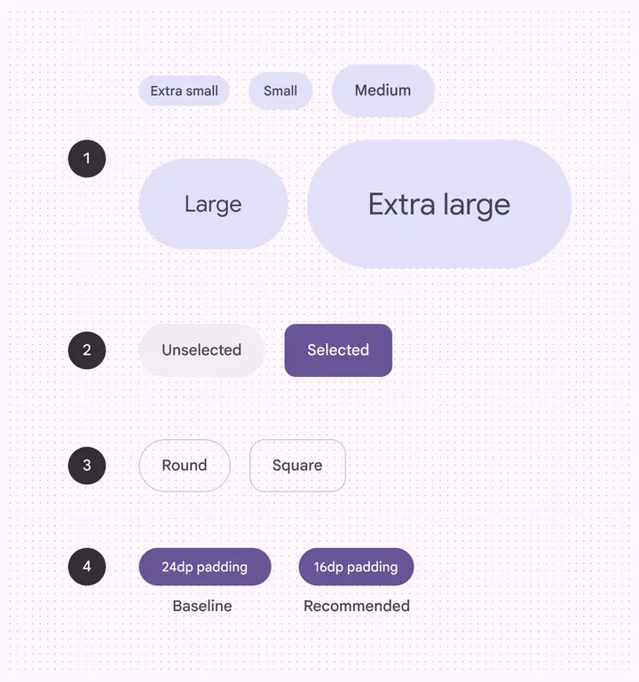
- Five sizes
- Toggle (selection)
- Two shapes
- Two small padding widths
Differences from M2
- Color: New color mappings and compatibility with dynamic color. Icons and labels now share the same color. Neutral text button is no longer recommended.
- Icons: Standard size for leading and trailing icons is now 20dp
- Shape: Fully-rounded corner radius and additional height options
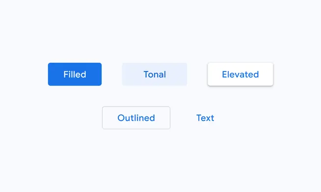
M2: Buttons have a height of 36dp and slightly rounded corner radius
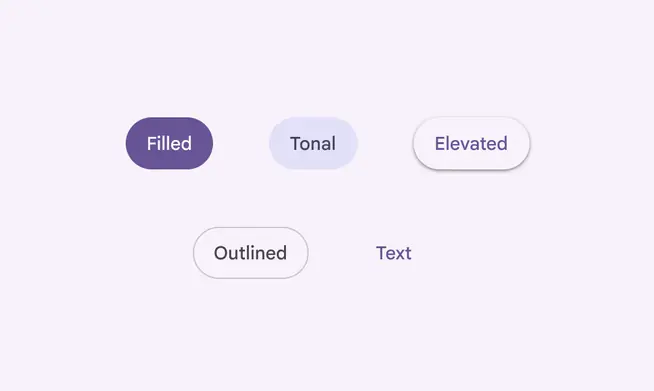
M3: Default buttons are taller at 40dp and have fully rounded corners