Buttons
Buttons help people take action, such as sending an email, sharing a document, or liking a comment. Common buttons prompt most actions in a UI.
Overview · Specs · Guidelines · Accessibility
Use cases
People should be able to do the following with assistive technology:
- Use a button to perform an action
- Navigate to and activate a button
Interaction & style
Color contrast
Enabled buttons need a 3:1 contrast ratio with the background to meet accessibility best practices.
This is measured from the container for elevated, filled, and tonal button styles, and the label text for outlined and text button styles.
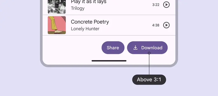
Higher contrast helps differentiate elements
200% text size
Avoid excessive text wrapping or truncation by choosing concise strings.
On Android, button labels should be kept concise enough to fit within two lines after the text size is increased to 200%. If a button label exceeds this limit and gets truncated, provide an alternative way to access the full content in a single tap.
Caution
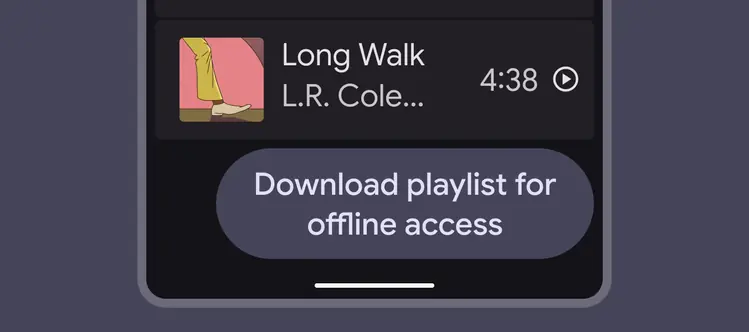
Avoid excessive text wrapping or truncation by choosing concise strings
Rapid clicks
On the web, you can use a modified motion curve to avoid resonant effects from overlapping animations. This provides a smoother experience for interactions where you anticipate multiple clicks or taps in succession.
Use the modified motion curve if rapid click or pointer interactions are expected
Keyboard navigation
| Keys | Actions |
|---|---|
| Tab | Navigate to a button |
| Space or Enter | Activate a button |
Labeling elements
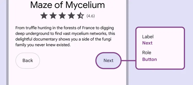
The accessibility label for a button should match the visible label text on the button such as Done, Send, or Reply.
It can contain extra contextual information if necessary.