Button groups
Button groups organize buttons and add interactions between them
Overview · Specs · Guidelines · Accessibility
Use cases
People should be able to do the following with assistive technology:
- Navigate to and interact with each button in the group
- Identify when buttons are selected
Interaction & style
Each button in a group should have a minimum 48x48dp target.
Extra small and small button groups have larger inner padding to ensure accessible targets. Avoid reducing the padding in these sizes.
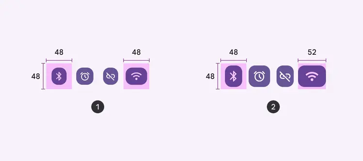
- Extra small button group
- Small button group
Initial focus
The button group container is not a focusable element. Initial focus should land on the first button in the group and then move to each button.
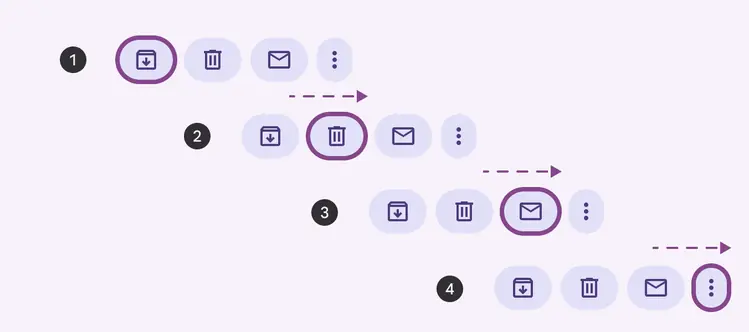
Initial focus should land on the first button, not on the container
Use Tab to navigate to a button group, the arrow keys to navigate between each item in the group, and Space or Enter to select a focused button.
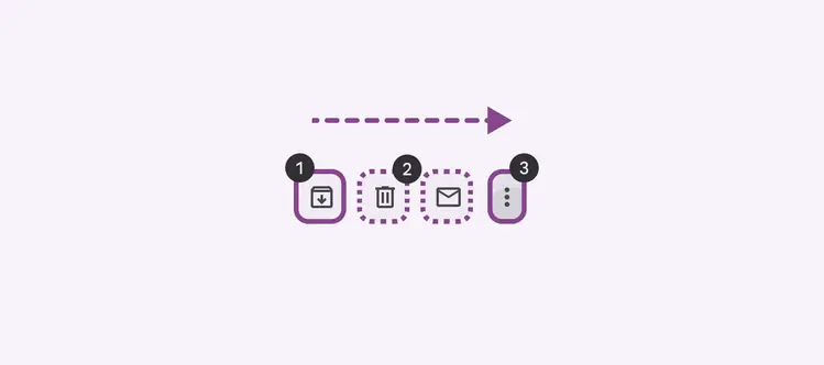
- Tab: Initial focus lands on the first button
- Arrow keys: Navigate between items
- Space or Enter: Selects a focused item
Keyboard navigation
| Keys | Actions |
|---|---|
| Tab | Navigate between buttons |
| Arrow keys | Navigate inside the component |
| Space or Enter | Activate a focused button |
Labeling elements
The button group container doesn't need to be labeled. Label each button according to the button and icon button accessibility guidance.
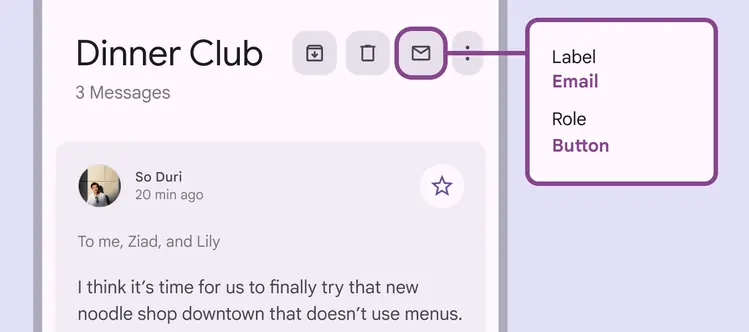
Label each button within the button group