Bottom sheets
Bottom sheets are surfaces containing supplementary content, anchored to the bottom of the screen.
Overview · Specs · Guidelines · Accessibility
Modal bottom sheets are above a scrim while standard bottom sheets don't have a scrim. Besides this, both variants of bottom sheets have the same specs.
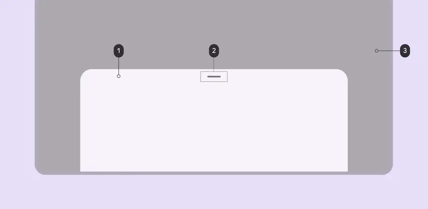
- Container
- Drag handle (optional)
- Scrim
Tokens and specs
Browse the component elements, attributes, tokens, and their values. Learn more about design tokens
Design tokens
Token table
Machine-readable relationship table
Bottom sheets tokens · 1 token set · 13 tokens · live token table · DSDB TOKEN_TABLE.75e530a1014802b3
- Default context: Theme: Light · Platform: Android · Audience: 3P · Contrast: Default · iOS dark theme elevation: None · iOS weight setting: Default
- Not configurable here (group default used): Motion scheme: Standard · Font: Static · Language height: Small
- Other contexts: Theme: Dark · Contrast: Medium contrast, High contrast. "Other contexts" lists values that differ from the default when only that one context changes.
- Reference chain: aliases from the token to its source value (
token → alias → … → value). "—" means the token holds a literal value.
Sheets - Bottom · md.comp.sheet.bottom · 13 tokens
For bottom sheets.
| Group | Token | Type | Reference chain | Resolved value | Other contexts |
|---|---|---|---|---|---|
| Enabled › Container | md.comp.sheet.bottom.docked.container.color | Color | md.sys.color.surface-container-low → md.ref.palette.neutral96 | #F7F2FA | Dark: #1D1B20 via md.ref.palette.neutral10 |
| Enabled › Container | md.comp.sheet.bottom.docked.container.surface-tint-layer.color (deprecated) | Color | md.sys.color.surface-tint → md.sys.color.primary → md.ref.palette.primary40 | #6750A4 | Dark: #D0BCFF via md.ref.palette.primary80Medium contrast: #4F378B via md.ref.palette.primary30High contrast: #381E72 via md.ref.palette.primary20 |
| Enabled › Container | md.comp.sheet.bottom.docked.modal.container.elevation | Elevation | md.sys.elevation.level1 | 1dp | — |
| Enabled › Container | md.comp.sheet.bottom.docked.standard.container.elevation | Elevation | md.sys.elevation.level1 | 1dp | — |
| Enabled › Container | md.comp.sheet.bottom.docked.container.shape | Shape | md.sys.shape.corner.extra-large.top | Rounded corners: top-left 28dp, top-right 28dp | — |
| Enabled › Container | md.comp.sheet.bottom.docked.minimized.container.shape | Shape | md.sys.shape.corner.none | Rounded corners 0dp | — |
| Enabled › Drag handle | md.comp.sheet.bottom.docked.drag-handle.color | Color | md.sys.color.on-surface-variant → md.ref.palette.neutral-variant30 | #49454F | Dark: #CAC4D0 via md.ref.palette.neutral-variant80Medium contrast: #322F37 via md.ref.palette.neutral-variant20High contrast: #000000 via md.ref.palette.neutral-variant0 |
| Enabled › Drag handle | md.comp.sheet.bottom.docked.drag-handle.opacity (deprecated) | Opacity | — | 0.4 | — |
| Enabled › Drag handle | md.comp.sheet.bottom.docked.drag-handle.width | Length | — | 32dp | — |
| Enabled › Drag handle | md.comp.sheet.bottom.docked.drag-handle.height | Length | — | 4dp | — |
| Enabled › Focus indicator | md.comp.sheet.bottom.focus.indicator.color | Color | md.sys.color.secondary → md.ref.palette.secondary40 | #625B71 | Dark: #CCC2DC via md.ref.palette.secondary80Medium contrast: #4A4458 via md.ref.palette.secondary30High contrast: #332D41 via md.ref.palette.secondary20 |
| Enabled › Focus indicator | md.comp.sheet.bottom.focus.indicator.thickness | Length | md.sys.state.focus-indicator.thickness | 3dp | — |
| Enabled › Focus indicator | md.comp.sheet.bottom.focus.indicator.outline.offset | Length | md.sys.state.focus-indicator.outer-offset | 2dp | — |
Color
Color values are implemented through design tokens. For design, this means working with color values that correspond with tokens. For implementation, a color value will be a token that references a value. Learn more about design tokens
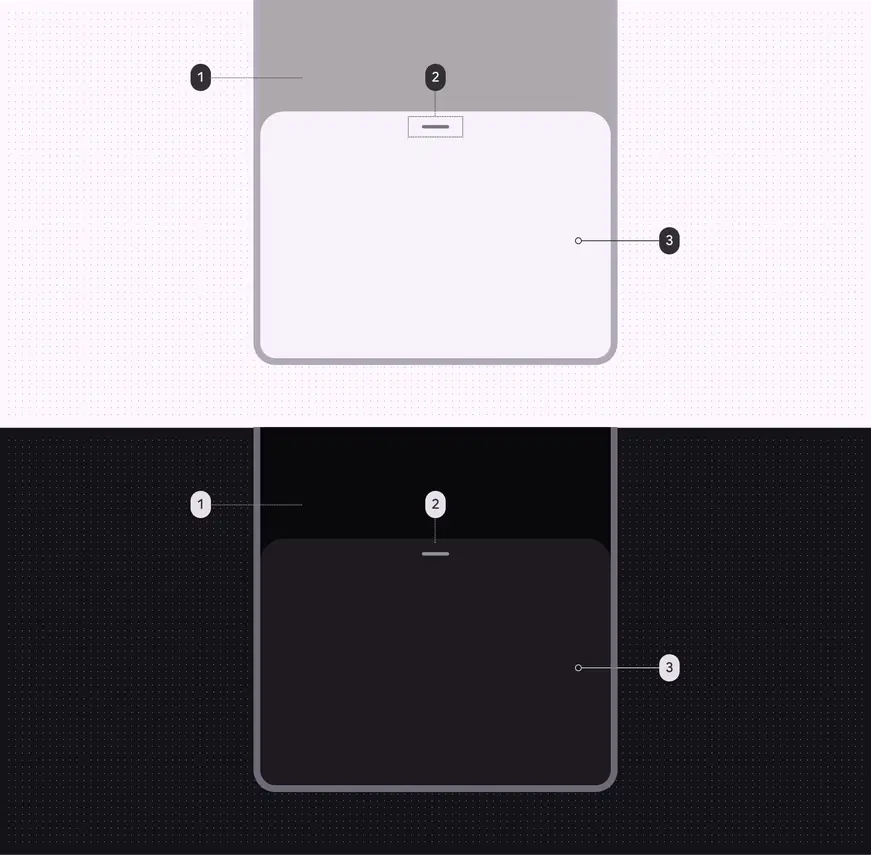
Bottom sheet color roles used for both light and dark schemes:
- Scrim*
- On surface variant
- Surface container low
*On Android platforms, the scrim color and opacity is automatically handled by the system UI.
Measurements
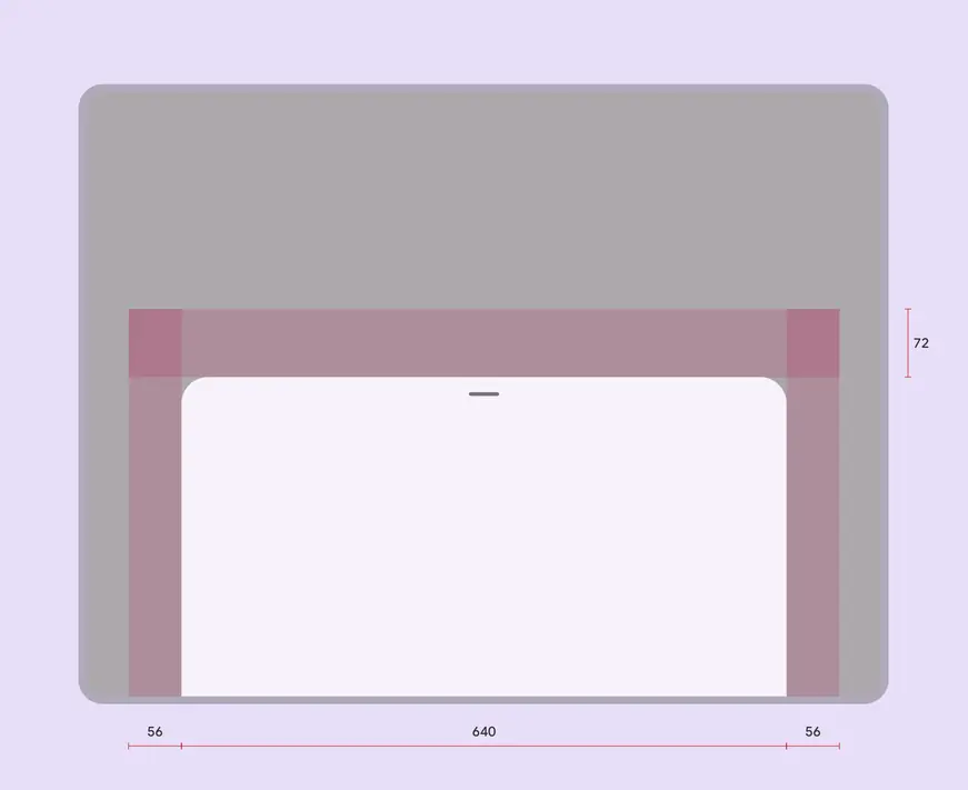
Bottom sheet padding and size measurements
Bottom sheets span the full window width up to 640dp. When the window width exceeds 640dp, bottom sheets adjust to have a top margin of 56dp and side margins of 56dp.
| Attribute | Value |
|---|---|
| Drag handle alignment (horizontal) | Center |
| Drag handle padding top/bottom | 22dp |
| Top margin | 72dp |
| Top margin (window width > 640dp) | 56dp |
| Start/end margin (window width > 640dp) | 56dp |
| Width | Full width, up to max-width 640dp |
| Height | Variable |