App bars
Top app bars display navigation, actions, and text at the top of a screen. They contain a title and actions related to the current screen.
Overview · Specs · Guidelines · Accessibility
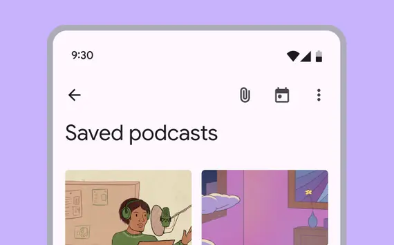
- Focus on describing the current page and provide 1–2 essential actions
- Displays labels and page navigation controls at the top of the page. (Use a toolbar to display page actions)
- Four variants: Search app bar, small, medium flexible, large flexible
- On scroll, apply a fill color to separate from body content
- Can animate on and off screen with another bar of controls, like a row of chips
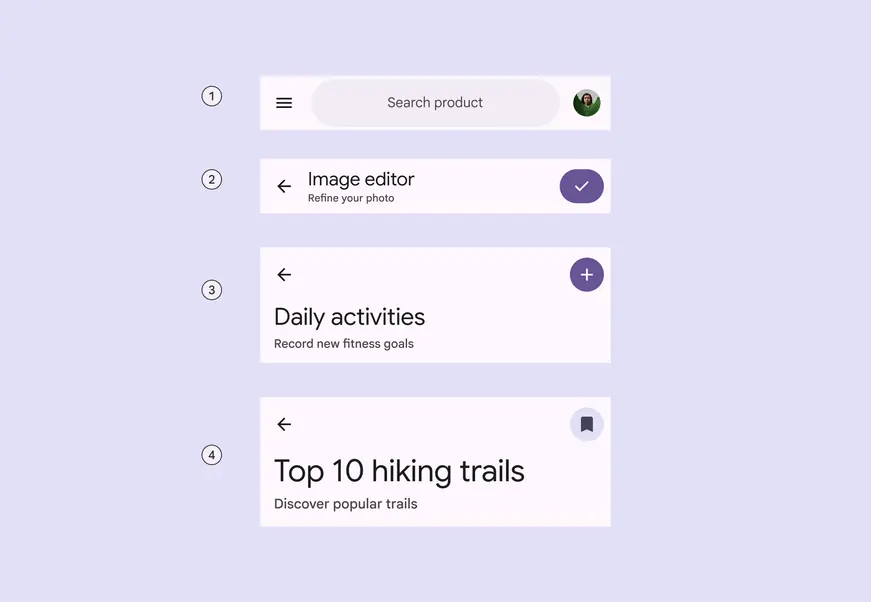
- Search app bar
- Small
- Medium flexible
- Large flexible
Availability & resources
| Type | Resource | Status |
|---|---|---|
| Design | Design Kit (Figma) | Available |
| Implementation | Flutter | Available |
| Implementation | Jetpack Compose | Available |
| Implementation | Jetpack Compose: Expressive | Available |
| Implementation | Android Views (MDC-Android) | Available |
| Implementation | Android Views (MDC-Android): Expressive | Available |
| Implementation | Web | Unavailable |
| Implementation | Web: Expressive | Unavailable |
M3 Expressive update
May 2025
The new search app bar supports icons inside and outside the search bar, and centered text. It opens the search view component when selected.
The new medium flexible and large flexible app bars come with significant improvements, and should replace medium and large app bars, which are no longer recommended. The small app bar is updated with the same flexible improvements.
More on M3 Expressive
Variants and naming:
Renamed component from top app bar to app bar
Added search app bar
Medium and large app bars are no longer recommended
Added medium flexible and large flexible app bars with:
- Reduced overall height
- Larger title text
- Subtitle
- Left- and center-aligned text options
- Text wrapping
- More flexible elements for imagery and filled buttons
Added features to small app bar:
- Subtitle
- Center-aligned text option
- More flexible elements for imagery and filled buttons
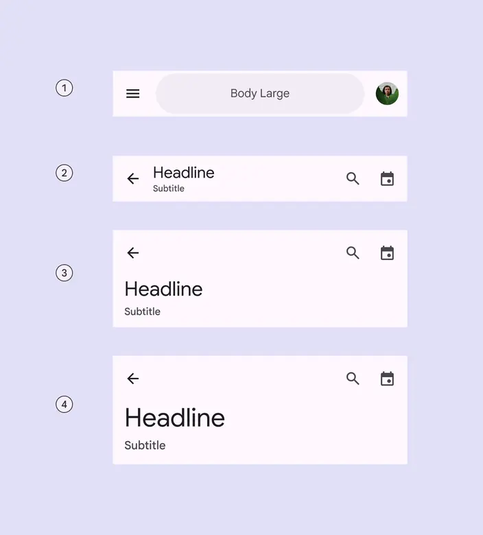
- Search app bar
- Small
- Medium flexible
- Large flexible
Differences from M2
- Color: New color mappings and compatibility with dynamic color
- On scroll: No drop shadow, instead a color fill creates separation from content
- Typography: Larger default text
- Layout: Smaller default height
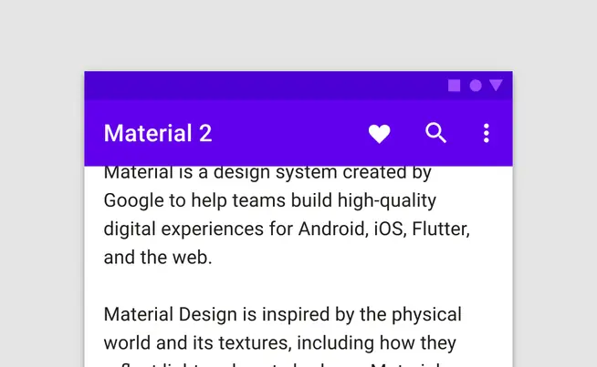
M2: Elevation and a drop shadow raise the top app bar when content is present underneath
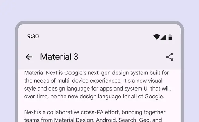
M3: On scroll, a color fill overlay separates the app bar from the content beneath