---
url: /foundations/interaction/states/applying-states.md
description: States show the interaction status of a component or UI element
---
# States
States show the interaction status of a component or UI element
[Overview](overview.md) · [State layers](state-layers.md) · **Applying states**
## Enabled
An enabled state communicates an interactive component or element. Enabled states use the default styling for each interactive component.
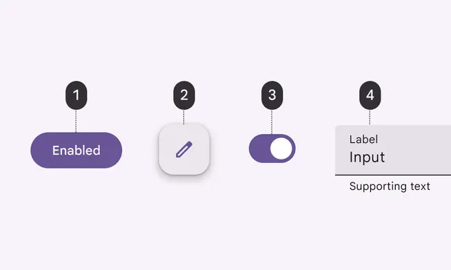
Enabled states for:
1. Button
2. FAB
3. Switch
4. Text field
## Disabled
A disabled state communicates when a component or element isn’t interactive. This state is visually communicated through color changes and reduced elevation.
**Disabled states don't need to meet Material's contrast requirements.**
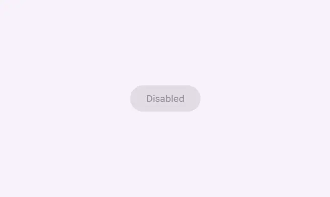
Disabled button
Disabled states **are** inherited by action, selection, and input components:
* Buttons
* Cards
* Checkboxes
* Chips
* List items
* Radio buttons
* Switches
* Text fields
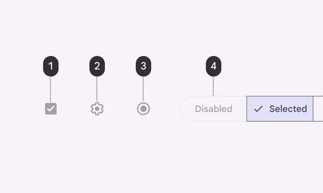
Disabled states for:
1. Checkbox
2. Icon button
3. Radio button
4. Segmented button
Disabled states **aren't** inherited by communication, containment, navigation, and some actions components:
* App bars
* Badges
* Dialogs
* Floating action buttons (FABs)
* Menus
* Navigation bar, drawer, and rail
* Sheets
* Tabs
* Tooltips
::: danger Don't
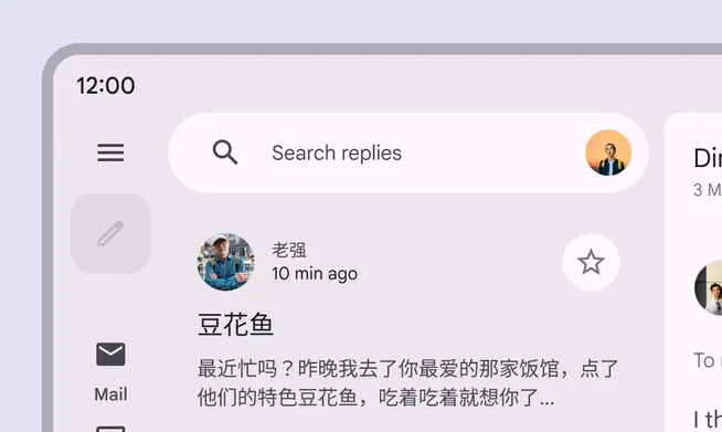
If the action represented in the FAB is unavailable, the FAB shouldn't appear
:::
### Behavior
Disabled components can’t be focused, dragged, or pressed, and they don’t change state when tapped or hovered over.
A disabled button doesn’t inherit hover or other state layers
There can be any number of disabled states in a layout.
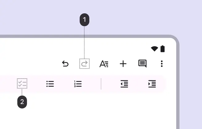
1. Disabled redo icon button
2. Disabled checklist icon button
## Hover
Hover states are initiated by the user pausing over an interactive element using a cursor.
The lower-emphasis surface overlay for hover states can be applied to the entire component, elements within a component, or as a circular shape over part of the component.
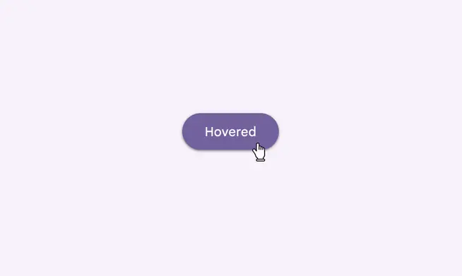
Hovered button
Hover states **are** inherited by action, selection, and input components:
* Buttons
* Cards
* Checkbox
* Chips
* Date and time pickers
* List items
* Slider
* Switch
* Text fields
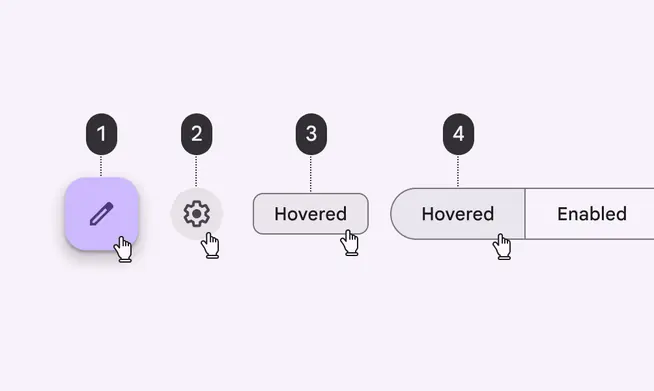
Hovered states for:
1. FAB
2. Icon button
3. Chip
4. Segmented buttons
Hover states **aren’t** inherited by communication, containment, or navigation components:
* App bars
* Badges
* Dialogs
* Menus
* Navigation bar, drawer, and rail
* Sheets
* Tabs
::: danger Don't
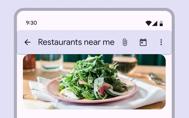
The individual components that are actionable within the app bar inherit hover states, not the whole app bar
:::
### Behavior
Hover states are initiated by the user pausing over an interactive element using a cursor.
Hover states appear and disappear using a low-emphasis animated fade
Hover states can be combined with focused, activated, selected, or pressed states.
A selected filter chip in both selected and hover states
There can only be one hover state at a time in a layout.
Hover state can only be on one element at a time based on cursor position
## Focused
A focused state communicates when a user has highlighted an element using a keyboard or voice. Focus states apply to all interactive components.
The higher-emphasis surface overlay for focused states can be applied to the entire component, elements within a component, or as a circular shape over part of the component.
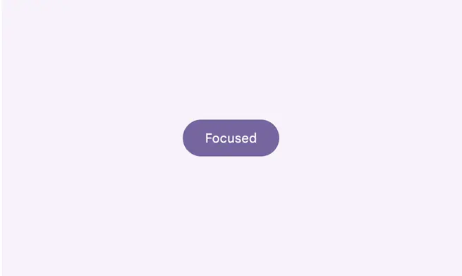
Focused button
Focus states **are** inherited by action, selection, and input components:
* Buttons
* Cards
* Checkbox
* Chips
* Date and time pickers
* List items
* Selection controls
* Text fields
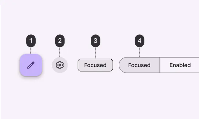
Focused states for:
1. FAB
2. Icon button
3. Chip
4. Segmented buttons
Focus states **aren’t** inherited by most communication, containment, or navigation components:
* App bars
* Badges
* Banner
* Card
* Dialogs
* Navigation bar, drawer, and rail
* Sheets
::: danger Don't
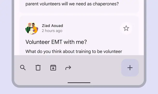
The individual components that are actionable within the app bar inherit focus states, not the whole app bar
:::
### Keyboard focus indicator
Many people use the **Tab** key or other shortcut to navigate the interactive elements of a web page, like links, buttons, and chips.
When an element is tabbed to, it appears in its focused state with a ring-like **keyboard focus indicator**. This indicator helps web users know where they are on the page.
While focused, an element can be acted on with the keyboard.
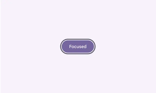
Keyboard focus indicator for a filled button
### Behavior
Focus states are initiated by the user by pressing the **Tab **key on the keyboard (or equivalent).
Focus states can be represented in combination with hover, activated, or selected states.
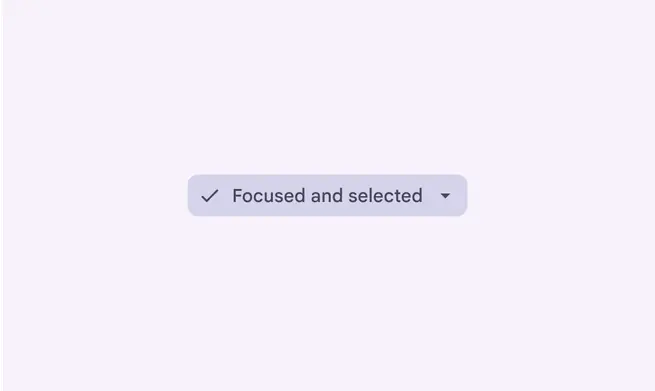
A selected filter chip in both selected and focused states
There can only be one focus state at a time in a layout.
A focus state applied to one card at a time
## Pressed
A pressed state communicates a user-initiated tap or click via cursor, keyboard, or voice input. This state applies to all interactive components.
Pressed states trigger a change in composition and should be high-emphasis.
A ripple overlay signifies a pressed state. It can be applied to an entire component or elements within a component, or as a circular shape over part of the component.
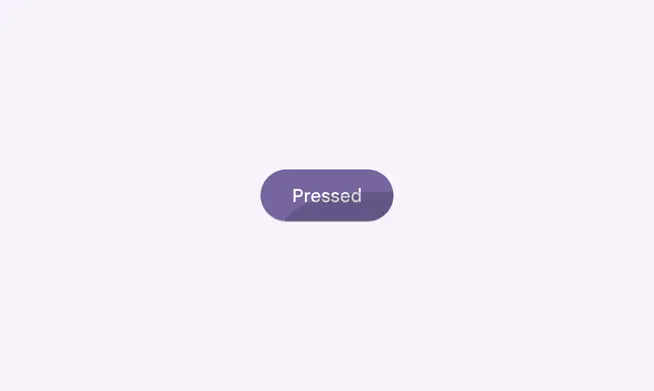
Pressed button
Some components, such as buttons or cards, can inherit elevation to signify a pressed state.
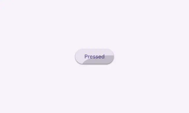
Pressed button with elevation
Pressed states **are** inherited by action, selection, and some containment components:
* Buttons
* Cards
* Checkbox
* Chips
* List items
* Text fields
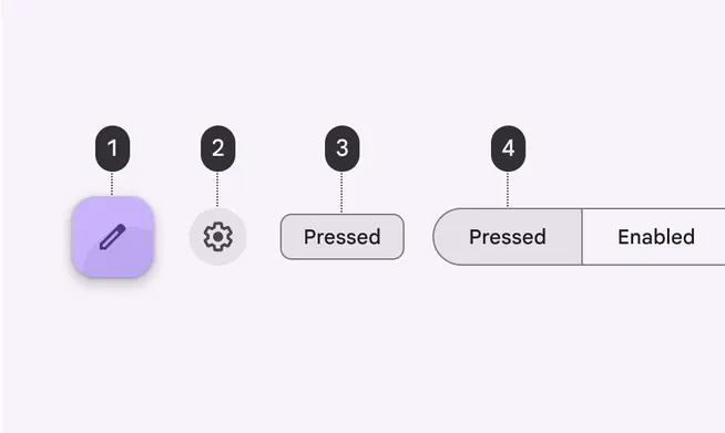
Pressed states for:
1. FAB
2. Icon button
3. Chip
4. Segmented button
Pressed states **aren’t** inherited by communication, navigation, or some containment components:
* App bars
* Badges
* Bottom navigation
* Dialogs
* Menus
* Sheets
* Tabs
::: danger Don't
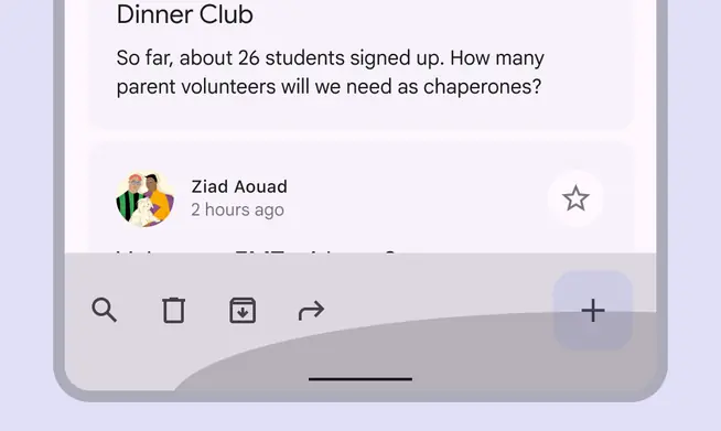
The individual components that are actionable within the app bar inherit pressed states, not the whole app bar
:::
### Behavior
Pressed states are initiated by user keyboard or voice input on an interactive element.
Activated states appear in user-initiated order
Pressed states can be combined with hovered, focused, activated, or selected states.
Activated states can be represented in combination with hover and focus
There may only be a single pressed state at a time in a layout.
A pressed state applied to one card at a time
## Dragged
A dragged state occurs when a user presses and moves an element or component. Dragged states should be low emphasis, to avoid distracting users from their task.
Dragged states use a lower emphasis overlay. It can be applied to the entire component or to elements within a component.
Some components, such as list items, chips, or cards, can inherit elevation to signify a dragged state.
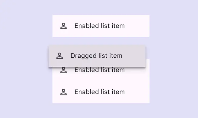
Dragged list item
Dragged states **are** inherited by some containment and selection components:
* Cards
* Chips
* List items
* Sliders
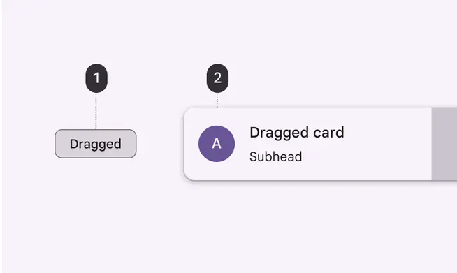
Dragged states for:
1. Chip
2. Card
Dragged states **aren’t** inherited by action, communication, navigation, or some containment components:
* App bars
* Badges
* Buttons
* Dialogs
* Menus
* Navigation bar, drawer, and rail
::: danger Don't
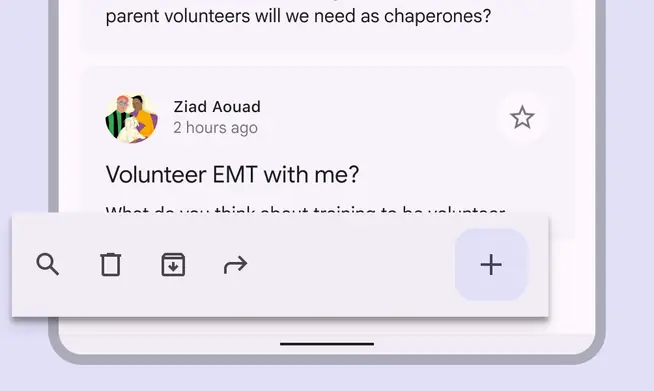
Components like an app bar that require consistent placement should not inherit dragged states
:::
### Behavior
Dragged states are initiated when users touch and hold elements, using an input method such as a tap or click.
A list item in a dragged state
There may only be a single dragged state at a time within a layout.
Dragged state applied to one card at a time